
BRIGHTER AND BOLDER: 2026 IS THE YEAR OF COLOUR IN CONTRAST
words by ANOUK WOUDT
Though Pantone’s colour of the year is described as a soft, airy white, according to our little research, we are in for something a dash more exciting. Bored of minimalist color schemes, this year seems to opt for a delightful jumble of electric colours in all sorts of unlikely combinations, as the focus drifts from effortless elegance, with a growing desire to make a statement.
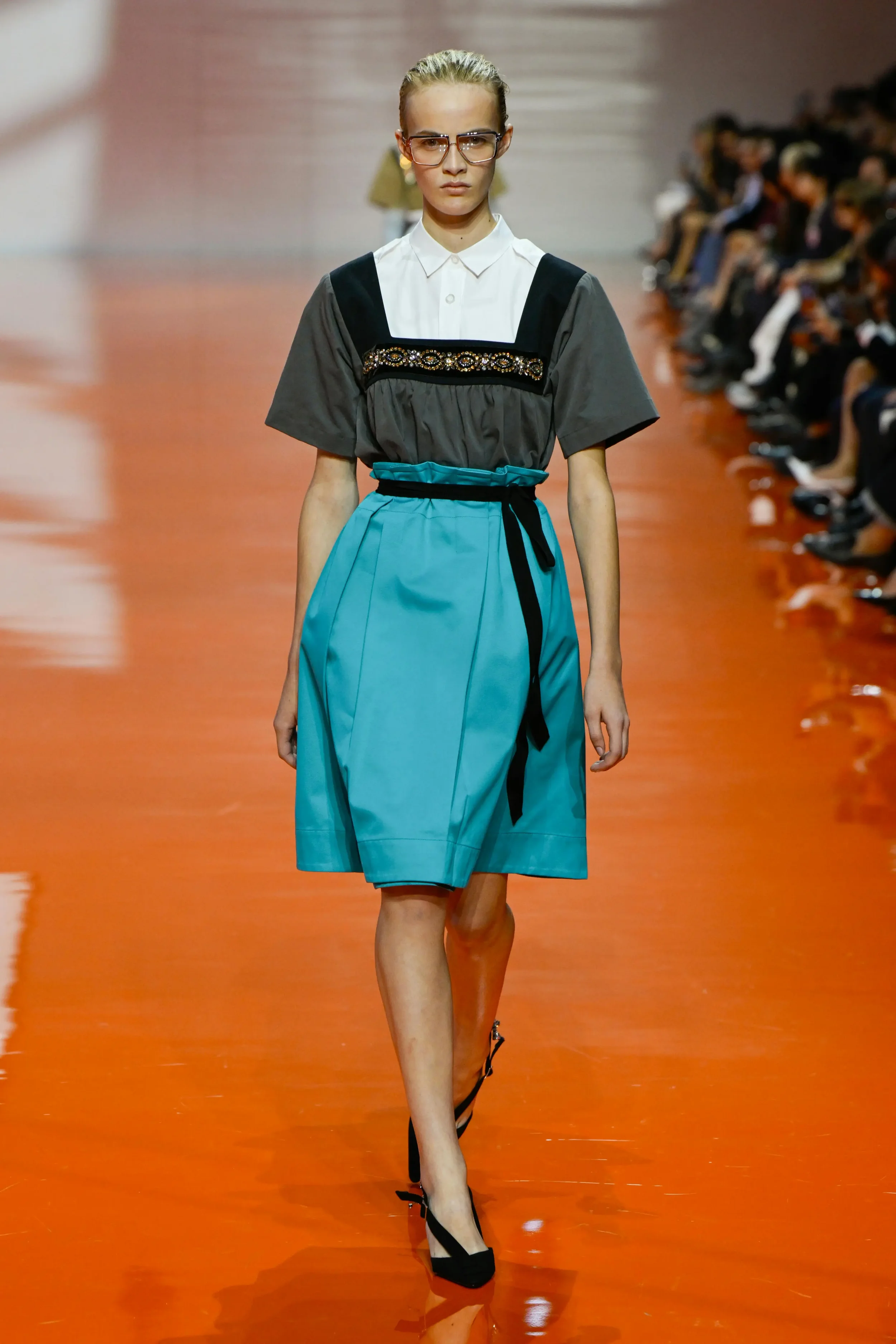
COLOUR-BLOCKING
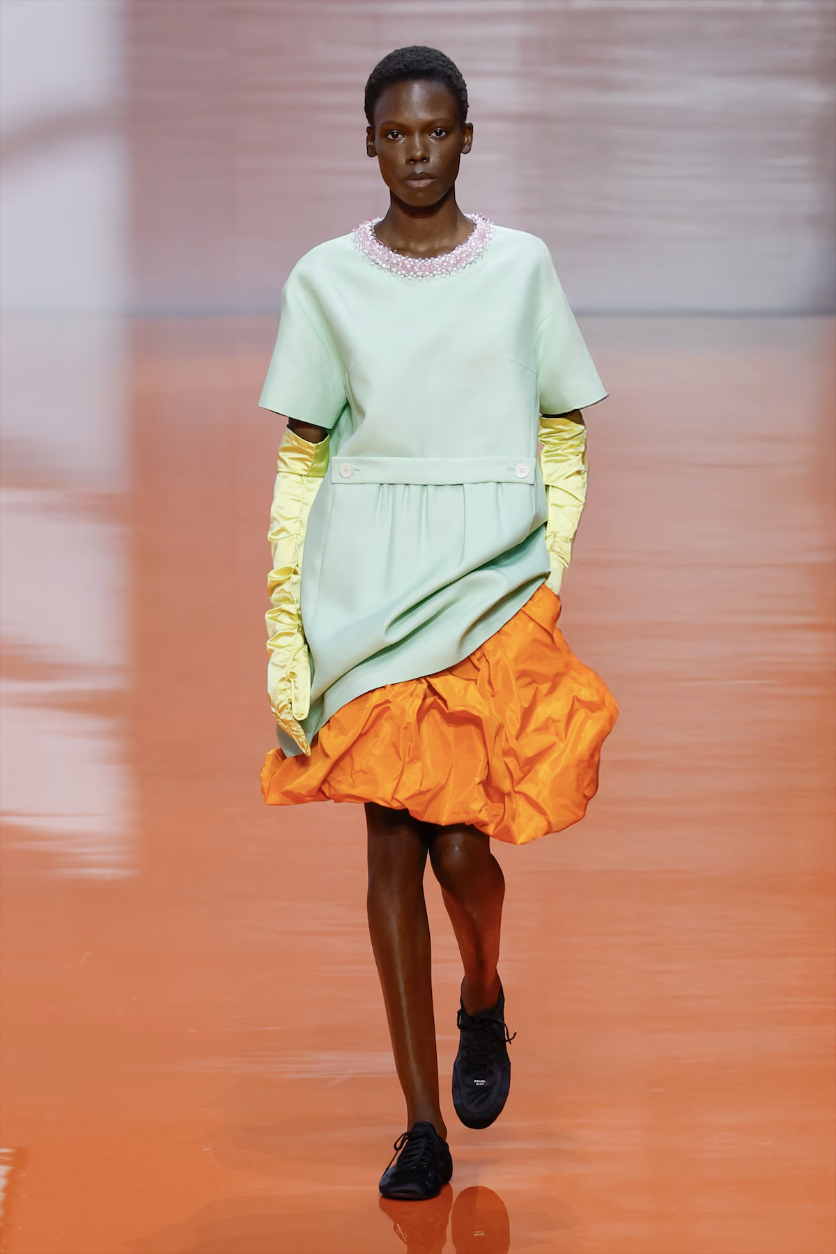
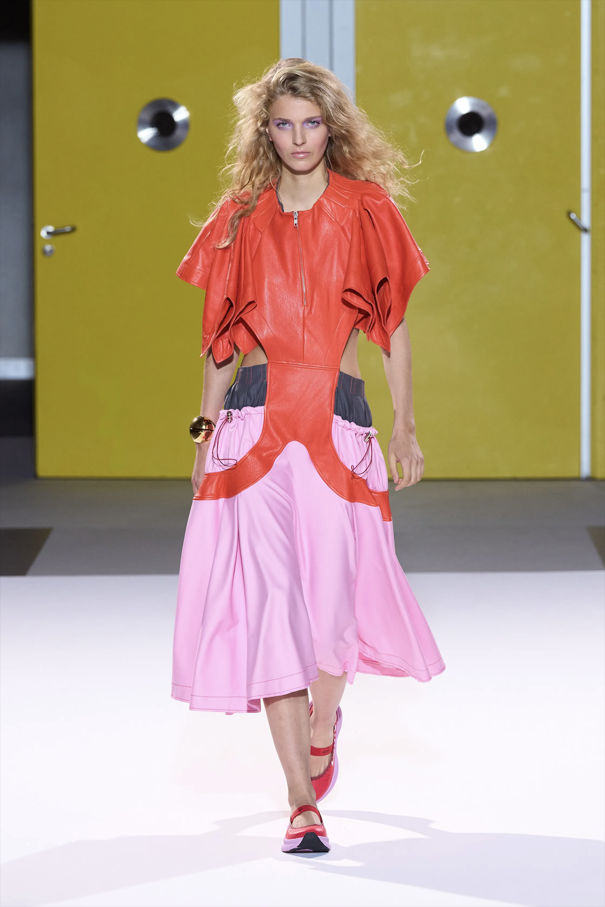
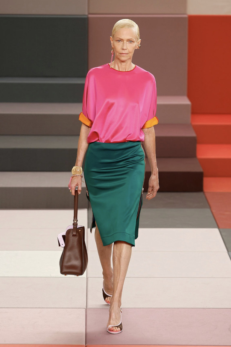
left to right: PRADA, ZOMER, FENDI, ZOMER
The year of 2026 is all about unlikely color combos, and this past runway season is living proof of that. Starting with Spring/Summer collections, we saw colour-blocking on full display at Prada’s womenswear show that showcased persimmons paired with muted teals, and reds clashed with purples. This absolutely signals that the current fashion market is starved for brightness. Besides Prada, brands such as Fendi proved that colour-blocking is in with striking, colourful contrasts at the focal point of last season, marking a clear wane from neutrals and the reign of the elevated basic.
Another absolute standout that cemented the state of this phenomenon was Zomer’s S/S26 opening look. The daring mix of bright orange and bubblegum pink shows an ode to the death of minimalist color schemes and a new era of blooming eclecticism in fashion.
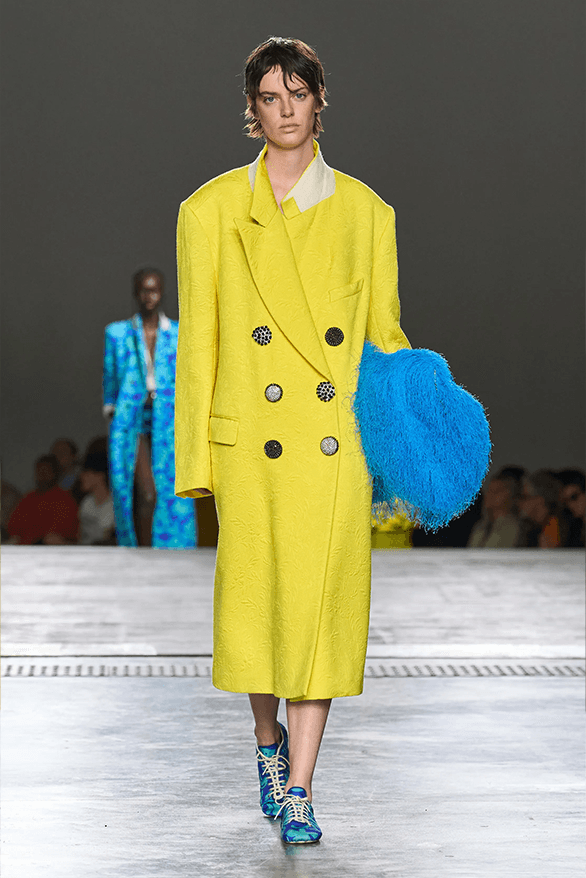
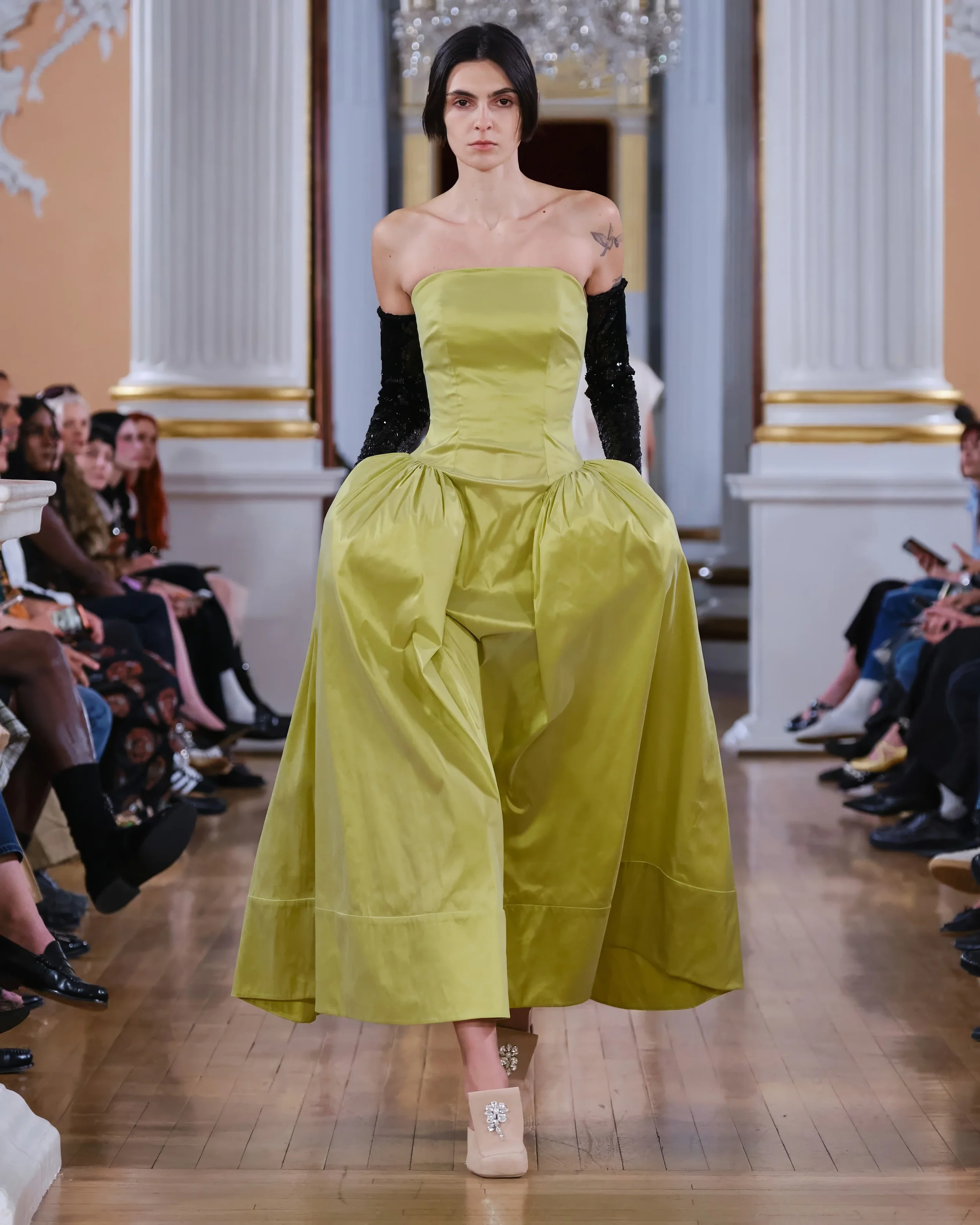
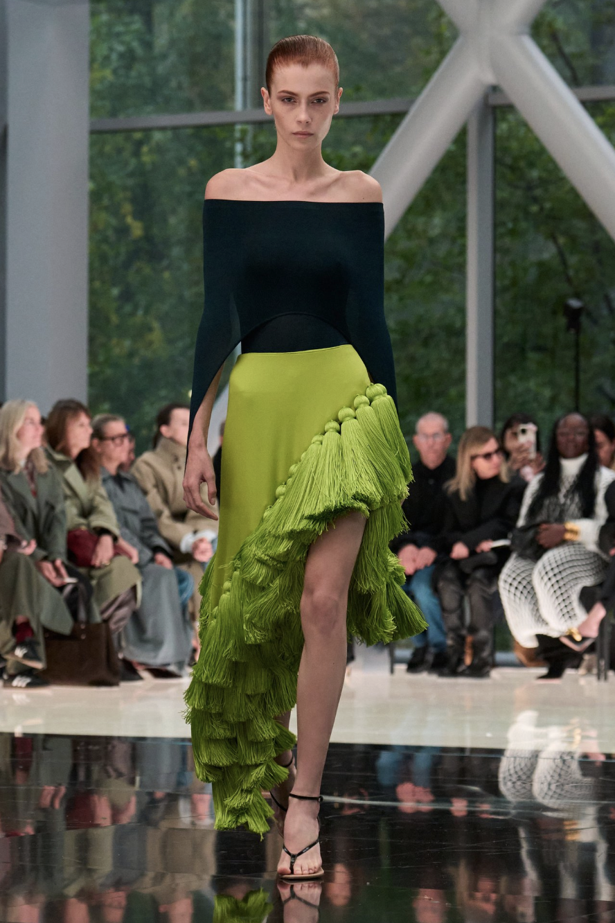
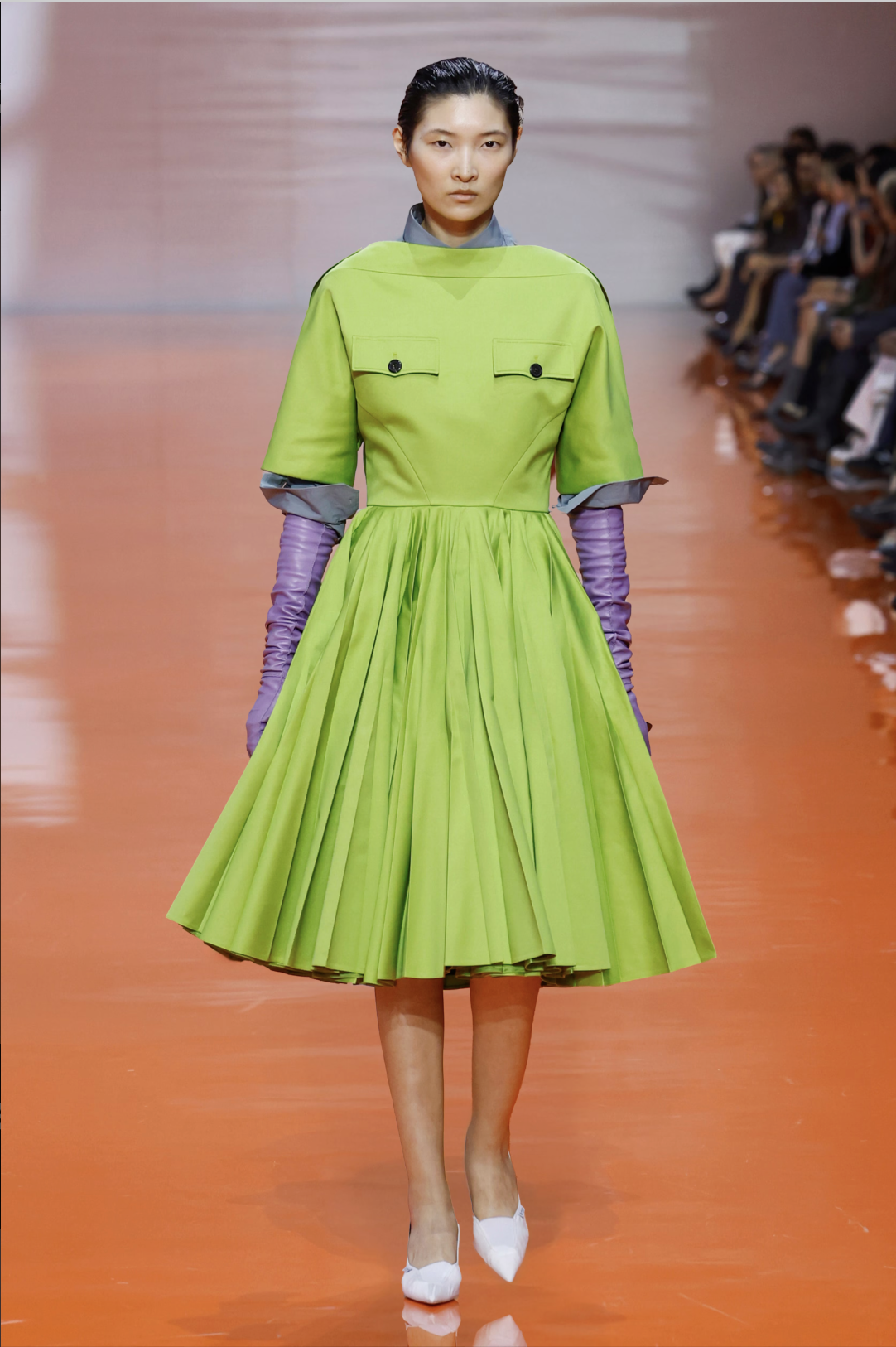
BRIGHT AND ZESTY
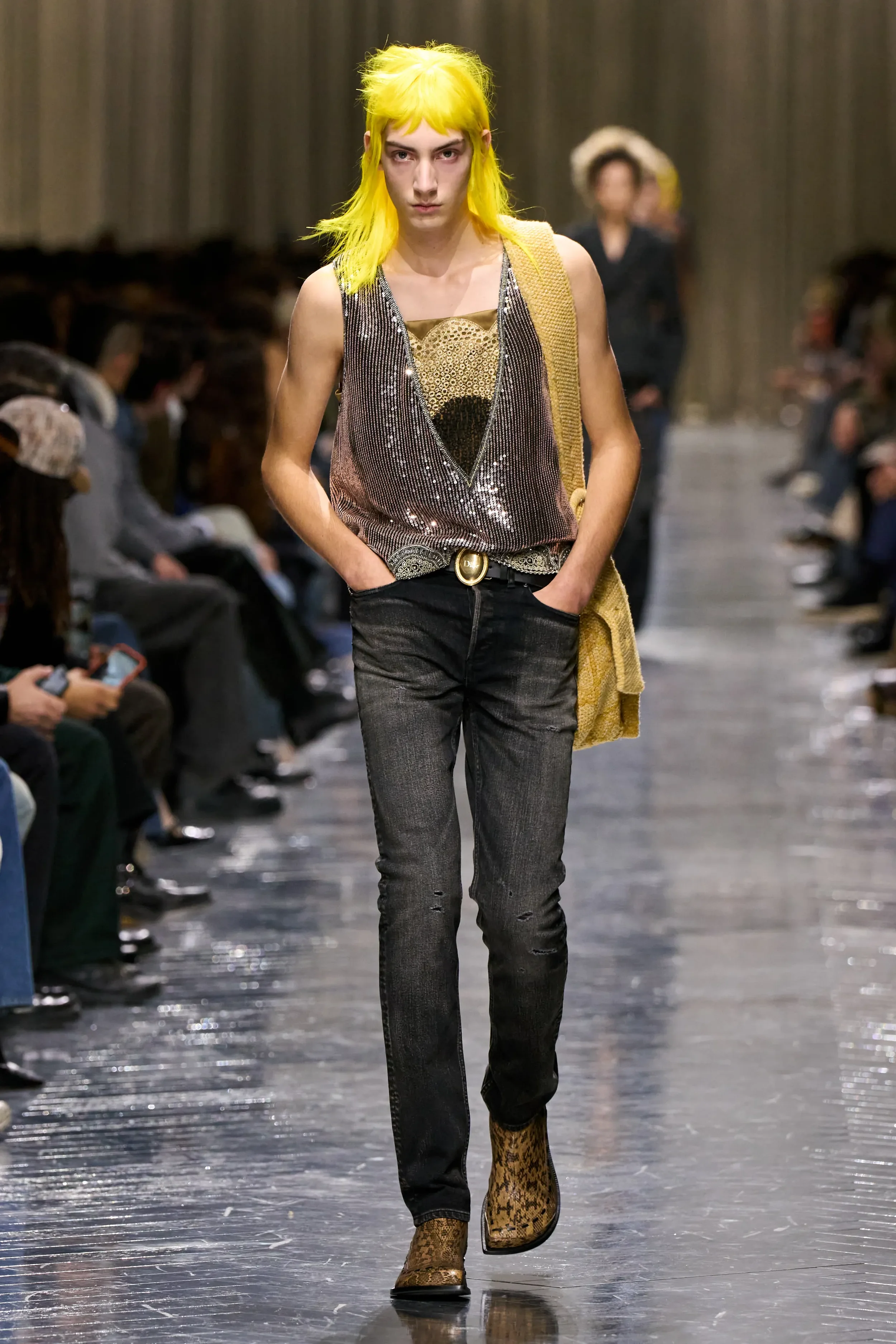
left to right: DIOR, DRIES VAN NOTEN, SIMONE ROCHA, MAISON ALAÏA, PRADA
Shifting to specific colours, citrusy greens and yellows are having their moment, regressing from the butter-yellow phenomenon, which had a chokehold last year in a chokehold. The shocking wig choices from Jonathan Anderson’s Dior menswear show make this apparent, parading neon hair pieces alongside sparkling purples and bright greens. The same canary yellow also made its appearance on the Dries van Noten runway, alongside an equally electrifying blue.
An appeal for chartreuse is also creeping into the fashion zeitgeist; a ceremonial passing of the torch from the brat-green epidemic of 2024 to its zestier, more sophisticated cousin. Prada, Alaïa, and Simone Rocha’s Summer collections all incorporate this punchy hue, cementing its status as a key color on 2026’s palette.
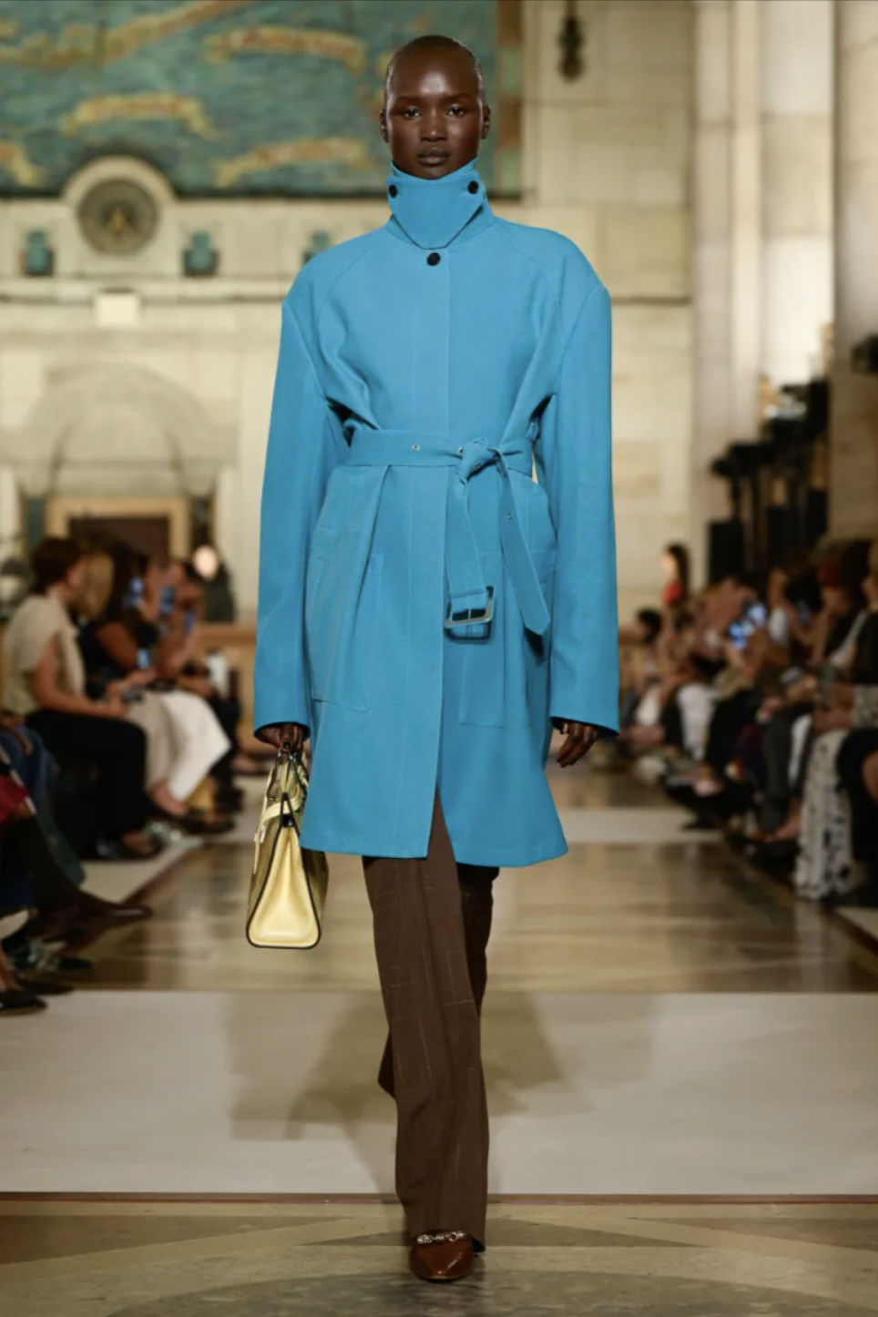
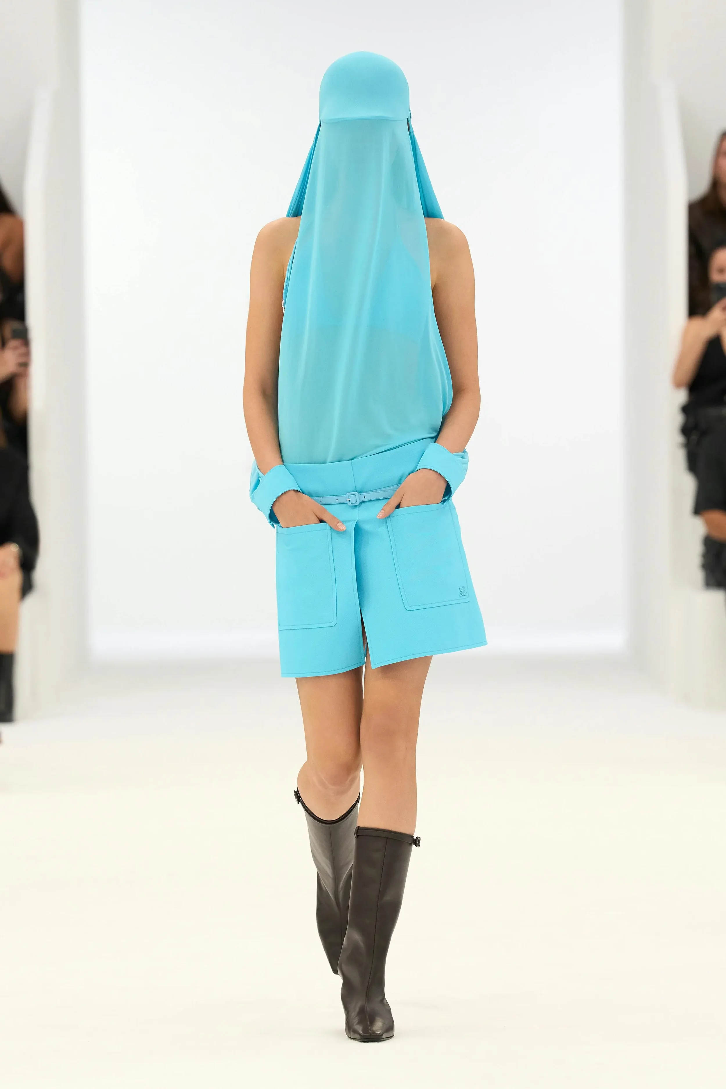
STRIKING CERULEAN
left to right: TORY BURCH, PRADA, ASHLYNN, COURRÈGES, FORZA COLLECTIVE
Cerulean blues are also definitely having their time in the spotlight, with features in many looks that sparked serious buzz in fashion discourse. After all, this shade of blue was chosen by Miranda Priestley herself. Though slightly off-putting and not easily wearable, this shade encapsulates the theme of this year’s color scheme. The trend of tonal palatability in favour of silhouette is phasing out, and experimentation is being placed back in colour’s court. Ashlyn’s SS26 collection made this clear, flaunting multiple pieces drenched in this daring hue, while Tory Burch’s trench paired with a deep espresso brown let the color explode in contrast. Forza Collective followed suit, with their FW26 collection, which consisted primarily of steely greys, and shocked guests with the final blue look that caught all of our attention.
The references are endless, with Courrèges and Prada also rocking boldly cerulean looks, insinuating that this won’t be a passing fad.
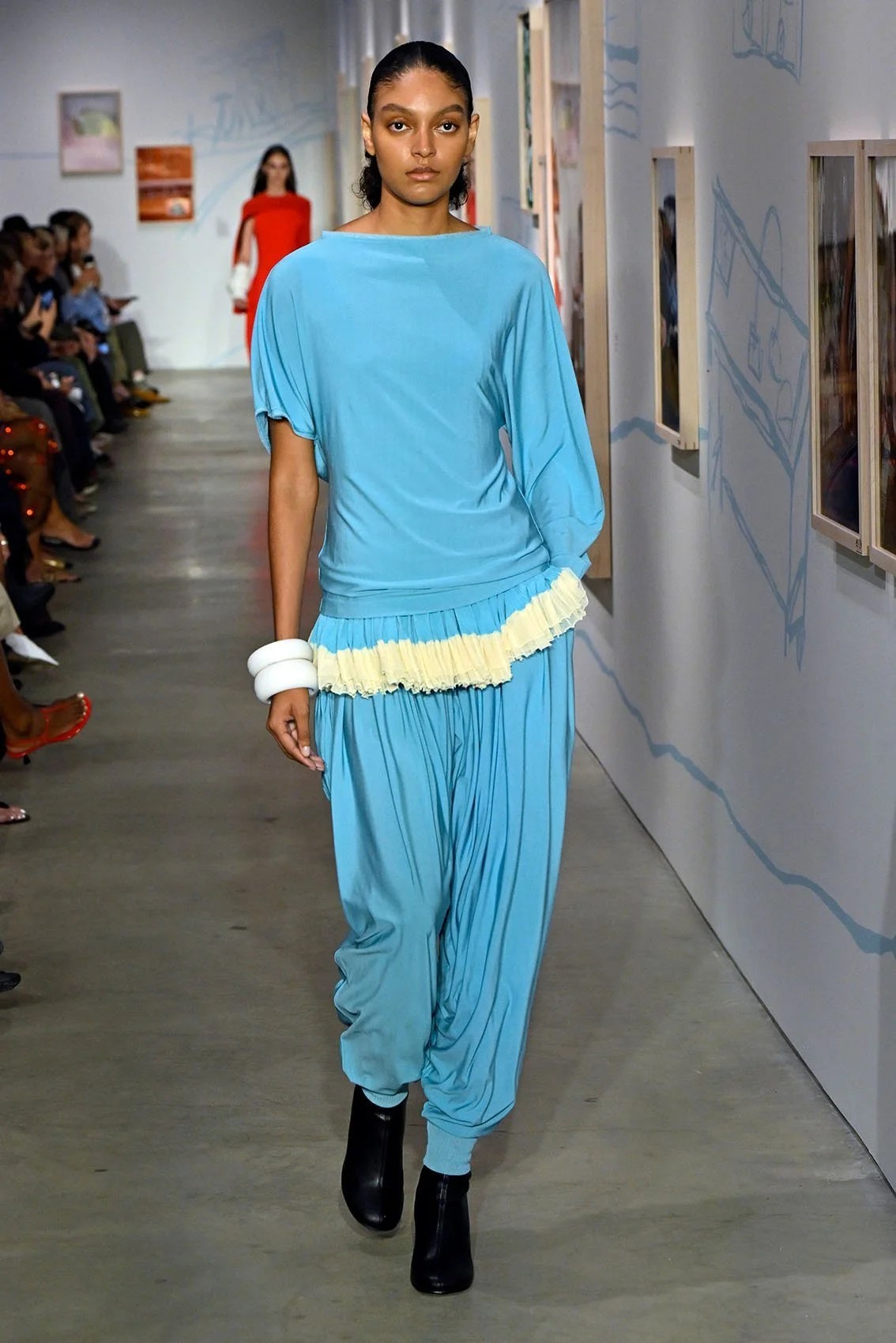
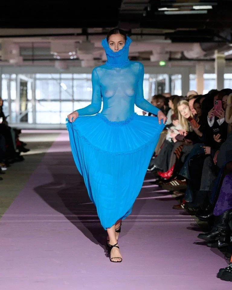
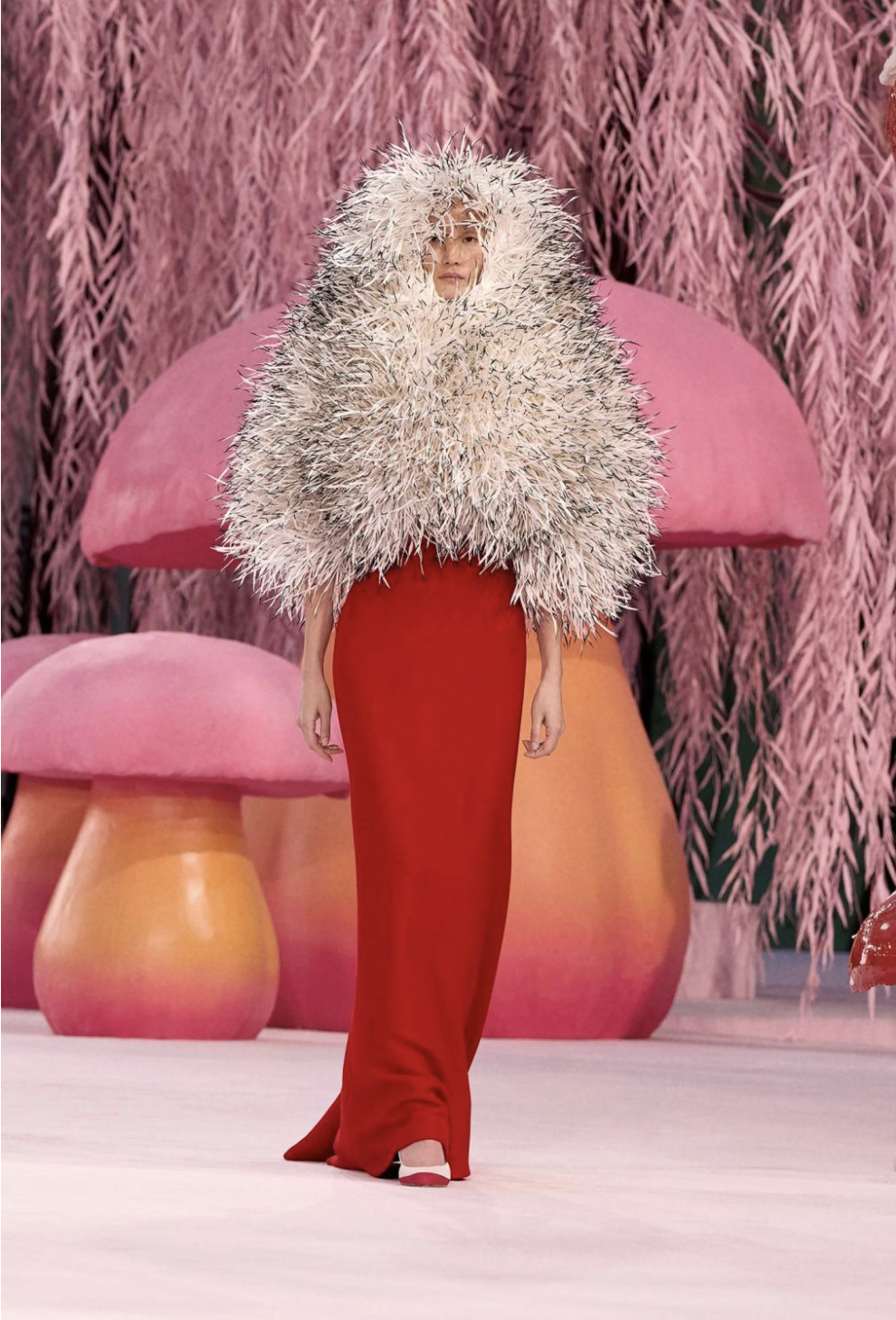
TEAL OBSSESION
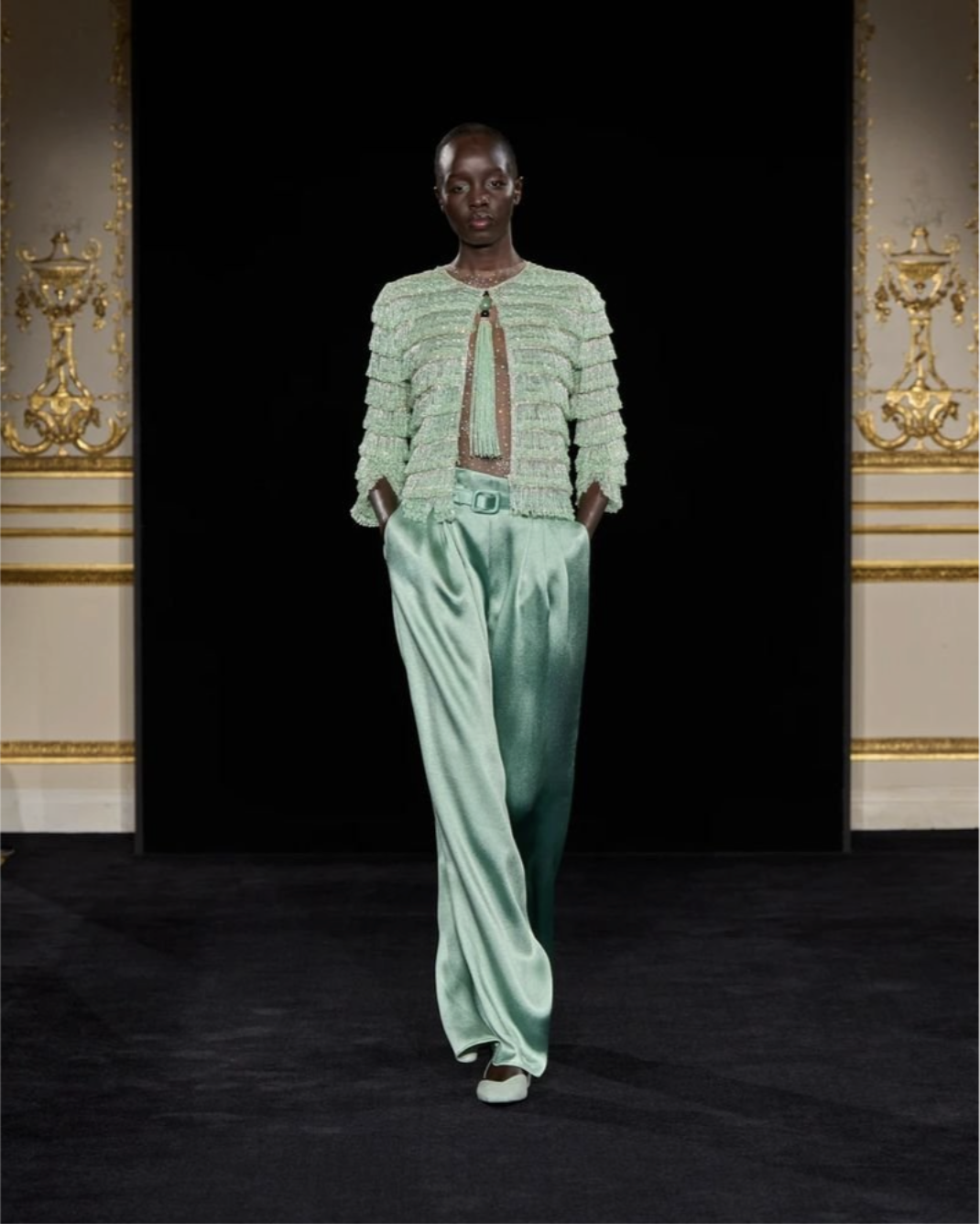
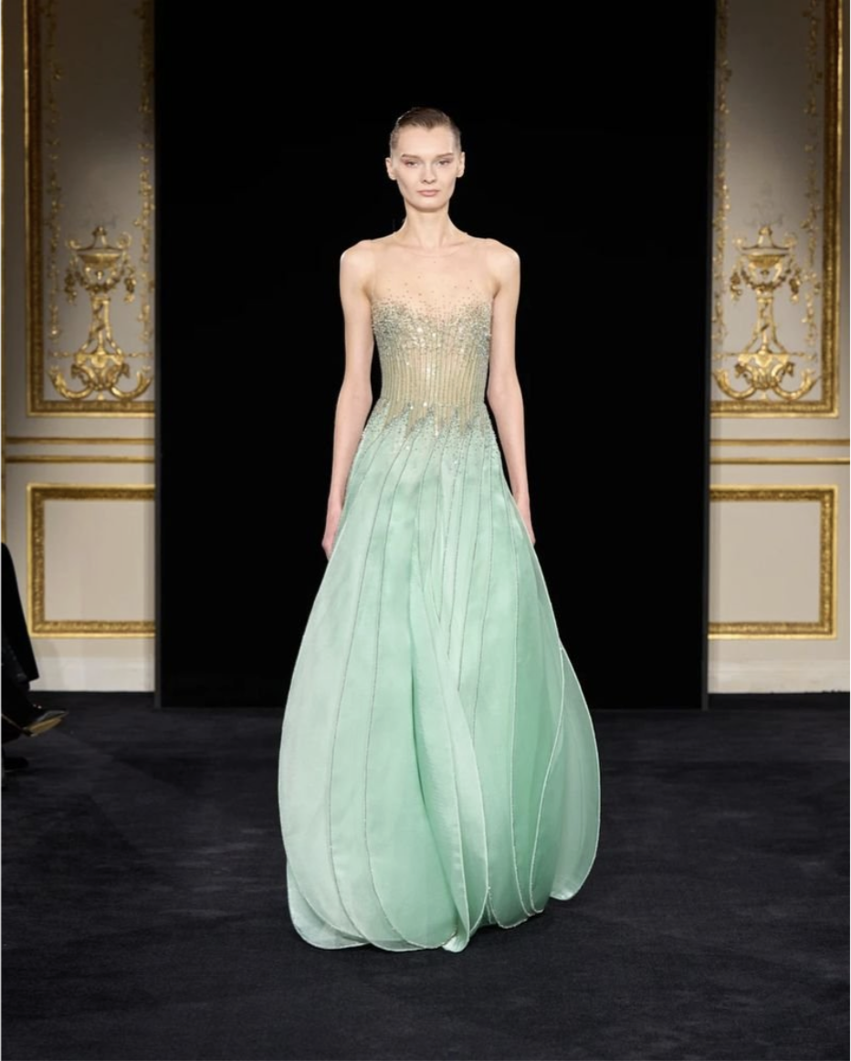
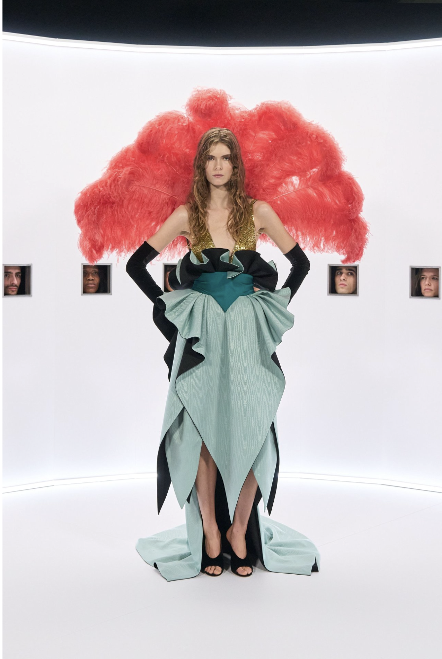
left to right: GIORGIO ARMANI PRIVÉ, VALENTINO
We can’t talk about colours without mentioning Armani Privé’s recent Haute Couture show. Typically flying under the radar, their almost entirely mint collection caught the attention of fashion-lovers worldwide, pushing the brand to the forefront of this minty revival. Though they leapt the deepest into the teal pool, many other fashion houses were seen sporting minty fresh outfits, signifying that this brightly subdued colour is here to stay. A full-circle moment back to 2014 Tumblr, when every girl dreamed of having every possession in some variation of mint. Looks from Valentino’s stunning Spring ‘26 Haute Couture collection also put Mint on a pedestal, contrasting, of course, with the boldest of reds, pulling juxtaposition again to the forefront of this season’s colour wheel.
As nostalgia settles in, this obsession is creeping its way back into pop culture, with its apparition not being limited to the runway, but also being seen making rounds on social media. From nails to hair accessories, mint is becoming a staple for the ‘pop of colour’ trend.
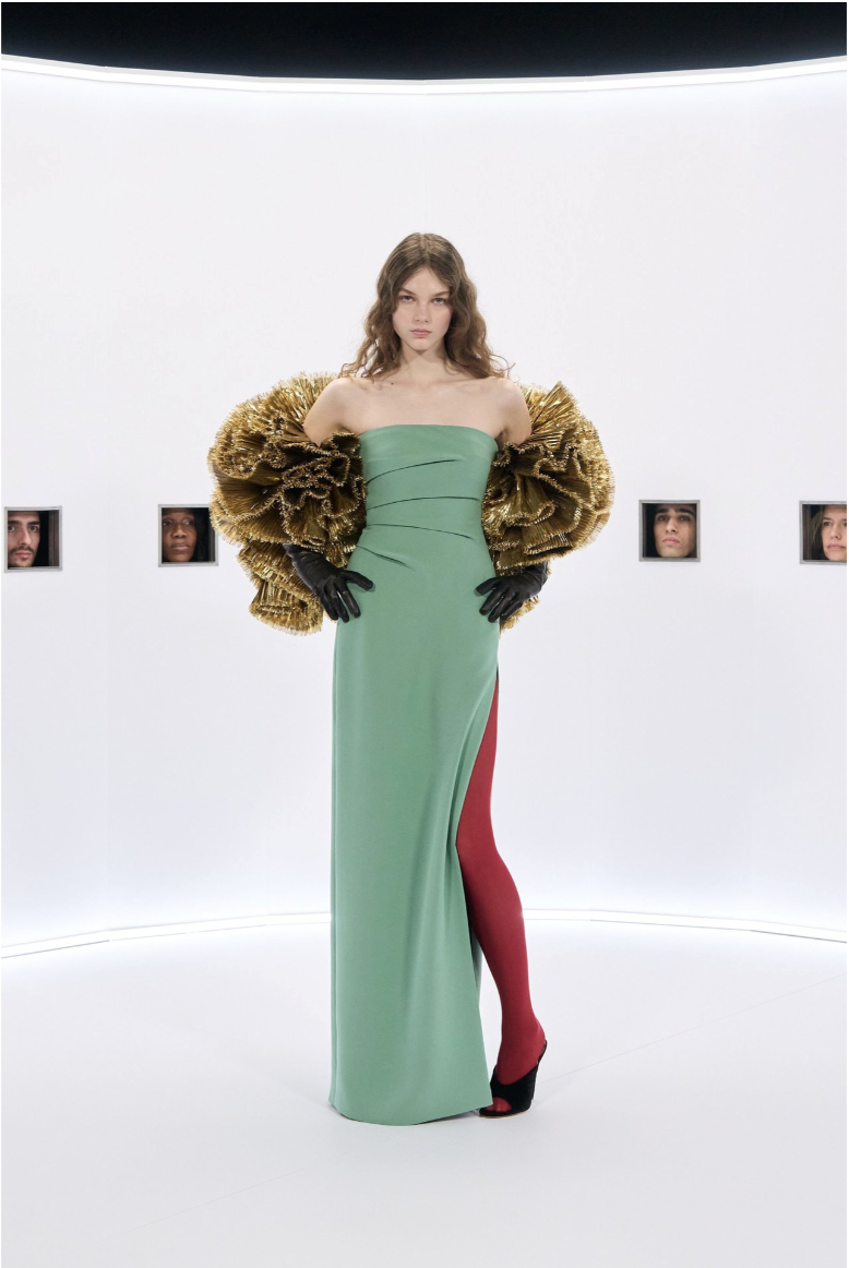
REDS AND PINKS
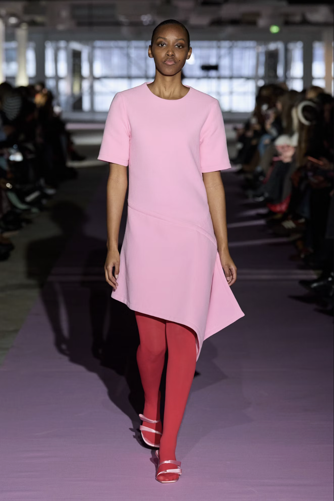
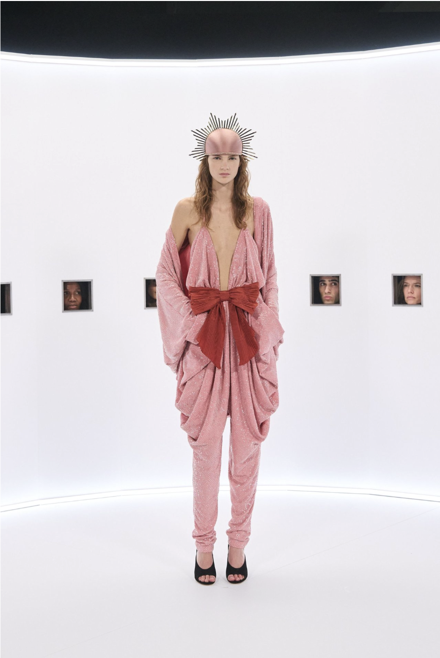
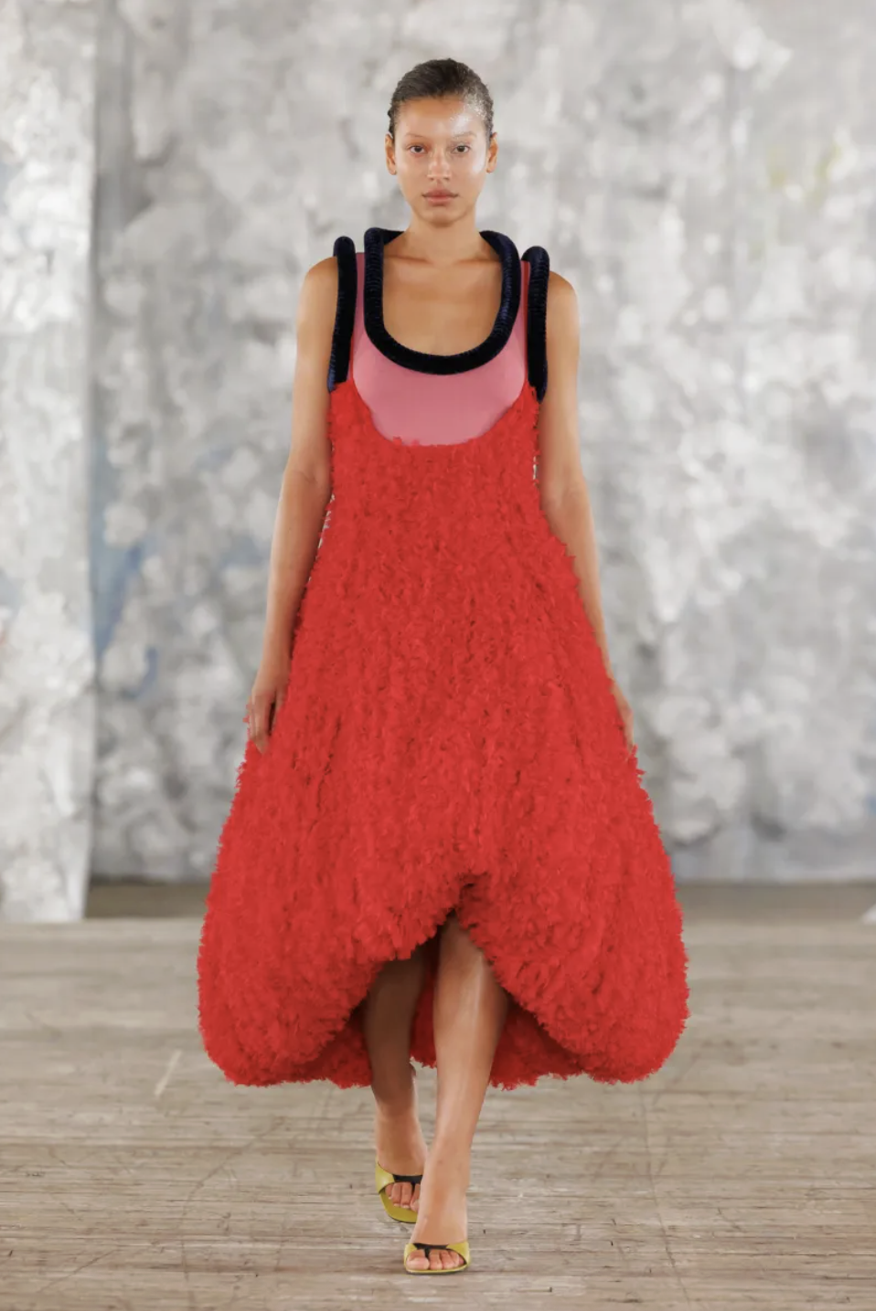
left to tight: FORZA COLLECTIVE, VALENTINO, DIOTOMA, CHANEL, SIMONE ROCHA
We have mentioned the unlikely color combinations, but now it’s time to acknowledge the most imposing of them all. Throughout all of the color surges of the past season, this duo remained strong, with a pairing of bubblegum pinks and a bold, bright red. It creates imagery that feels like it really shouldn’t work, yet somehow it does. Some stunning looks that used this pairing come from the prized jewel of last season, obviously Valentino’s Haute Couture, where this color combo, among other stunningly strange ones, grasped our attention. Other starring looks and honorable mentions include look 32 from Diotoma’s recent collection and Chanel’s Haute Couture Color palette, including the stunning fairytale landscape that we saw transform into a runway.
ARE THE ‘80s COMING BACK?
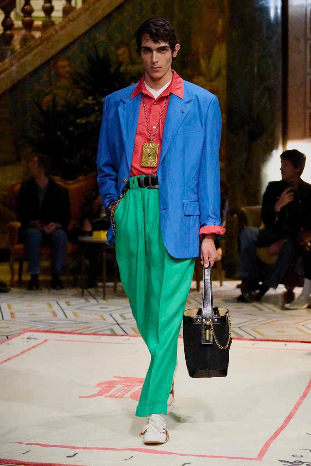
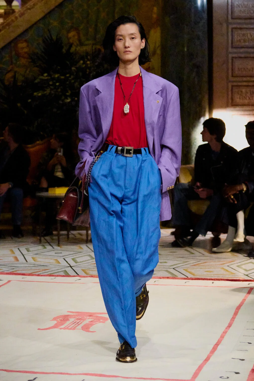
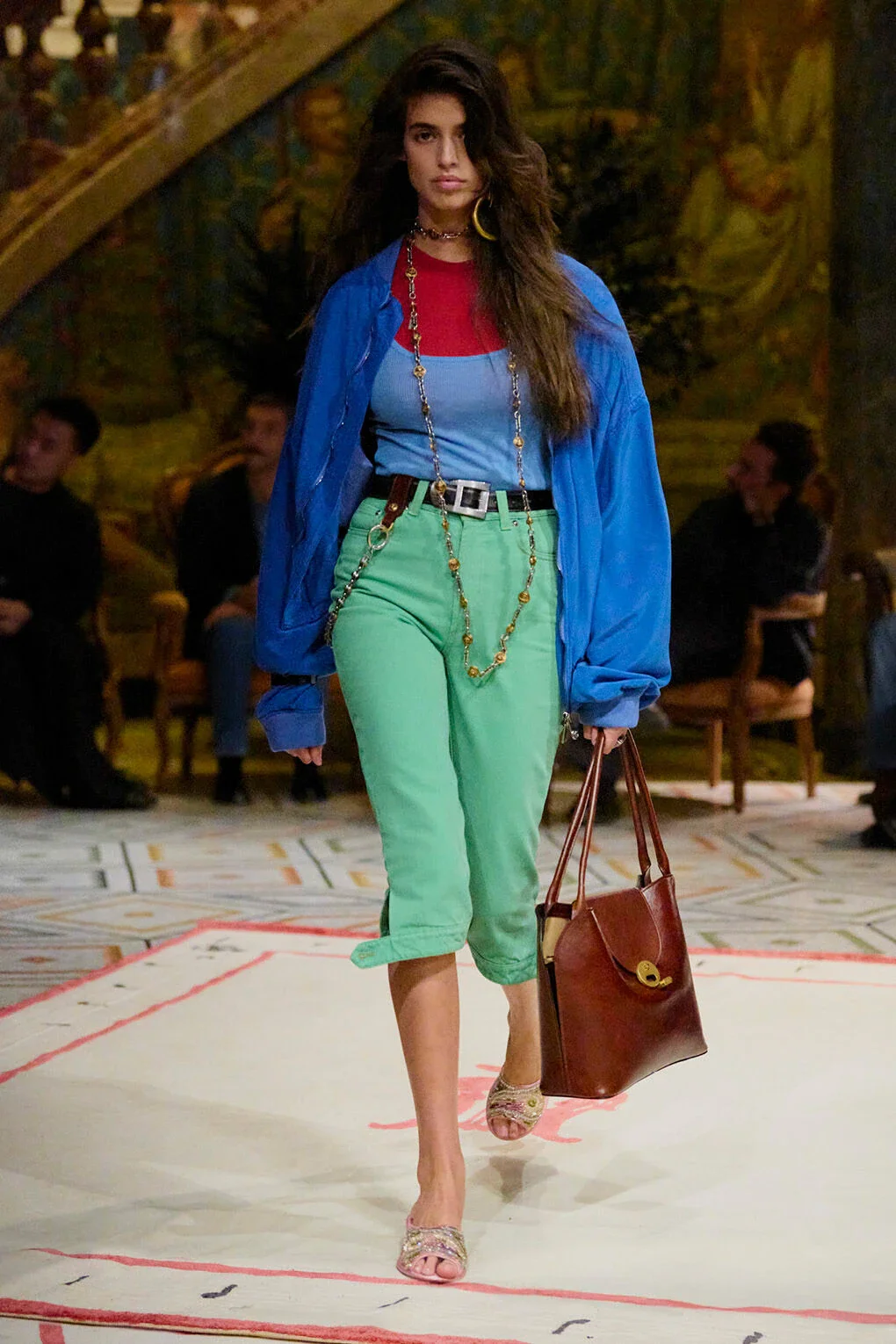
all VERSACE
Continuing on to the conversation around colour-blocking, we seem to be slowly inching into yet another shift in the fashion cycle. Over the past few years, ‘90s minimalism has dominated the trend landscape, with everyone desperately seeking the perfect elevated base to embody that effortless chicness. However, slowly, the monotone spell is wearing off. A push for vibrancy has become apparent with the infamous ‘pop of colour', a phrase uttered by nearly every it-girl. breaking grey monotony with jolts of neon. As expected with this insanely fast trend cycle, the next phase is zooming closer: ‘80s maximalism, promising loud, funky colours that aim to overstimulate.
Versace’s SS26 show makes these influences impossible to ignore, fully embracing the ‘80s aesthetic. From the obnoxious colours to the classic mom jeans silhouette, it’s a reminder of an era that we haven’t seen since 2018. Though hopefully, we do it better this time.