
MILAN FASHION WEEK MENSWEAR FALL/WINTER 2026: DAY 3
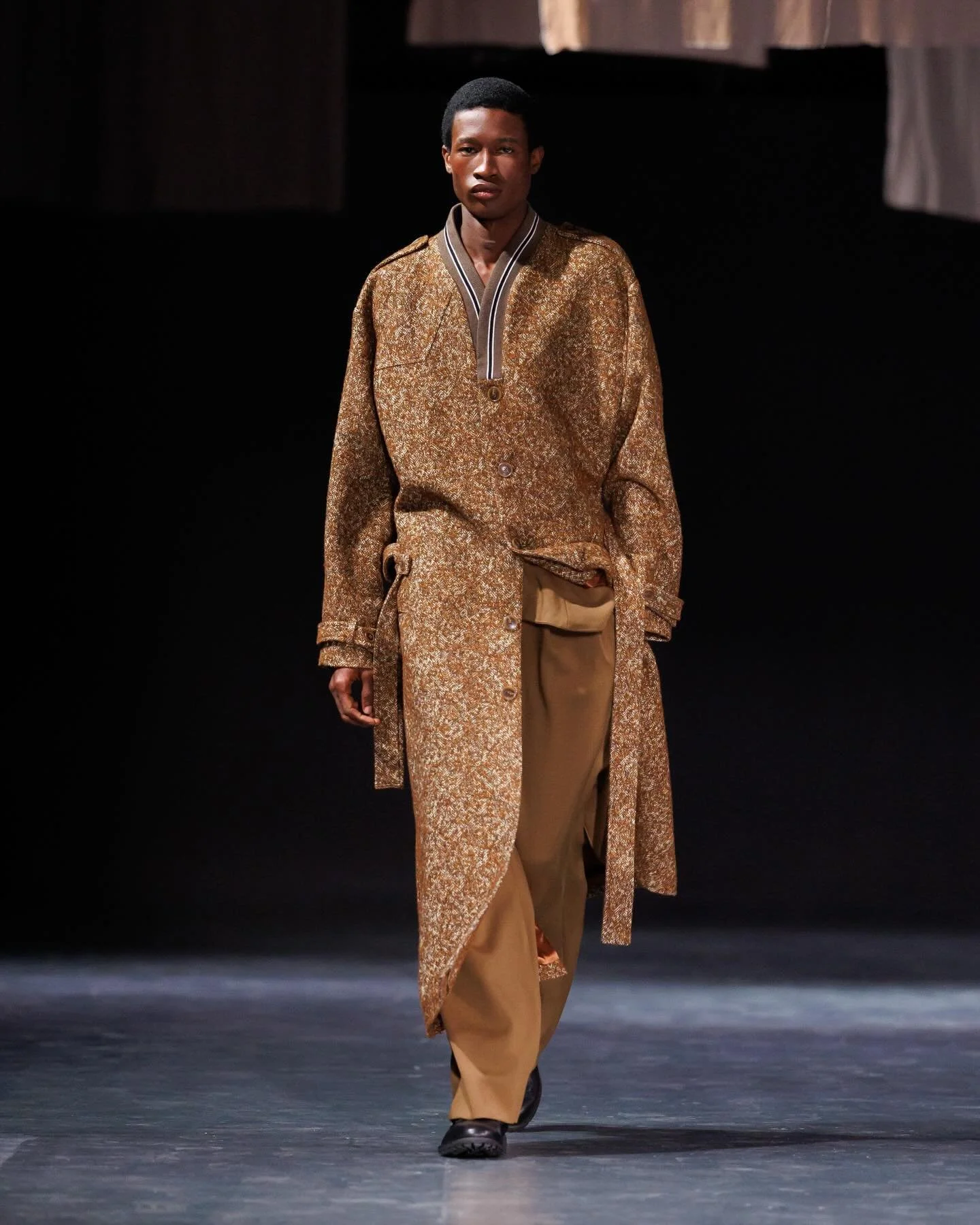
QASIMI
review by MAREK BARTEK

images courtesy of QASIMI
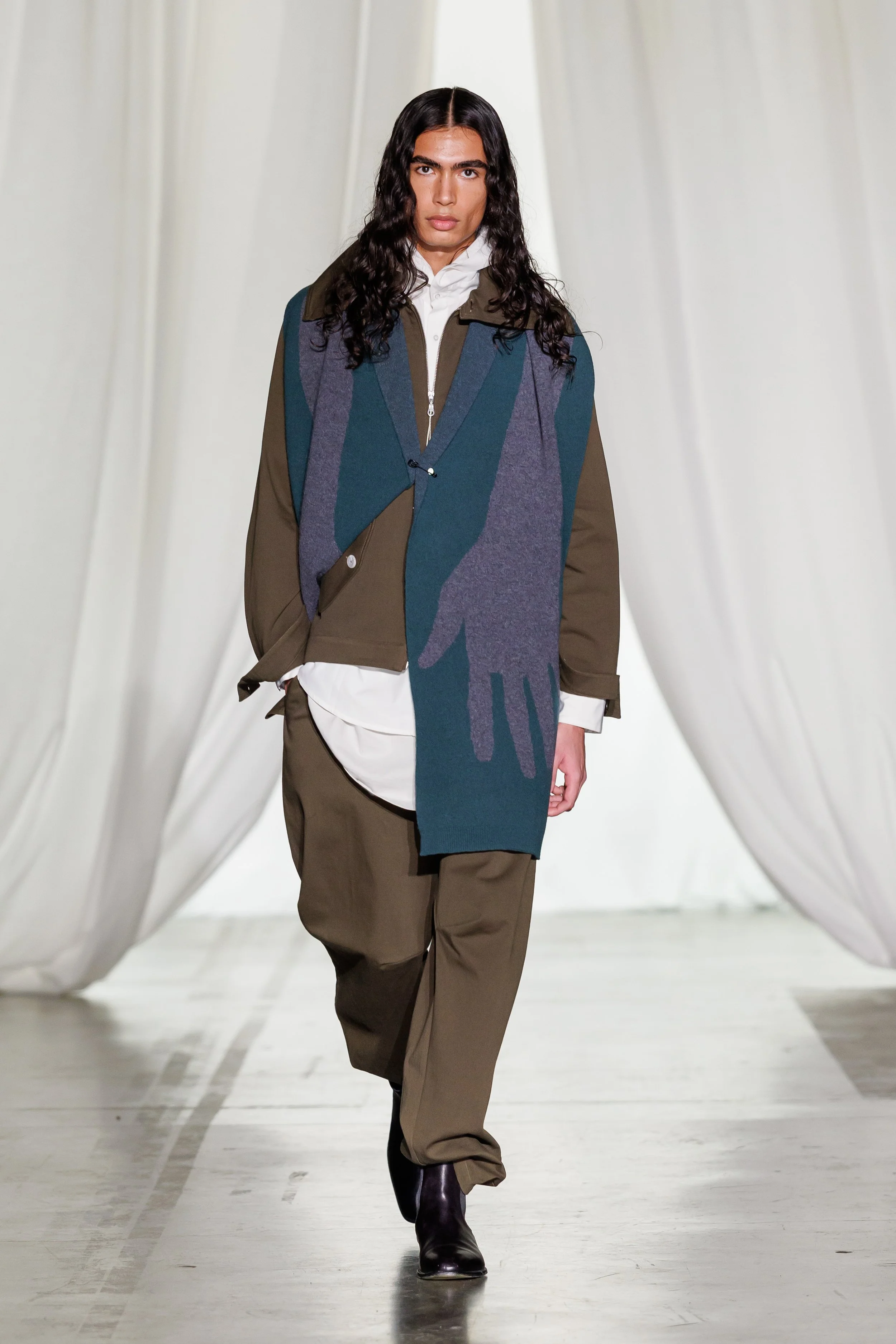
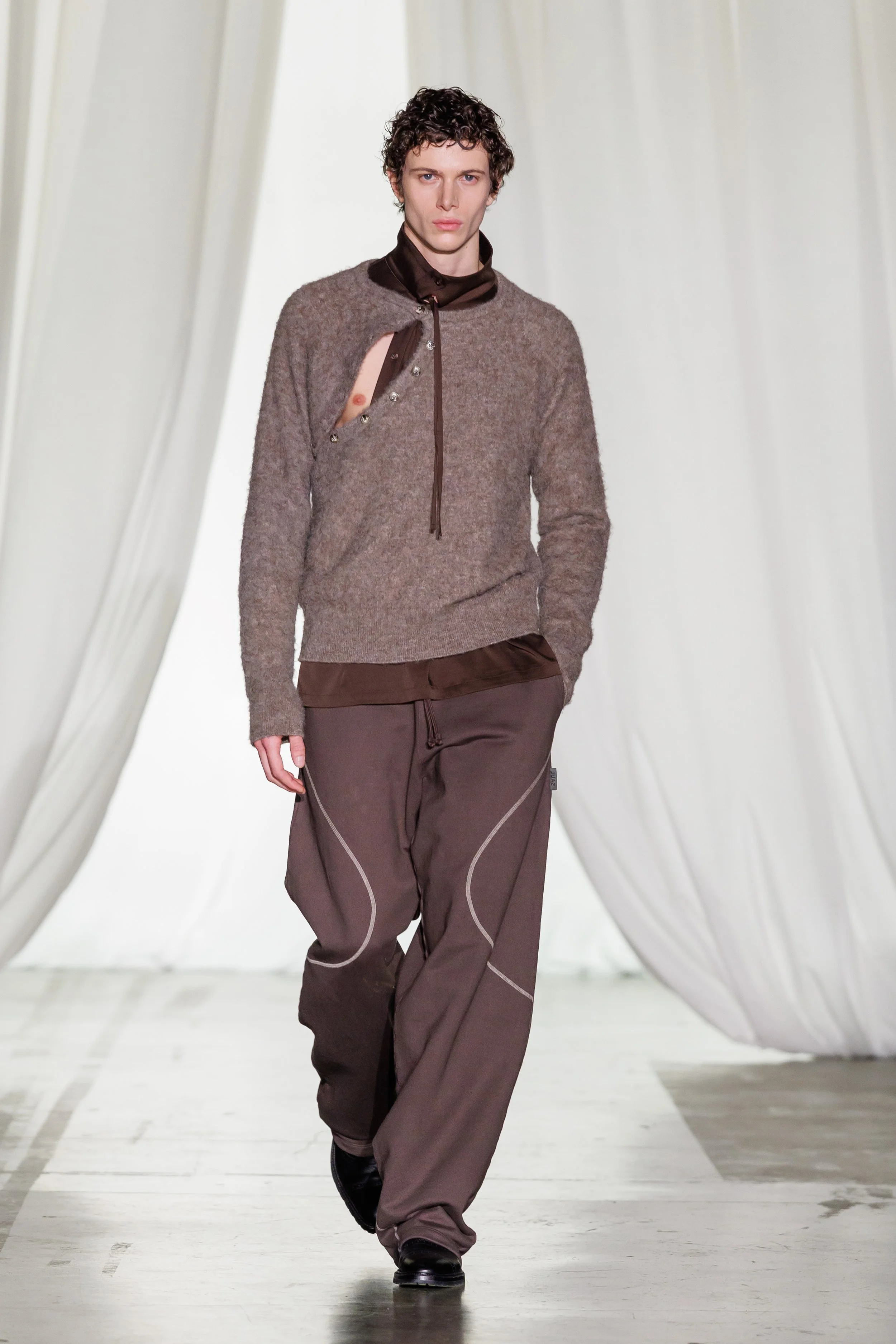
Qasimi’s Autumn/Winter 2026 approached clothing as a carrier of memory — not as metaphor, but as construction. Under the title Memory and the House of Remembrance, the collection focused on how garments hold, protect, and repair fragments of the past.
Layering and deconstruction defined much of the design language. Pleated shirts sat alongside billowing trousers, denim zip-up jackets, and pocket-heavy outerwear, reinforcing the brand’s ongoing balance between tailoring and casualwear. Mending techniques were explored across knitwear, not as decoration, but as visible acts of repair, focusing on longevity and continuity rather than perfection. One black-and-white knit, reminiscent of a keffiyeh pattern, quietly introduced a political undertone, without shifting the collection into overt statement-making.
Modular jackets, slit dresses, and fluid knits introduced contrast in form, while silhouettes played with cinched waists against wide hems, creating a sense of both shelter and movement. The palette remained grounded in earthy browns, greens, clay and slate grey, punctuated by burgundy and sharp white. Overall, it was a collection rooted in both construction, and the emotional weight clothing can carry.
PRADA
review by MAREK BARTEK
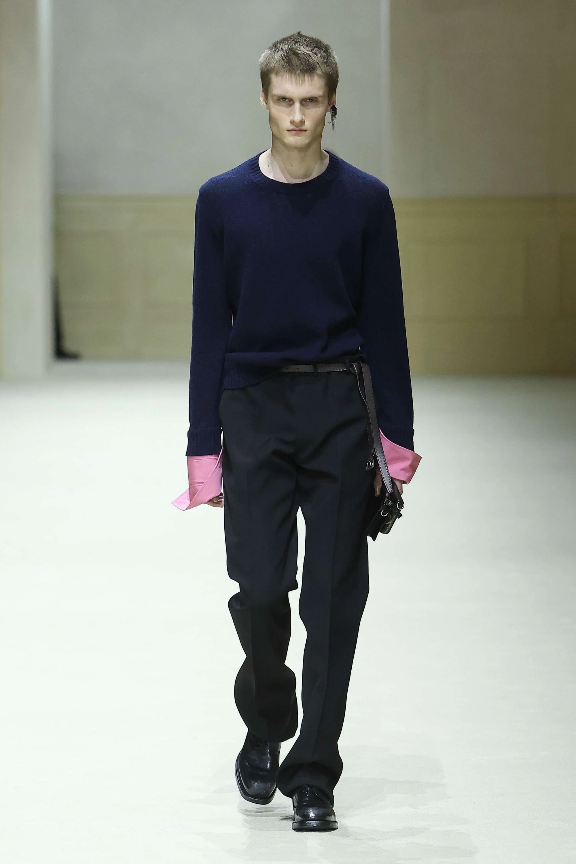
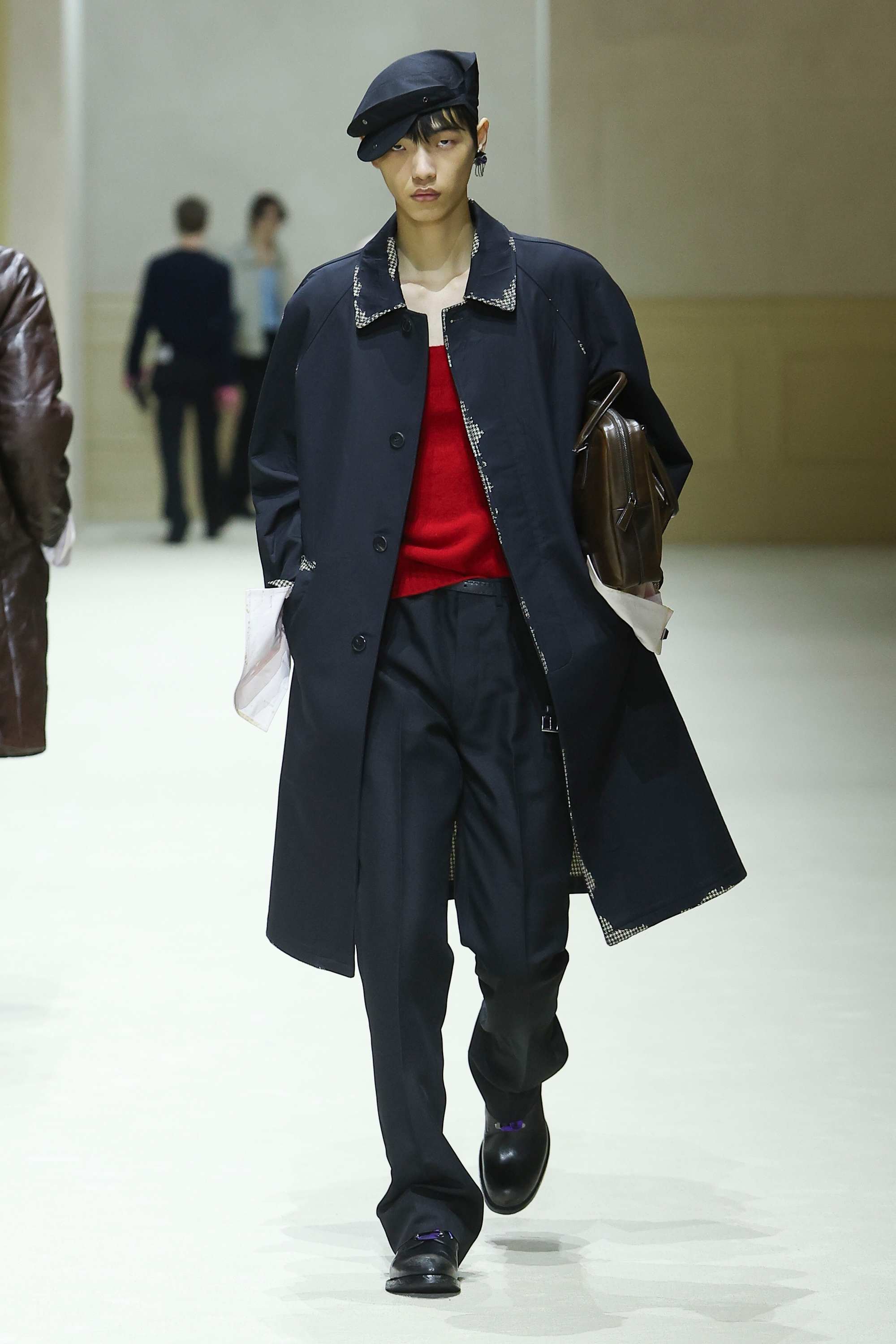
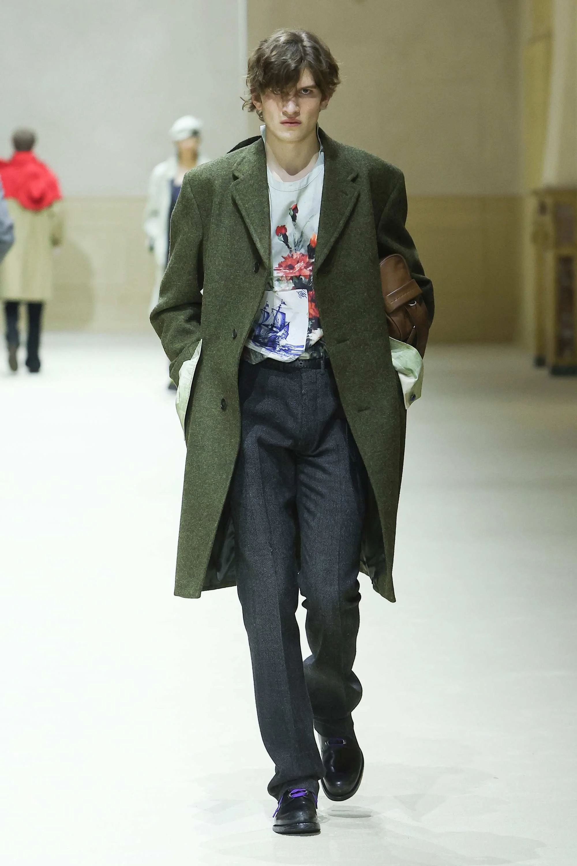
images courtesy of PRADA
Babe wake up, the Prada Day is here!
In these days of uncertainty, the only thing certain is that Prada will be showing its latest collection, and it will be something to talk about. Once again, we returned to the iconic Deposito at Fondazione Prada to witness what’s been keeping Ms Prada and Mr Simons busy.
This season, the intellectual power duo looks inwards, posing the question: “What can we build, from what we have learned?” The show revolved around evolution without erasing the past, and new ideas that are built on the knowledge we had accumulated. “There was an aspect of archeology in our minds,” Simons shared right after the show.
The space was kept open, with seats creating aisles, and the walls decorated with patches of interior elements. Double doors, fireplaces and various approaches to wall design across multiple floors; we could see the cut through of a building, as if we demolished it from the inside, and now just stood in its entrails looking at the outer walls.
In the design language, this meant looking back at the years Prada and Simons have collaborated together and to see which ideas should be revisited and further developed. Although I’m sure they’ve dug through the archives of many collections, it is interesting — and almost funny — to see that the world’s current 2016 obsession has also reached the walls of Prada. Be that the revisiting of the hats, cuffs sticking out, or the floral prints layered with other prints — this time with Delft blue paintings; the connections to its Fall 2016 show were undeniable. Prada might be a trend-setter but it’s apparent it isn’t completely shielded from trend following either. From more recent history, the we saw the same pops of colour — especially pink — as during Fall 2023 collection. While back then the colours were applied mostly on collars, they now found their way back into the Pradaverse, reimagined as shirt cuffs, short trench mini-capes or knits.
The silhouettes, though never really slouchy, felt especially elongated playing on the attitude of standing tall, with clearly intentional layering. Knee-length single- or double-breasted coats created slender appeal, accompanied by meticulously tailored trousers — none of being ankle-length (something we have seen regularly over the past seasons at Prada). The themes of uncovering were translated also in a more literal sense, with some coats appearing to have been painted beige and navy blue over a checked print with the colour falling off. Knits in yellow, red, green and purple created the feeling of coziness and played off contrasting cuffs, delivering some very eye-pleasing colour combinations. Among the standout accessories were definitely short mini-capes layered on top of the coats, and the already mentioned hats — slouchy, marine-like or flattened and attached to the back of the coats.
Everything seemed just off enough to create beauty — something Prada has been doing since the beginning of its ready-to-wear. Prada man, after all, isn’t macho. He’s intellectual and well-put together, and there is something inevitably sexy about it…
We do live in uncomfortable, unprecedented times, but these experiences aren’t unique to the humanity — we have been through this already. And though design is a chosen language for Ms Prada and Mr Simons, their message is clear: it is time we look at the past and how we tackled the situations we’re dealing with nowadays, learn from our mistakes and make better choices in hopes that everything will eventually be okay.
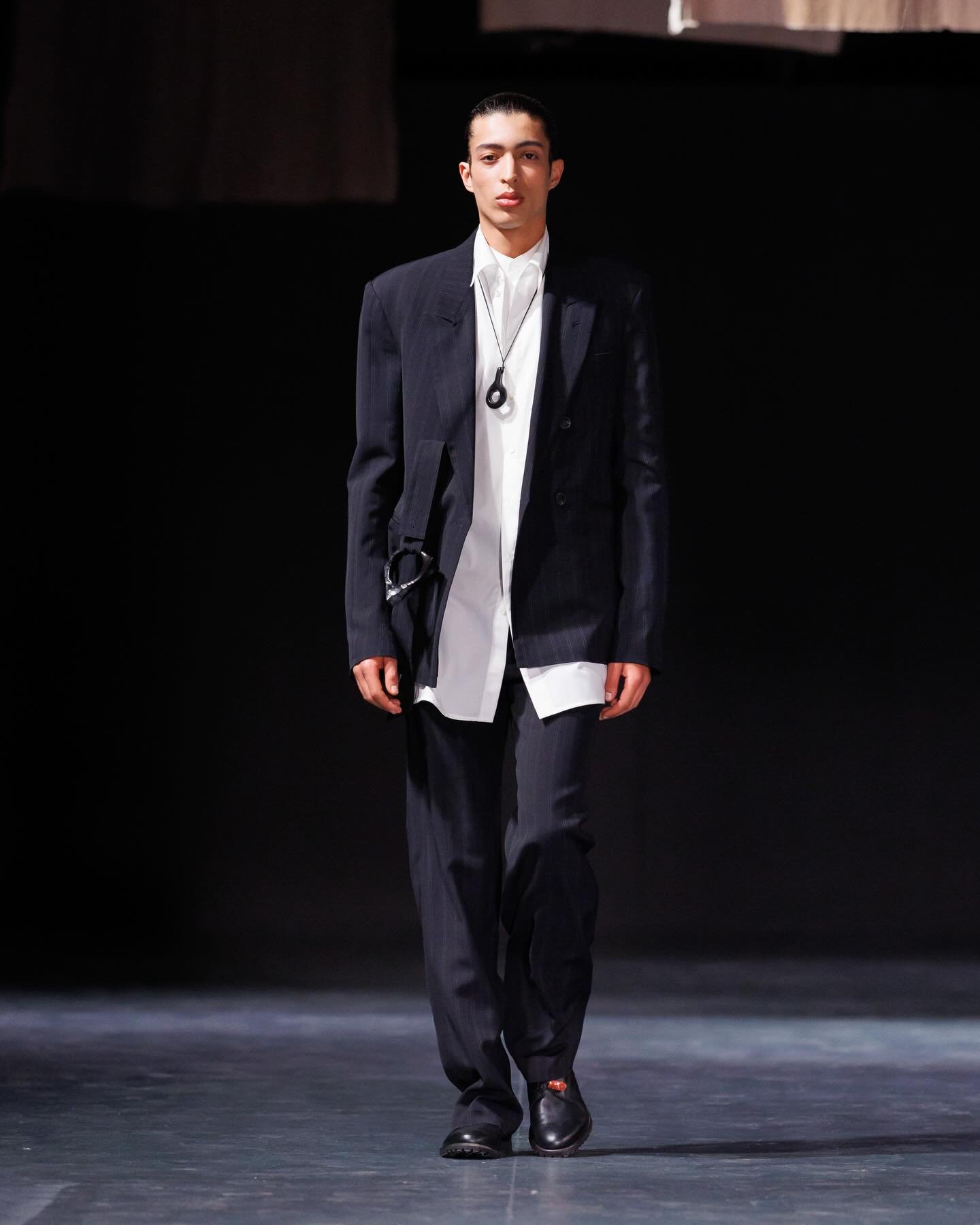
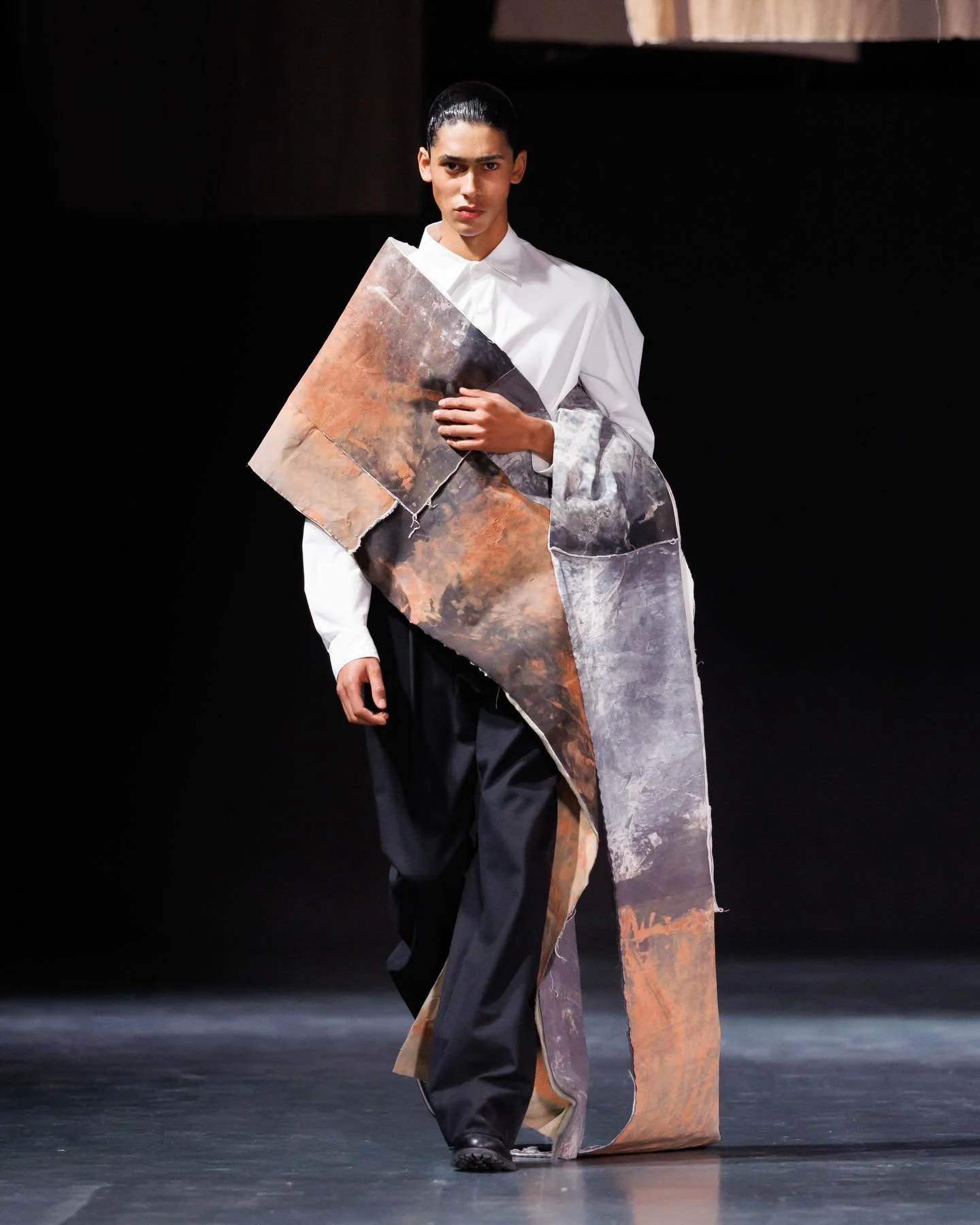
SAUL NASH
review by NIA TOPALOVA
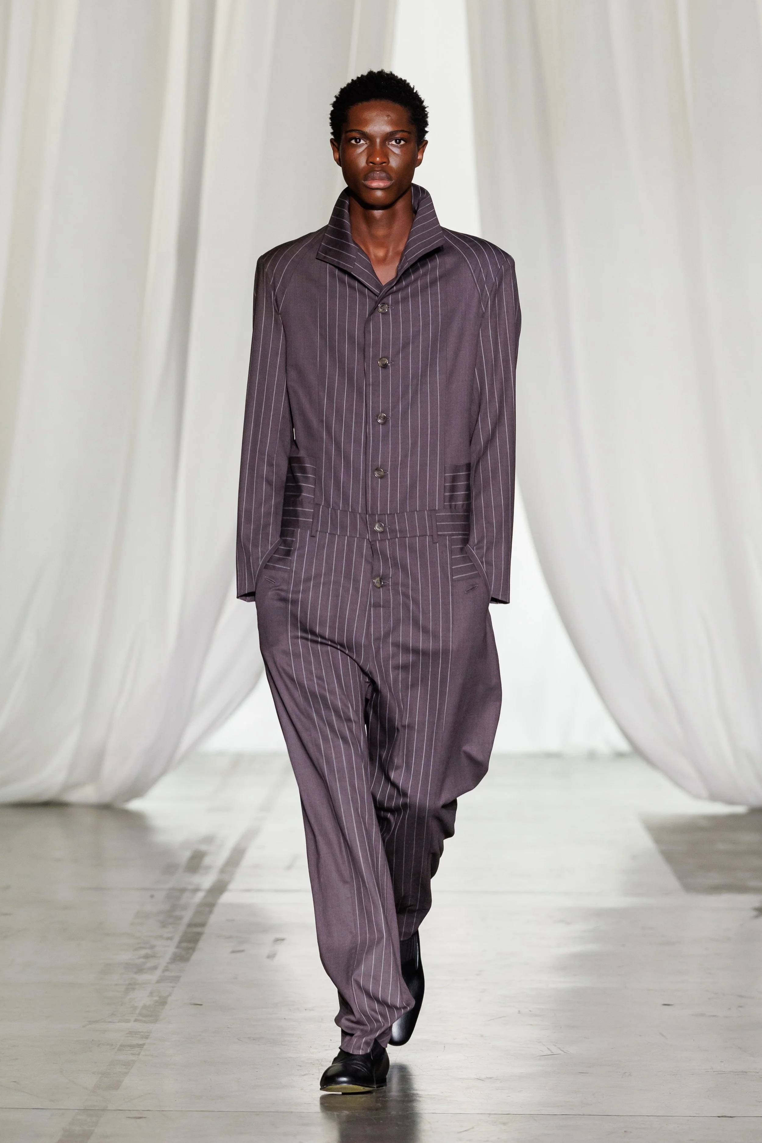
images courtesy of SAUL NASH
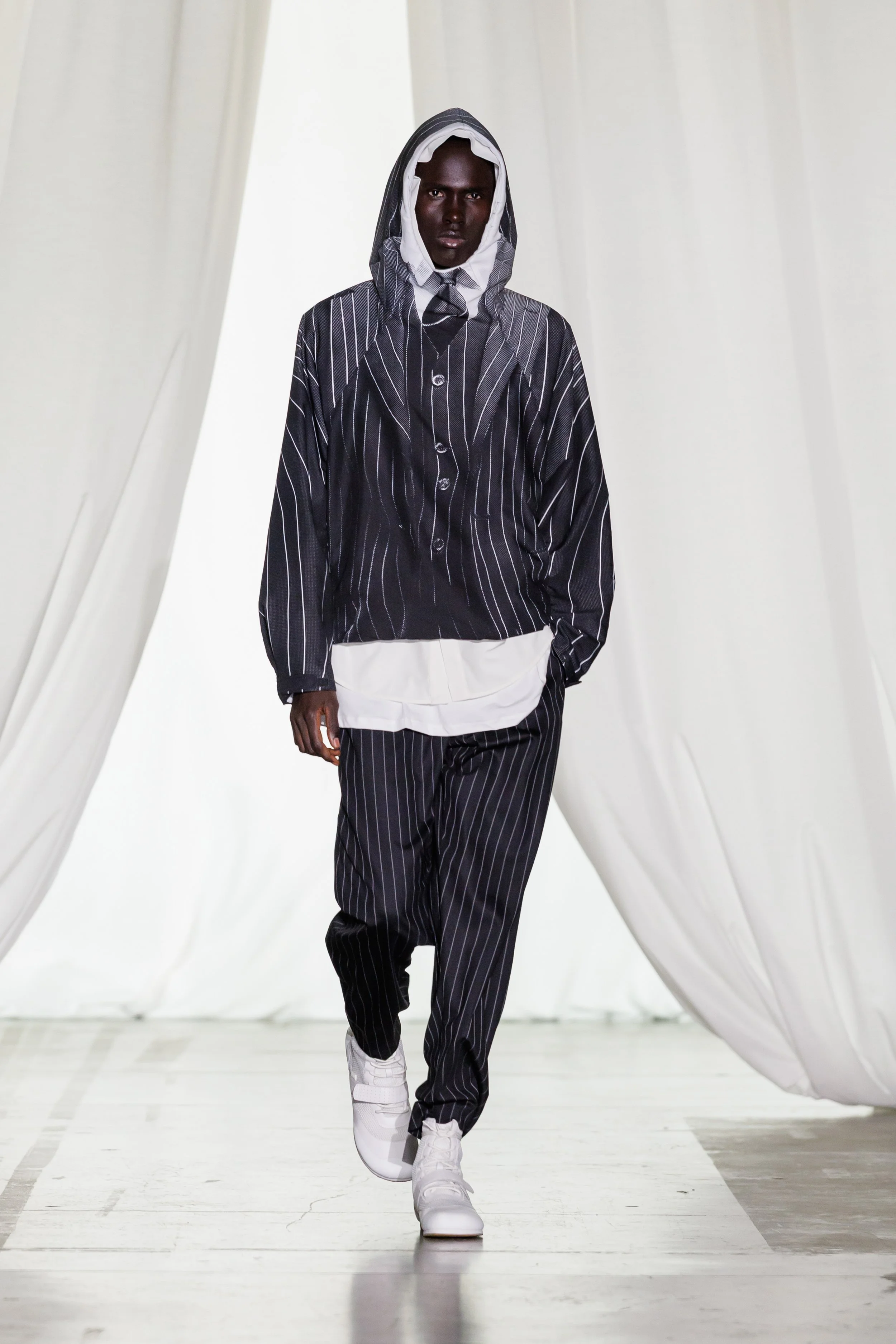
Saul Nash seems to understand something inevitable about the self we present and the self we long to conceal. Masquerade served both as armour, and as a way to transform one’s very essence and become something entirely different. Carnival costumes at the Notting Hill street party sparked this train of thought, and continued in Venice, where masks are tools for transformation, for becoming someone, perhaps freer, even if just for a night.
Returning to Milan for the third season, Nash delved into themes of disguise, identity, and power dressing. Masquerade offered a clear dissonance between form and fluidity - a silhouette of a suit printed on a tracksuit: a tracksuit as masquerade, or a suit without a suit. Nash seemed to have found a formal way to move through the world, while still retaining the freedom to breathe. “This is a way to fit in, but at the same time, staying true to who you are”.
Codes of 1980s British and Italian power dressing were reinterpreted: a wide, pinstriped merino wool jumpsuit mimicked the movement of masquerade costumes when in motion, while horizontal and vertical lines on shirts took inspiration from the costume that appears in Ben Magid Rabinovitch’s photograph Tamaris in "Dirge" (1931). Jackets with transformable collars and ultra-lightweight padded coats offered functionality, and silky utility trousers were paired with recycled nylon zip-ups. The Julien Boot was introduced: a hybrid of sportswear featuring mesh, leather, and velcro fastening - created to move.
In addition to the theme of masking, Nash’s collection played with body consciousness. Compression tops printed with faint body motifs held bodies, and mohair cardigans flashed nipples in a certainly more sensual, rather than sexual manner. Masquerade was an exploration of self, of how we are both the players and the masks we wear, further affirming that identity indeed is a shifting thing, and the mask we wear to meet the world is not always made of marble, but sometimes of fabric and movement.
TOD'S
review by DOMINIKA GŁOWACZ
images courtesy of TOD’S
TOD’S presentation Fall-Winter 2026/27 is all about symbolizing craftsmanship, unique materials that will last for timeless occasions.
At the center of the collection is the Winter Gommino, a refreshed take on the iconic shoe that stays true to its roots while feeling modern and easy to wear. Whether in suede lined with cashmere or shearling for winter adventures, or in beautifully aged leather for urban style. Portraying how TOD’S understands luxury and versatility. Leather is the center of the whole collection shown in the Pashmy project. Soft and lightweight in the statement pieces such as Coach Jacket and Castello Jacket, each signed by the artisan who made it.
Completes the collection in fresh and urban style made from premium materials Red Dot sneaker. Exhibited at Villa Necchi Campiglio marking that the brand is about quality, culture, and real connections.
ETRO
review by MAREK BARTEK
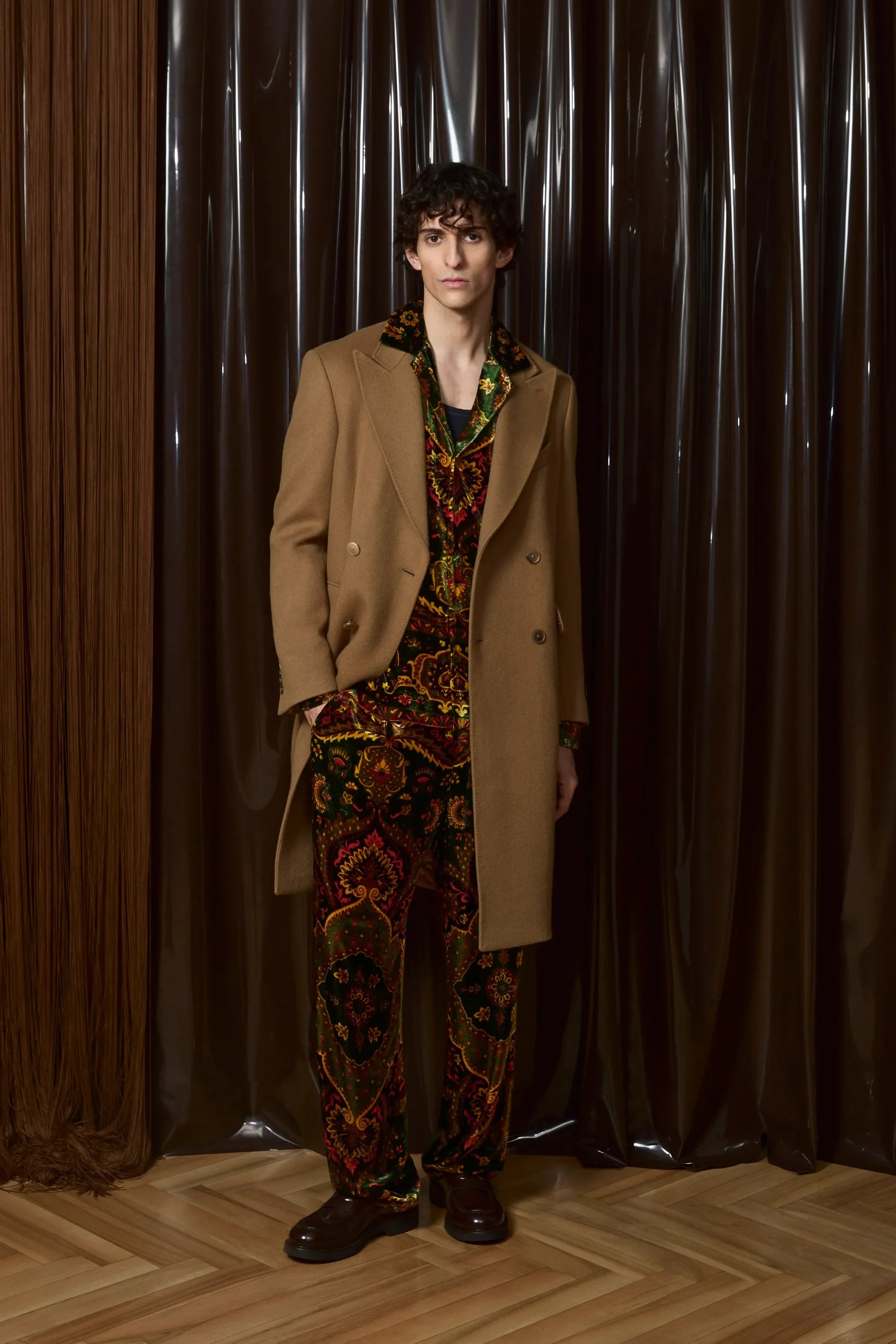
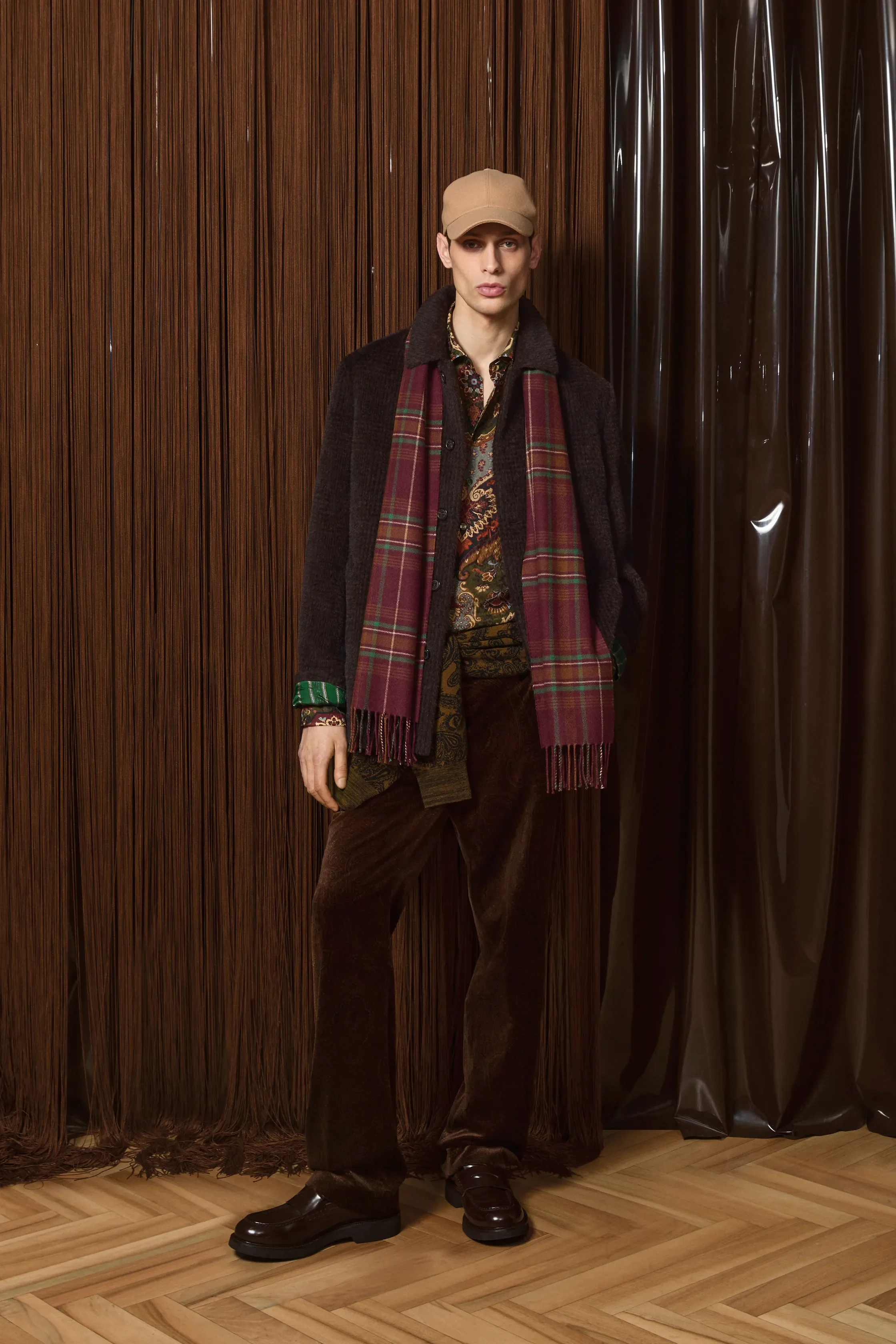
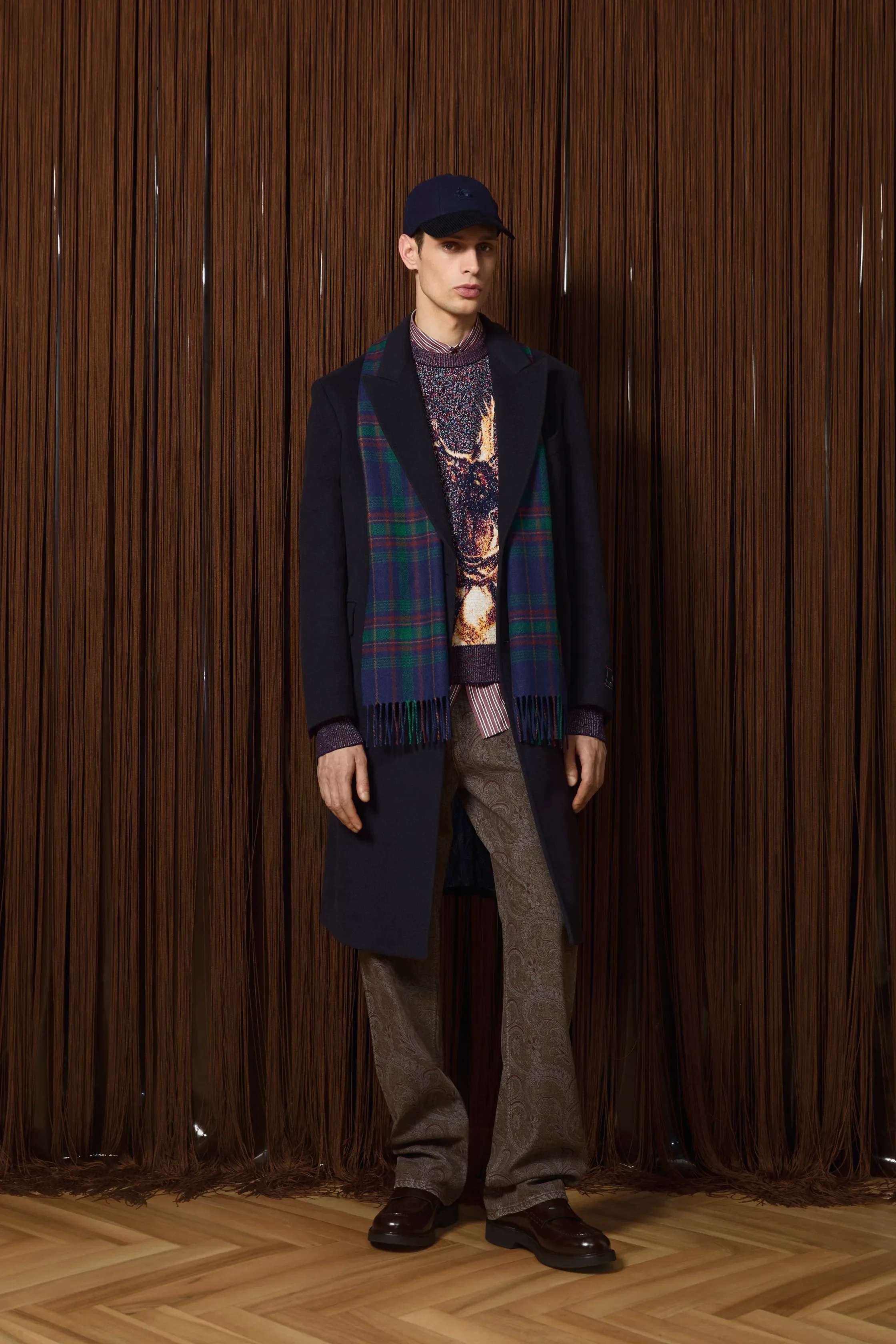
images courtesy of ETRO
Etro’s latest presentation took place in the back rooms of a Brera trattoria, a deliberately contained and intimate setting. Mannequins were topped with papier-mâché animal heads — foxes, owls, rams, bears — referencing a 1997 Etro campaign by Kean Etro, built around the idea of physiognomy and the overlap between human and animal traits. Marco De Vincenzo revisited this imagery not as a literal archive pull, but as a conceptual starting point for the collection, titled Ani-men.
The palette centred on browns, deep greens, and garnet reds, grounding the looks in darker, saturated tones. Velvet paisley robes, relaxed pyjama silhouettes, and slim tailoring trimmed with feathers moved between ease and formality. Animal motifs appeared in pixelated jacquards, while paisley remained central, functioning less as decoration than as Etro’s visual DNA.
Soundtracked by Wendy Carlos, the presentation framed De Vincenzo’s ongoing approach at Etro: reworking the brand’s past into a contemporary language.