
PARIS FASHION WEEK MENSWEAR FALL/WINTER 2026: DAY 3
CAMPBERLAB
review by MAREK BARTEK
Camperlab’s Fall/Winter 2026 show unfolded as a direct and playful reflection on love, marking the final collection designed by Achille for the brand. Pink ran through the season as both colour and concept, appearing in leather jackets, layered knits, sneakers with pink soles, and softly Y2K-leaning styling that set the emotional tone from the start.
Silhouettes moved between oversized and deliberately undone. XXL parkas and distressed, extra-long knits contrasted with sharp colour-blocked tailoring and matching sets. Denim was brushed in brown, treated to resemble leather, or fully transformed into it, blurring material boundaries throughout the collection, with details carrying the narrative even further. Laces were woven into the models’ hair, football-style scarves wrapped the neck, and chains traced across leather backs and boots.
Footwear anchored the looks, from flat cream square-toe shoes to high boots laced twice over. The show closed with a live concert, ending the collection on a celebratory note — a final gesture from Achille that balanced affection, attitude, and experimentation.
IM MEN
review by MARIA MOTA
all images courtesy of IM MEN
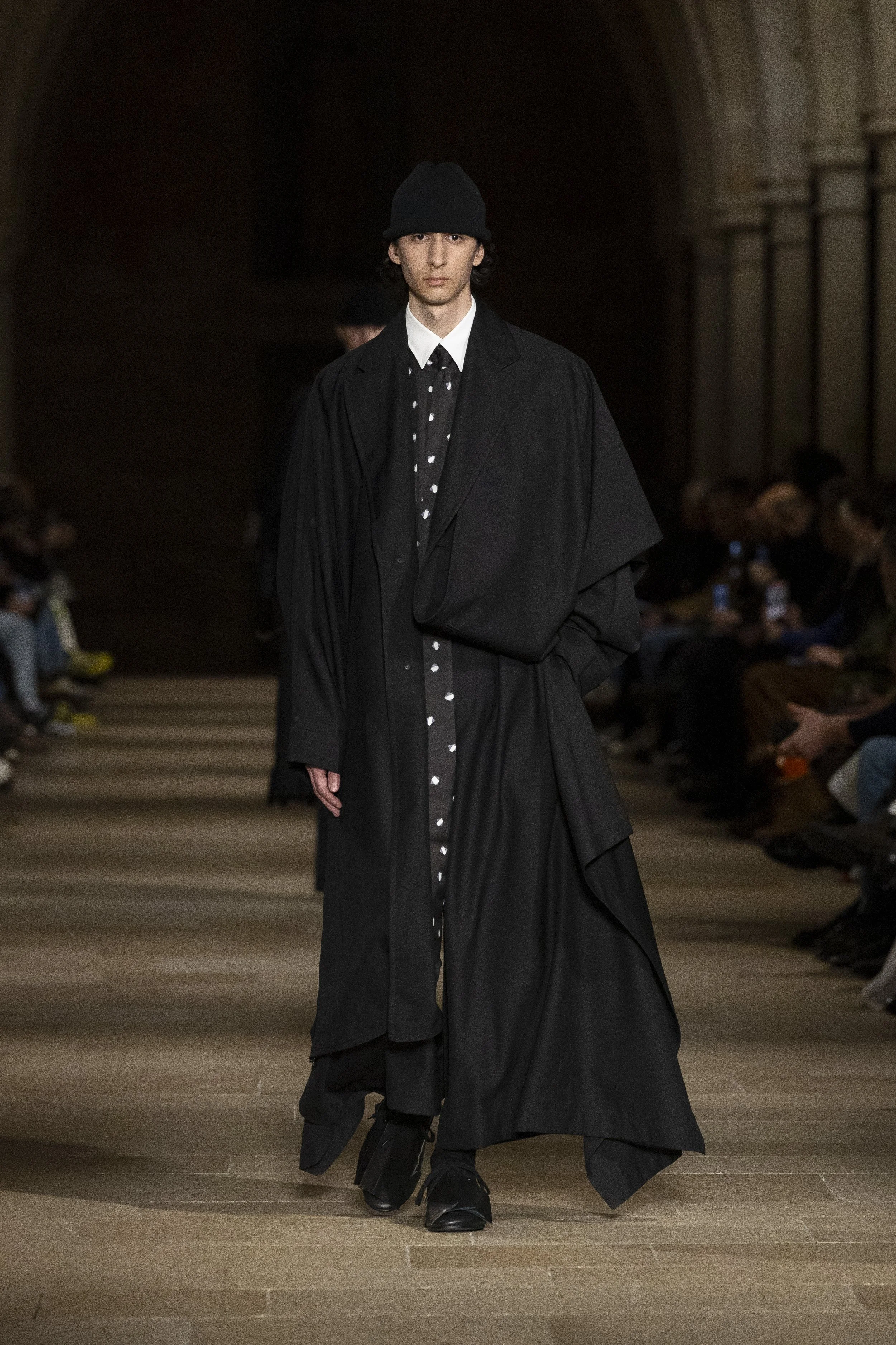
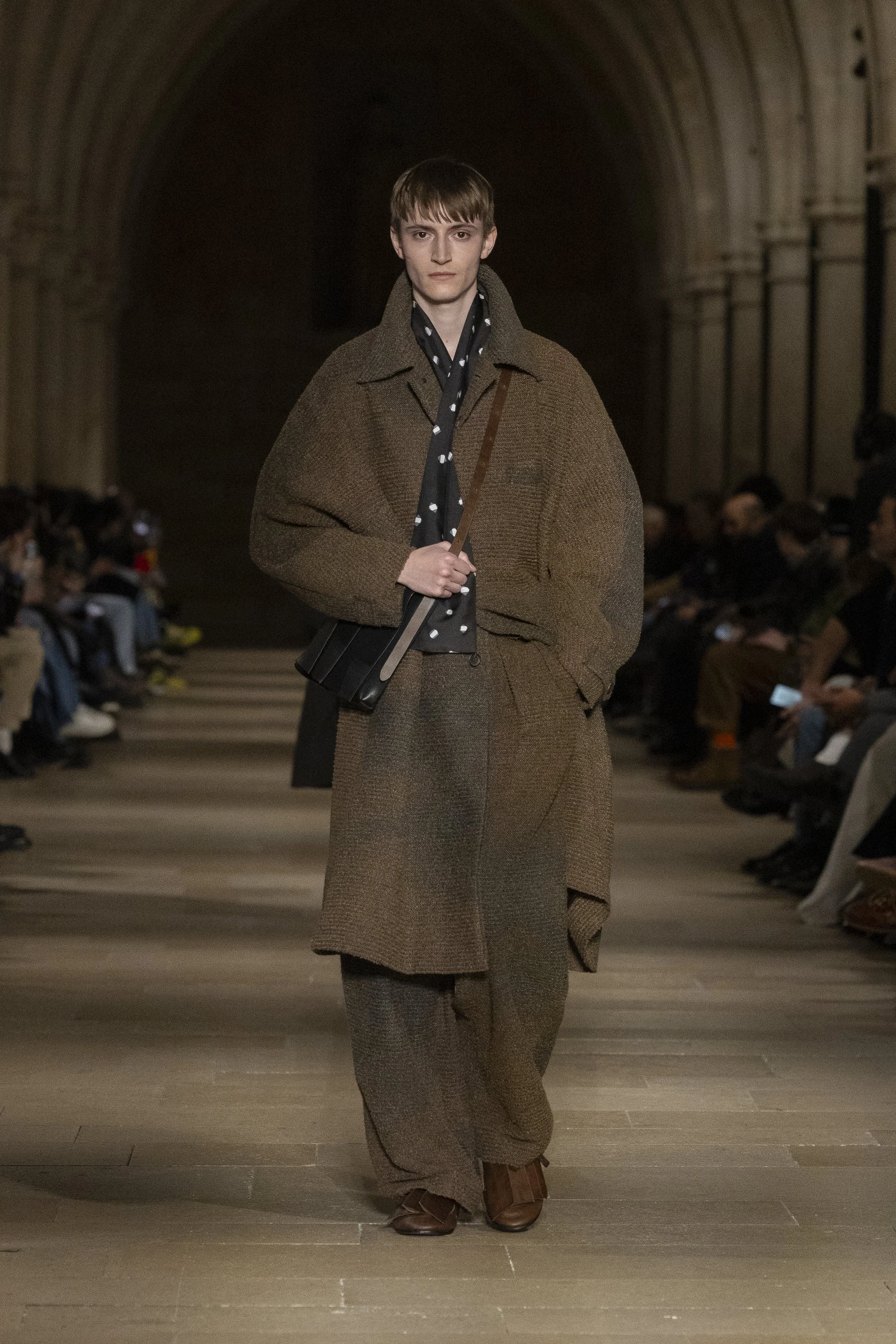
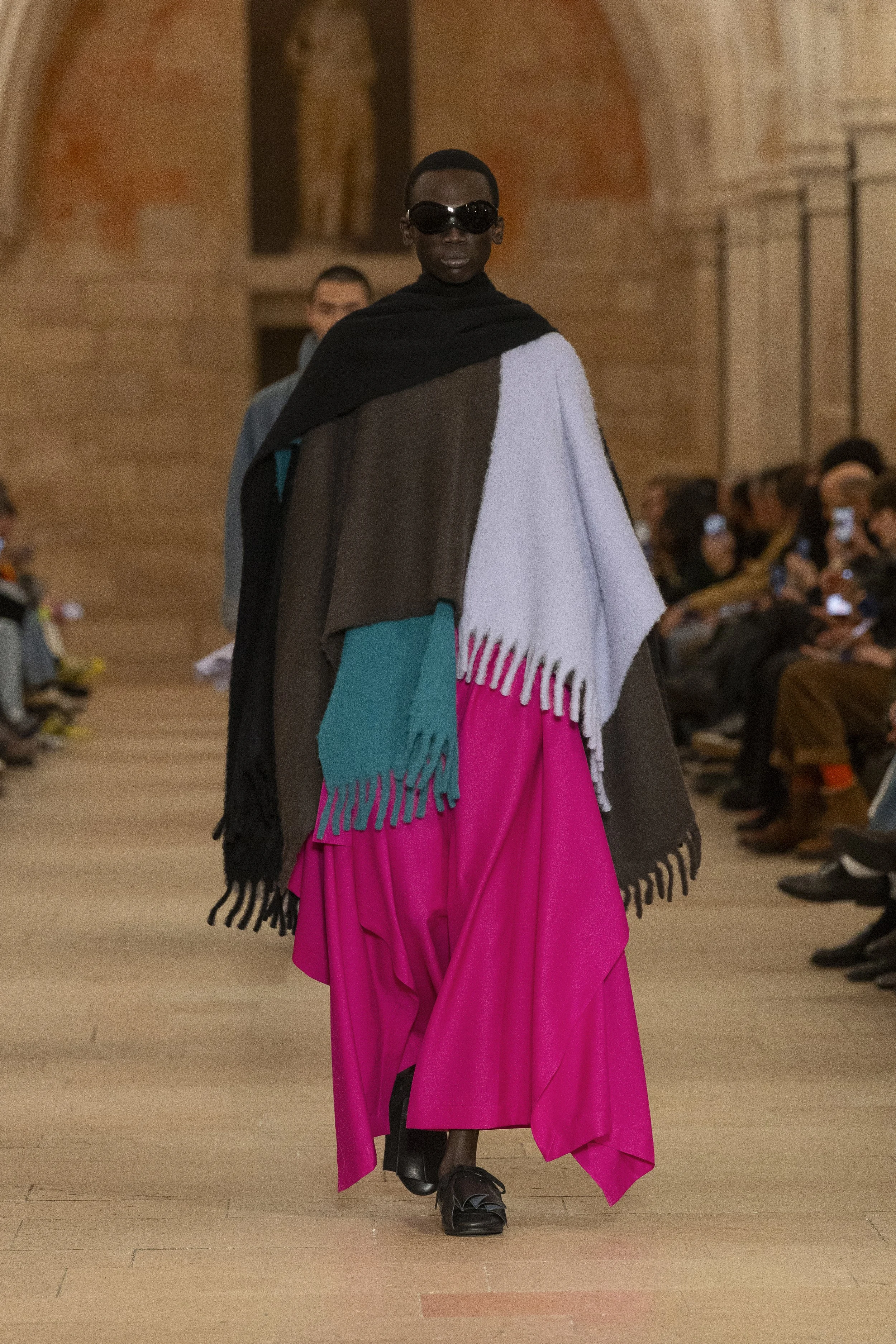
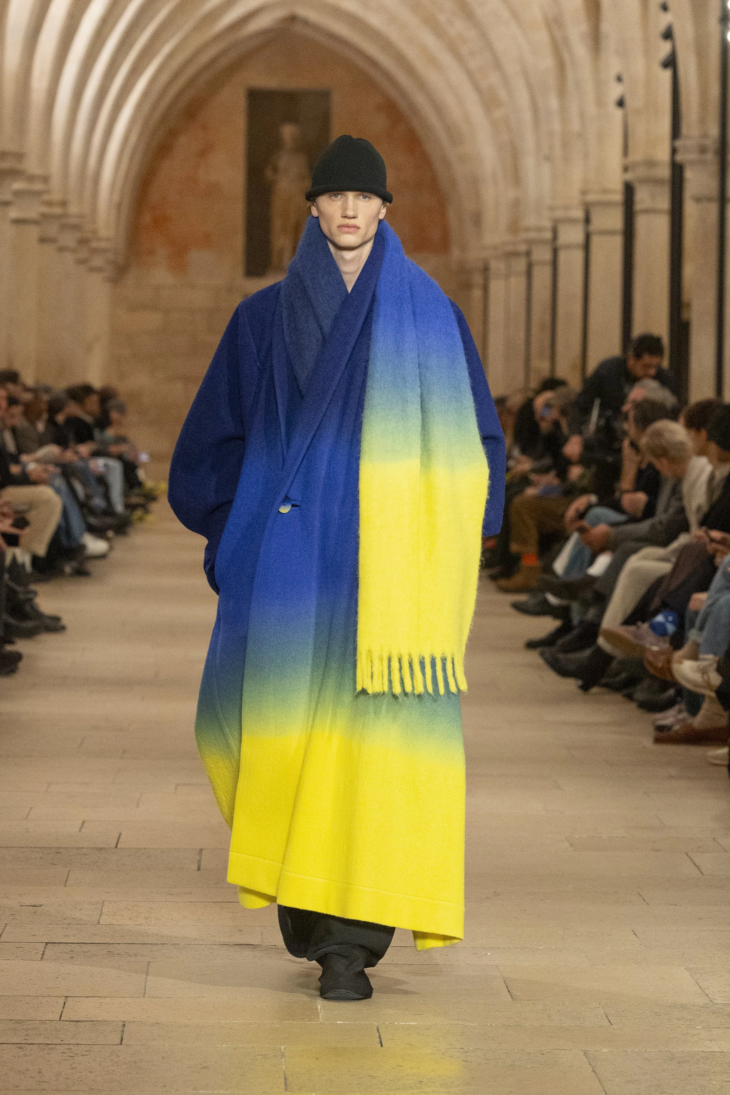
FORMLESS FORM unfolded poetically, from the setting and soundtrack to the slowed pace of the models and the way colour moved across the room.
IM MEN asked a simple question: could the sensation that rises in everyday life, that makes you want to straighten up, be expressed through a piece of cloth?
The answer was in the details. Coats cut from continuous patterns spilled satin along collars and sleeves. Structured hats softened into oversized scarves. Extremely long ties tossed behind shoulders. A trench able to transform into a poncho. Front panels wrapped like oversized scarves, layered for a double-breasted effect, or left to drape freely. Polka dots appeared playfully.
Silhouettes shifted from sculptural to relaxed, voluminous to padded, draped to undone, always allowing ease of movement. The designs emphasized wrapping and enveloping the body, prioritizing fluidity, freedom, and comfort. Bags stood out as a must-have, with large pleats balancing structured cuts with soft lines.
Colour carried the emotional weight, moving from light to dark, dawn to dusk. Hand-poured dye created gradual, unique patterns, evoking early morning skies and fading evening light.
And then a leather coffee cup walked past, familiar and strangely perfect. A reminder that IM MEN understands the poetry of everyday objects and how material alone can shift how form is seen and felt.
RICK OWENS
review by NIA TOPALOVA
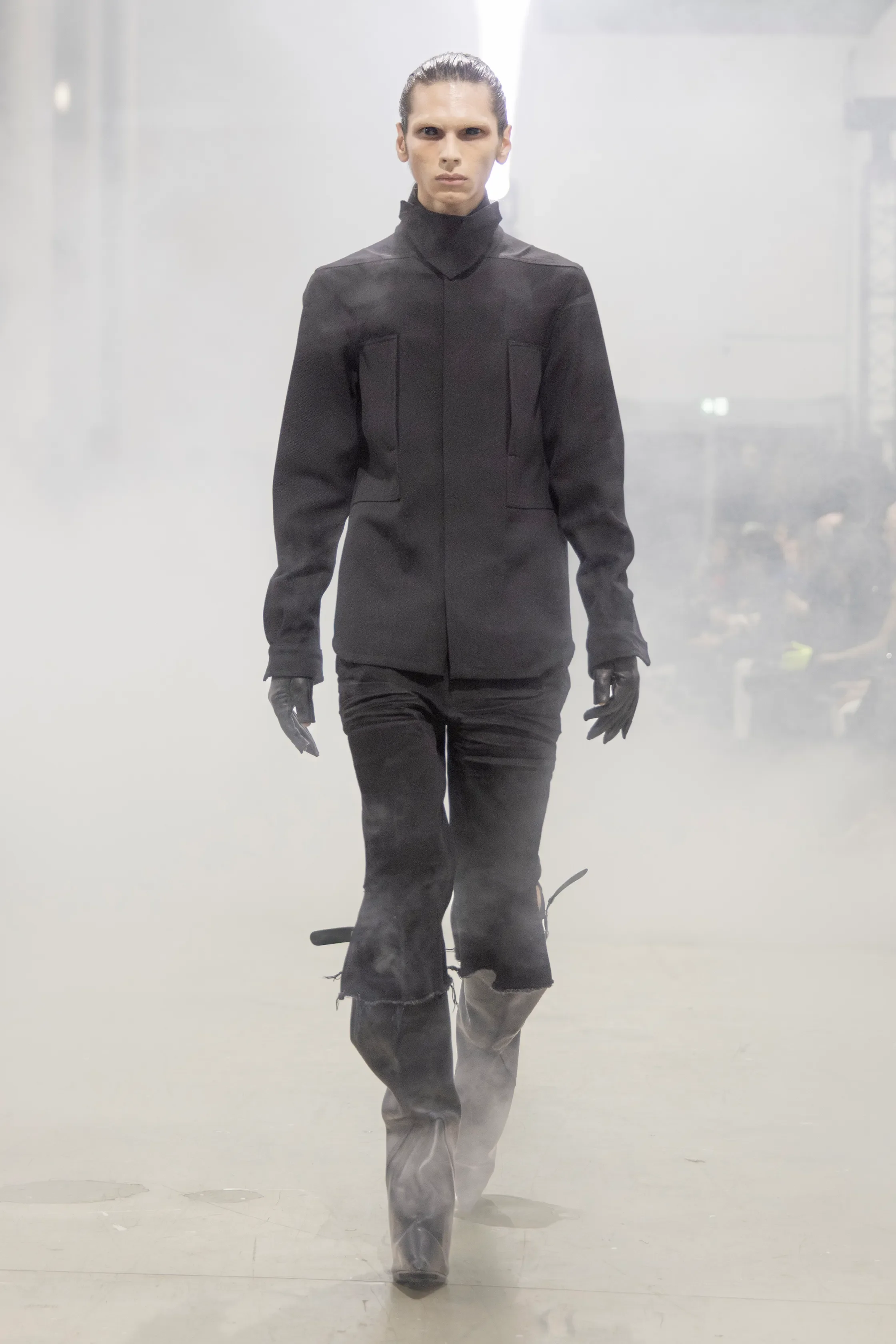
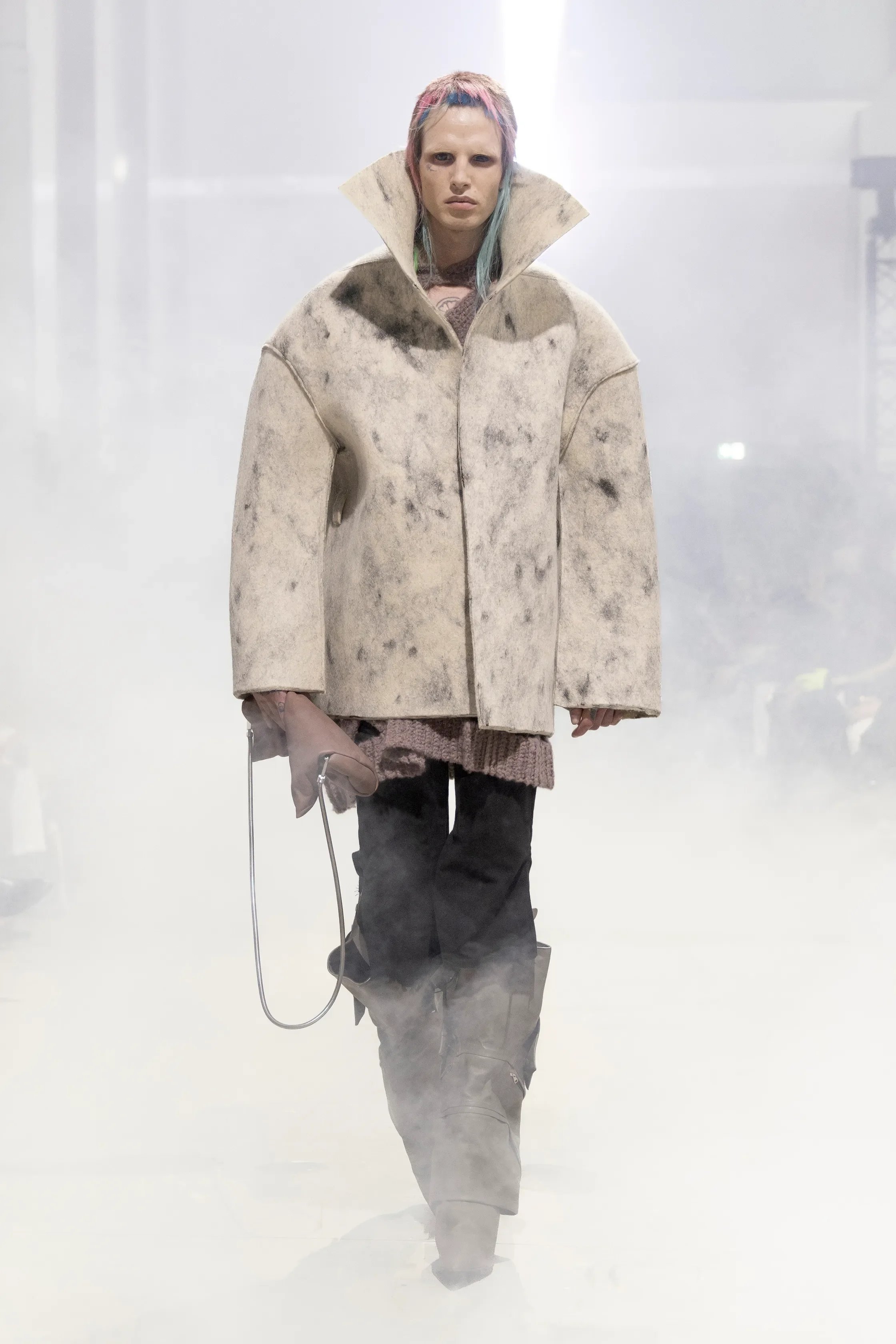
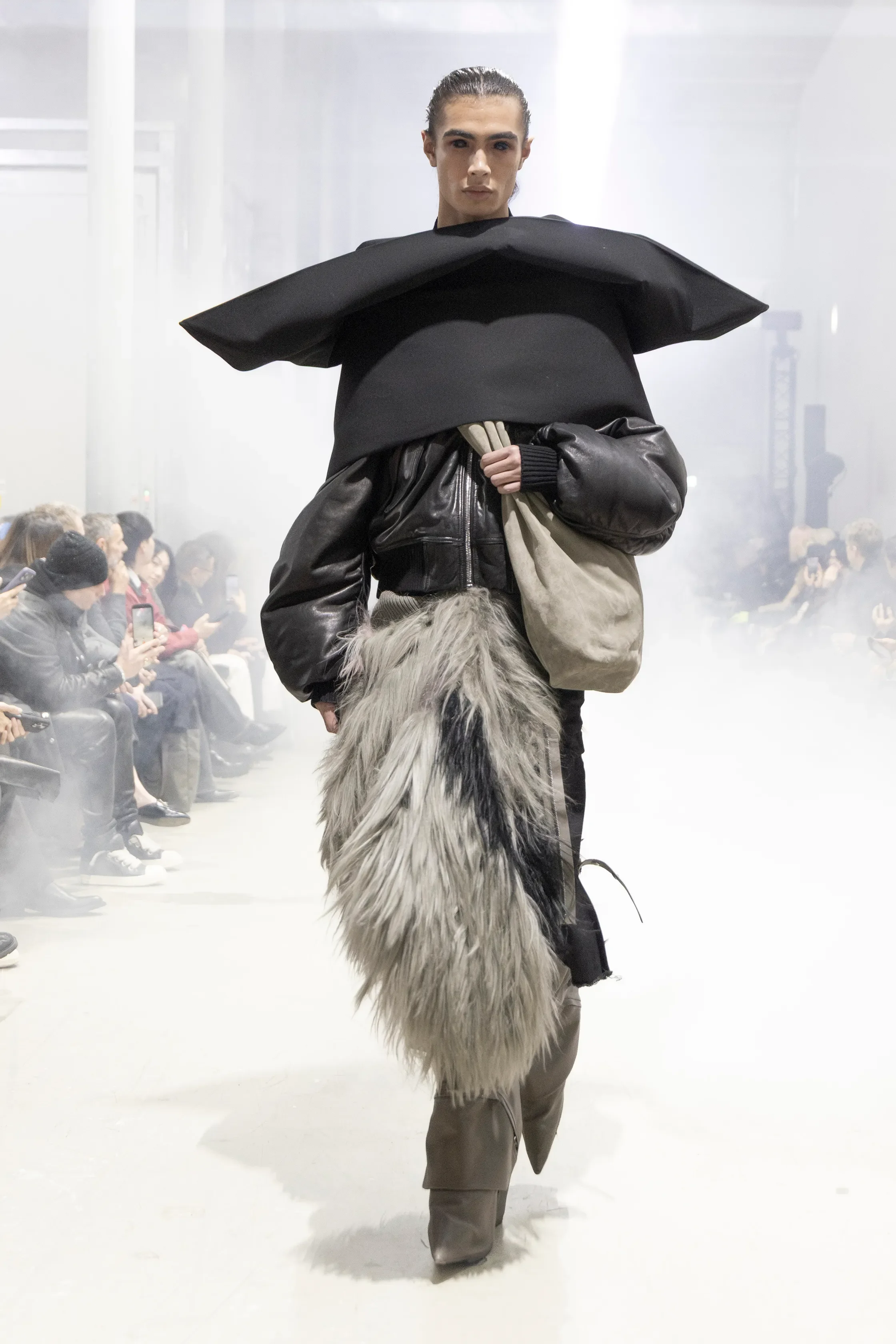
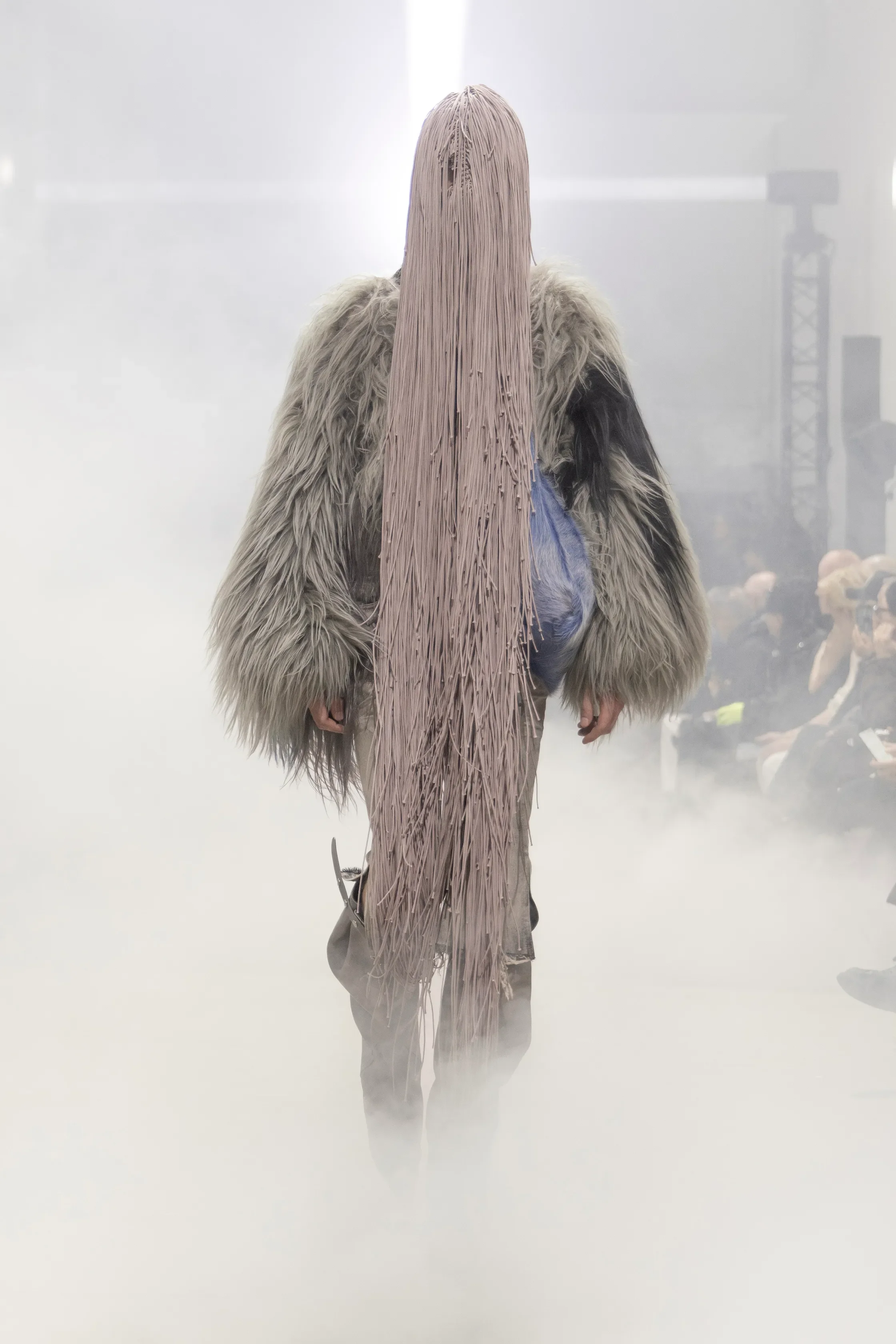
all images courtesy of RICK OWENS
Rick Owens played with authority and enforcement as he noted that “The world around us is impossible to ignore so the only way to go is parody.” As a social commentary, TOWER positioned authority in a context of theatrical forms subverting traditional power structures. Hair and makeup reinforced this spirit of reactive protest, positioning the wearer as both participant and observer.
Militaristic and protective motifs were turned into exaggerated police boots, tight, wrapped leather or Kelvar lab like coats, Japanese 16oz denim and heavy canvas, and layered cowhide jackets. Himalayan wool, Tuscan alpaca, Japanese and Italian wools, heavyweight denim, and silk-cashmere blends were all sourced and treated using sustainable, traceable, and artisanal methods. Shaggy leather flight jackets, hand-crocheted knits, hand-tufted jackets, and macramé masks were created in collaboration with London and Paris-based designers.
Owens’s witty reference to David Bowie’s lines “We are the goon squad and we’re coming to town (beep beep)” functioned as a knowing critique of cyclical trend obsession and the adoption of authority through style, a sentiment rooted in Bowie’s original commentary on the performative excess of 1980s New Romanticism.
Garments as consciously worn symbols reframed power as mutable and ironic. Sustainability and provenance were treated as structural values, reinforcing the idea that resilience, either personal, cultural, and material, is built slowly. Ultimately, TOWER resolves as meditation on love, hope, and protection for those moving through a world that remains, unavoidably, impossible to ignore.
SEAN SUEN
review by THORE DAMWERTH
all images courtesy of SEAN SUEN
In a season saturated with noise, acceleration, and visual excess, stillness became Sean Suen’s most radical gesture. His Fall/Winter 2026 collection at Paris Fashion Week was a quiet yet potent statement of conceptual rigor and sartorial poetry. Titled Second Skin, the collection posits clothing not as armor but as residue, the architectural imprint left on the body after protection has completed its task.
Suen’s vision, rooted in both philosophy and material exploration, sits at the intersection of introspection and form. Elongated silhouettes, voluminous outerwear, and layered constructions evoke a sense of emergence. Garments that hold and release, concealing and revealing in equal measure. The restrained palette of creams, blacks, and soft neutrals underscores this meditative sensibility, allowing texture and proportion to take center stage.
The presentation, a contemplative installation, embraced a stillness that amplified Suen’s narrative on vulnerability and transition. Sculptural bombers with curved hems, oversized blazers with scalloped paneling, and wide trousers that pool around robust boots suggested bodies in flux. Neither here nor there, but suspended in transformative space.
Rather than chasing immediacy, Suen proposed duration. AW26 unfolded as a measured reflection on form, weight, and restraint, where meaning emerged through pause rather than performance. In resisting excess, the collection reaffirmed fashion’s ability to articulate nuance – not through spectacle, but through what remains once movement slows.
AMIRI
review by VERONICA TLAPANCO SZABÓ
all images courtesy of AMIRI
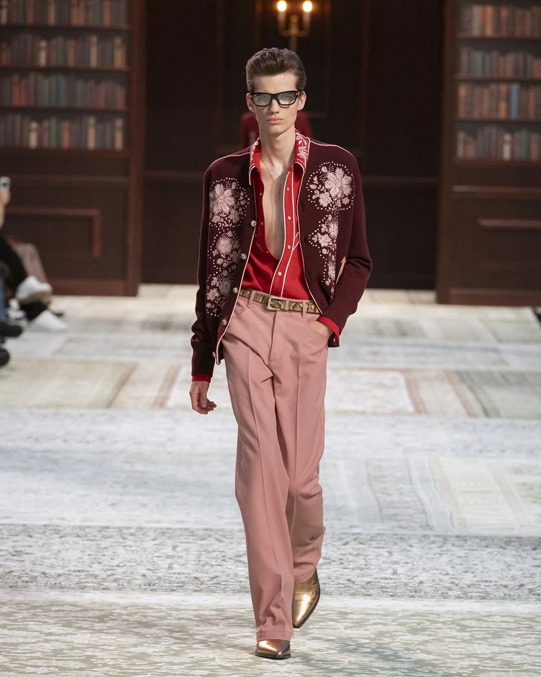
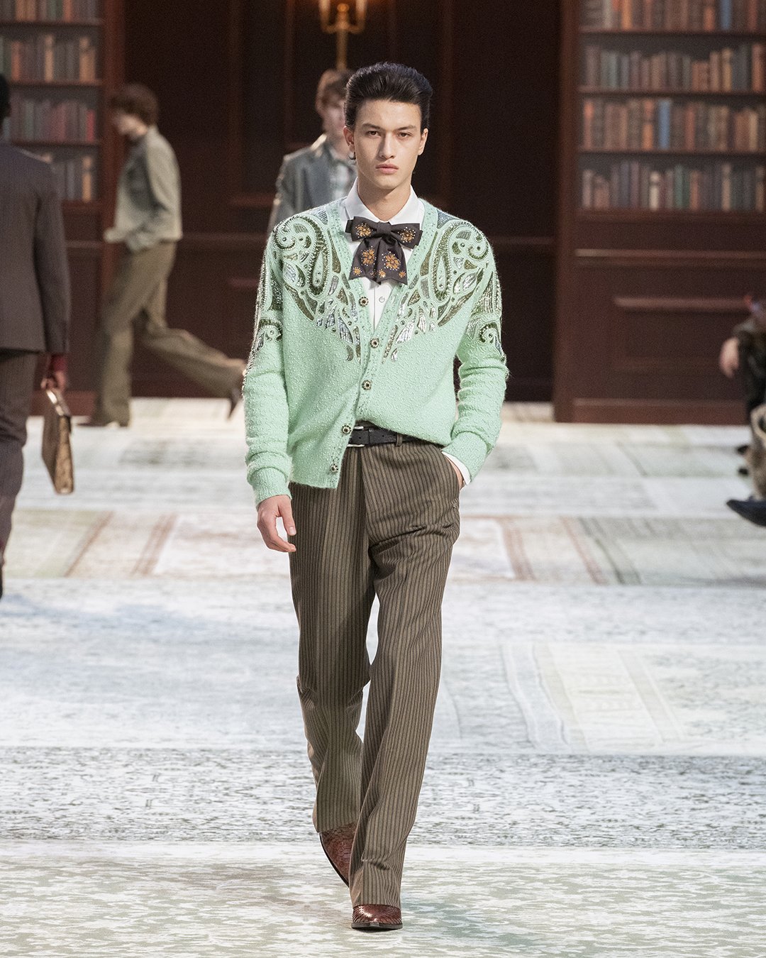
Rock and roll will never die! A blazer over a Henley! Boots instead of dress shoes! This oh-so LA-infused collection comes courtesy of Mike Amiri. Rooted in modern American luxury, his designs carry a deeply personal allure that pushes men’s formalwear somewhere new. Right now, there’s a wider conversation happening about where menswear is headed, something that Amiri himself has previously commented on. A growing desire for something real, something that sparks emotion and hits a nerve in our collective consciousness. And what has shaped ideas of dress and luxury more than the Hollywood Hills?
For Fall, Amiri answers with just that, in sartorial forms, of course, this means leather, romantic shades of pink and red, ornate embroidery and velvet in rich, warming layers. It all feels like Laurel Canyon, the former homestead of cinema's biggers figures during the city’s Golden Age and since the 1970s, a cradle of counterculture. That era sets the mood, the spirit of the ’70s, so definitive for the overall West Coast style, seeps into every look. Every seam is considered, the closer you get, the more you feel. And to pull us even deeper into the Hollywood hills, Amiri stages the set in such a way that it becomes the interior of an imagined Laurel Canyon den, all plush textures, decadent book collection and sconces included. The lights are low, the volume is up, and let Desire (the band) transport you.
YOHJI YAMAMOTO
review by NIA TOPALOVA
all images courtesy of YOHJI YAMAMOTO
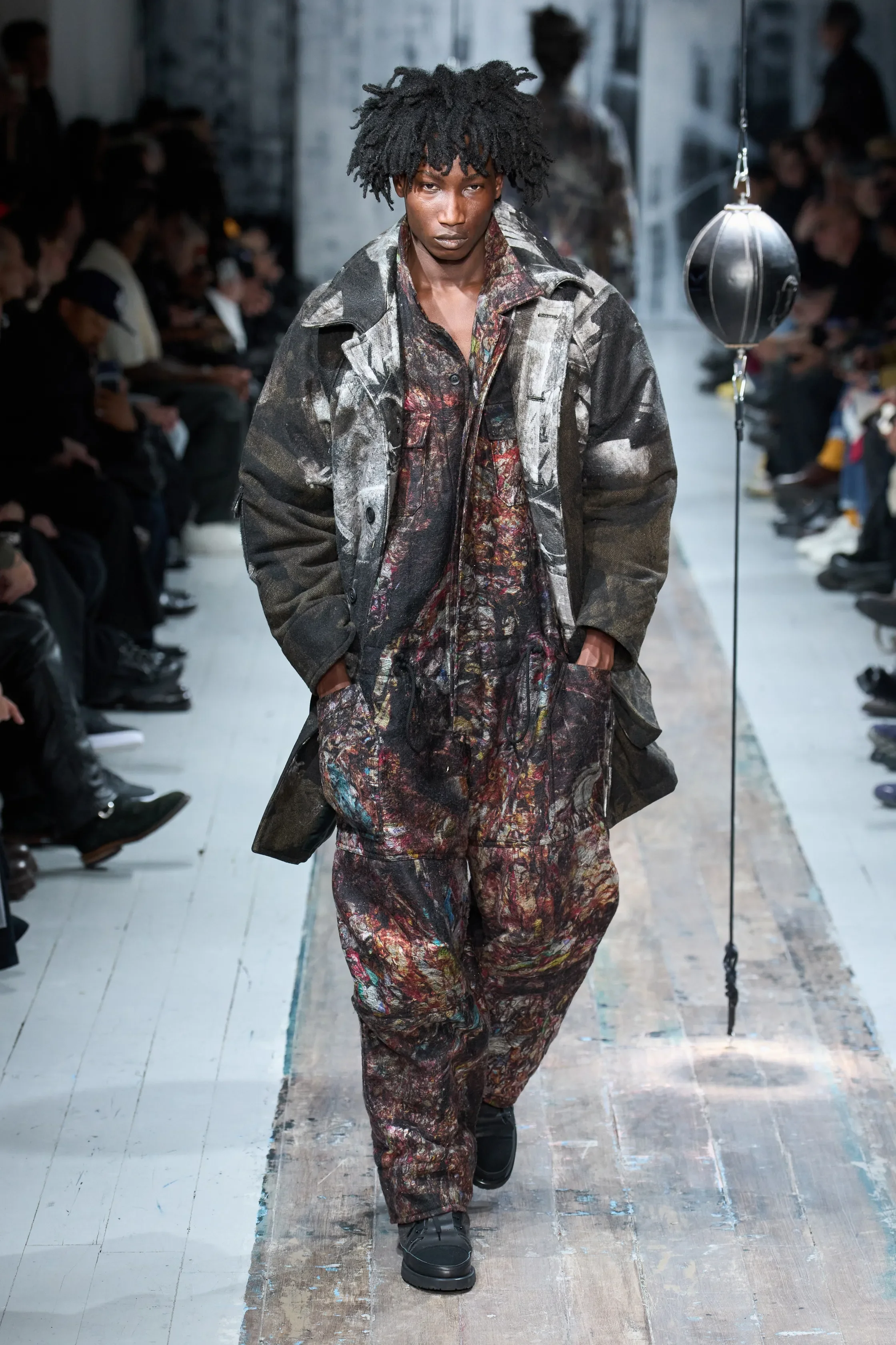
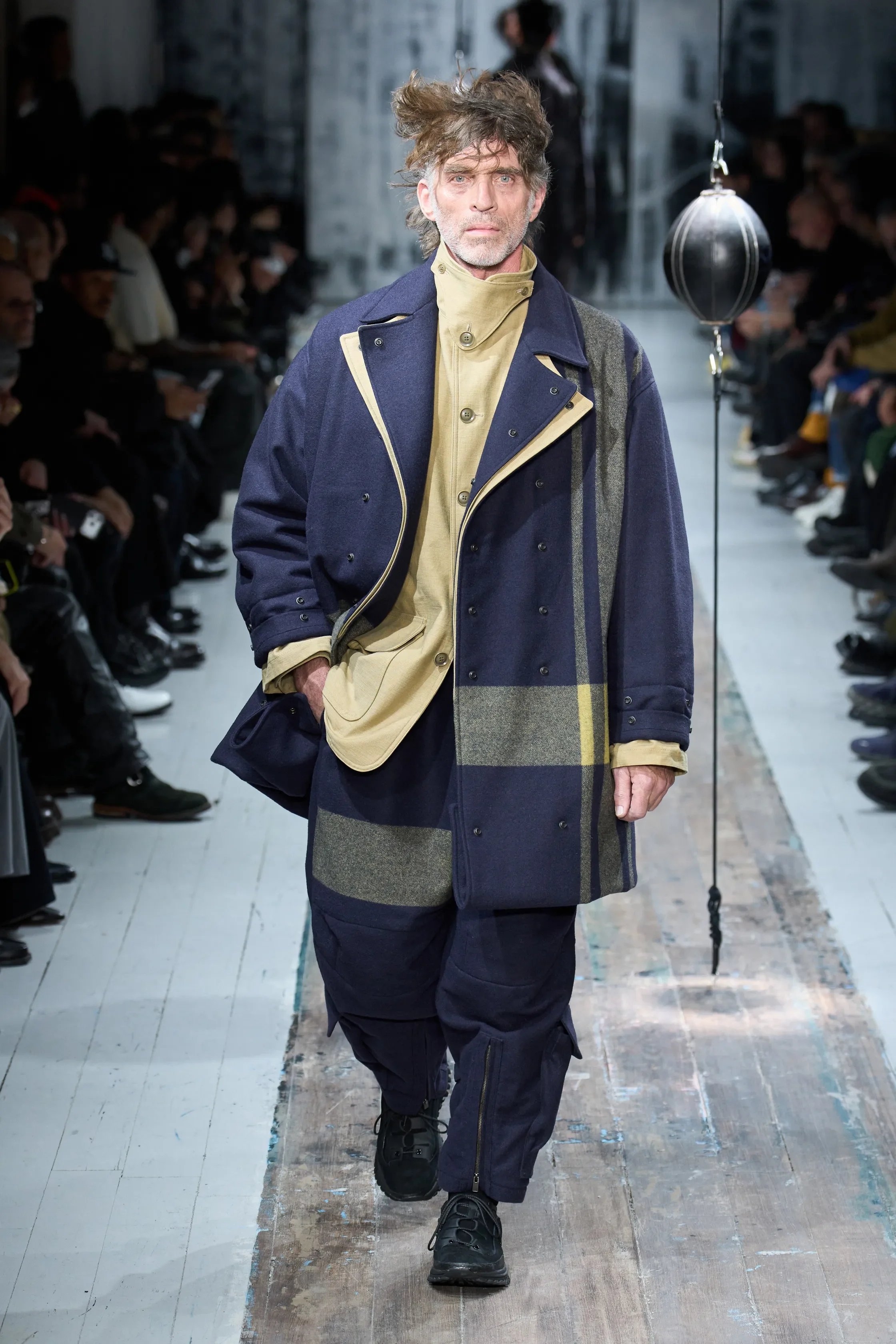
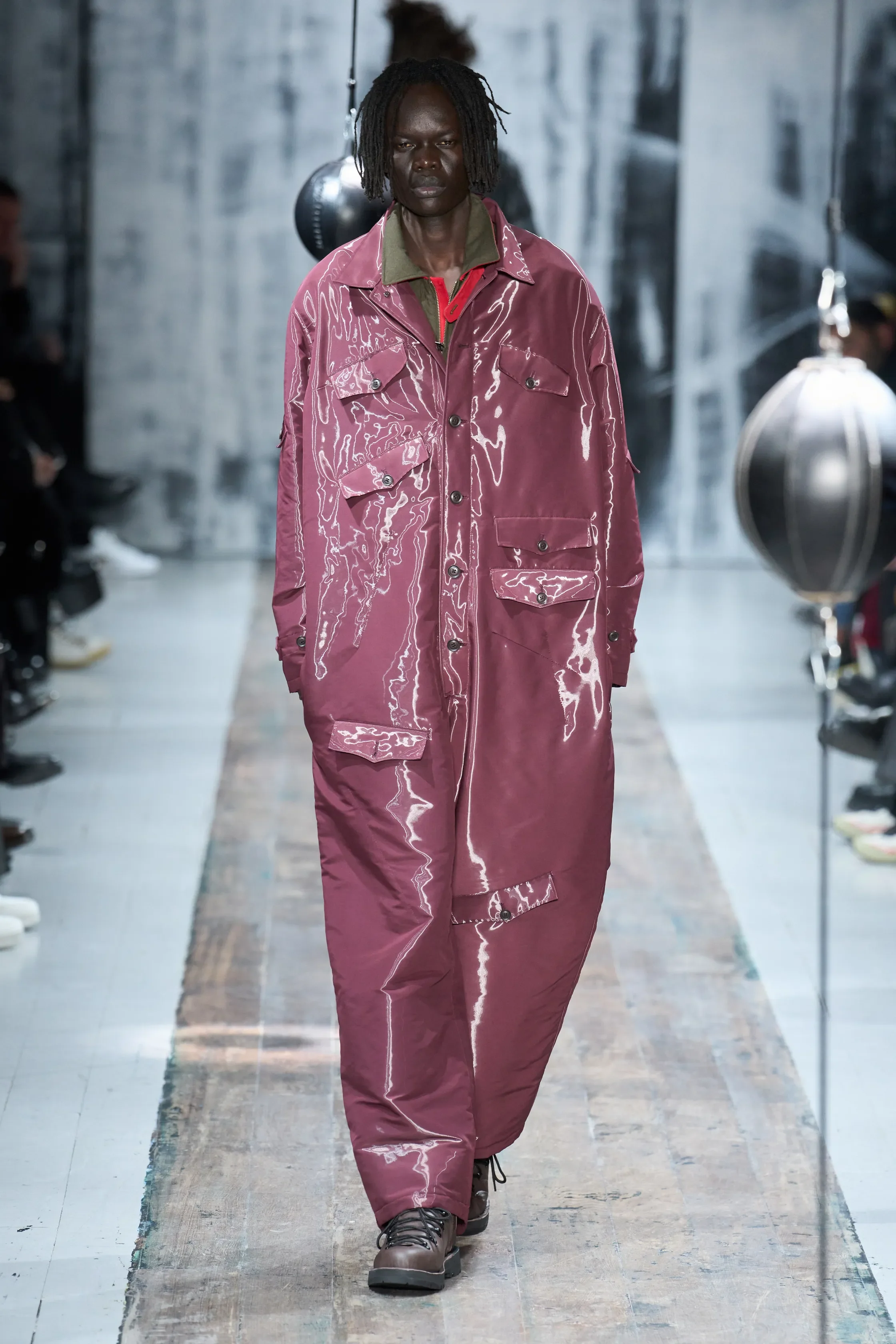
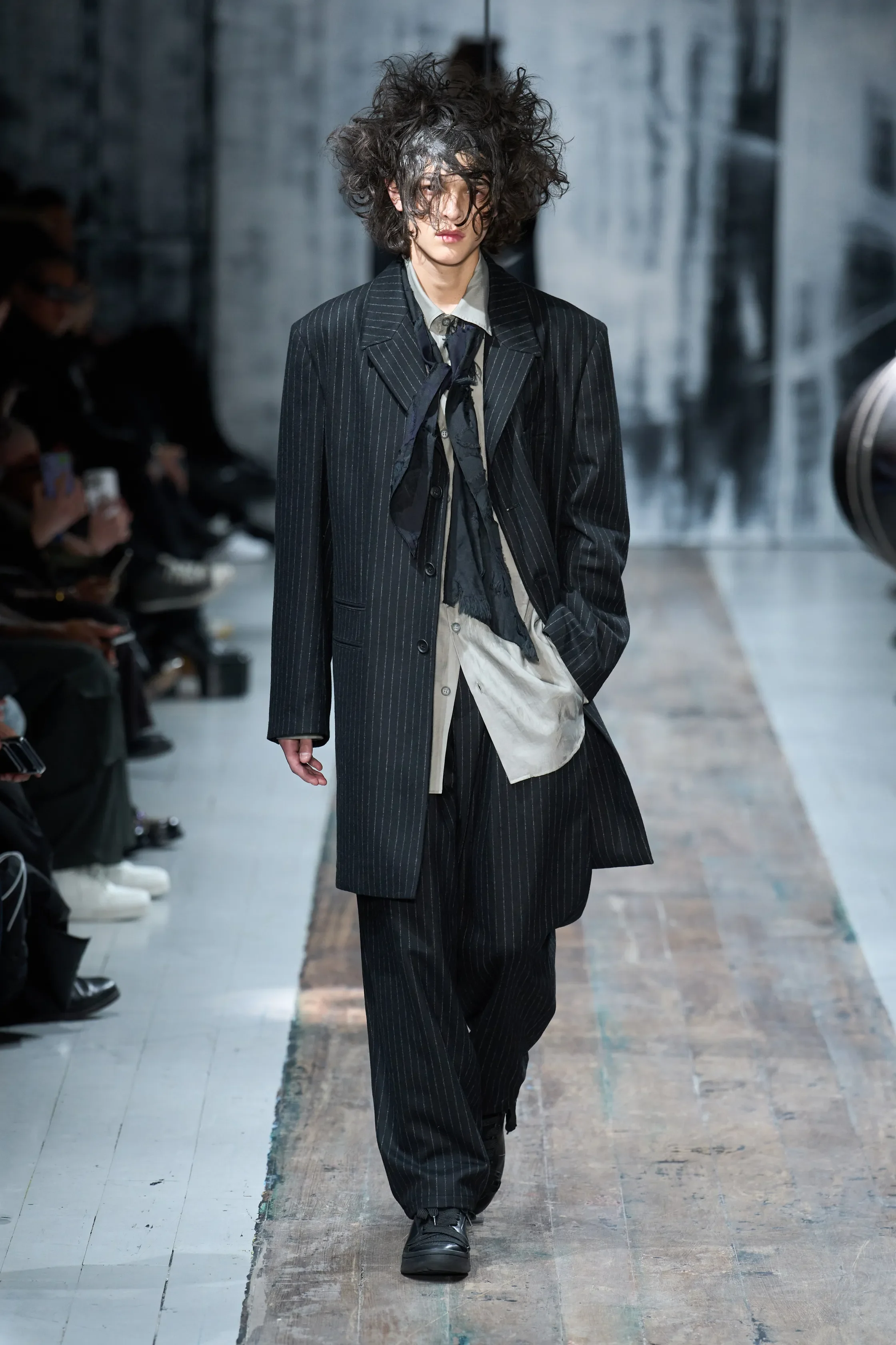
For over five decades Yohji Yamamoto has been presenting work that resists the Western cut, insisting on shadow and weight, and privileging movement. Time and again he has taken what the West calls tailoring and upended it, unmaking it into drape and asymmetry, offering space between garment and body.
In Pour Homme 2026 Autumn-Winter the palette of inky blacks and charcoals functioned as material condition in which silhouette and volume became legible. Within this context, layered garments carried weight through form and draping.
The runway was transformed into a boxing ring as a metaphorical arena in which men were confronted with their own resistance. Models faced an inevitable interaction with two black punching balls, each of them responding in their own way: a respectful kiss, a bow, a gentle touch, or a punch. Interwoven through the collection were mechanical and military references that drew inspiration from mud, grit, unpolished labor of working in dirty environments. Army and combat clothing, Yamamoto explained, become tools of survival, garments essential for safety.
Yamamoto’s persistent skepticism toward perfection as a way of acknowledging the truth of what clothes are and do, once again reflects the Japanese wabi-sabi as his own philosophy, the idea that incompleteness and impermanence are profound truths rather than flaws. In this context clothing were meant to move, resist and adapt.
DRIES VAN NOTEN
review by MAREK BARTEK
all images courtesy of DRIES VAN NOTEN
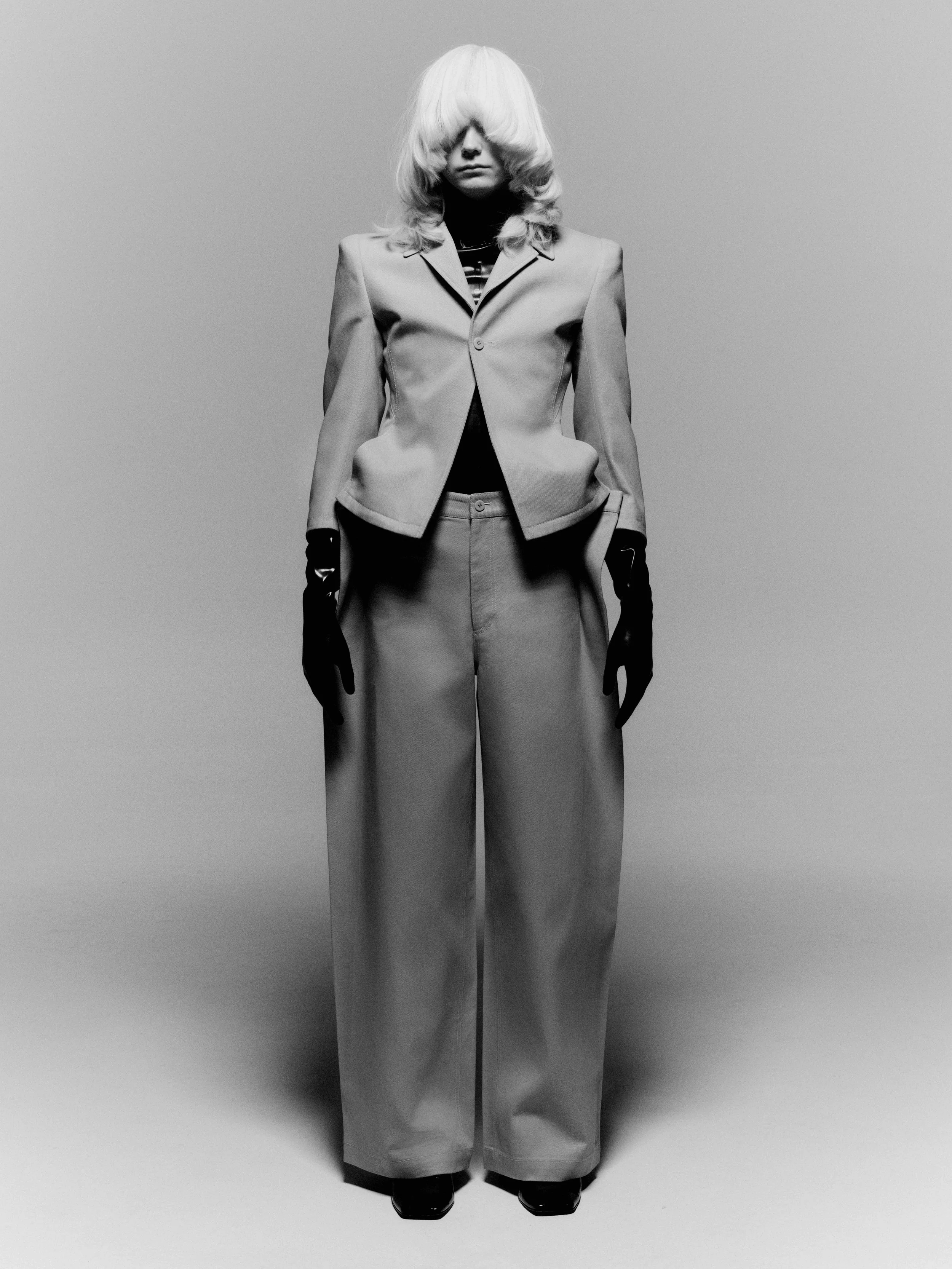
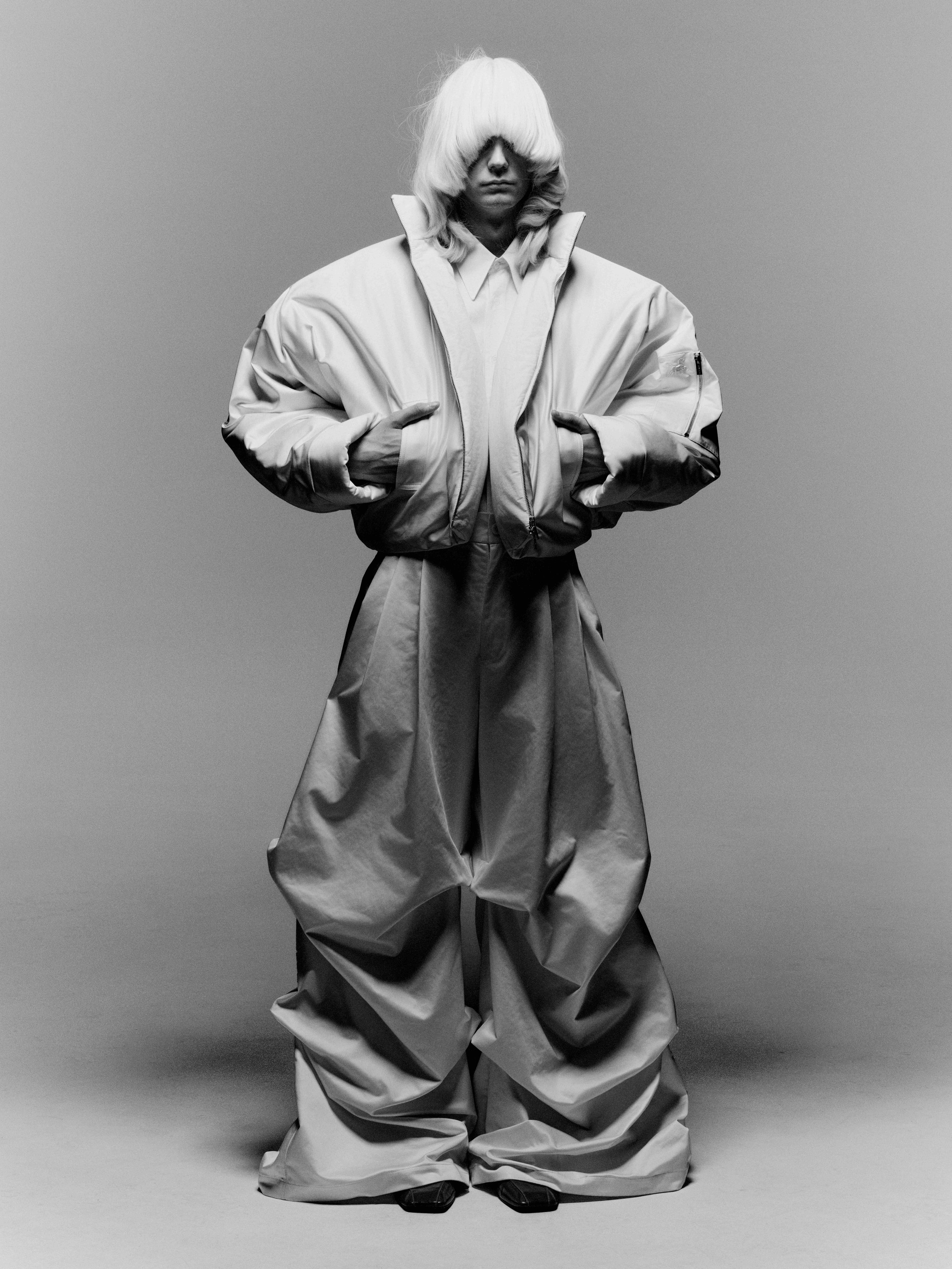
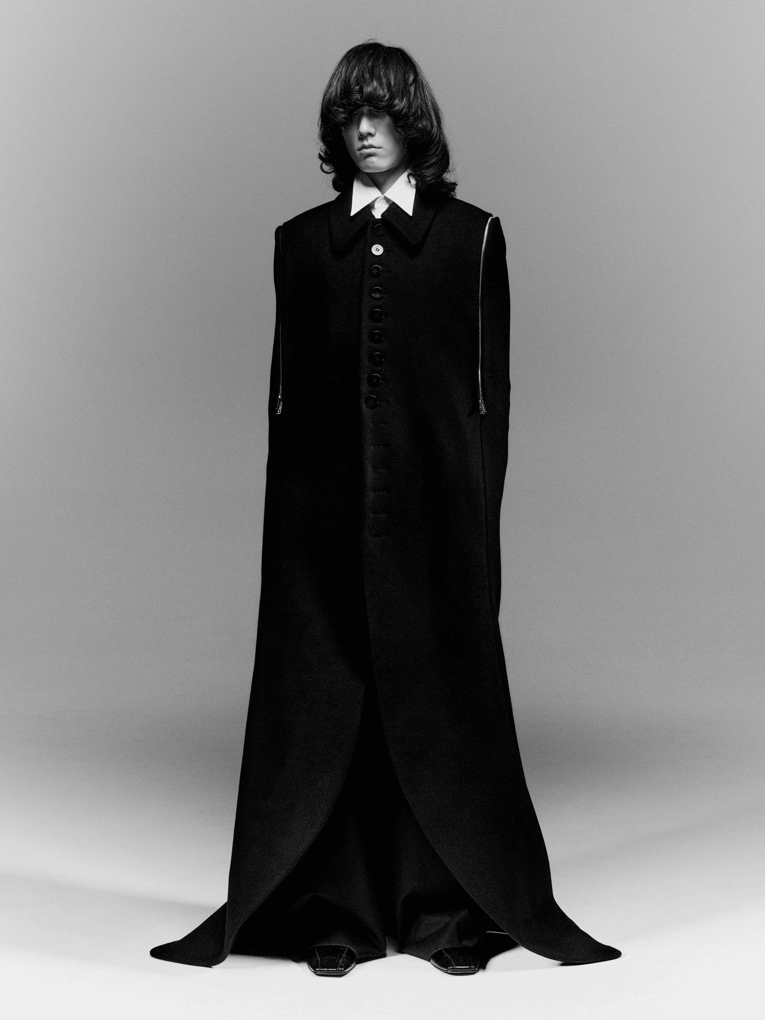
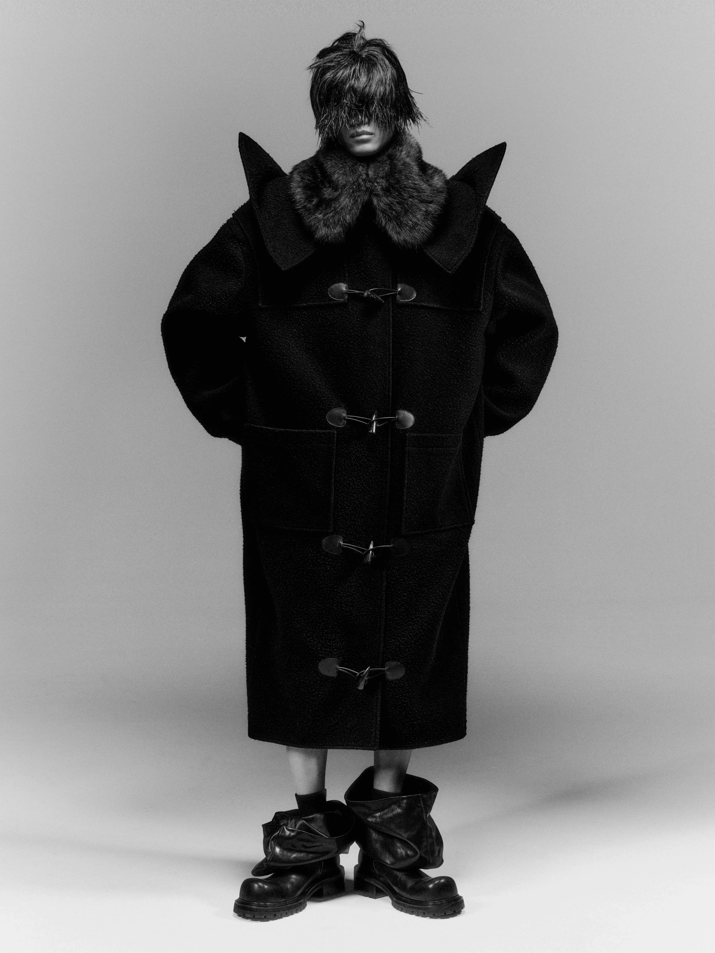
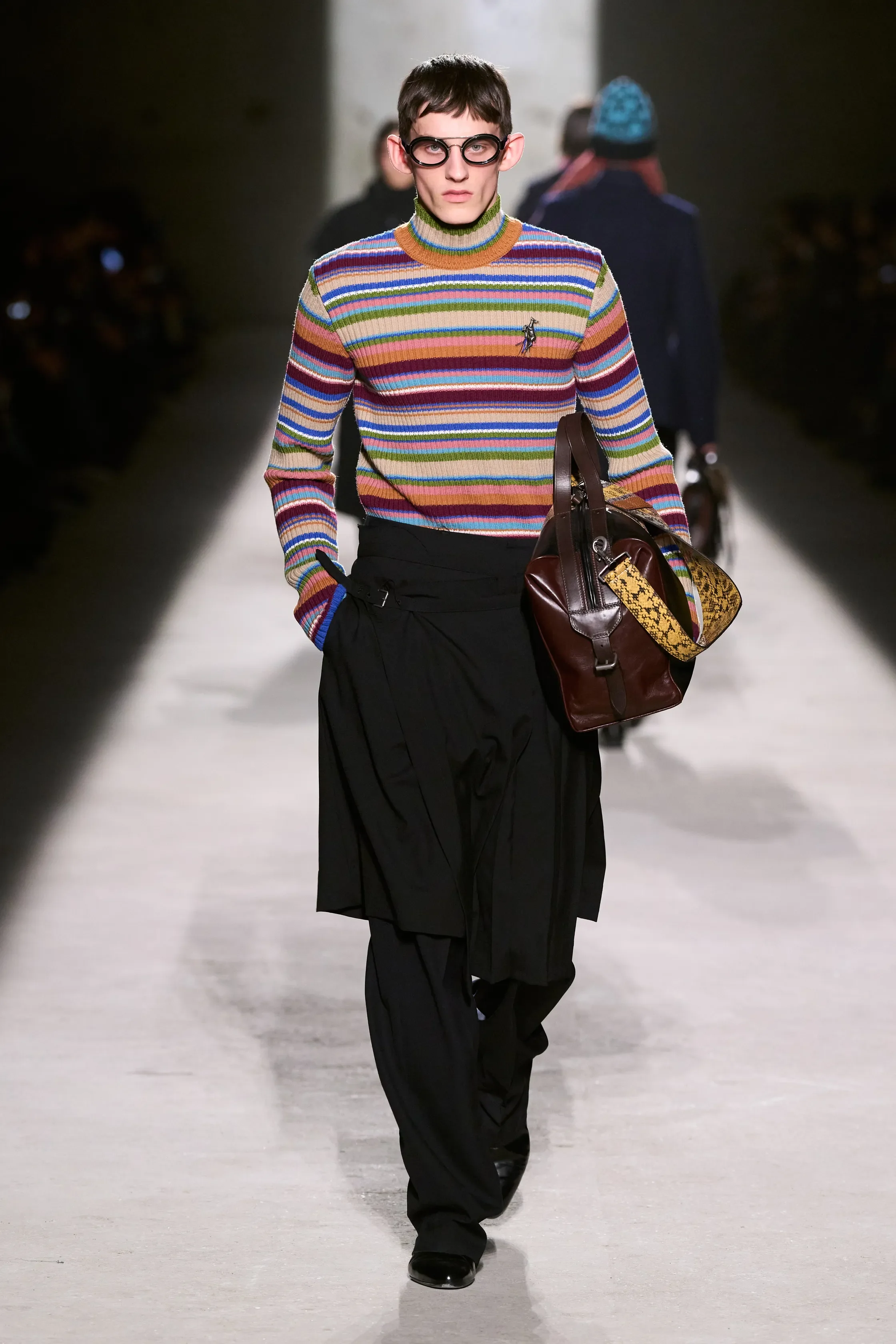
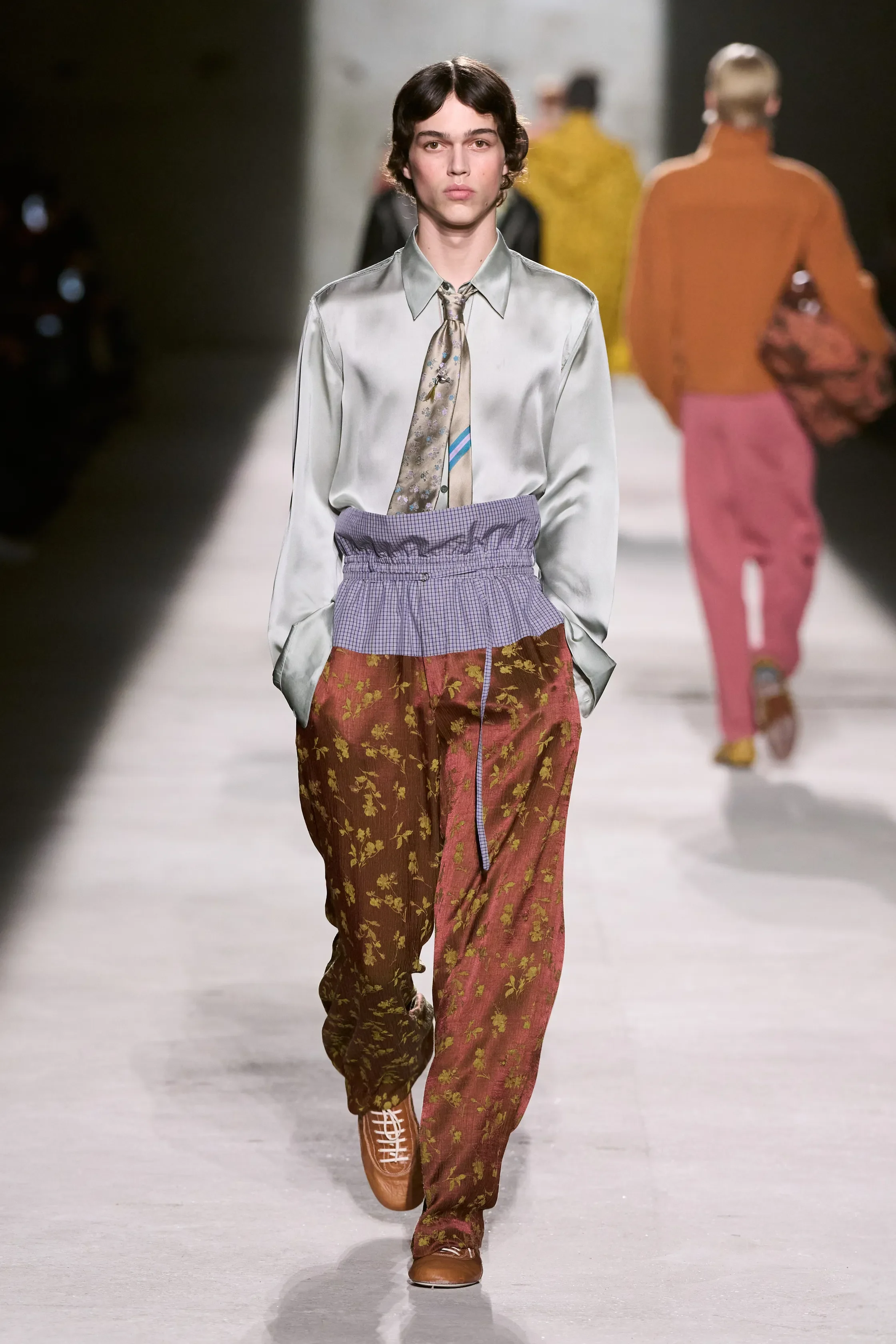
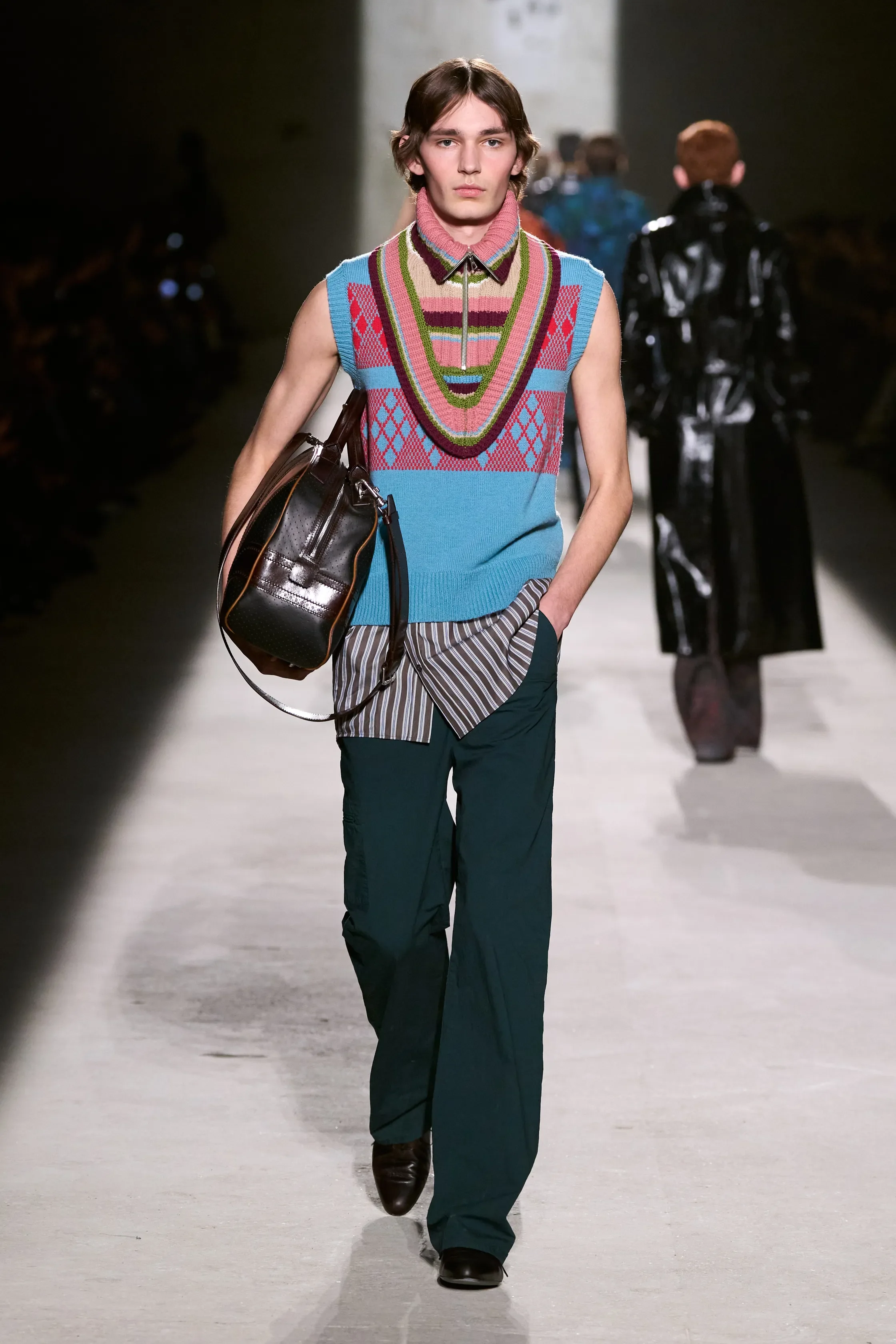
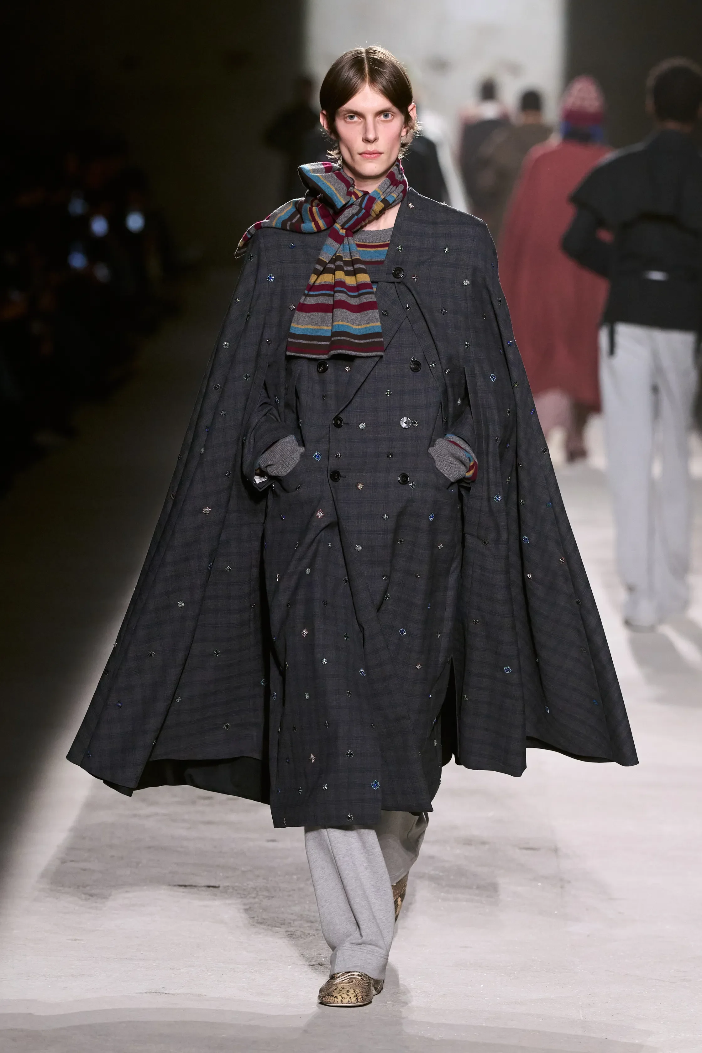
Dries Van Noten’s Fall/Winter show unfolded in a stark, all-black setting. Under Julian Klausner, the house continued to explore its core codes — colour, pattern, and texture — this time through a transitional, experimental wardrobe.
Knit dominated the collection. Layered sweatshirts, knit-on-knit styling, patterned neck warmers, and modular constructions created kind of assembled silhouettes. Skirt-like shapes and kilts appeared throughout, often layered over trousers or integrated into tailoring, while asymmetrical necklines and buttoned collars added a sense of movement and instability.
Pattern clashing remained, with geometric knits, crest embroideries, and patchworked outerwear building dense, graphic surfaces. Colour stayed muted but deliberate, punctuated by sharp accents and high-shine patent leather coats and trousers. Tailoring moved between narrow shoulders and slim waists on one side, and fluid, softly built volumes on the other. Structured leather handbags grounded the collection in utility. Playful accessories — aviator-style beanies, layered hats — softened the mood.