
NEW YORK FASHION WEEK SPRING/SUMMER 2027: DAY 6
AISLING CAMPS
review by JOYCE ONUORAH
all images courtesy of AISLING CAMPS
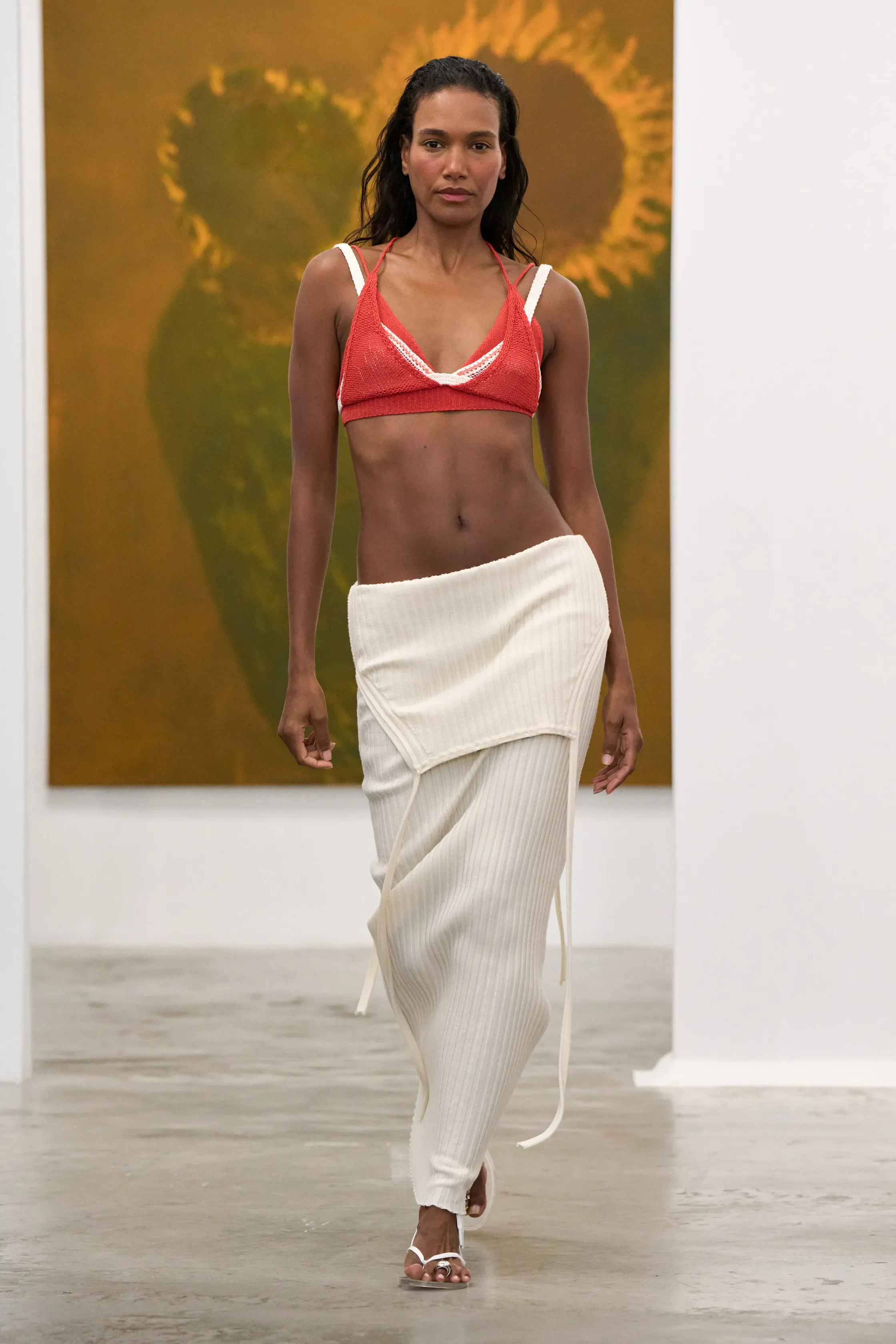
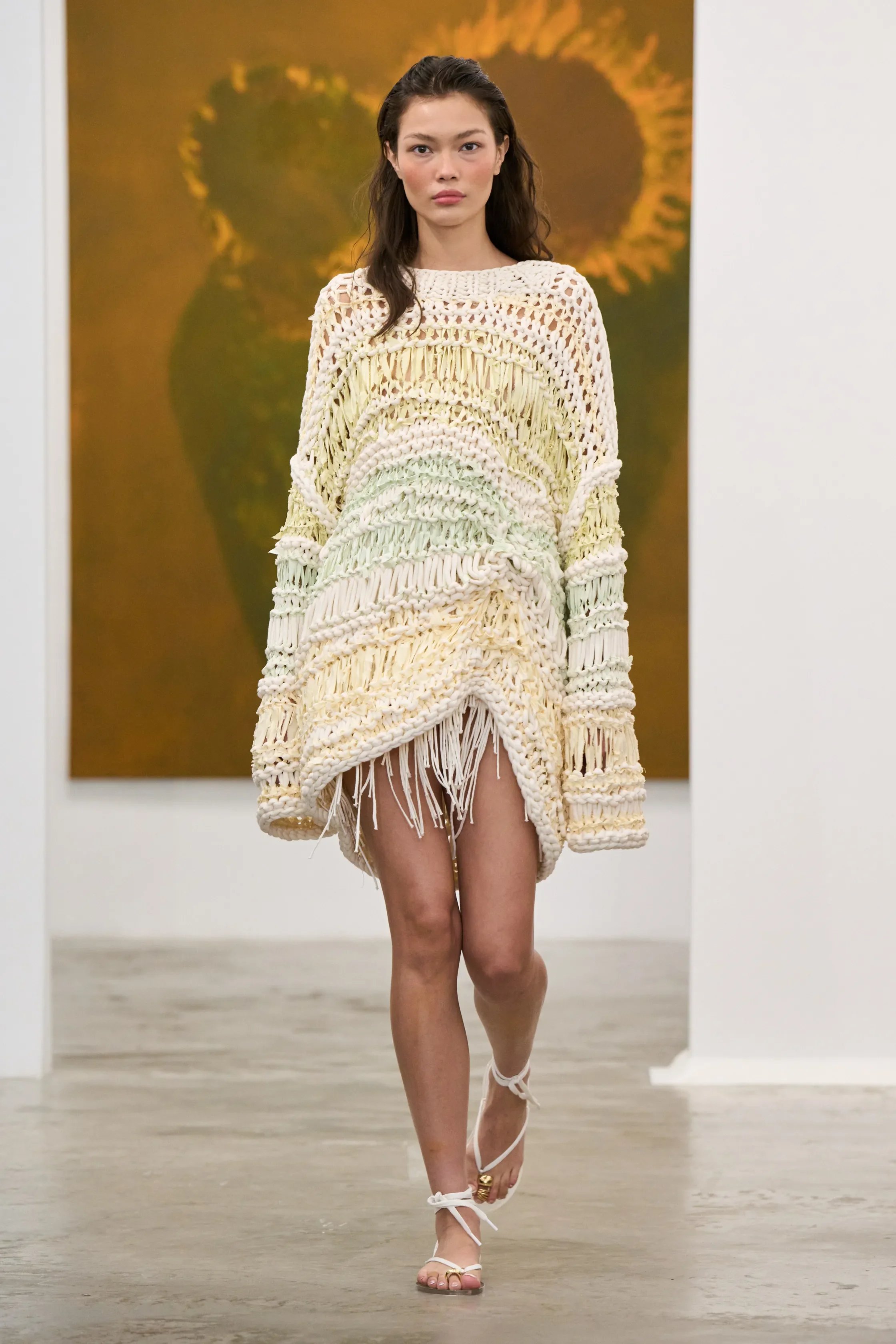
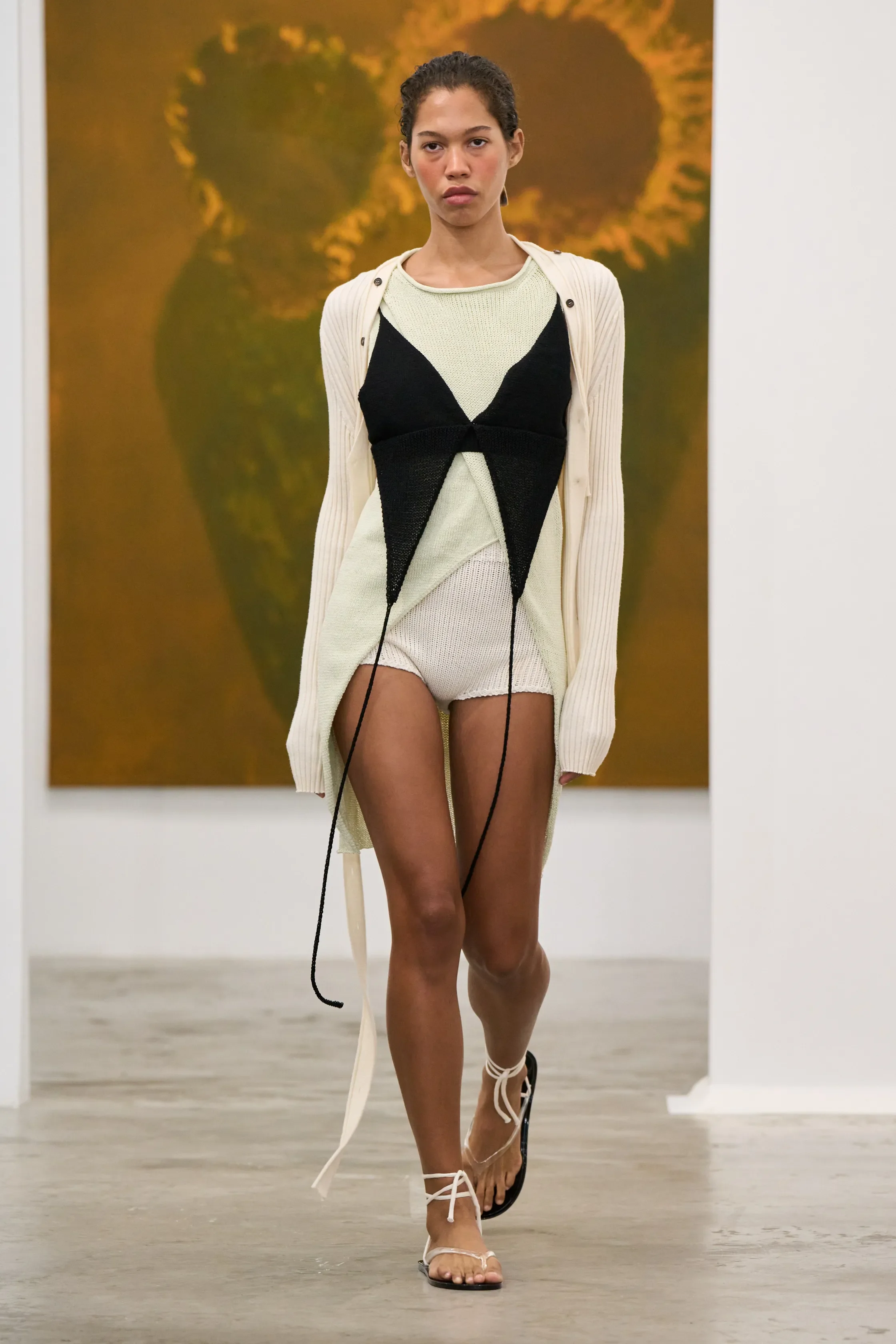
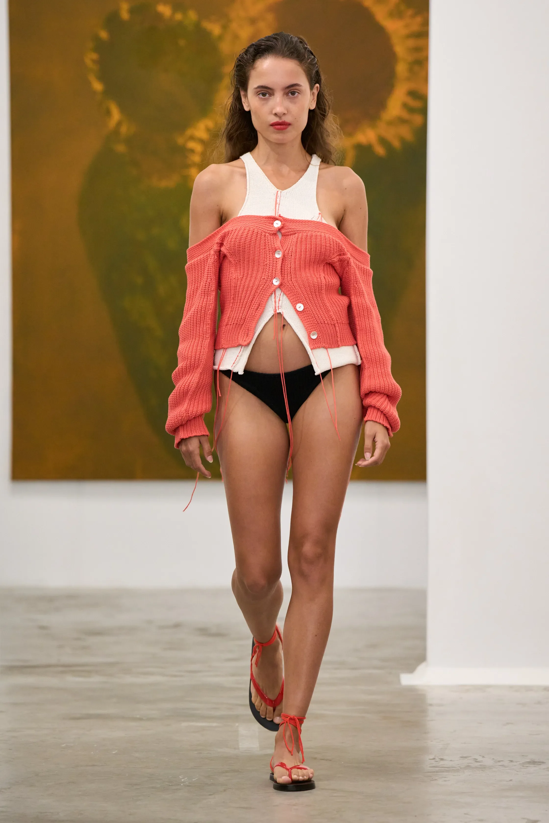
Aisling Camps familiar silhouettes returned with looser proportions and new ways of wearing, while new colors added new intrigue to otherwise clean shapes. The collection drew from Camps’ Trinidadian childhood, particularly the ease and freedom of island life, but the clothes remained grounded in her understood design language.
Several pieces appeared in multiple versions, each changed through styling and construction. A garment could shift from one look to the next simply by changing how it was worn, while loose threads and exposed seams gave the clothes a more unrestrained quality. Camps showed how each piece could continue to evolve, rather being a fixed silhouette.
Her engineering background was evident in the construction, while still displaying movement and irregularity throughout the collection. Her clean lines were interrupted by different shapes and softened through satin layers and different proportions.
The collection felt like a continuation rather than a reset. Camps took elements that have become recognizable within her work and pushed them further, using construction and styling to show how those ideas can change without losing their identity.
FFORME
review by MAREK BARTEK
all images courtesy of FFORME
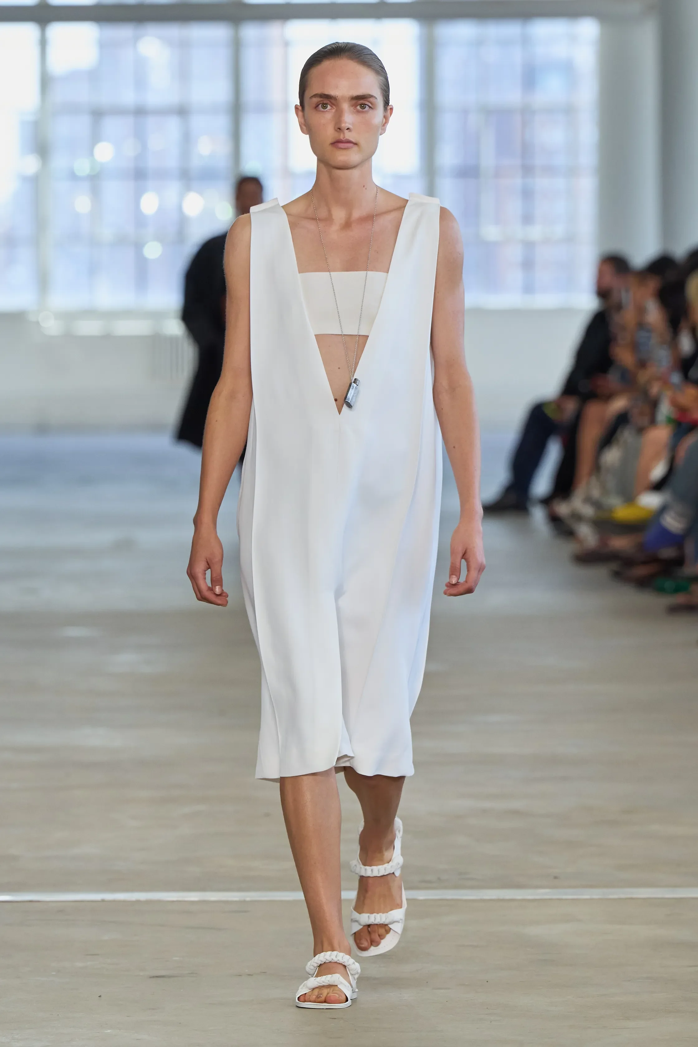
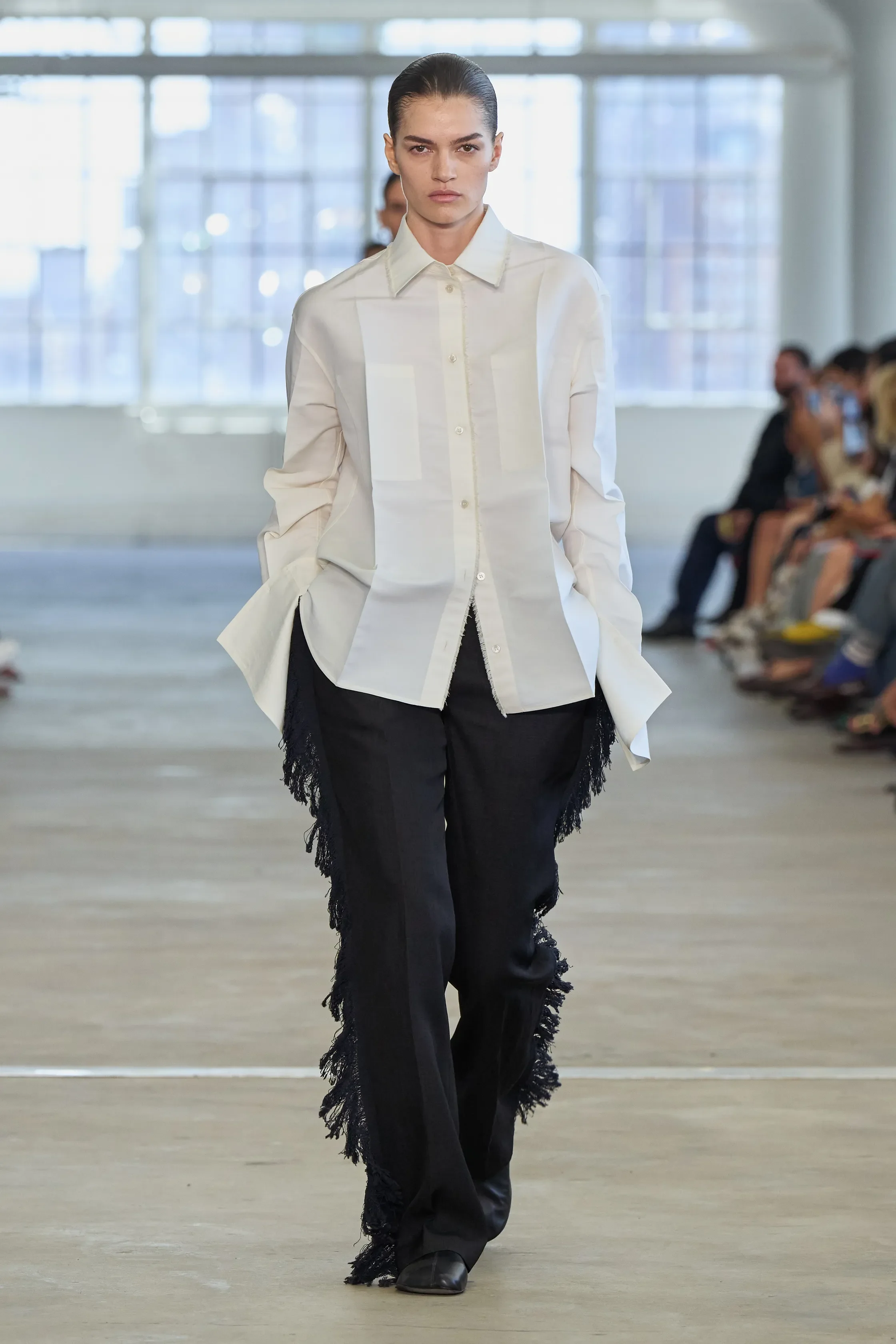
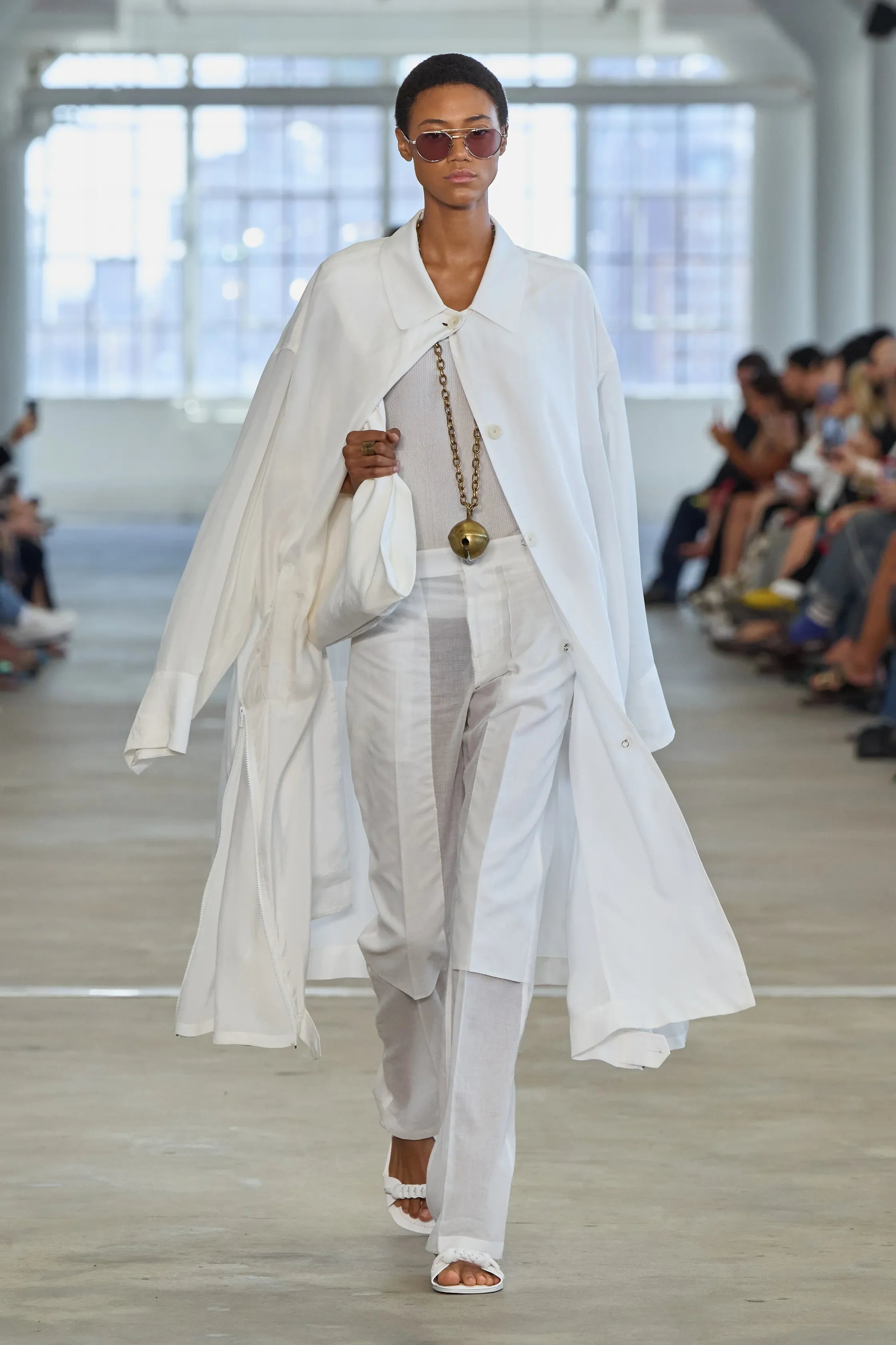
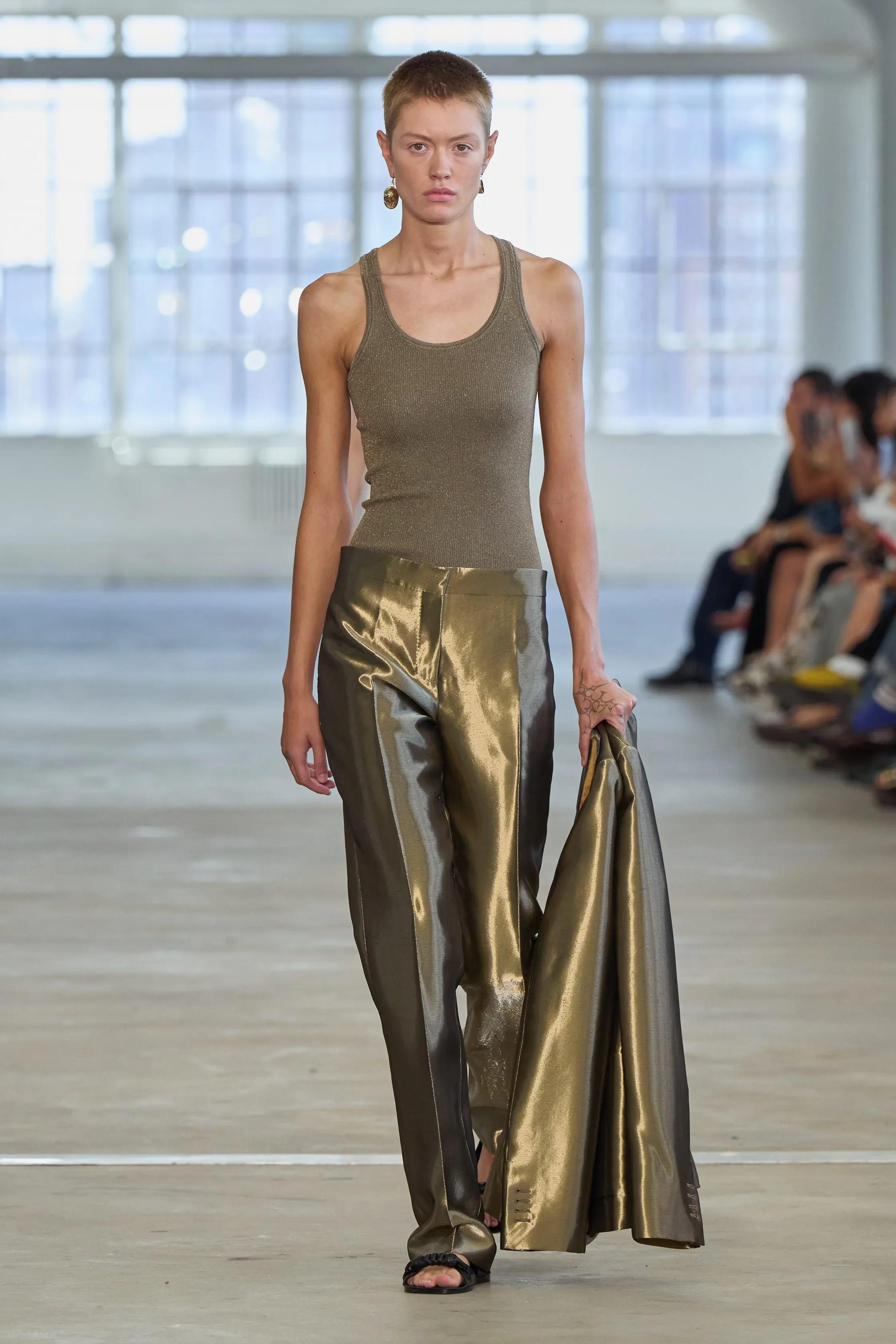
There's an ease to Frances Howie's work that can sometimes read as understated, but here it felt deliberate rather than restrained. The collection stripped things back without ever becoming clinical, relying instead on proportion, fabrication and subtle construction to create interest.
American sportswear remained the foundation, but it was interpreted through a sharper, more urban lens. Crisp shirting, elongated tunics, softly tailored trousers and fluid outerwear created a wardrobe that felt luxurious rather than overtly fashionable. The sculptural coats, particularly the airy cobalt and ivory trenches that moved almost like capes, alongside beautifully cut black leather outerwear demonstrated the label's increasingly confident hand with tailoring.
Transparency ran throughout the collection, from open-knit dresses layered over minimalist foundations to delicate netted pieces and feather-light separates that balanced sexiness with sophistication. Metallic lamé dresses introduced glamour, while fringe and delicate jewellery provided movement without distracting from the clothes themselves. Even the simplest ribbed tanks and straight-leg trousers felt elevated through thoughtful proportions and impeccable fabrication.
Every garment appeared carefully thought out, with clean lines, exceptional materials and details that revealed themselves on closer inspection. In a season filled with louder statements, Frances Howie demonstrated the confidence of knowing exactly how much is enough.
ZANKOV
review by MAREK BARTEK
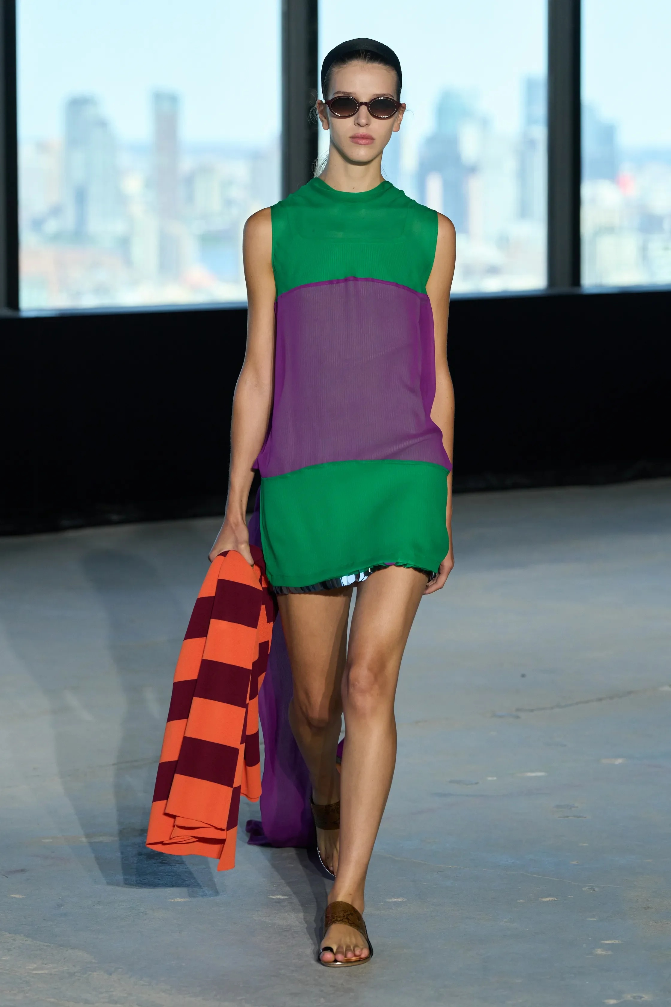
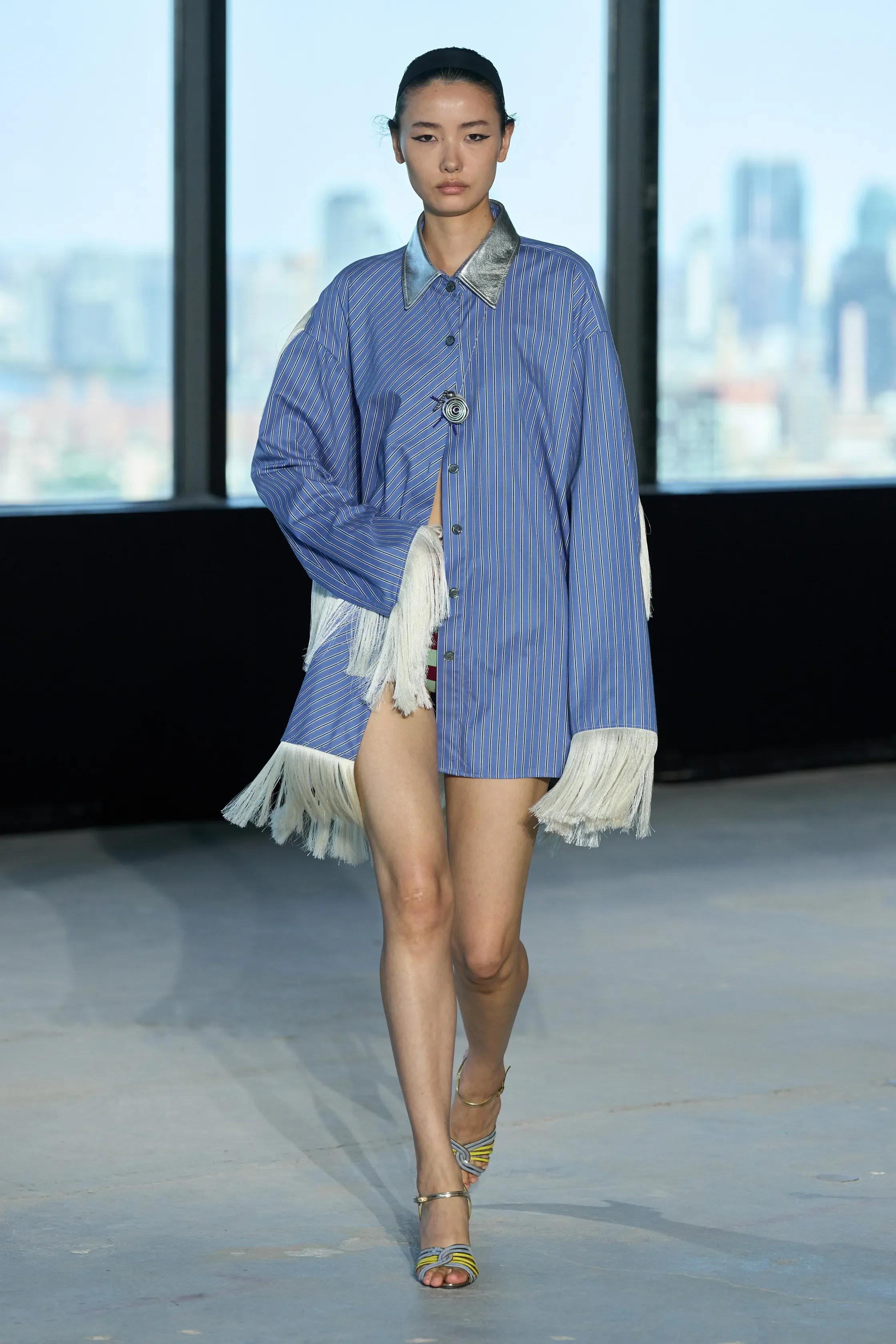
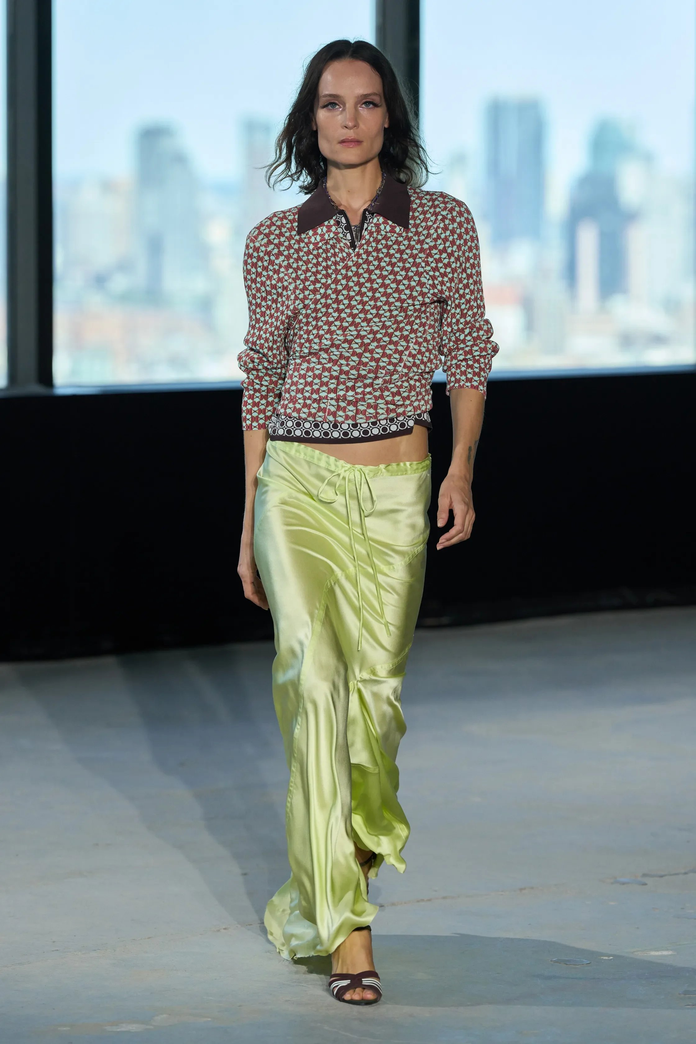
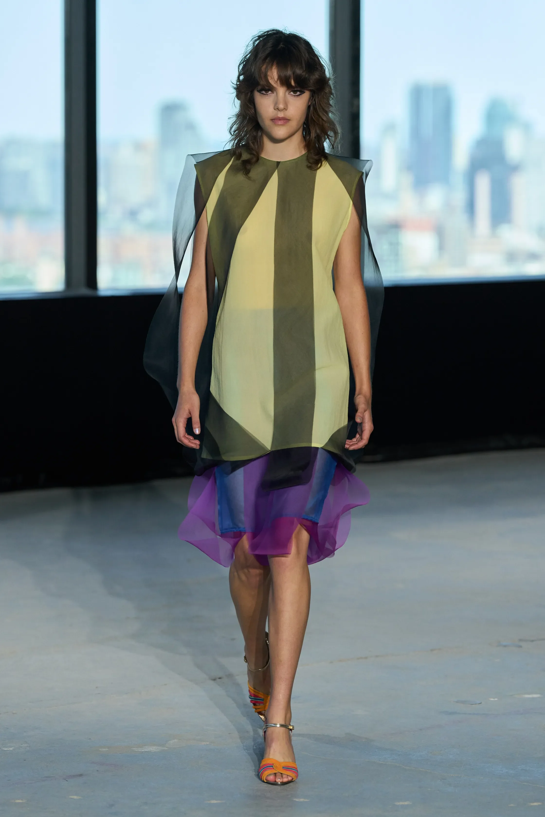
all images courtesy of ZANKOV
Henry Zankov has always understood colour better than most designers working today, and this season, he borrowed the optimism of the 1960s space age — the belief that the future could be brighter, stranger and more playful — and translated it into clothes that felt entirely contemporary.
The collection was built around unexpected combinations. Electric greens collided with purple, tomato red with fuchsia, while metallic silvers, shimmering paillettes and glossy satins caught the light throughout. Yet despite the exuberant palette, nothing felt chaotic. Zankov balanced graphic knits, translucent layers and sequinned textures with fluid skirts, relaxed tailoring and easy proportions that kept the collection grounded in everyday wearability.
Knitwear, unsurprisingly, remained the highlight. Bold striped sweaters, swirling graphic jacquards and oversized cardigans demonstrated the designer's remarkable command of colour, while sparkling paillette pieces injected a welcome sense of glamour. Metallic skirts, layered slip dresses and sheer overlays nodded to the era's fascination with futurism without feeling like costume, instead suggesting a wardrobe assembled over time by someone unafraid to experiment.
There was also a confidence to the styling that reflected the brand's growing maturity. Prints mixed with stripes, sequins sat comfortably beside athletic silhouettes, and transparent layers softened the graphic intensity of the knitwear. Even the more eccentric looks retained an ease that made them feel surprisingly approachable.
Hope is not always an easy emotion to communicate through clothing, yet Zankov managed exactly that. In a season where many designers turned to familiarity, he offered colour, personality and optimism without sacrificing sophistication. It was a collection that celebrated dressing as a form of self-expression, reminding us that the future can still look playful.
LUAR
review by ANOUK WOUDT
all images courtesy of LUAR
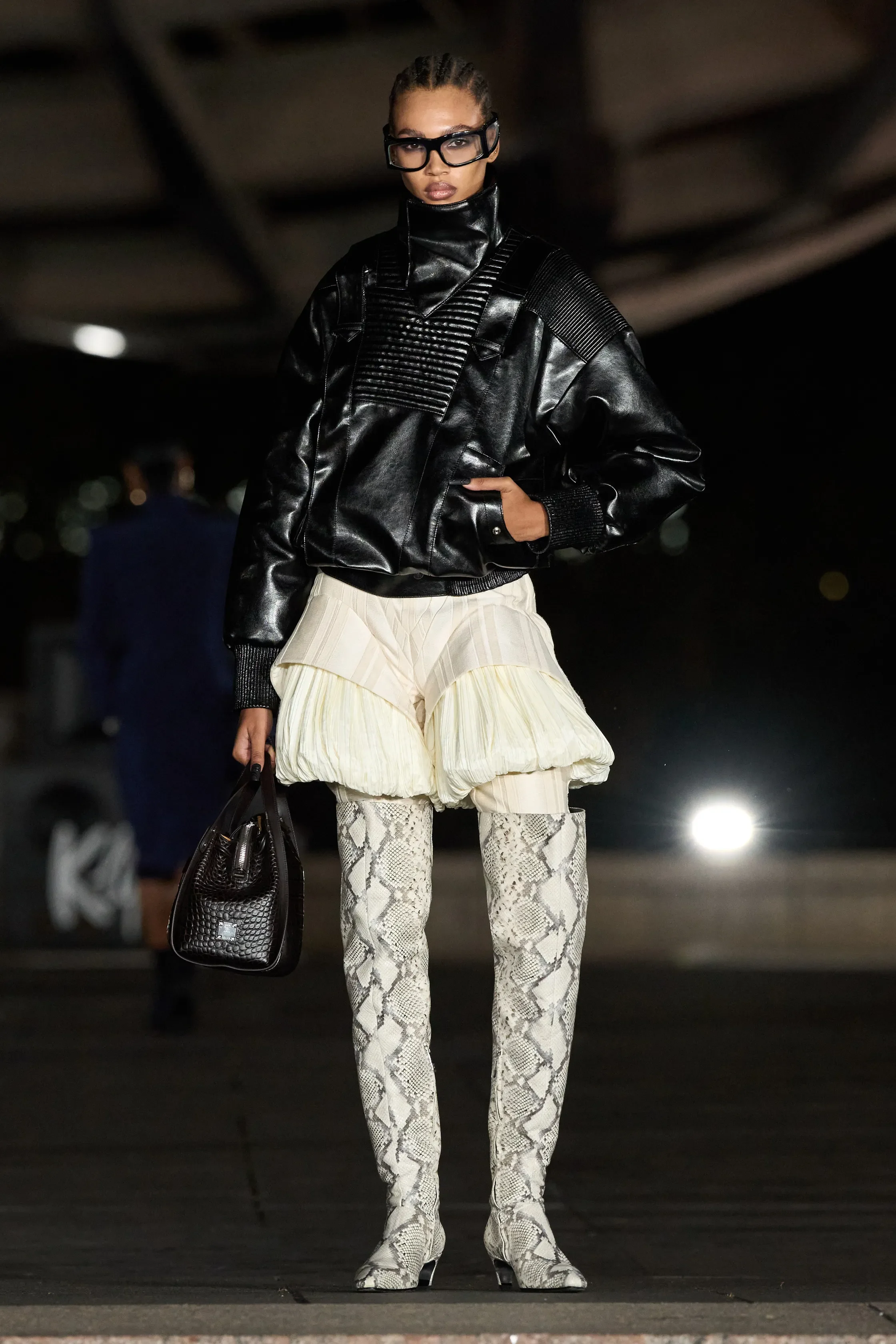
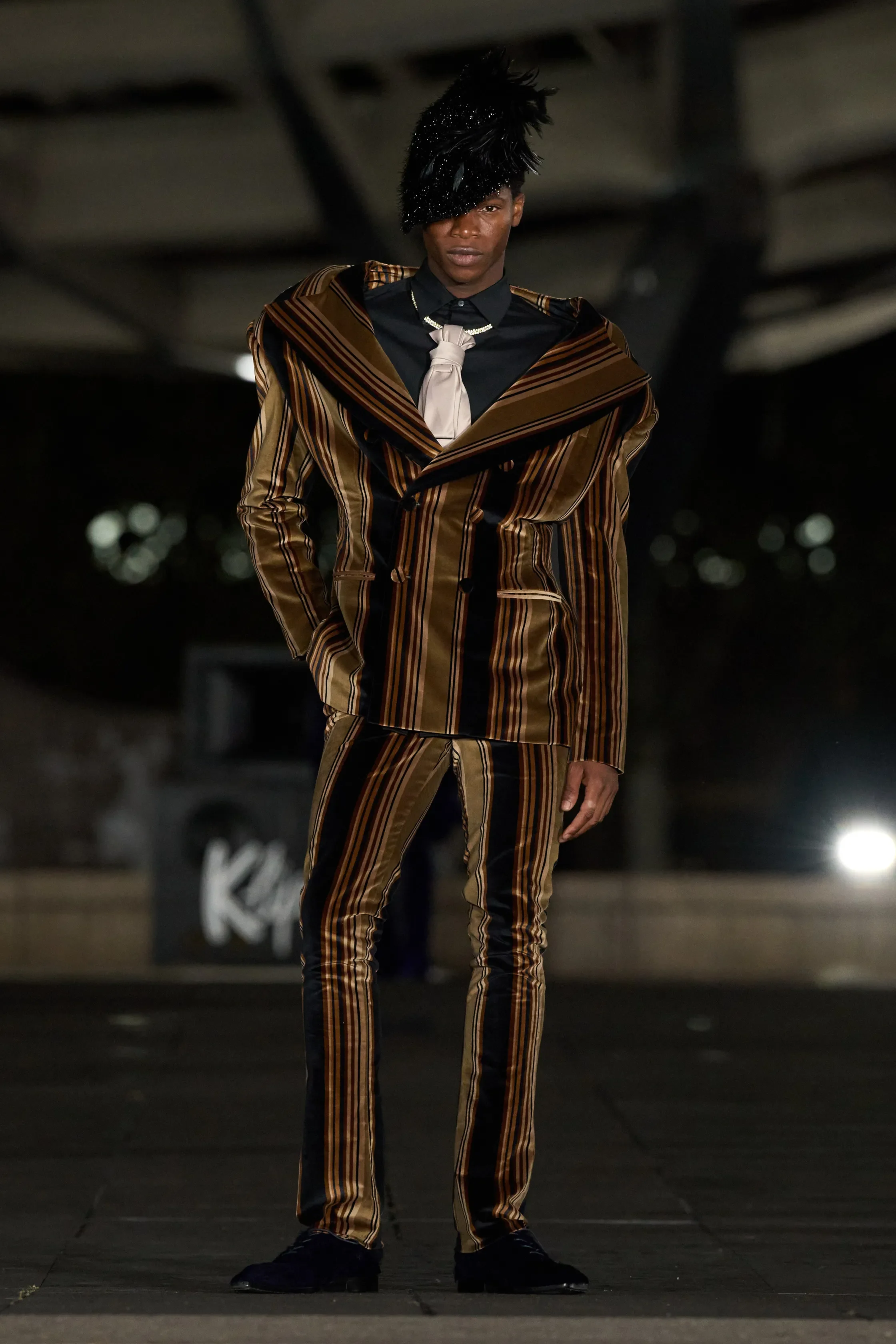
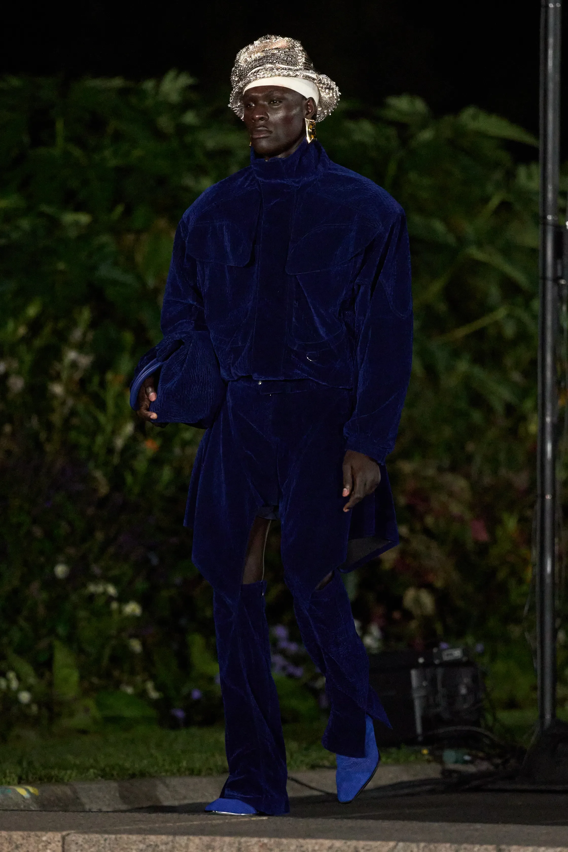
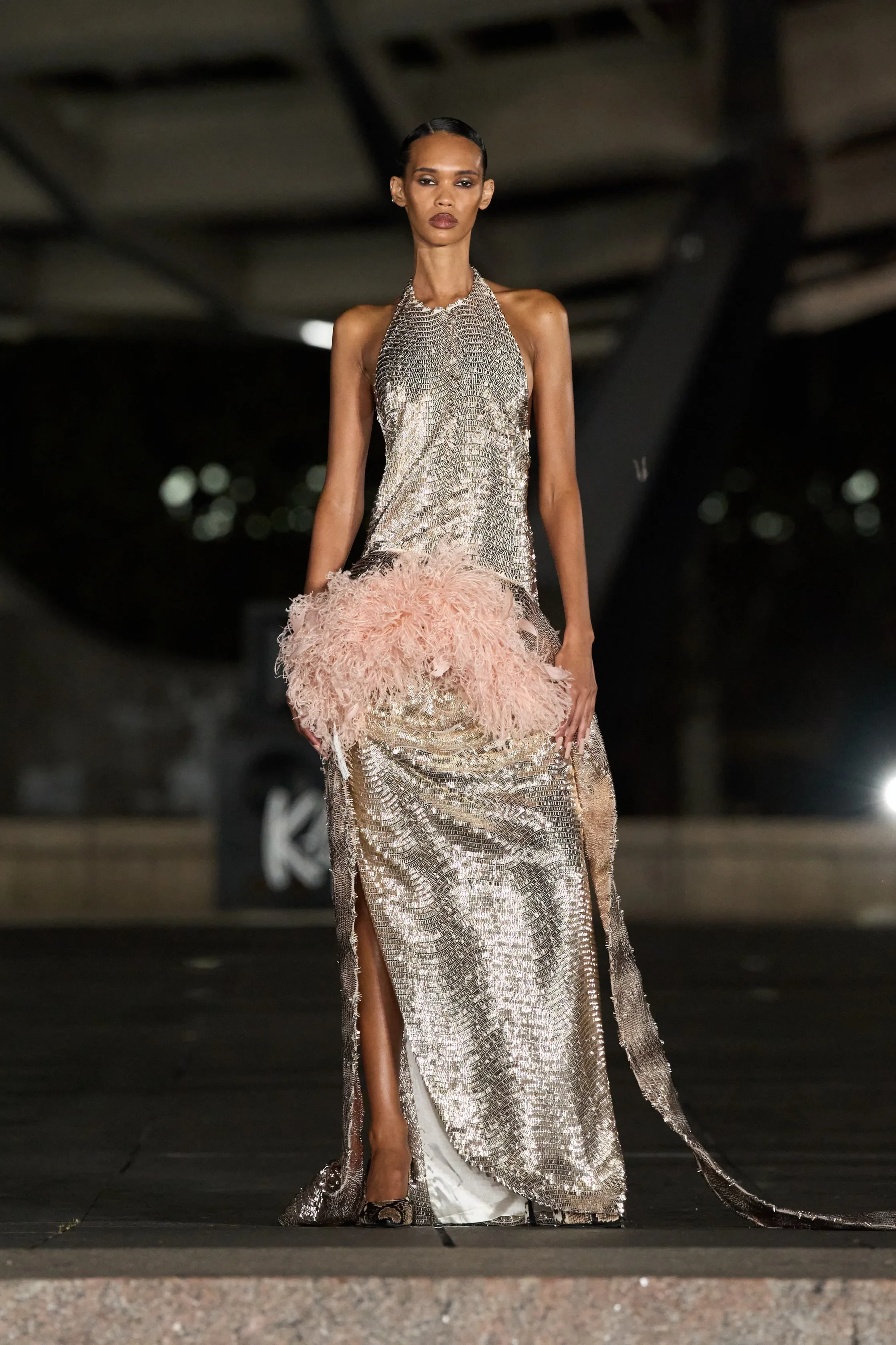
Backdropped by Corona Park’s Unisphere, Luar’s SS27 show definitely stood out as one of the most memorable moments of NYFW. One by one, each model traversed the giant metal globe’s circumference, creating a spectacle lifted straight out of a science fiction film.
Titled Christopher Street Columbus, the collection draws conflicting parallels between two very different kinds of Christopher. There’s Christopher Street, where designer Raul Lopez came of age within New York’s queer scene, a site famed for the 1969 Stonewall riots. The other is Christopher Columbus, a name practically synonymous with colonisation and America’s imposed identity. On the runway, the two collide in a rather unlikely marriage of 16th-century colonial dress and ballroom glamour.
Despite being entrenched in Raul’s identity as both a queer man and a man of Dominican-American descent, each piece maintained an air of play. Even in fitted colonial attire, the proportions felt distinctly tethered to the stylistic standards of today, with eccentric ballooned silhouettes and flashy accesorisation. Cobalt blues, canary yellows and especially sequins sent youthful zaps of energy down the runway, proving that Luar is making clothing for the younger generations.
That playfulness carried through to the hair and makeup styling. Models came strutting with tight-strung roller curls and powder-white faces, their looks finished with pencil-thin brows and clownish dots. A style oddly reflective of the Roaring ‘20s, though within the context of the collection, it retrospectively seems less flapper and more Founding Father meets drag.
Ending very fittingly with Nas’ If I Ruled The World, the show’s final walk turned Flushing into Luar’s world – a fitting tribute to Raul’s own Queensian roots.