
PARIS FASHION WEEK SPRING/SUMMER 2027: DAY 7
NICCOLÒ PASQUALETTI
review by MAGDALENA ROE
all images courtesy of NICCOLÒ PASQUALETTI
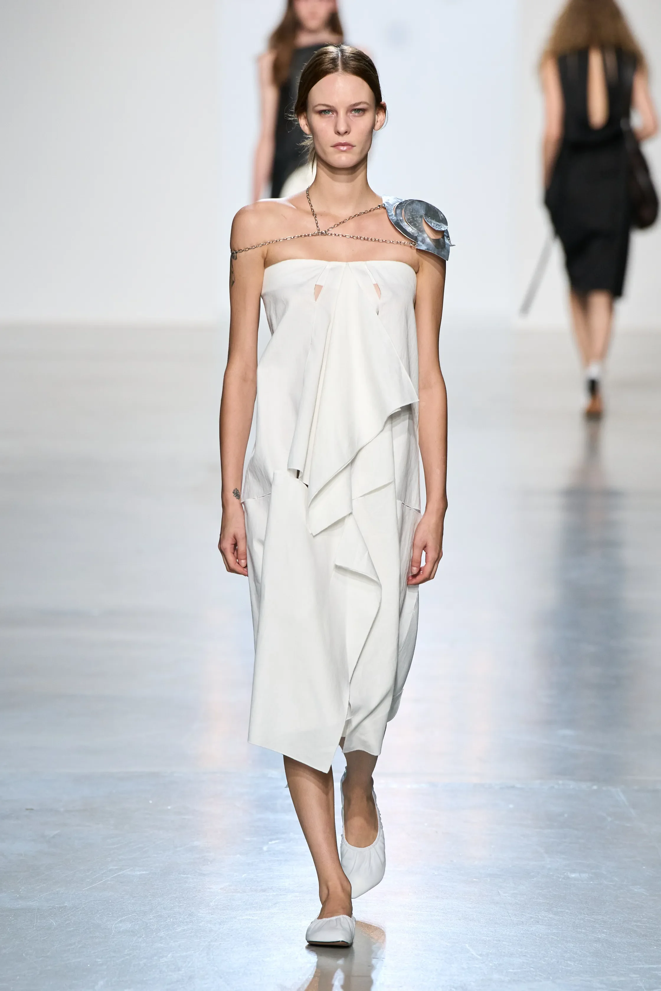
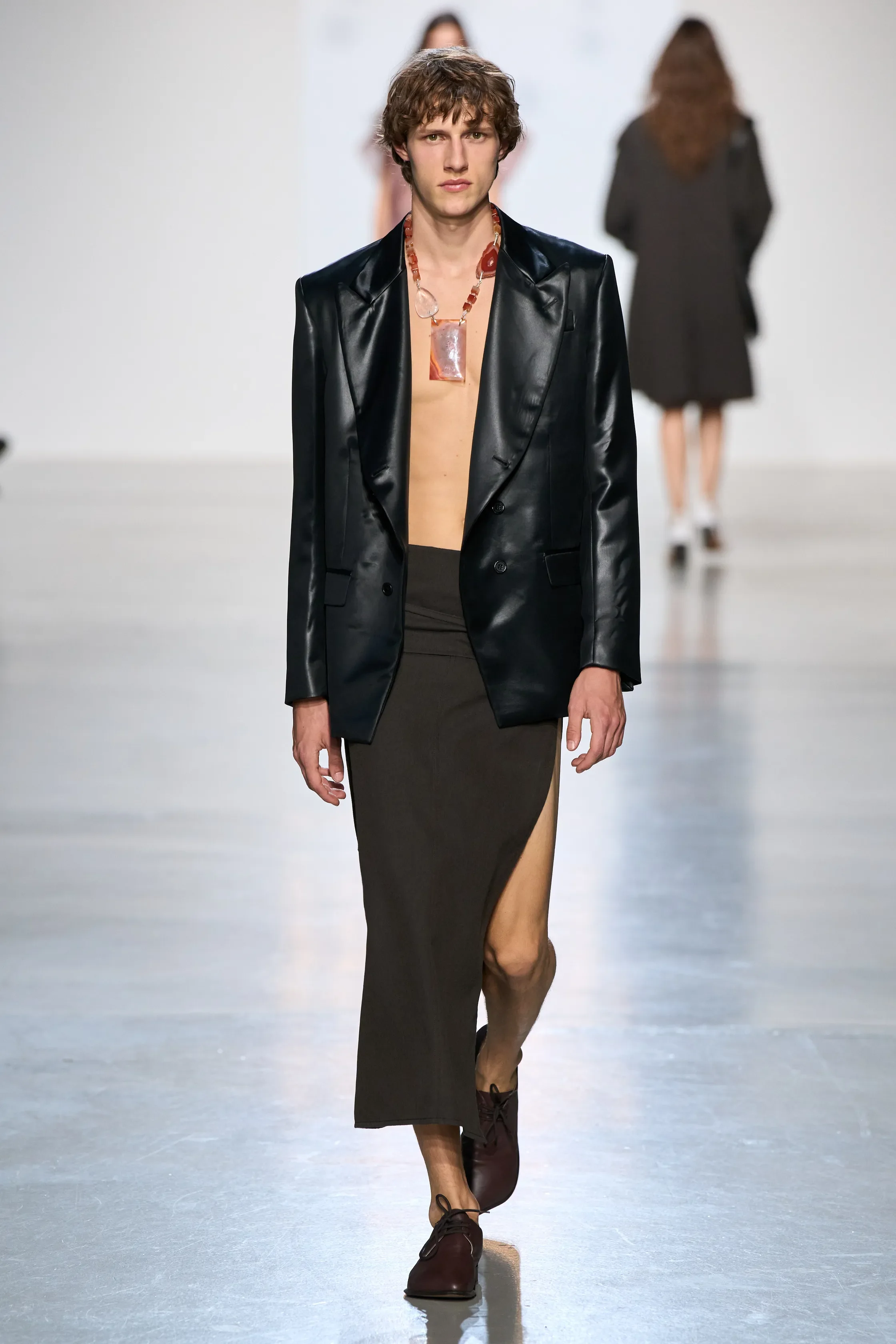
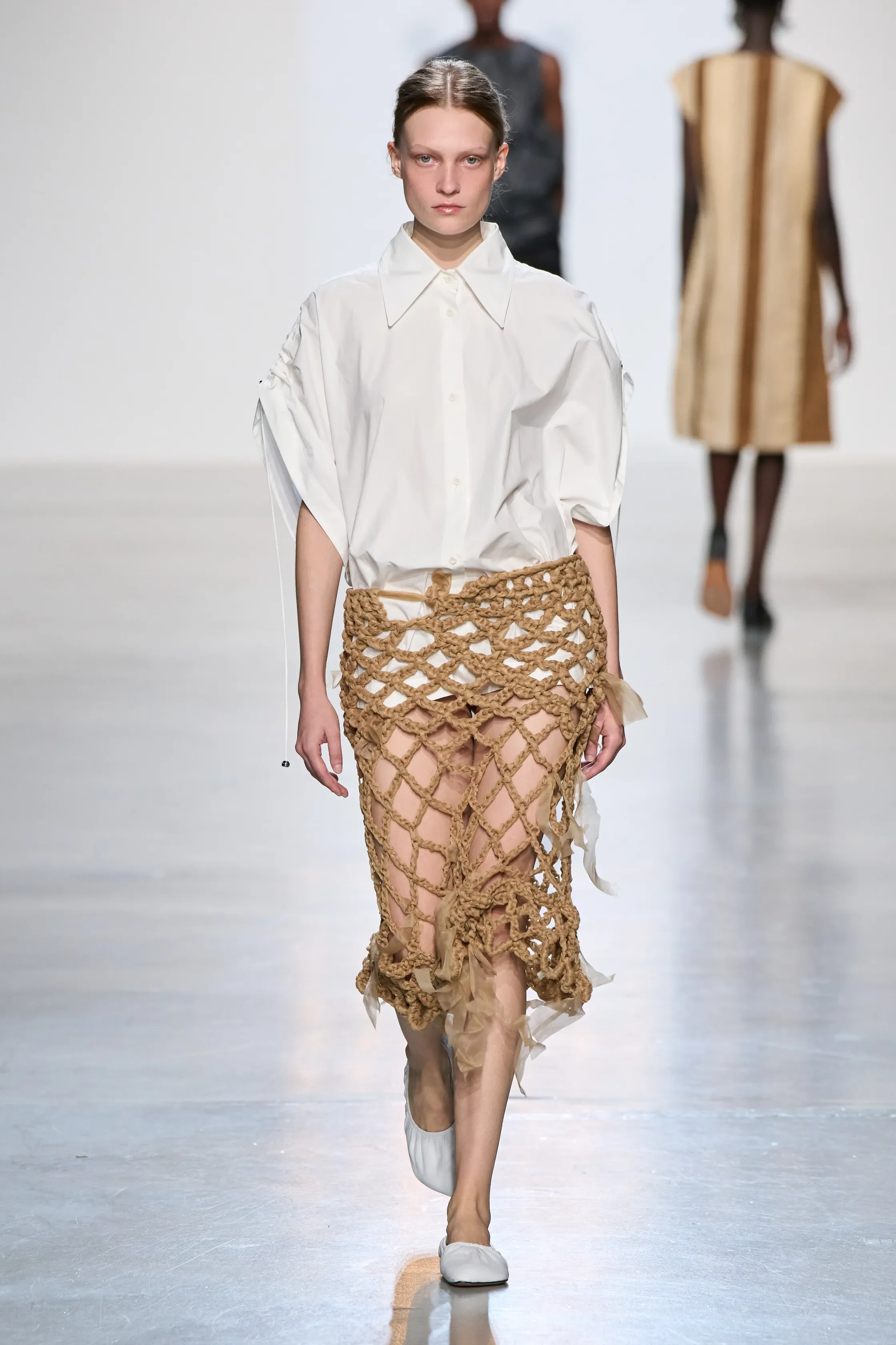
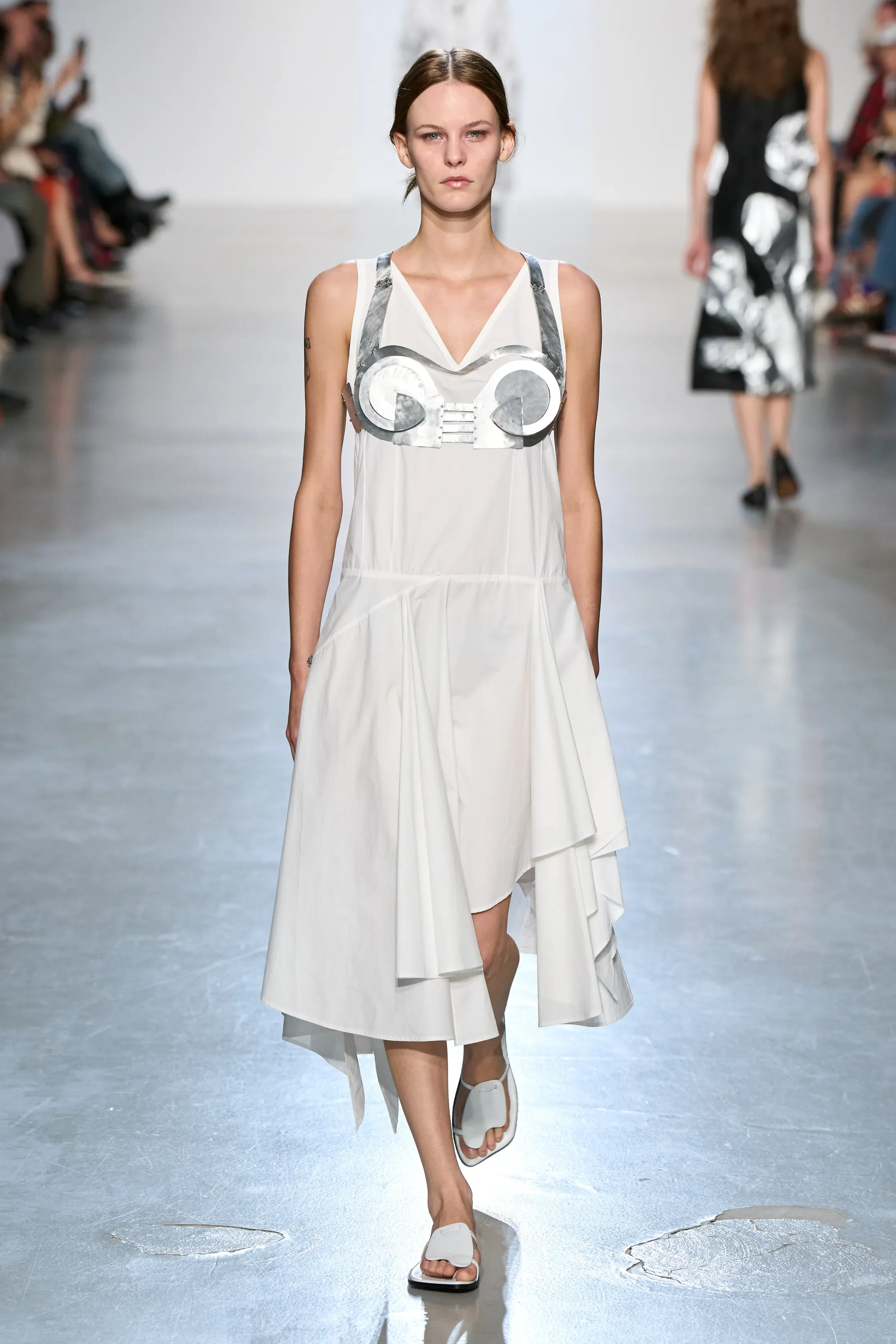
A garment only becomes itself once there is a body inside it. For Spring/Summer 2027, Niccolò Pasqualetti explored the space between abstraction and the physical self, treating clothes not as finished objects but as forms waiting to be transformed by whoever wears them.
Inspired by Lygia Clark’s relational objects, pieces began with deceptively simple geometries. Laid flat, they existed as triangles, squares and linear cuts; on the body, those shapes shifted, folded and surrendered to human contours. It was an exercise in letting precision become instinctive, allowing the wearer to complete what the designer had started.
Material experimentation pushed that tension further. Cords pulled cotton poplin into unexpected volumes, silk was laminated until it resembled crumpled silver foil, and tulle was twisted and knotted into strange, sculptural forms. Fluid gauze and satin met raw linen and denim, weightless viscose sat against tactile suede, while loose mesh was layered beneath structured gabardine. Contrasts that shouldn't necessarily belong together somehow found their balance.
Even the accessories became sculptures of their own. Sheets of metal were cut and bent around the body, while luminous gemstones were bound within intricate metallic structures, blurring the distinction between jewellery, object and garment.
Yet for all its conceptual thinking, the collection ultimately came back to something deeply human. Pasqualetti wasn't prescribing an identity but leaving space for one to emerge. The geometry may have begun on the cutting table, but it was the body that gave it meaning.
MIU MIU
review by MAREK BARTEK
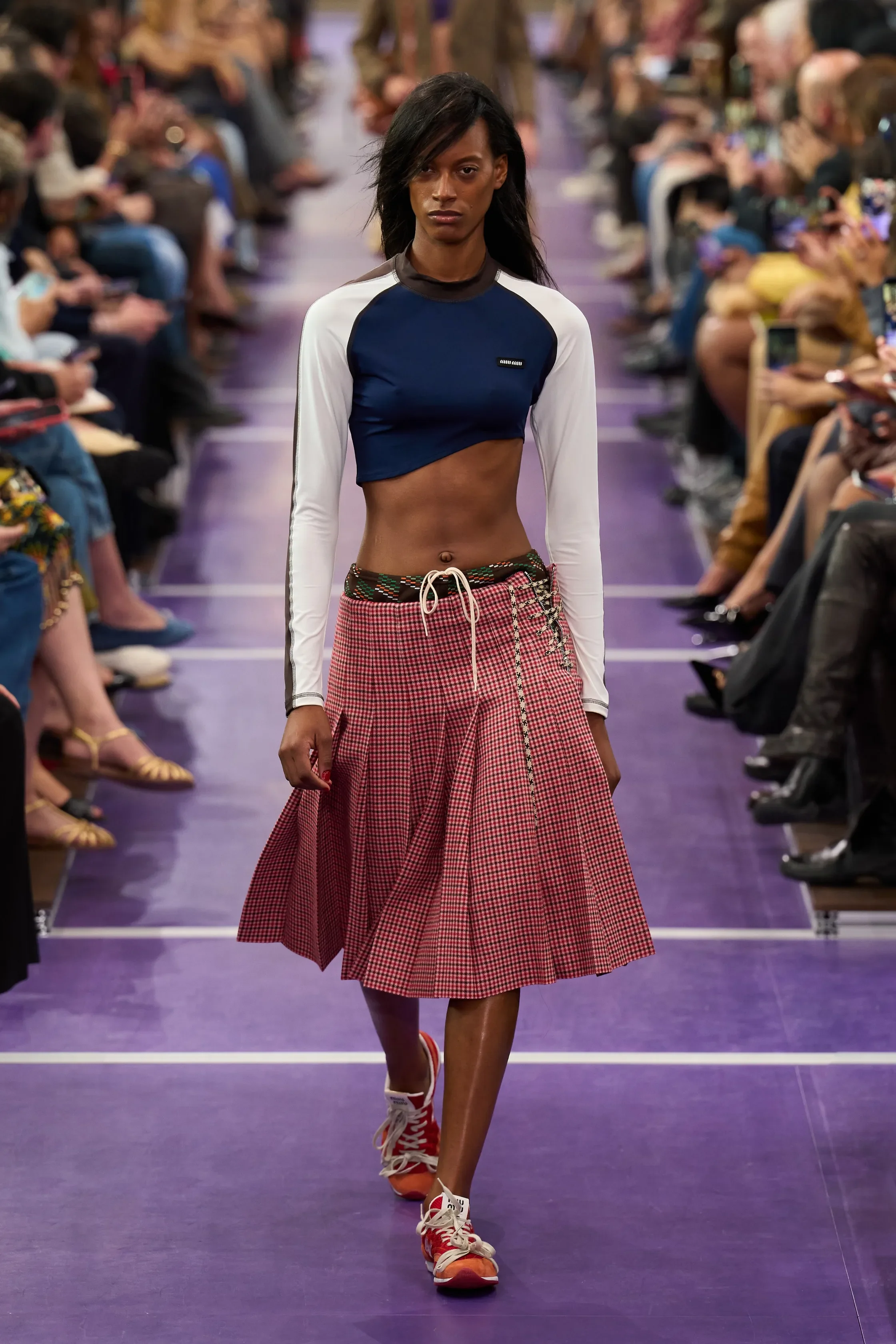
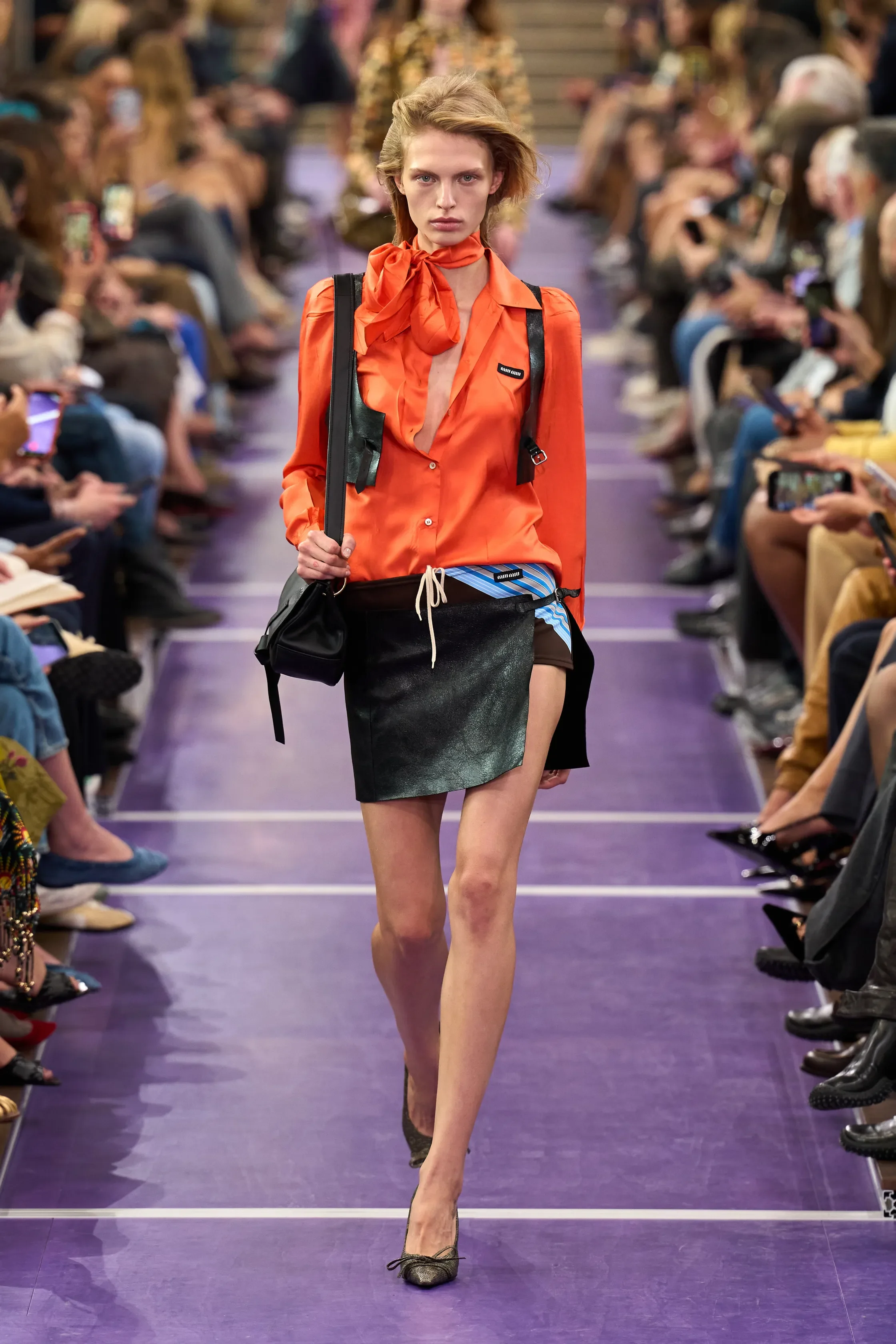
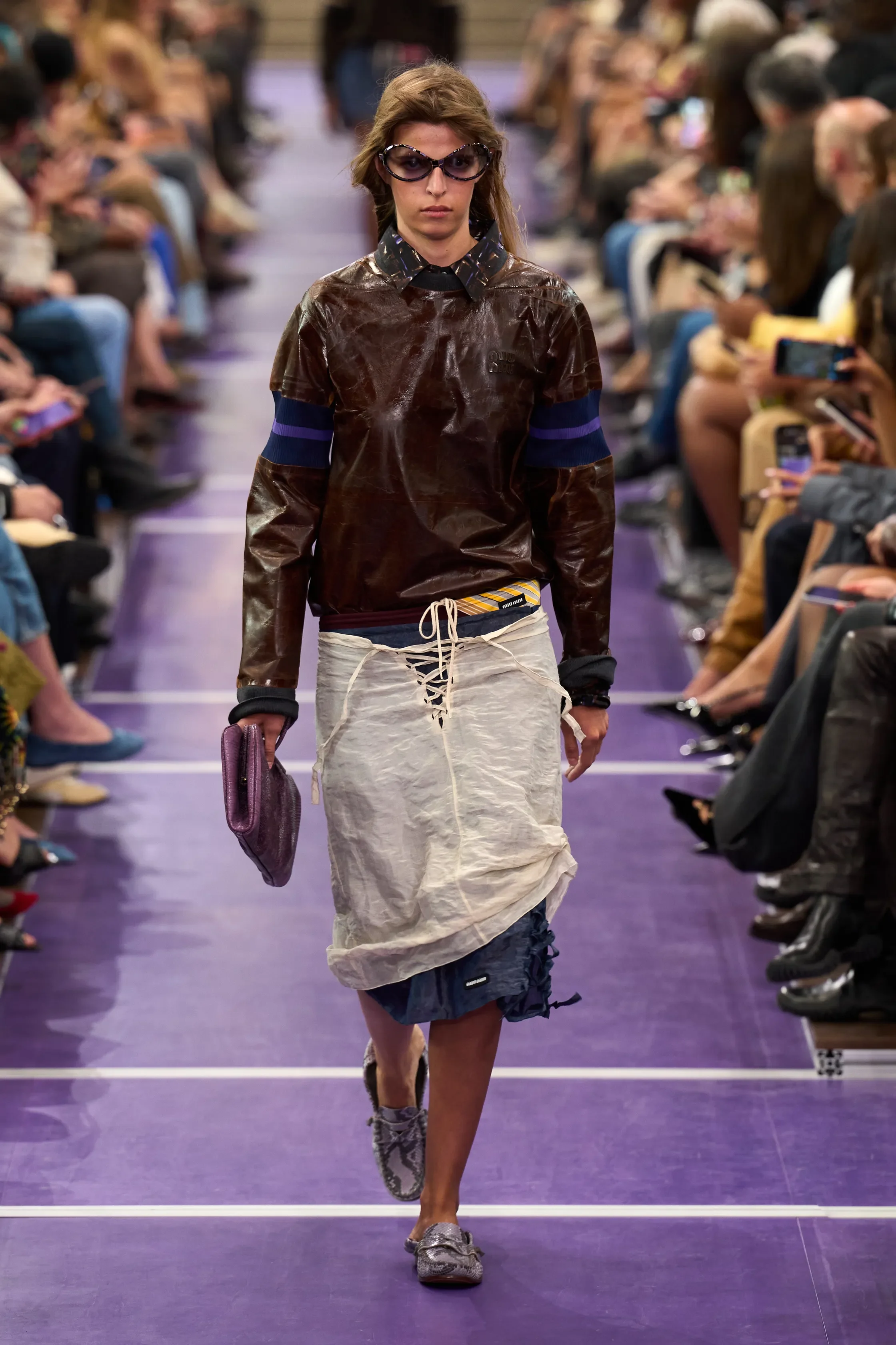
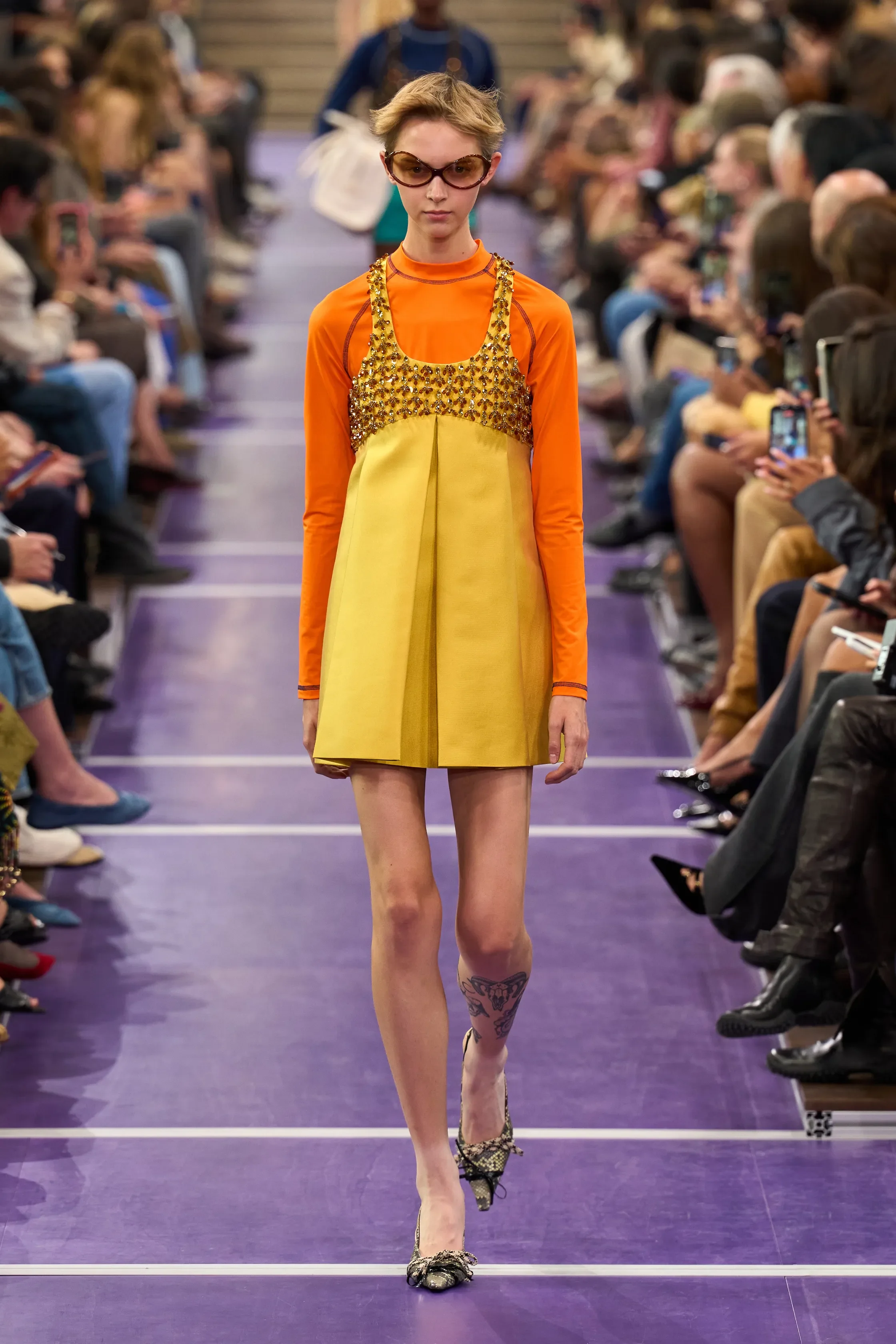
all images courtesy of MIU MIU
Apparently, all the cool girls have gym class this summer. They’re not necessarily working out, though. They’re mostly hanging around, looking hot and figuring out increasingly questionable ways to tie their clothes together.
Miu Miu SS27 went unexpectedly sporty, beginning with knee-length checked skirts and blazers before stripping down into cropped jerseys, tiny running shorts, tracksuits and swimwear. Skirts that could easily read conservative were worn with completely exposed stomachs, tailoring was worn over sportswear, and micro shorts peeked from underneath layers of clothes. Jeans were laced together at the fly with what looked like shoelaces, turning something completely ordinary into something oddly sexy.
But it wouldn’t be Miuccia Prada if we stopped there. ’60s prints clashed against checks, leather and technical sportswear and dawstrings dangled everywhere. Sparkly bras appeared over T-shirts and underneath jackets, crumpled — almost scrunched-up — dresses brought a very particular kind of girliness against all that athleticism, while skirts were layered over shorts, and then sometimes under yet another skirt. Look 56 seemed to contain about three outfits at once.
If this was an attempt to create the same excitement sport fans experience while watching a match, Miu Miu just earned that gold medal. There was tension of aesthetics that kept resurfacing and alternating, and it was incredibly fun to watch. Nothing remained purely sporty, preppy, sexy or feminine for very long. A tracksuit got a blazer. Running shorts got crystals. A tiny skirt got thrown over even tinier shorts. And those micro shorts were fucking hot — a brand new motivation to hit the gym again.
Miu Miu has always been that forever-girl dreamland. Where Prada can feel like Miuccia interrogating what clothes mean, Miu Miu often feels closer to the pleasure of simply getting dressed and seeing what happens. SS27 had that spirit in abundance. It was fresh, messy, sporty, girly and a little bit ridiculous. Basically, gym class — if everyone in it were a Miu Miu girl.
PALOMA WOOL
review by TIANA DE HASETH
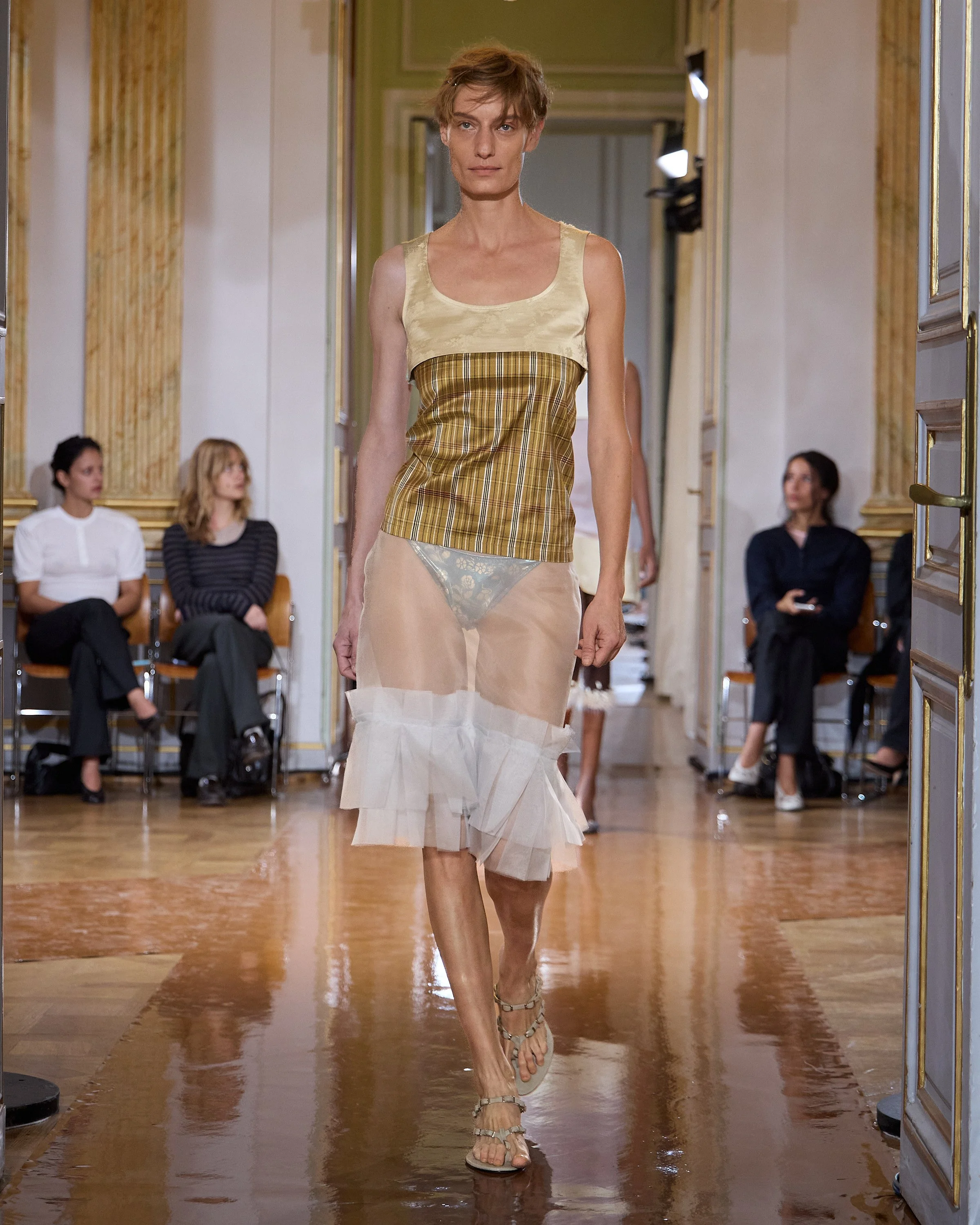
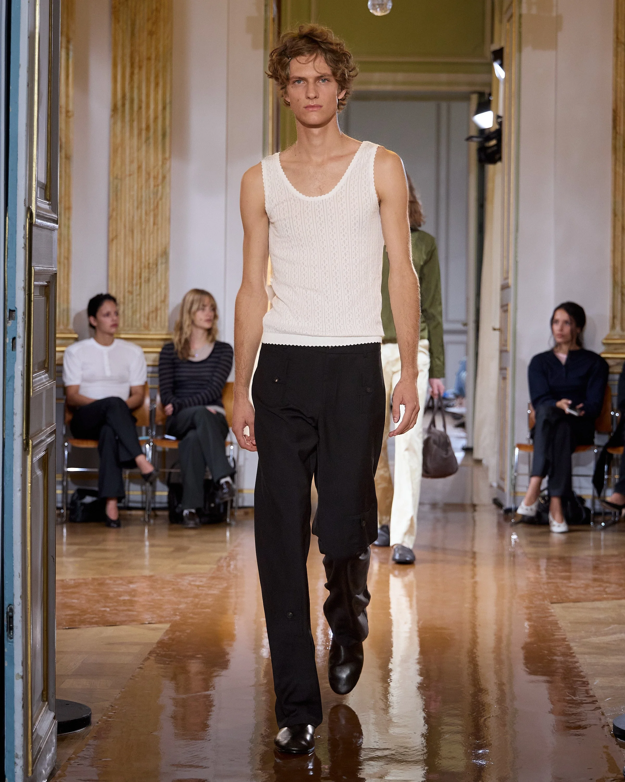
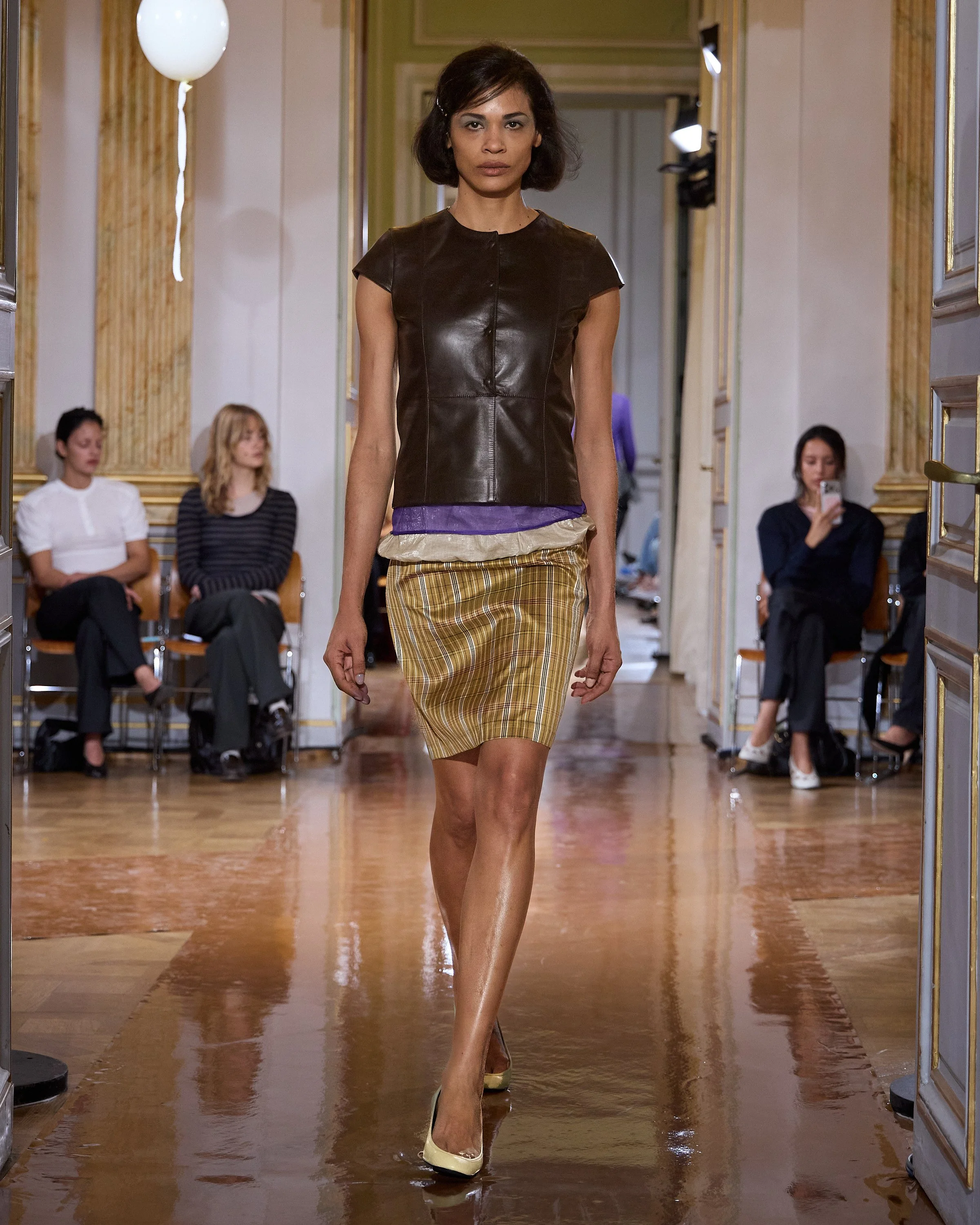
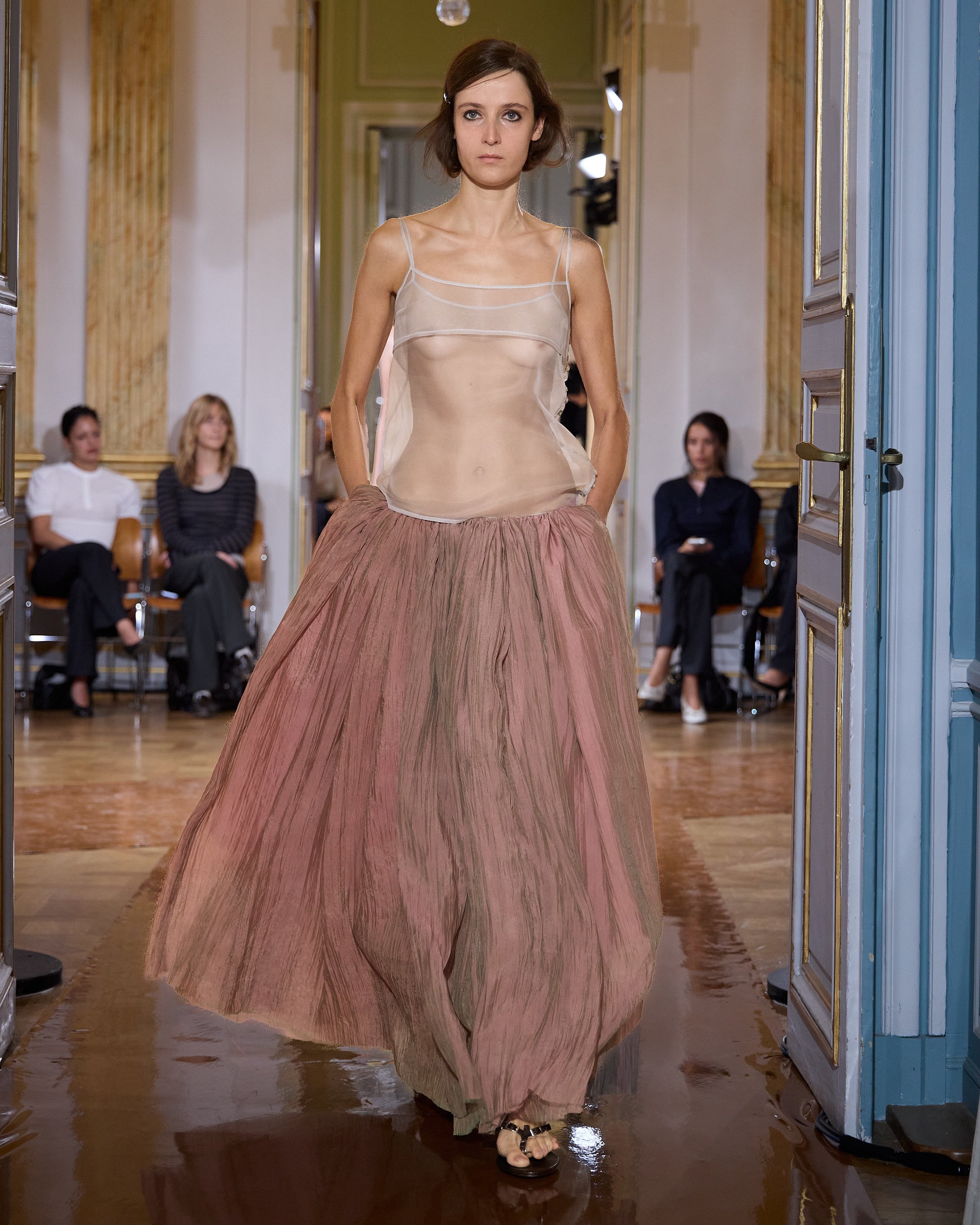
all images courtesy of PALOMA WOOL
Golden Jacquard and hecked Silk were the only two fabrics Paloma Wool needed for the Spring Summer 2027 collection. Presented at Maison de la Chimie, beneath a ceiling covered with white balloons, the show openeden playing “Margot Tenenbaum” by Brat Star, who was a major source of inspiration for the collection and its creative process.
The collection was built entirely around these two fabrics, which appeared in a wide range of silhouettes and constructions. Each look brought something new despite using the same textiles. Horizontal cuts, cropped tops, maxi dresses, skirts, sheer layers, and suspended skirts from the waist that created playful porportions.
The colours made the lineup feel like a party: green, purple, black, grey, mustard, golden yellow, off-white, with striped and checked prints that created a fun palette that made the translucent styles stand out. And of course, the details were the cherry on top of the Paloma Wool runway show. Lyrics from Brat star were engraved into brown bags and low-cut pumps, with a silver toe ring shining, while she also walked the runway.
This collection was for those who love playing with their wardrobe, repeating outfits, and mixing, matching, and reusing — proving that all it takes is two fabrics.
VALENTINO
review by MAREK BARTEK
all images courtesy of VALENTINO
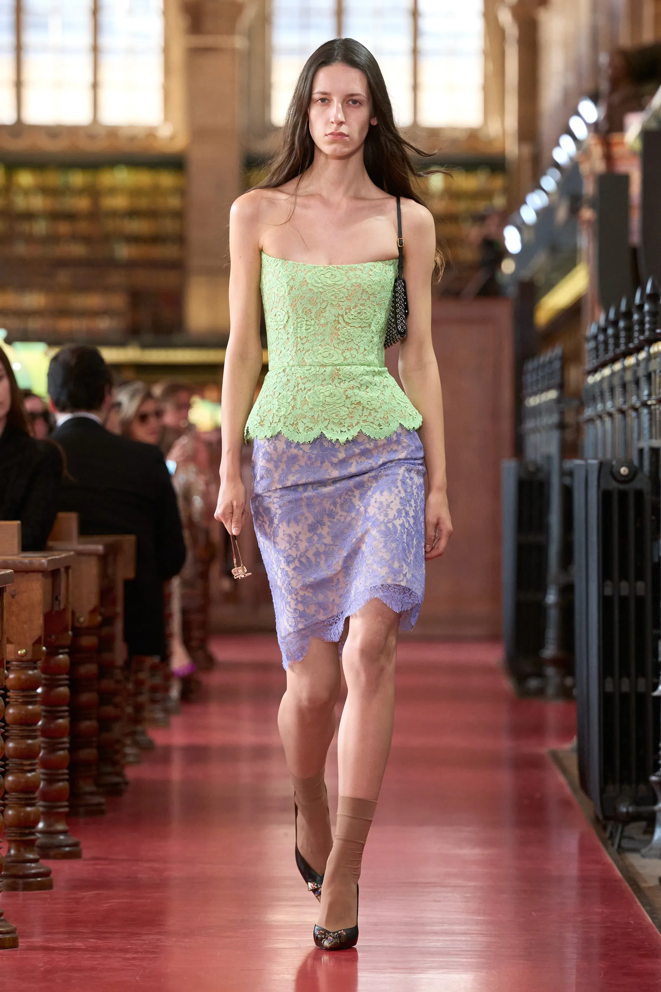
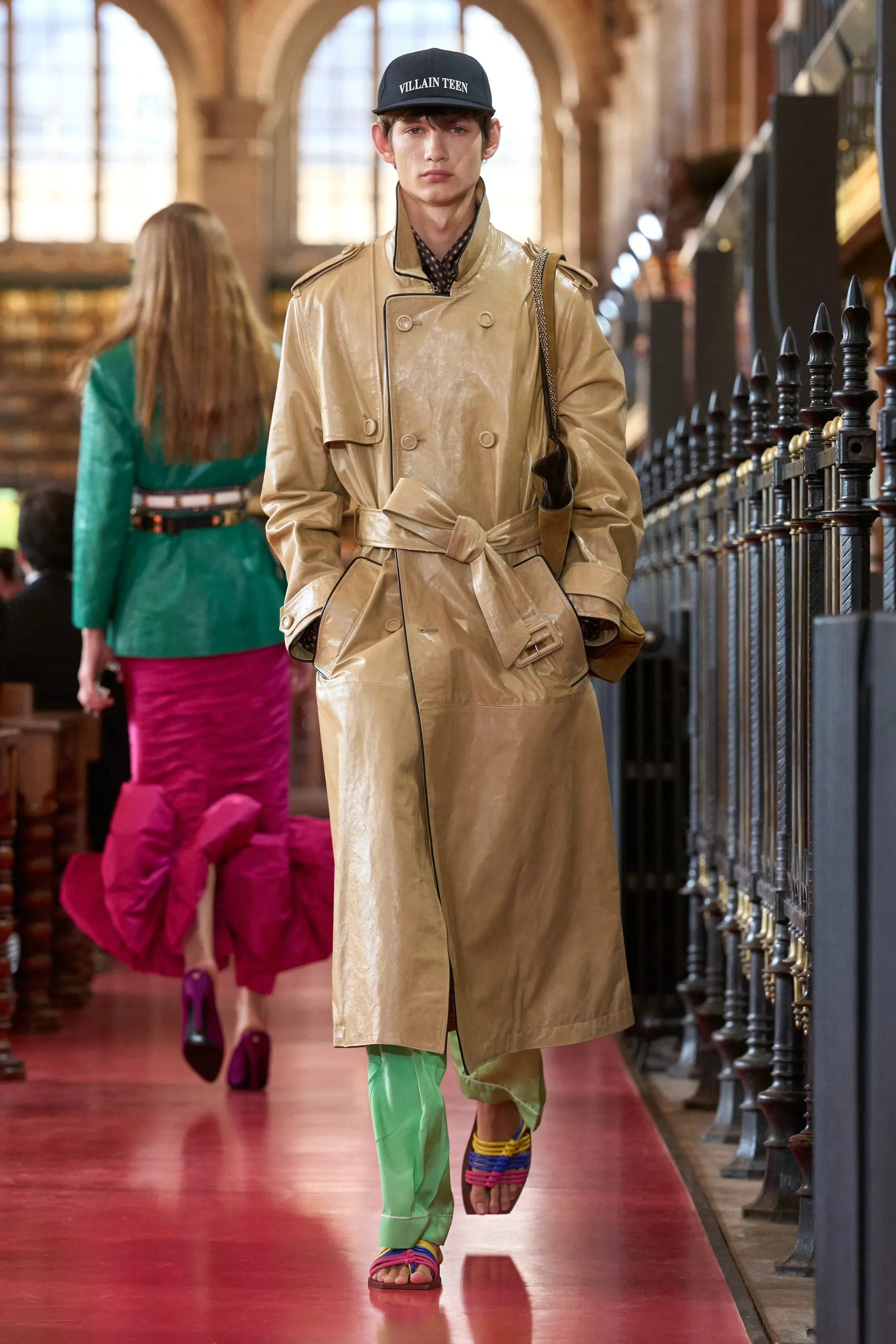
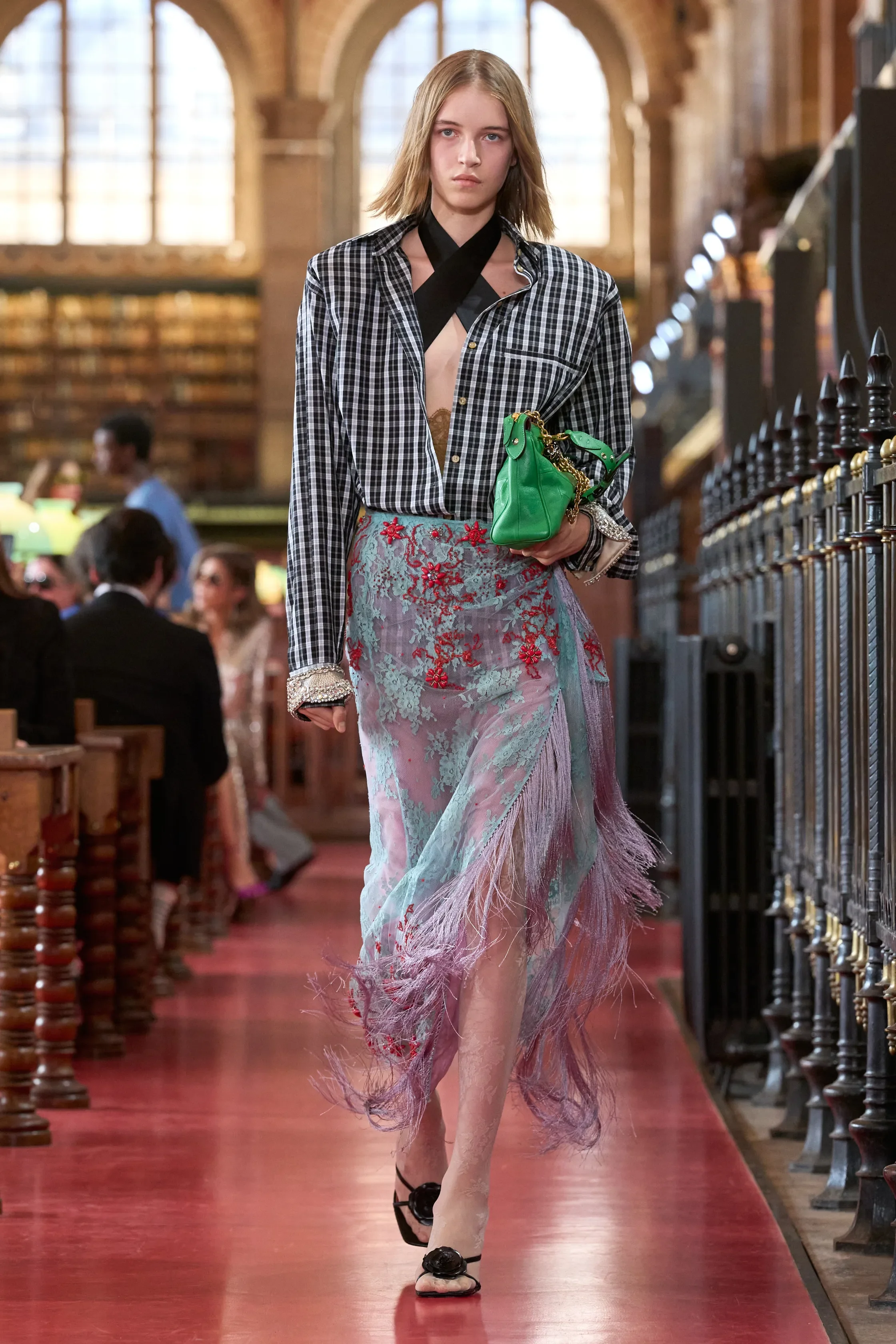
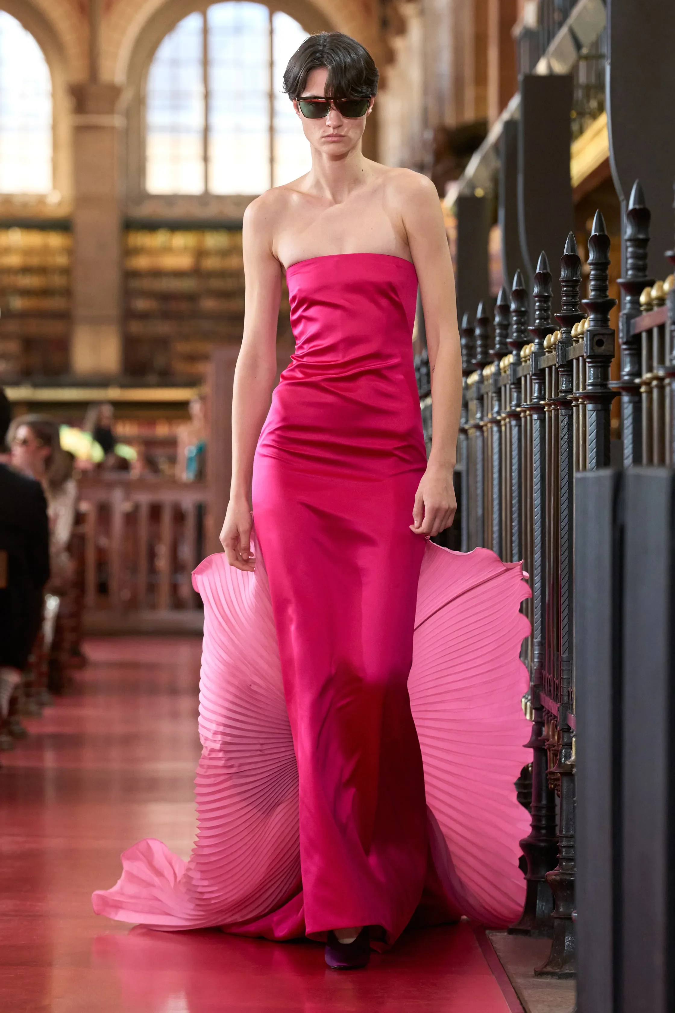
Calling all bookworms: Alessandro Michele wants us to expand our libraries (and our wardrobes). For Valentino SS27, guests arriving at Paris’s Bibliothèque Sainte-Geneviève were asked to bring a book of their own, introducing Michele’s idea of the “anti-library”: a collection whose value lies not in what has already been read, but in everything still waiting to be discovered. Clothes, he argues, can work the same way. Even those we never wear can represent lives we might have lived and possibilities still left open.
For such a cerebral starting point, the clothes were surprisingly straightforward — or at least straightforward by Michele standards. The opening looks were almost shockingly sober: jewel-toned bustiers paired with knee-length skirts, chiffon against satin, pink against yellow, green against turquoise. Rather than his usual avalanche of competing references, colours initially came in blocks and textures did much of the talking.
Slowly, the Michele-isms crept back in, and we were served an array of feathers, lace, embroidery, fringe, florals and clashing prints. Tailoring became increasingly eccentric and baseball caps interrupted otherwise fabulously dressed-up looks. Menswear was noticeably more casual, with roomy trousers, shirts worn loose and tailoring thrown together, mimicking the ease of someone who had simply grabbed whatever was nearby.
Yet even once the volume was turned back up, something remained unusually subdued. A stretch of predominantly black eveningwear towards the end felt particularly telling. Dramatic bows, plunging necklines, ruffles and jewellery provided the theatre without requiring Michele’s usual visual overload.
Five ready-to-wear collections in, Michele seems increasingly comfortable allowing Valentino’s glamour to breathe rather than covering every available centimetre with an idea. It is still colourful, tactile, eccentric and unmistakably him, just tightly edited. Judging by the anti-library, maybe that’s fitting — not every possibility has to be used at once.
JEAN PAUL GAULTIER
review by NIA TOPALOVA
all images courtesy of JEAN PAUL GAULTIER
At this point, isn’t it Jean Paul Lantink? If you, too, discovered the fashion world for the very first time through the masterpieces that were Jean Paul Gaultier’s 90s runway shows, watched on an old laptop in the solitude of your childhood bedroom, then it could only be assumed that, you too, might be in a bit of a somber period this autumn.
It is worth reminding ourselves that Gaultier himself also started his brand at a time when many were restrained to immediately accept his rebellion and sense of provocation. The difference is, perhaps, Gautier spent decades dissecting the ideas of “good taste”, understanding them intimately before he began to dismantle them. He too played with the proportions of the female form, but in a way of celebrating it.
Fine art is not too different of a concept here; before Picasso could completely shatter the shape of a cow, he studied its anatomy precisely and faultlessly. There are many contemporary artists and designers who seem to believe that they can take what others have arrived at after years of study, research, failure, and experimentation, without having to undertake the journey themselves. In fact, undeniably, they are allowed to arrive at this kind of conclusion without showing their working. The only thing is, it tends to show.
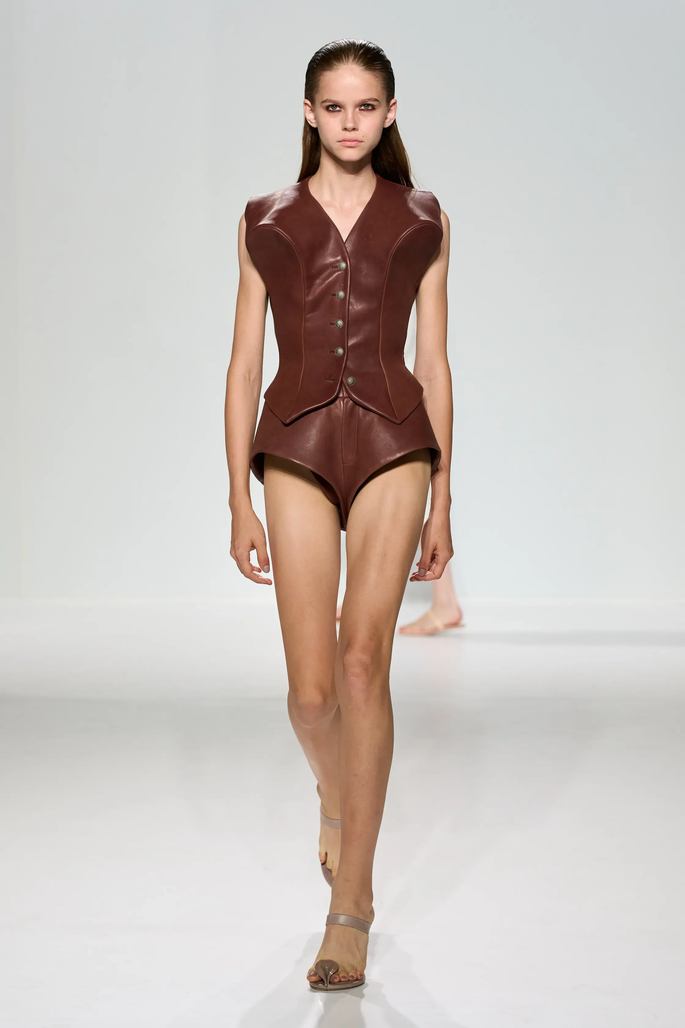
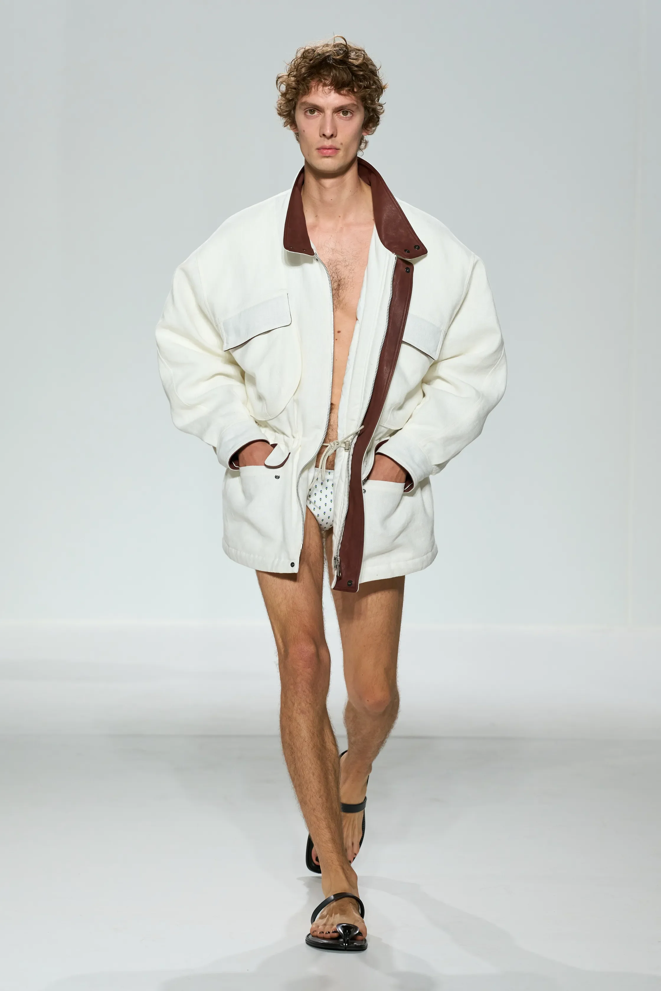
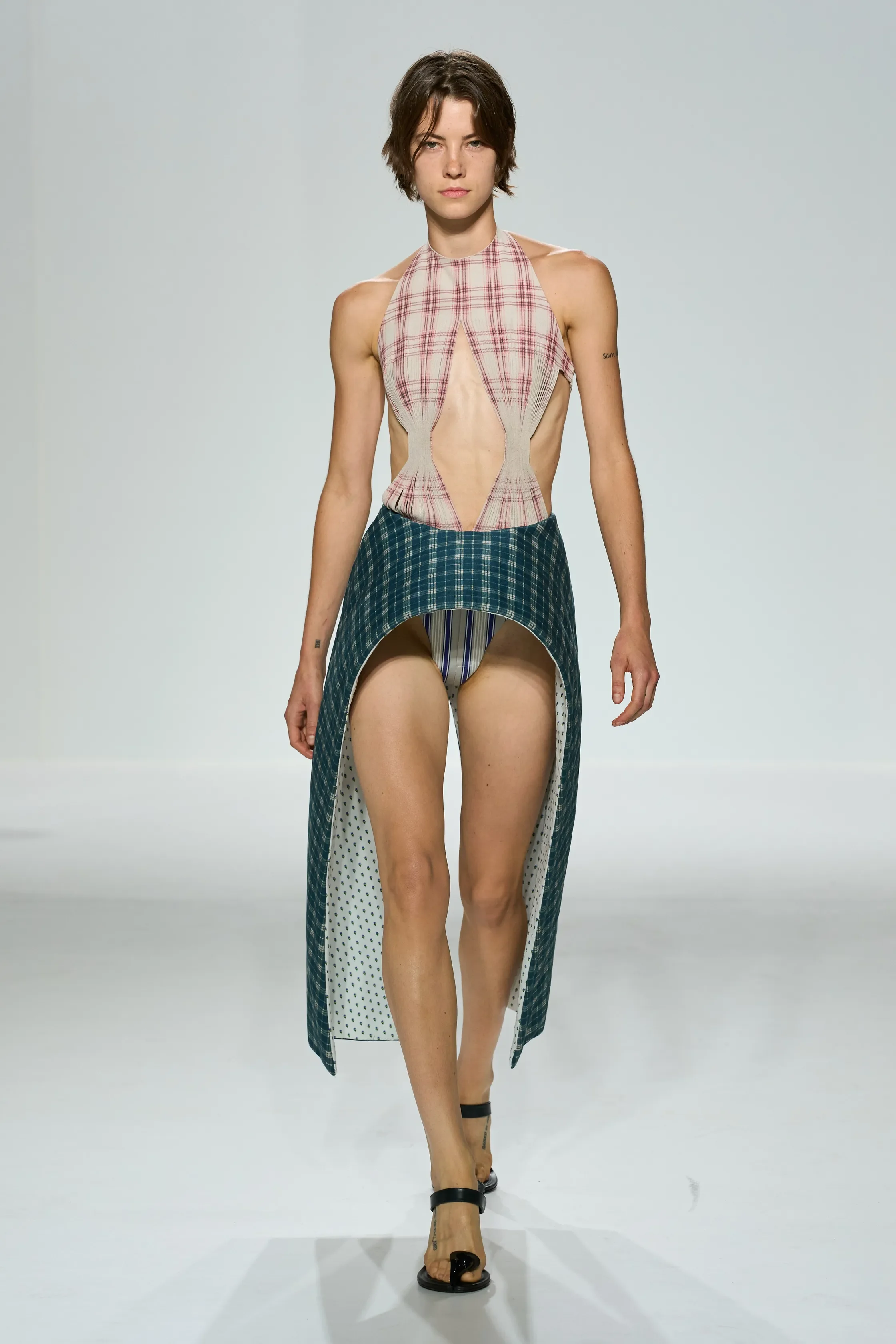
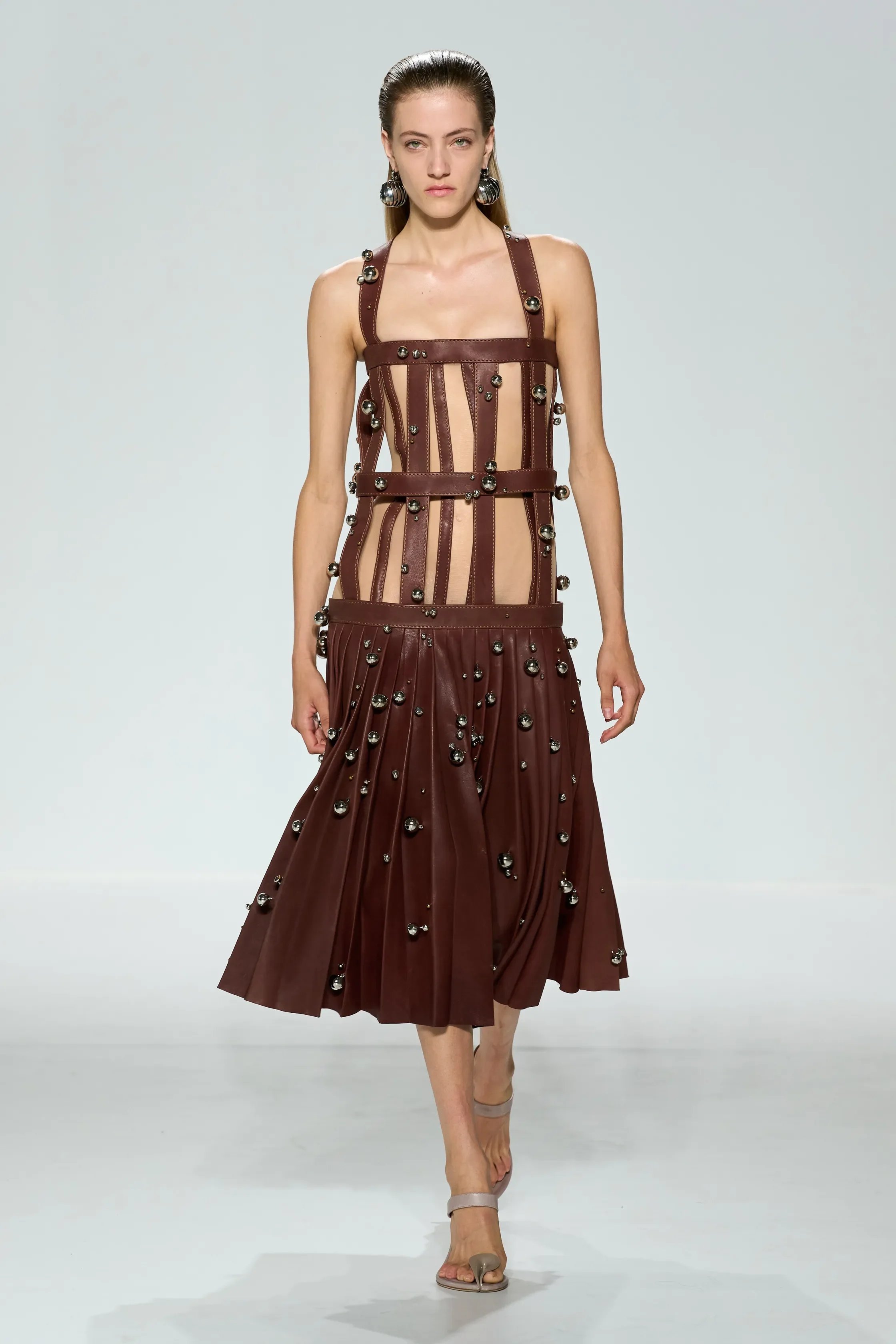
Lantink moved through various stylistic identities, exploring proportion and wearability along the way. What we’re observing since his debut last year, can be perceived as his experiments for the brand. This season, he gave us the cone bras, repeatedly revisited, the cage suits, and the corsets; denim, pleated skirts, metallic bells. Certainly, there was no shortage of references, nor of ideas being put into motion.
There were some explanations, such as the use of the bells which came to mind after Lantink opened a drawer of Gaultier and found a glove made of bells. Overall, the references were either too literal in some of the looks, while in others, they seemed to lack sufficient research or archival influence altogether: for instance, the Little Red Riding Hood in white, the khaki-coloured nun’s headscarf, or what looked like a sample of cascading ruffles with unfinished ends, attached to a jersey base.
There was a kind of a kinship between Lantink’s Spring/Summer 2026 and Galliano’s recent collaboration with Zara, only this one was meant for the runway, not the fast-fashion windows.