
MILAN FASHION WEEK MENSWEAR SPRING/SUMMER 2027: DAY 3
ALCHÈTIPO
review by MAREK BARTEK
Alchètipo’s SS27 collection begins where most ceremonies end. Titled Midnight Cruise, it imagines the hours after the celebration, when ties loosen, jackets slip from the shoulders and the formality of the evening slowly starts to unravel. The Italian label doesn’t aim to abandon tailoring, rather it distorts it gently.
Double-breasted jackets appeared sliced apart and reconstructed, corset-inspired panels sculpted the body, and elongated coats, oversized trousers and layered waistbands created silhouettes that feel both ceremonial and slightly undone. Semi-sheer mesh introduces moments of lightness beneath sharply tailored outerwear.
The palette of black, ivory and soft grey echoes the collection’s mood, interrupted only by metallic jewellery. The accessories further built up the story, with theatrical masks, sculptural footwear and corset-inspired detailing transforming familiar formalwear into something more enigmatic.
QASIMI
review by MAREK BARTEK
For Spring/Summer 2027, Qasimi continued to explore the idea of clothing as something unfinished. Creative Director Hoor Al-Qasimi embraced process, allowing construction, repair and transformation to remain visible.
Relaxed tailoring remained the foundation, but this season it felt softer and more tactile. Jackets appeared modular, with removable and reconfigurable panels, while lightweight outerwear, fluid shirts and generous trousers created silhouettes that moved with ease. Frayed edges, exposed stitching and layered textures gave the collection a lived-in quality, suggesting garments that evolve alongside their wearer rather than remaining fixed.
The earthy palette of sand, olive, slate, rust and black reinforced that sensibility, punctuated by artisanal details and subtle references to traditional craft. Utility codes were present throughout, but never felt overly functional. Qasimi made a compelling case of pieces that acknowledge imperfection, celebrate the act of making, and allow space for the story to develop further long after they leave the runway.
PRADA
review by MAREK BARTEK
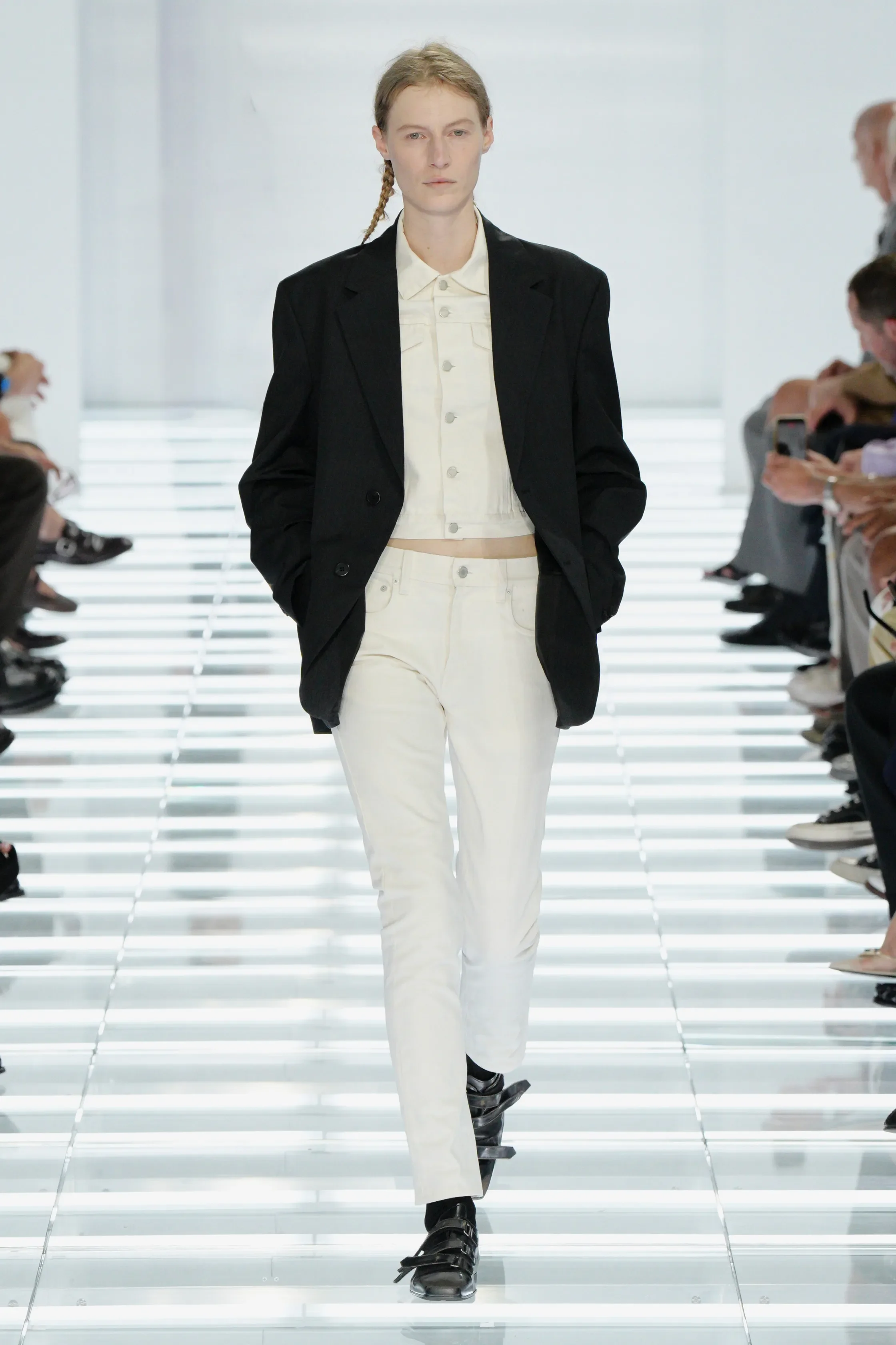
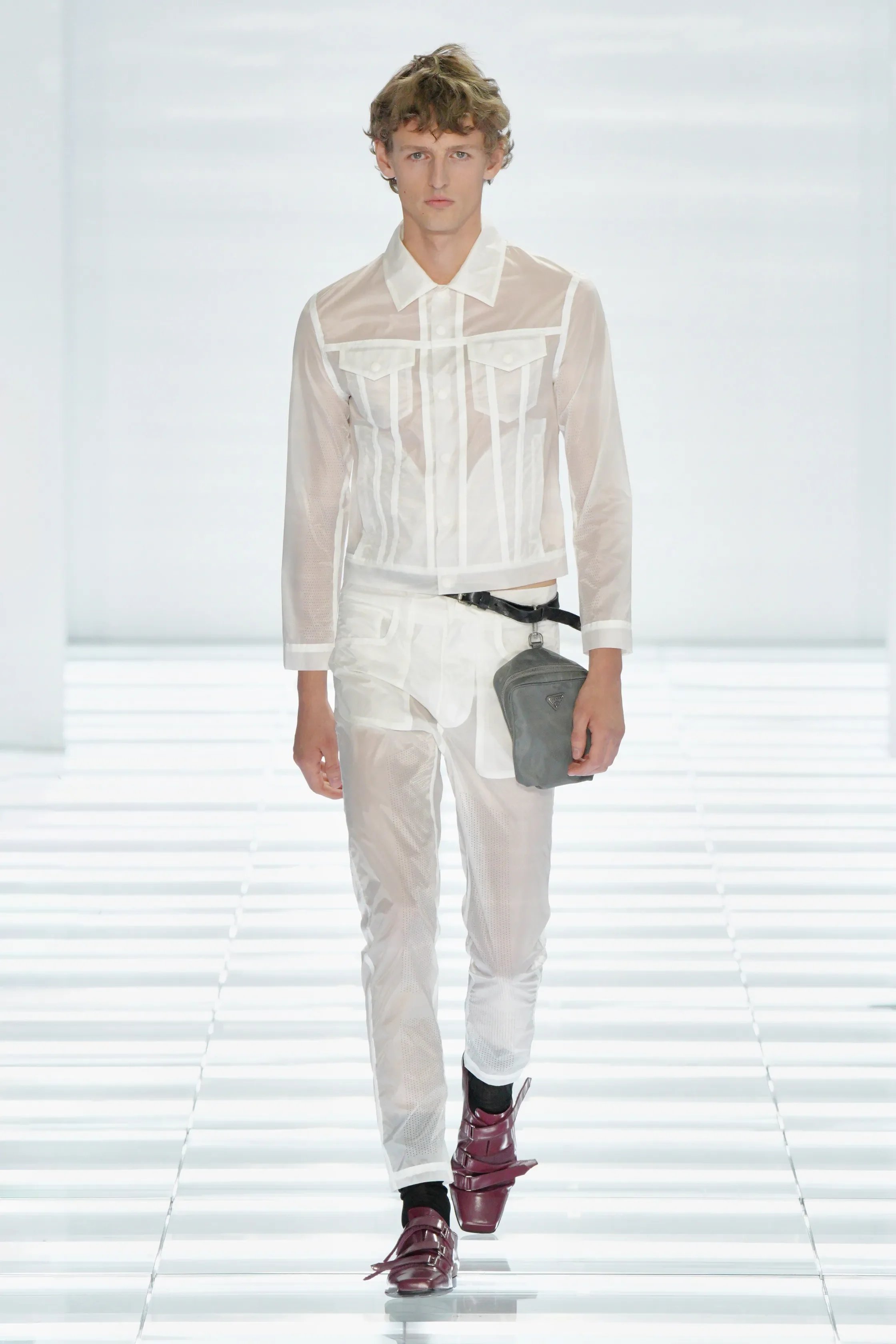
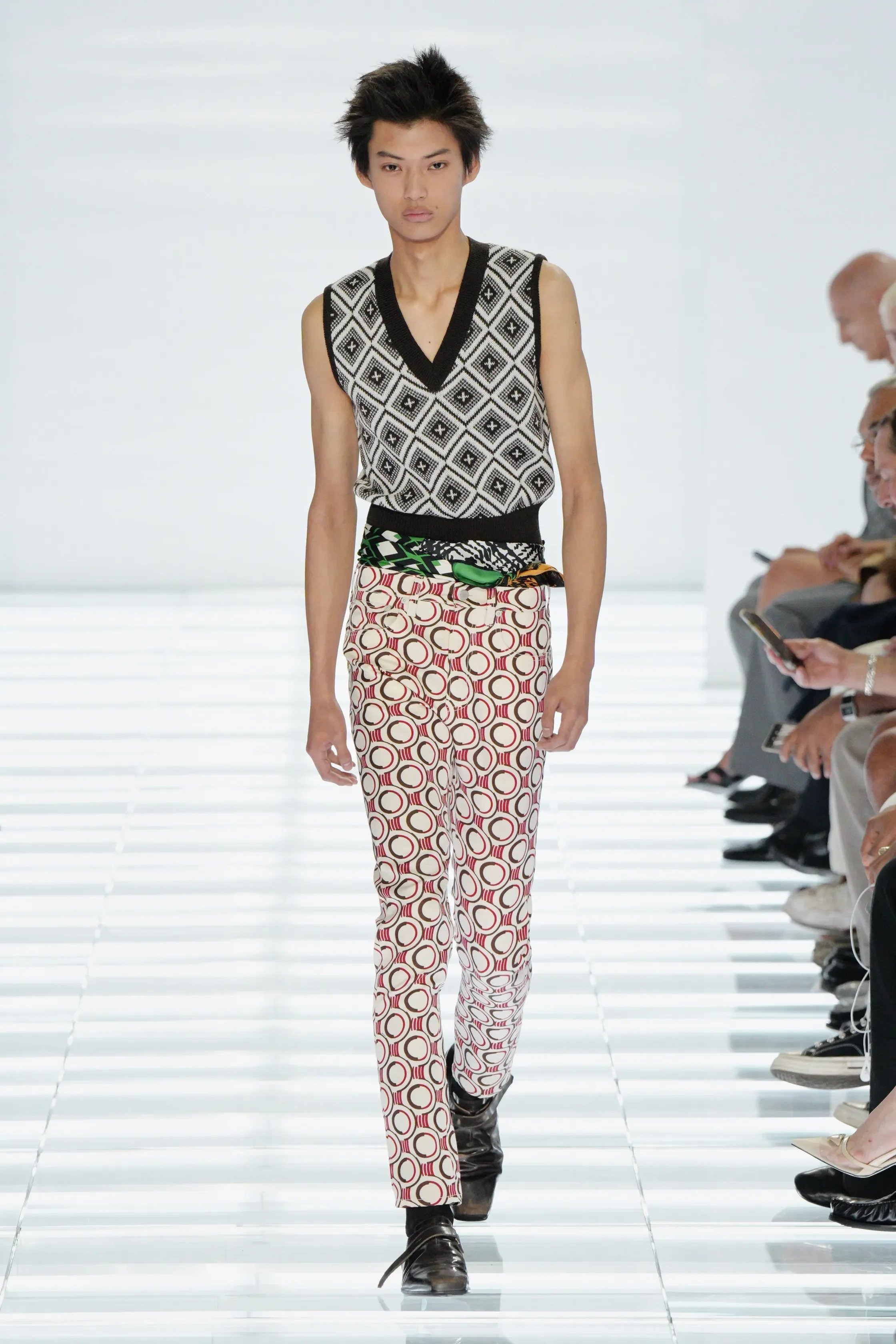
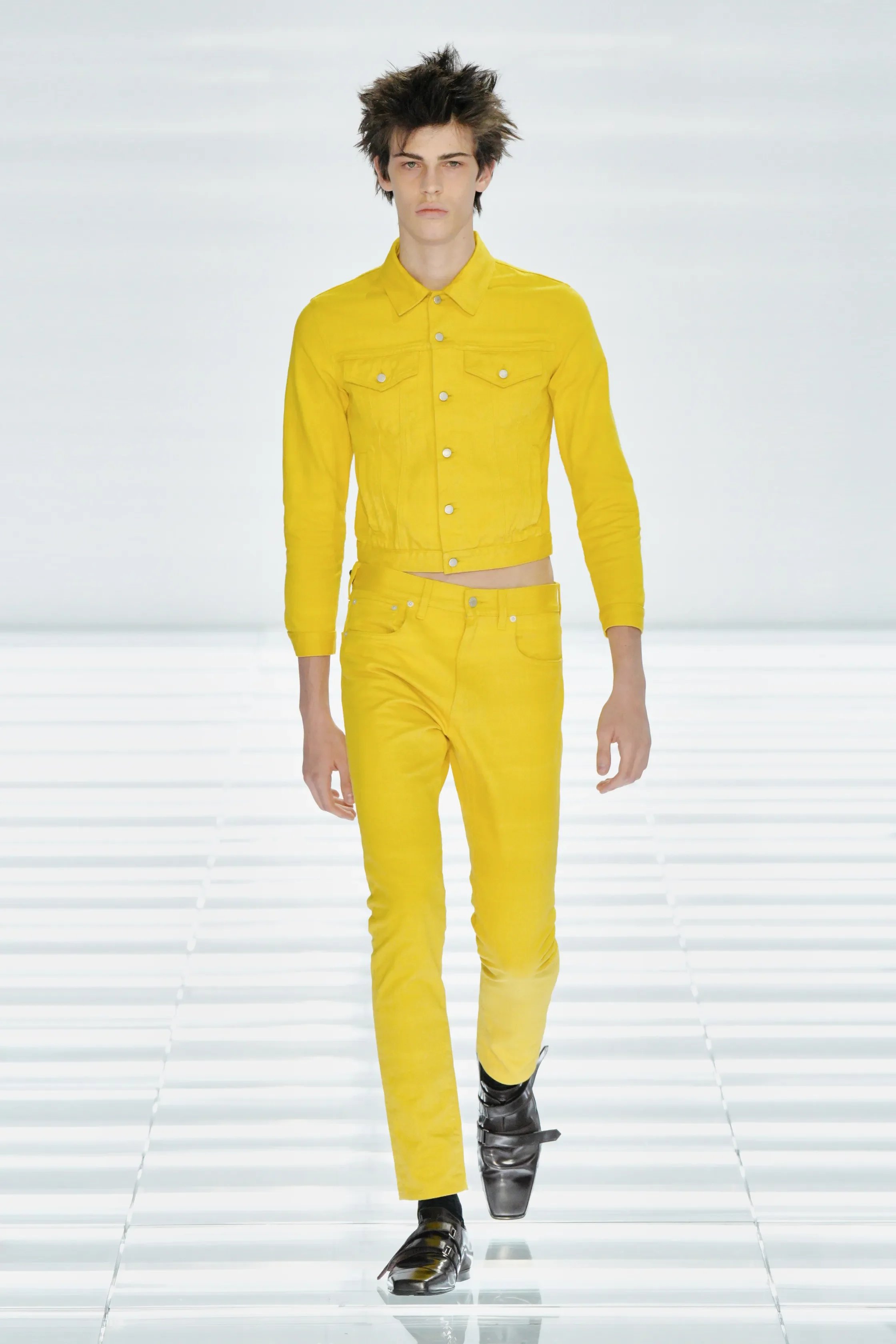
all images courtesy of PRADA
The Prada Day has finally arrived! Have you been impatiently waiting for it as well?
Despite the temperatures in Milan reaching soaring 36 degrees, the crowds outside Fondazione Prada were as large as ever. Some things never change; every season brings a new round of speculation about what Miuccia Prada and Raf Simons will do next, and this time around the mystery was only amplified by the invitation and teaser campaign, both of which hinted at a gaming-inspired world.
And yet, upon entering the Deposito, we were welcomed to a very different fantasy many expected. The space was almost entirely white. Transparent benches marking the route of the models sat on top of a raised glass floor revealing the raw concrete beneath it. Bright, futuristic and slightly disorienting, it felt like walking into a retro digital landscape, with the soundtrack following that same sense of disruption. Pulsing techno opened the show before unexpectedly giving way to Vivaldi, only to return to electronic beats moments later. For the finale, the choice of James Last and Gheorghe Zamfir’s Einsamer Hirte — especially since we’ve just seen a bright yellow denim set — made the mind instantly go to Kill Bill.
As for the collection itself, Ms. Prada and Mr. Simons set themselves a challenge of creating something new out of the familiar. Their starting point wasn’t fantasy, but some of the most ordinary garments imaginable — including five-pocket trousers, leather jackets, V-neck knits and shirts. As signora Prada explained after the show, the ambition was to work “against exaggeration” and “against useless design.”
The opening look was a showstopper on its own — partially for its stark simplicity, partially for the choice of a model. Casting Julia Nobis to open a menswear show was a bold move and yet another point on the long list of disruptions this collection presented. White trousers paired with white shirts and white denim jackets or black blazers looked deceptively simple, but nothing was quite what it seemed. Familiar silhouettes were reworked through unexpected materials, altered proportions and subtle interventions. Prada rarely needs grand gestures to make a point.
The defining feature of the collection was undoubtedly the silhouette. While much of the industry in Italy continues to embrace oversized, relaxed dressing, Prada moved firmly in the opposite direction. Trousers were cut slim, jackets sat cropped high on the waist, and knitwear highlighted the body. Skinny is back — at least according to Miuccia and Raf — and it looked incredibly chic. More importantly, it felt convincing because rather than simply reviving an old trend, Prada rebuilt an entire wardrobe around it.
The collection also felt like one of the clearest expressions of the Prada and Raf Simons partnership to date. The intellectuality of Prada was present throughout, but so was Raf’s fascination with youth, subculture and awkward beauty. There were moments that could have easily belonged to a Raf Simons collection: narrow silhouettes, cropped leather jackets, exposed waists and an almost obsessive focus on the body. Yet everything remained unmistakably Prada.
Sensuality was another big part of the collection. For a show rooted in wardrobe staples, there was an abundance of skin on display. Sheer shirts and trousers revealed the body underneath, and cropped jackets repeatedly exposed strips of bare midriff. Some of the strongest looks paired leather jackets with knitted vests, creating combinations that felt slightly wrong and therefore entirely right. It was sexy, but not in an obvious way. It was Prada sexy — intelligent, confident and just a little ugly.
House signatures appeared like hidden clues for those paying attention. The iconic rhombus motifs were reimagined across knitted vests and printed trousers. Tiny nylon pouches hung from distressed belts. Asymmetrical sunglasses disrupted otherwise classic looks. Even the accessories felt integrated into the clothing rather than existing as separate statements. Nothing was loud standalone but everything contributed to painting the whole picture.
Perhaps that is what made this collection so fantastic. Fashion often feels trapped in a cycle, where every season has to be louder, stranger and more spectacular than the one before it. Prada offered us an insight that familiar can still feel exciting. Rather than searching for the next big thing, Miuccia Prada and Raf Simons looked at the garments already surrounding us and asked how they could be seen differently. Radical, sure! Visionary, one hundred percent!
SAUL NASH
review by MAREK BARTEK
For Spring/Summer 2027, Saul Nash continued to blur the line between performance wear and everyday dressing, drawing inspiration from 1950s sports pin-ups. Rather than treating athletic uniforms as symbols of strength alone, he explored their underlining sensuality, creating garments designed to move with the body while allowing the wearer to decide how much to reveal.
Technical zip-up jackets, fluid tailoring and lightweight outerwear were layered over sheer compression tops and wrestling singlet-inspired pieces, whose curved seam lines echoed the body’s natural contours. Adjustable fastenings, gathered backs and elastic waists brought movement into even the most structured silhouettes, while denim was reimagined with the same ease as sportswear.
The colour palette shifted from soft creams, sand and powder blue into rich burgundy, deep navy and flashes of yellow, punctuated by Lululemon collaboration pieces featuring blurred, sun-faded prints. Throughout, the collection remained unmistakably Saul Nash athletic, sensual, and designed with movement at its core.
BRETT JOHNSON
review by MAREK BARTEK
Set against the backdrop of the Amalfi Coast, Brett Johnson’s Spring/Summer 2027 presentation made a convincing case for timeless dressing, built on exceptional craftsmanship rather than seasonal trends.
Soft suede bombers, featherweight knitwear, supple leather outerwear and relaxed tailoring formed the foundation of a wardrobe. Every piece appeared effortless, yet revealed careful attention to construction and luxurious materials upon closer inspection. Branding remained intentionally discreet, integrated into hardware, buttons and subtle finishing touches rather than oversized logos. The palette echoed the Mediterranean surroundings, moving through chalk white, sand, stone, sage green, dusty rose, chocolate brown, soft navy and buttery yellow. Combined with fluid silhouettes and effortless styling, the colours reinforced the collection’s sophistication.
Brett Johnson focused on perfecting the essentials and delivered something that felt refined, wearable and luxurious. Should the long-circulating rumours of Brett Johnson entering womenswear finally materialise, Spring/Summer 2027 made a convincing argument that the brand is more than ready for its next chapter.
TOD’S
review by MAREK BARTEK
For Tod’s Spring/Summer 2027, presented at Villa Necchi Campiglio, the creative director Matteo Tamburini refined his vision of modern Italian dressing, drawing inspiration from Luigi Ghirri’s Viaggio in Italia and its celebration of everyday beauty rather than postcard clichés.
Relaxed tailoring, featherlight outerwear and softly structured jackets came in an earthy palette of sand, cocoa, navy, dusty blue and terracotta. The collection embraced the effortless elegance that has long defined Italian style. Craftsmanship remained the focal point. The ongoing Pashmy project once again showcased leather so remarkably soft and lightweight it resembled cashmere, appearing across bombers, jackets and shirts that balanced precision with comfort. New Red Dot sneakers, updated Gommino loafers and refined leather accessories reinforced Tod’s commitment to understated luxury rooted in exceptional materials and Made in Italy savoir-faire.
Going fully trend-less, Tamburini reminds us that timelessness isn’t as much the absence of ideas as it is knowing which ones are worth keeping.
ETRO
review by MAREK BARTEK
Travel has always been woven into Etro’s identity, and for Spring/Summer 2027, the house once again invited us to pack our bags. Presented inside Milan’s Museum of Science and Technology among vintage trains and stacks of Arnica luggage, the collection imagined a cast of elegant travellers forever waiting for their next departure.
Creative Director Marco De Vincenzo wasn’t interested in reinventing the Etro wardrobe so much as refining it. Paisley prints, madras checks, archive foulards, embroidered jackets and supple suede outerwear all returned, joined by relaxed tailoring. Double-faced silk dusters, laser-cut suede overshirts and lightweight suiting reinforced an easy, lived-in attitude, while woven raffia caps, silver paper-airplane pendants and the house’s unmistakable Arnica luggage completed the picture of a well-travelled man.
If there was one criticism, it was that everything felt almost too familiar. The ingredients were undeniably Etro, but they didn’t really combine into something unexpected. Rather than pushing the house forward, the collection celebrated what already works. Whether that is enough depends on what you expect from fashion. Those looking for reinvention may have left wanting more, but for anyone drawn to effortless Italian dressing, rich textiles and the romance of travel, Etro remained a reliable companion.