
PARIS FASHION WEEK MENSWEAR SPRING/SUMMER 2027: DAY 3
GIVENCHY
review by MAREK BARTEK
all images courtesy of GIVENCHY
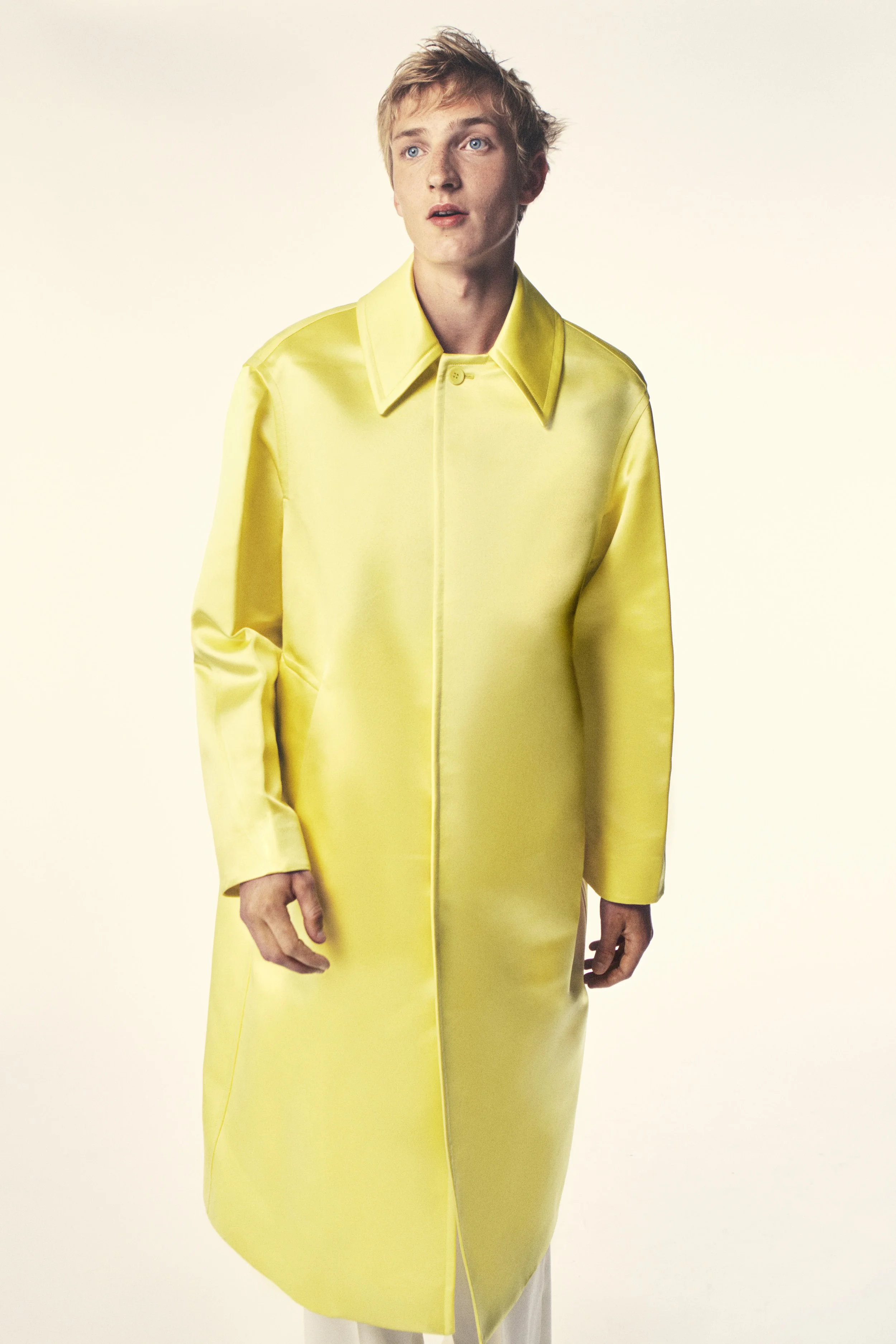
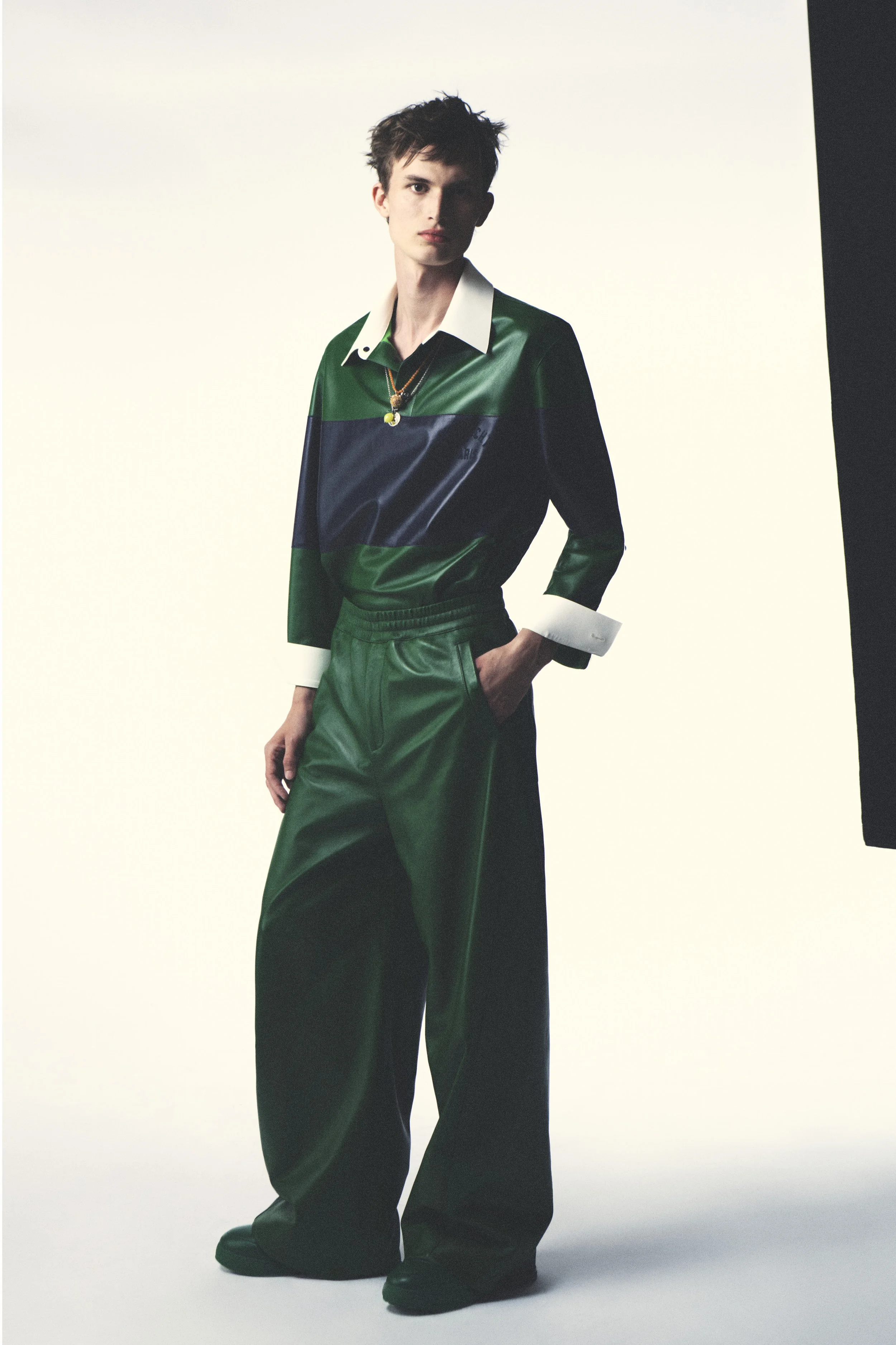
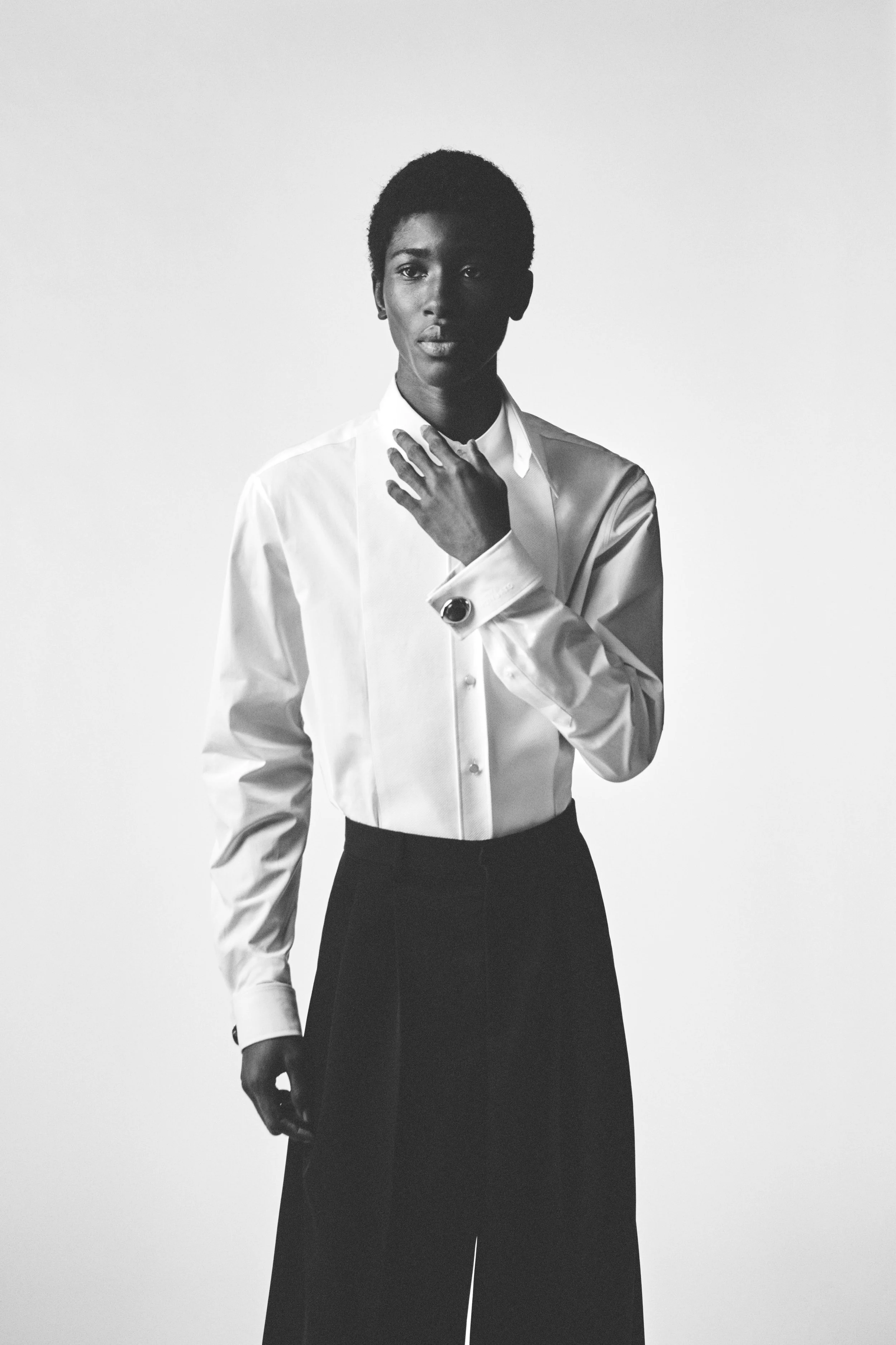
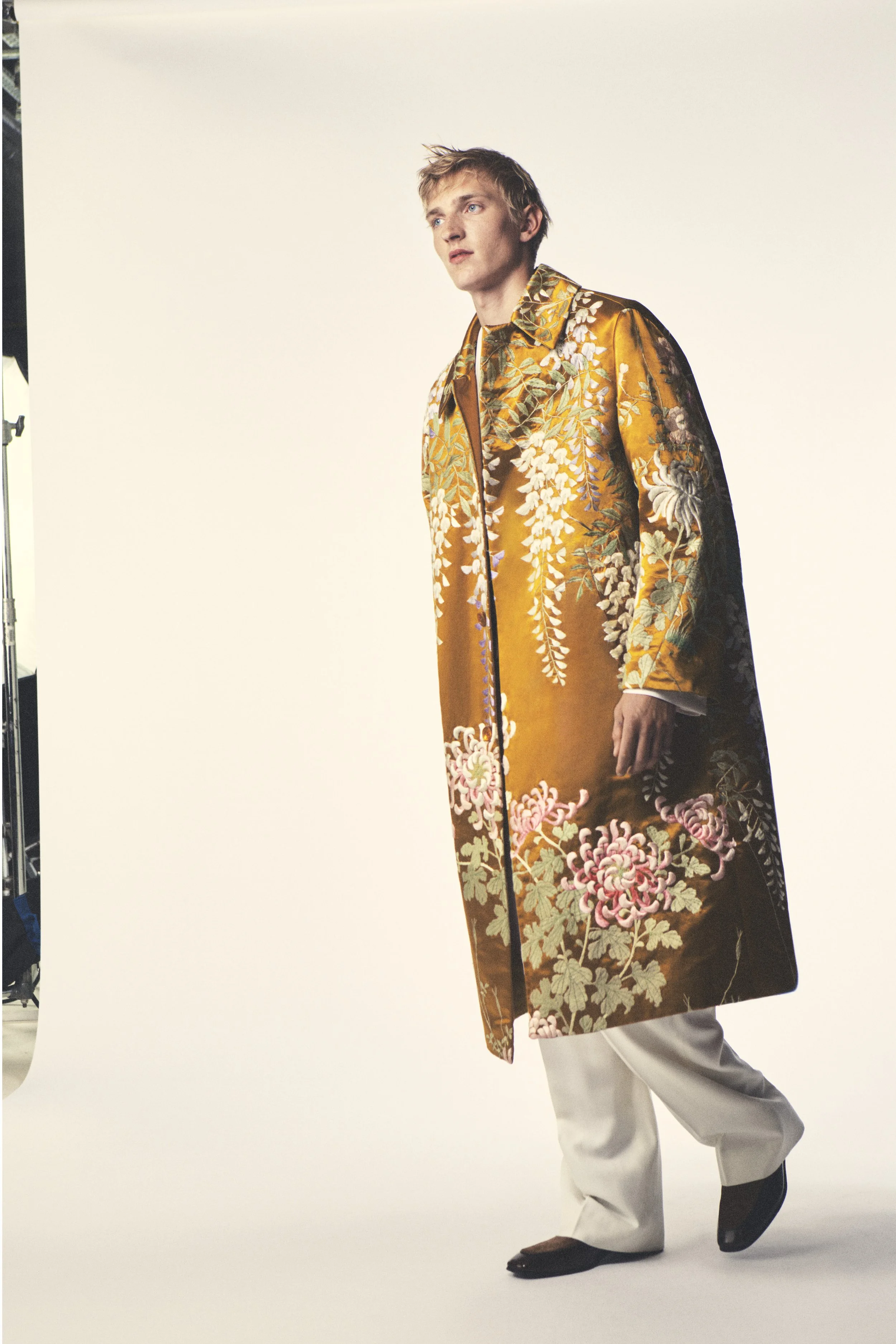
Sarah Burton presented her first standalone menswear collection for Givenchy with a clear goal: to strip things back and start anew. Presented inside the house’s historic headquarters on Avenue George V, the intimate installation created in dialogue with British artist Rachel Whiteread, centred on the building blocks of a modern wardrobe – from sharply tailored suits and crisp white shirts to bombers and leather jackets.
Rather than looking to the archives, Burton focused on familiar menswear archetypes, subtly reshaping them through her signature approach to tailoring. Jackets were sliced and reconstructed, lapels shifted off-centre, while colourful leather tracksuits, embroidered MA-1 bombers and floral jacquards added a touch of softness into the otherwise toned down collection.
The result felt refreshing. Burton delivered a confident new foundation for Givenchy menswear – one that’s rooted in craftsmanship, focused on silhouettes, and is made to build a lasting wardrobe instead of just one season gimmick.
IM MEN
review by MAREK BARTEK
all images courtesy of IM MEN
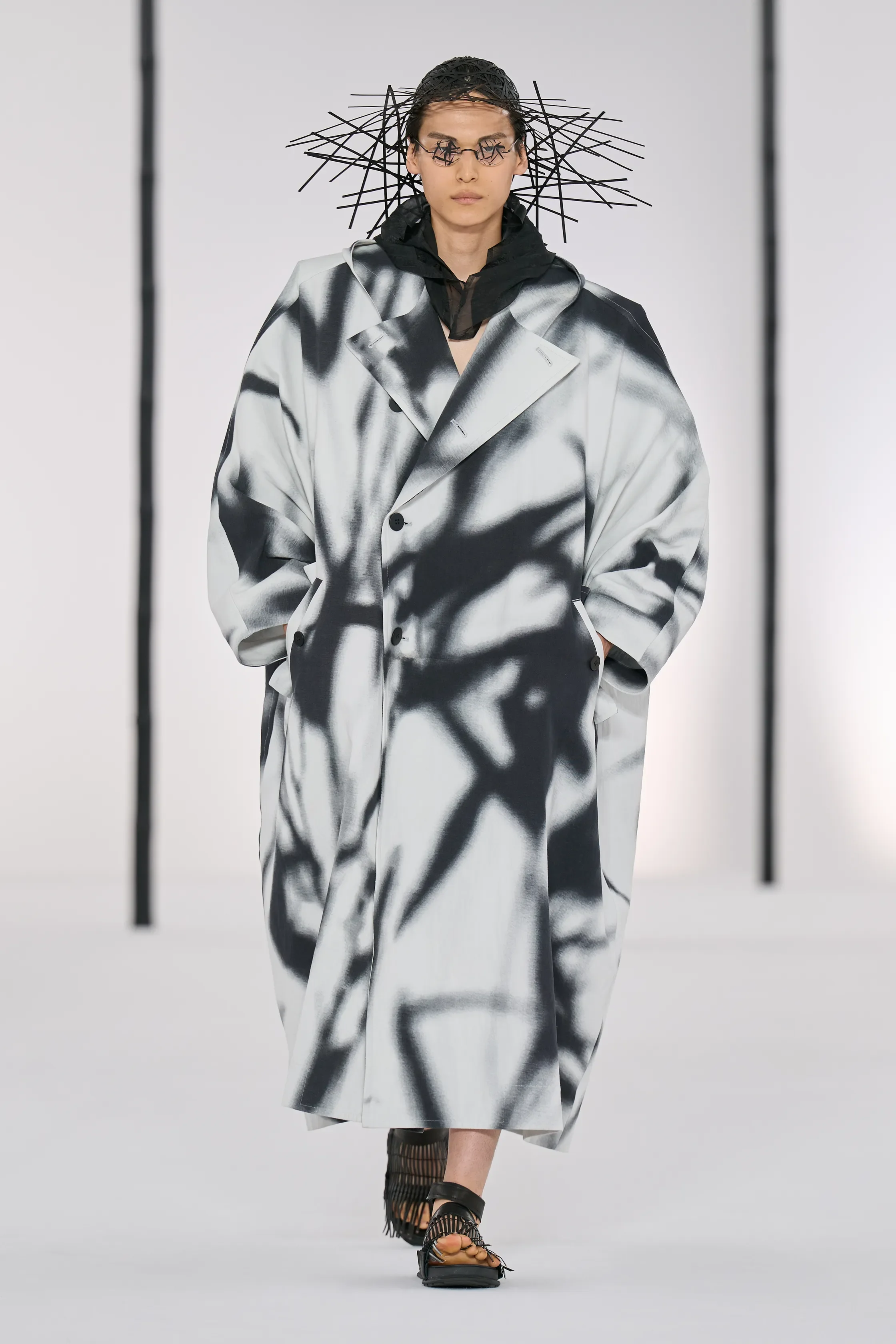
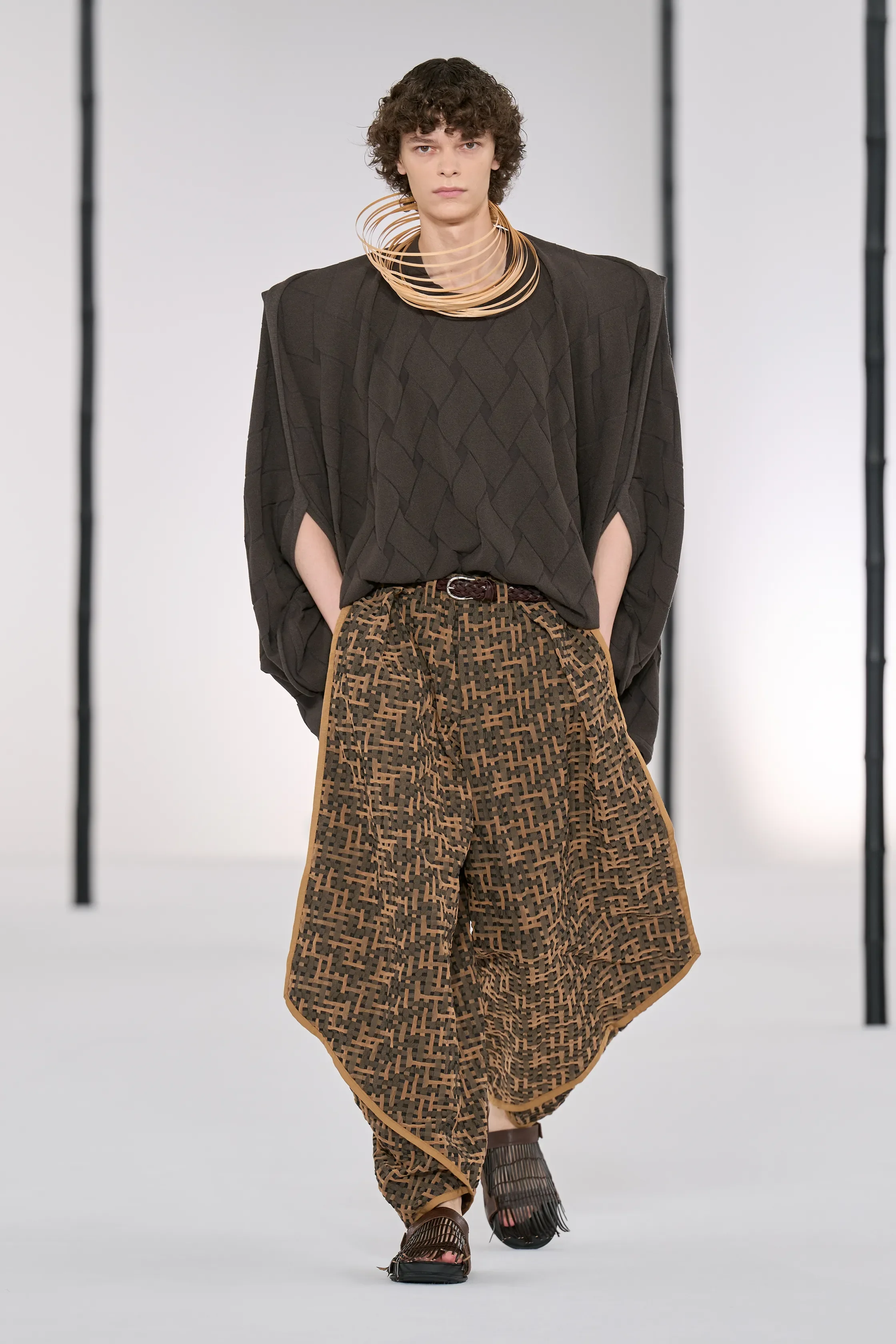
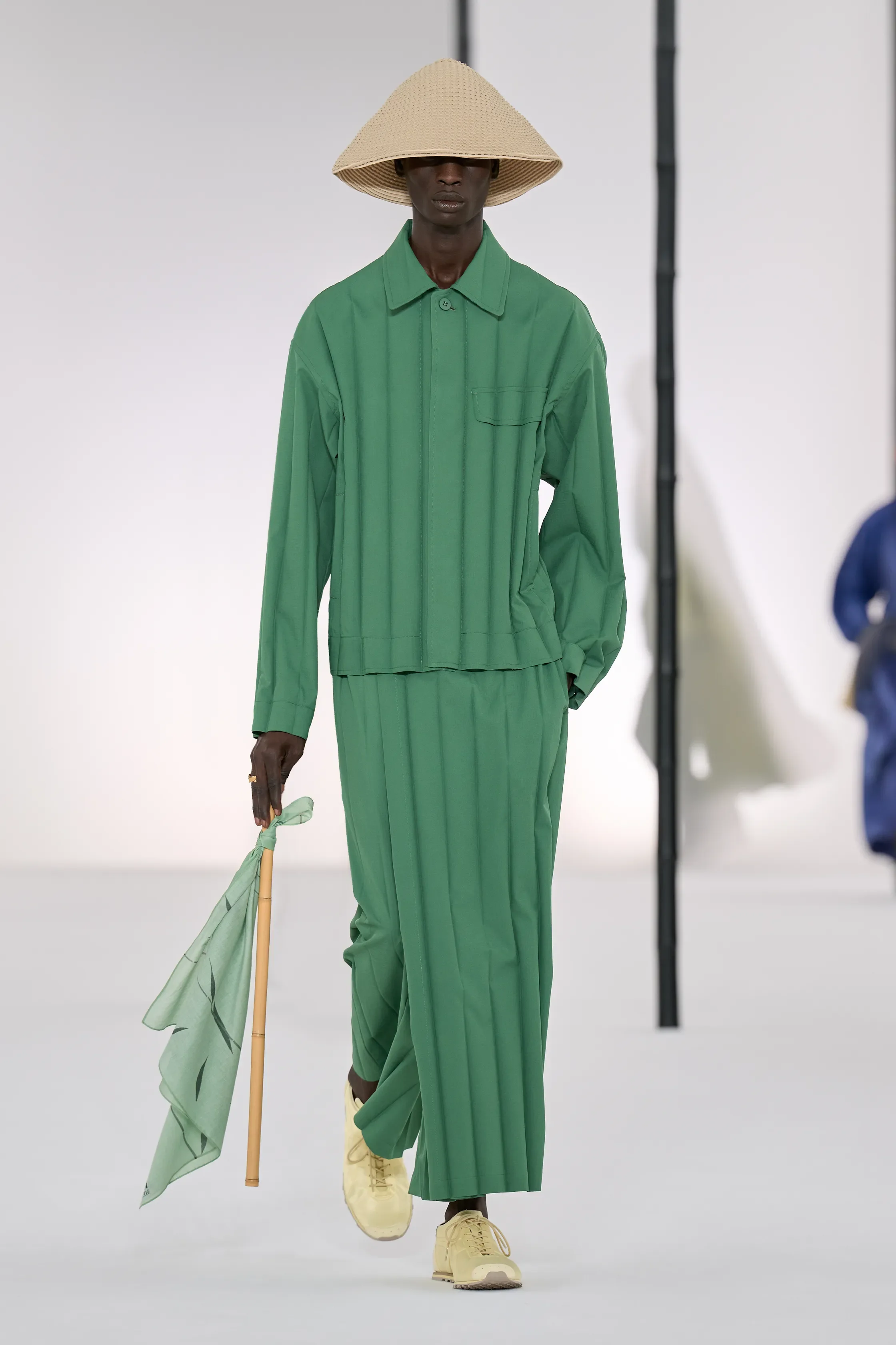
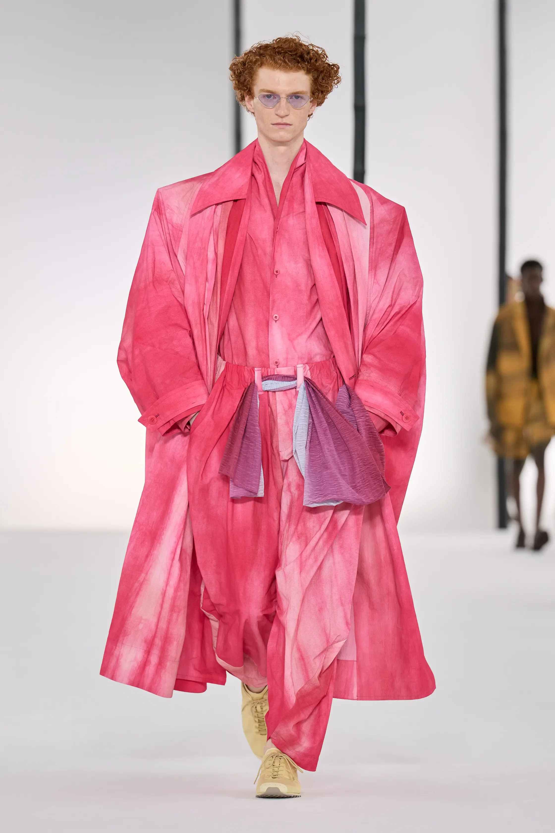
For Spring/Summer 2027, IM Men found inspiration in one of Japan’s most enduring symbols: bamboo. Titled In Praise of Bamboo Shadows, the collection explored the plant’s beauty, resilience and cultural significance through textiles, silhouette and movement, transforming a familiar natural element into a sophisticated study of contemporary dressing.
Opening looks in black and white featured bamboo-shadow prints, hand-dyed denim recalling ink wash paintings and fabrics woven with bamboo-blend yarns. As the collection unfolded, the palette gradually softened into forest green, pale sage, earthy brown and delicate pink, while airy tailoring, curved trousers, voluminous coats and wrap-inspired silhouettes demonstrated the label’s signature balance between avant-garde innovation and wearability. A midnight-blue tunic embroidered with golden bamboo motifs, together with the vivid colours of the closing looks, referenced the Japanese folktale of Princess Kaguya.
Conceptual without feeling inaccessible, IM Men once again proved that technical experimentation and everyday practicality can coexist beautifully — offering clothes that felt thoughtful, lightweight and remarkably relevant for the summer ahead.
RICK OWENS
review by NIA TOPALOVA
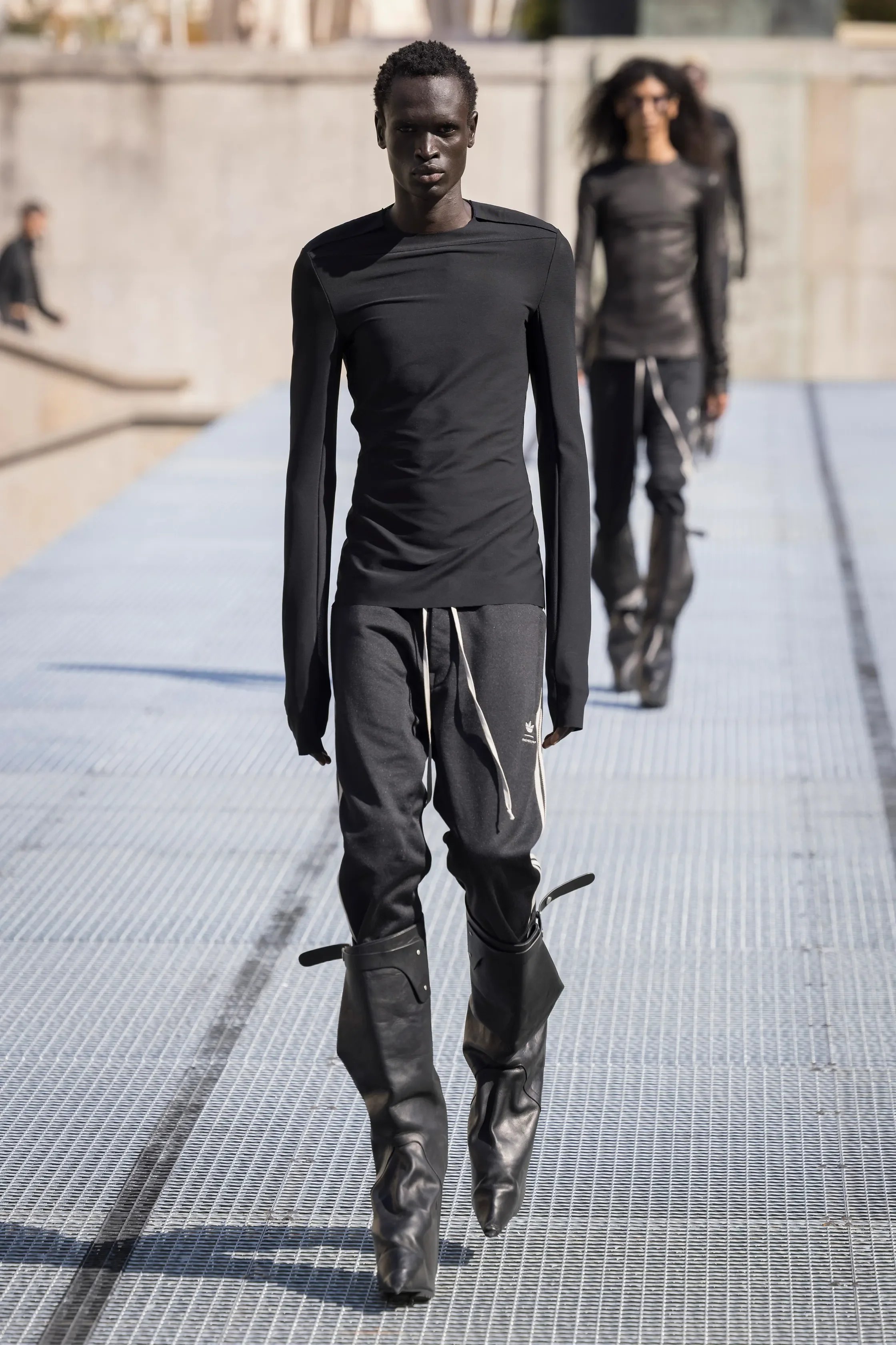
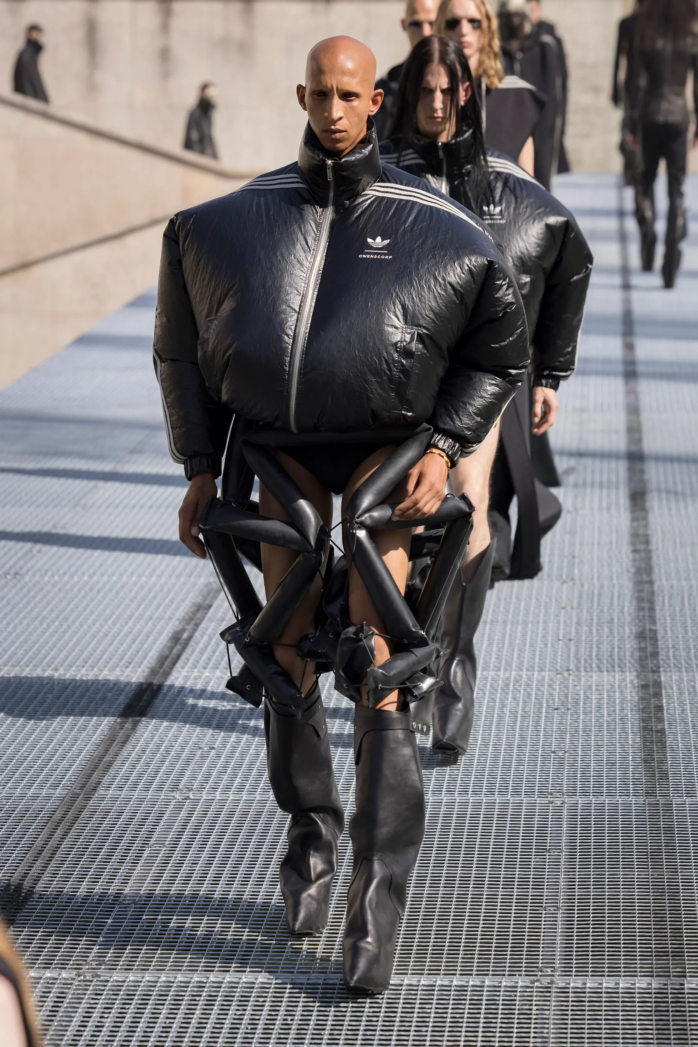
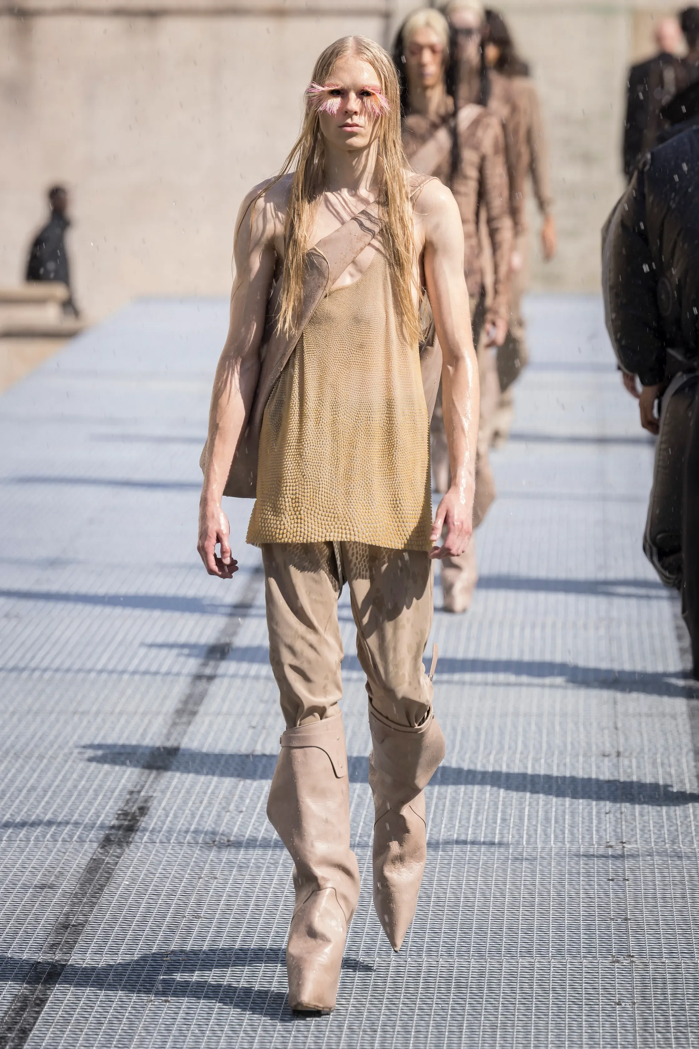
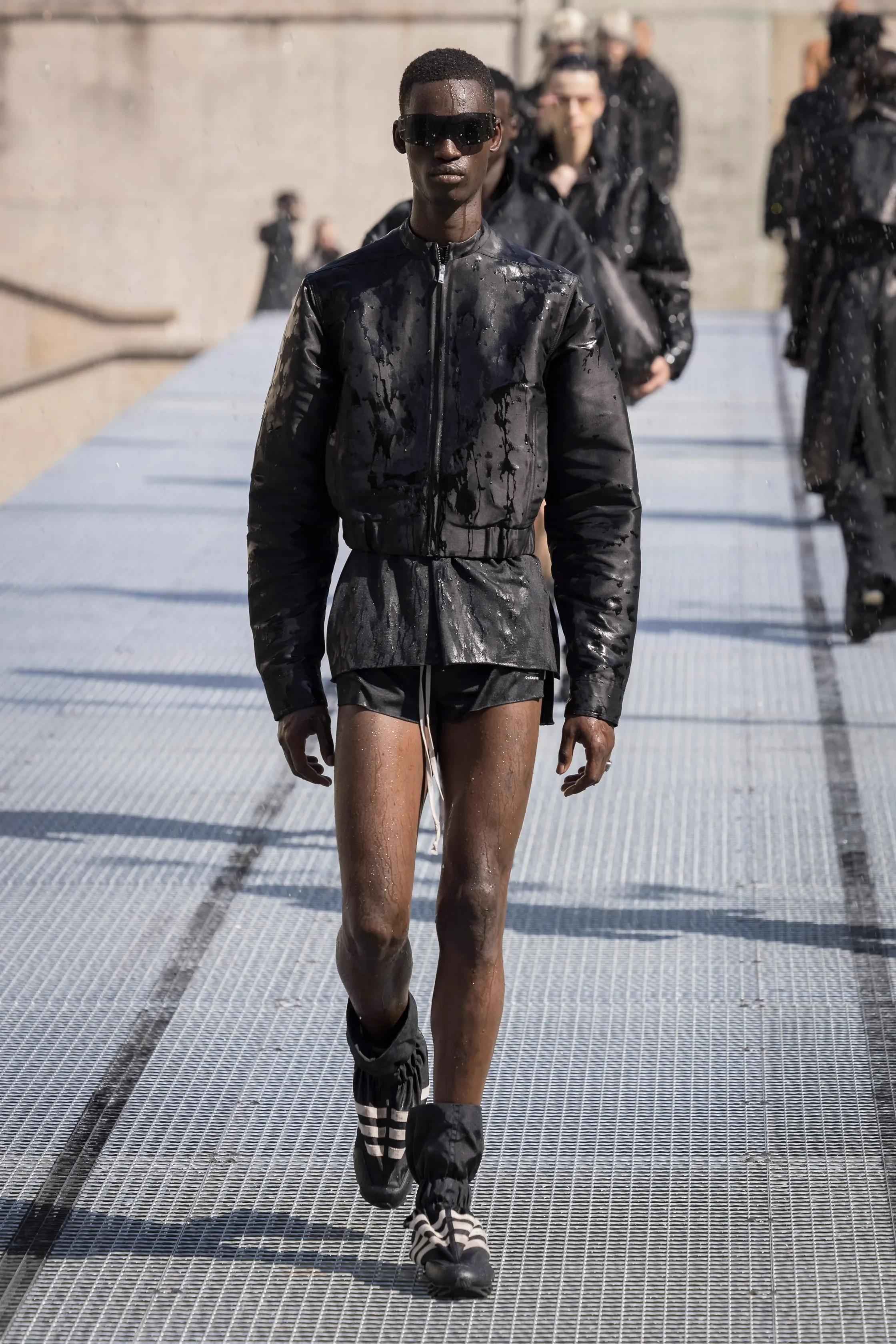
images courtesy of RICK OWENS
Rick Owens’s stone men explored the psyche through the physical, and the physical through the psyche. Both becoming structure and protection.
Owen’s notes stated: “We are all processing menace. Some of us arm. Some of us train. Some of us turn away. Some of us turn to stone.” He played with tensegrity structures suggesting relation with the human body and mind. Tensegrity is a system of isolated components under compression inside a network of continuous tension. These structures exist in nature and architecture, as well as in the human body in the way bones are held in compression while connective tissues are held in tension.
For his SS27 collection, Owens worked with Adidas’ Climacool system technology to create inflated jackets and shorts offering interior fans. Combined with an ice vest, the result is a wearable air-conditioning system designed to cool down runner’s bodies. (An excellent excuse to spend all of my fortune during this unholy summer 26’ heatwave.)
Silk was woven in the Como Region of Italy, due to its heritage of silk production, to be later on combined with sharp-shouldered tailoring and jackets and coats with removable leather epaulets. Light silk Duchesse were woven with dense yarns by vintage looms. Tank tops resembling 1920s beaded lingerie were produced in Paris with each garment taking 25+ hours and 4 hands to complete.
SEAN SUEN
review by FRANCESCO PIZZUTI
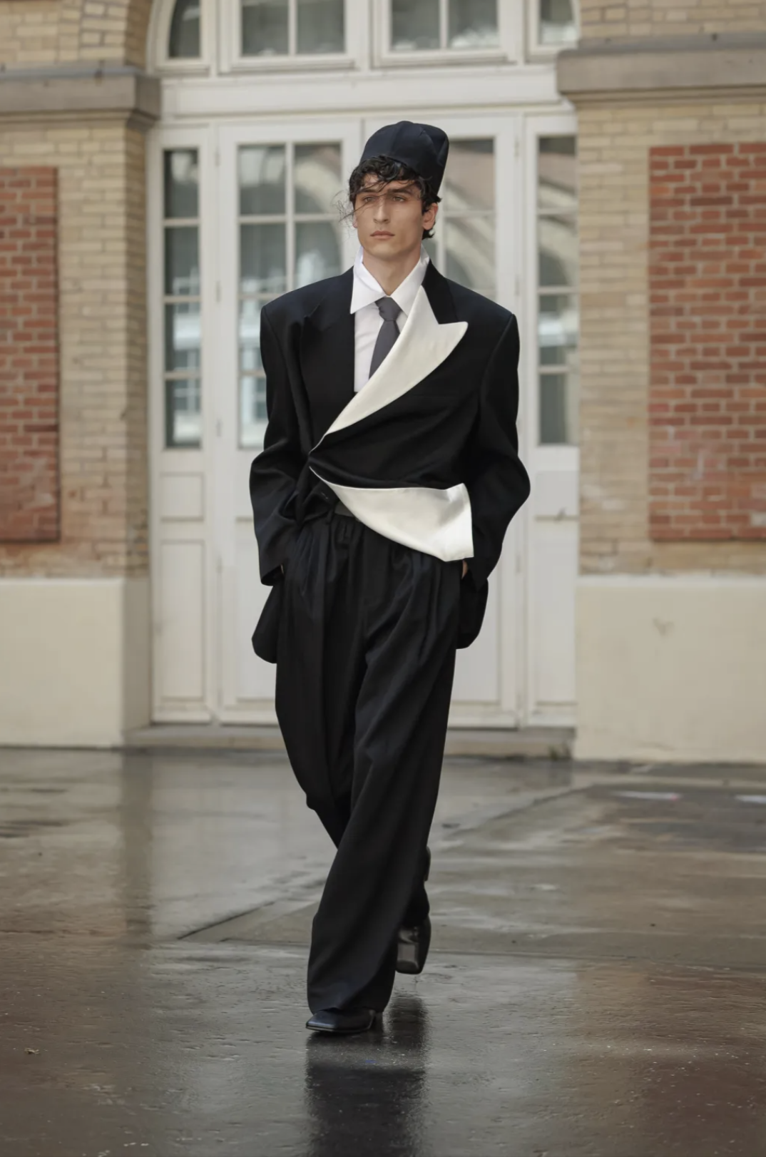
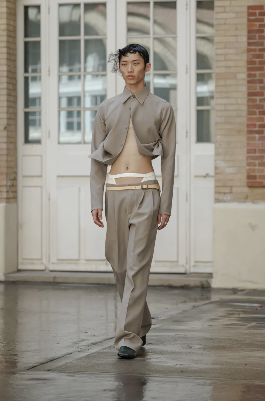
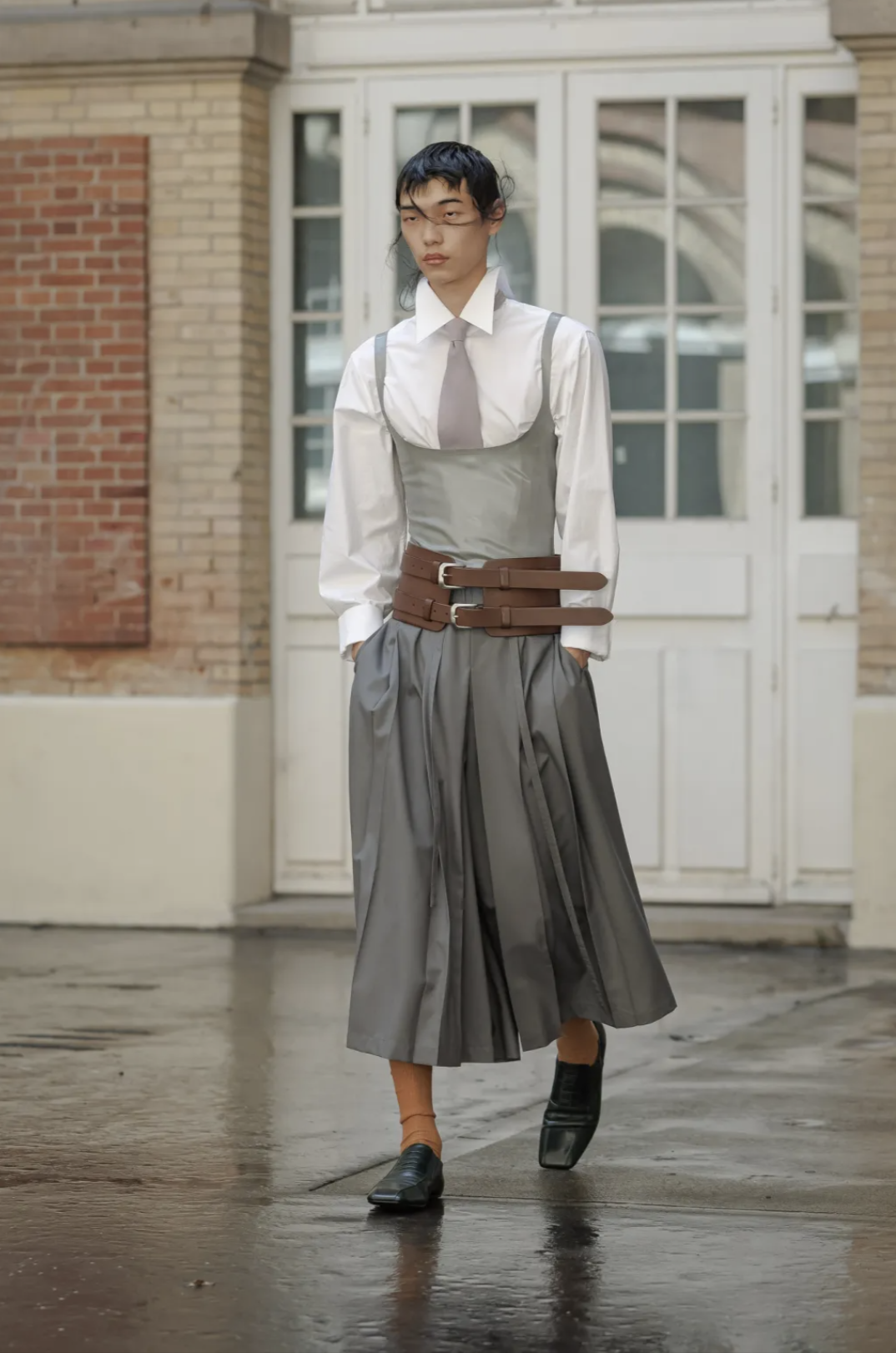
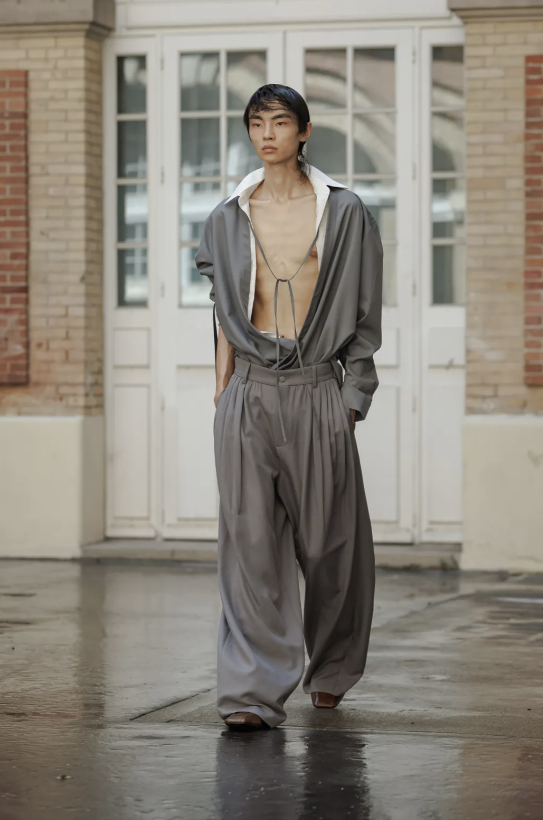
During Sean Suen’s show, models walked the runway like bodies caught in weather, between nature, softness, release and constraint. Strands of hair were dragged across models’ faces like memories of wind, like something carried from elsewhere and stuck mid-gesture. A single butterfly clung to the hair’s movement, slightly absurd and delicate, adding to this contrast between fragility and interruption.
The clothes oscillated between extremes, cinched waists tightened into sexy disciplinary silhouettes, while oversized garments like coats and trousers collapsed outward, inflated by invisible gusts. Reminders of officewear were inverted into something erotic, with exposed dress shirts and wife-pleasers in latex placed over strict uniform collars and ties, as if intimacy and sensuality had been moved to the surface.
The Beijing bikini phenomenon of rolled-up shirts to combat hot Chinese summers was a major reference; a social meme of excess and release, bellies and hems lifted by heat and permission — strikingly on point considering the current heat wave in Europe.
With Sean Suen’s show, nothing stayed still. Structure looked temporarily negotiated under pressure of air and desire and light and heat. Everything felt like it was happening and un-happening at once, between control and undoing.
FENG CHEN WANG
review by FRANCESCO PIZZUTI
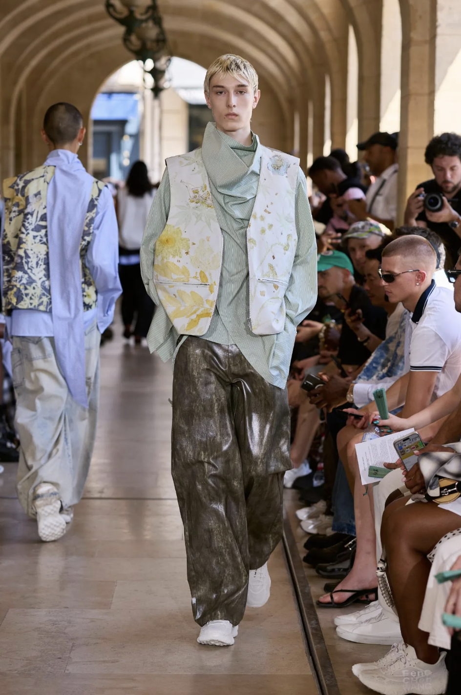
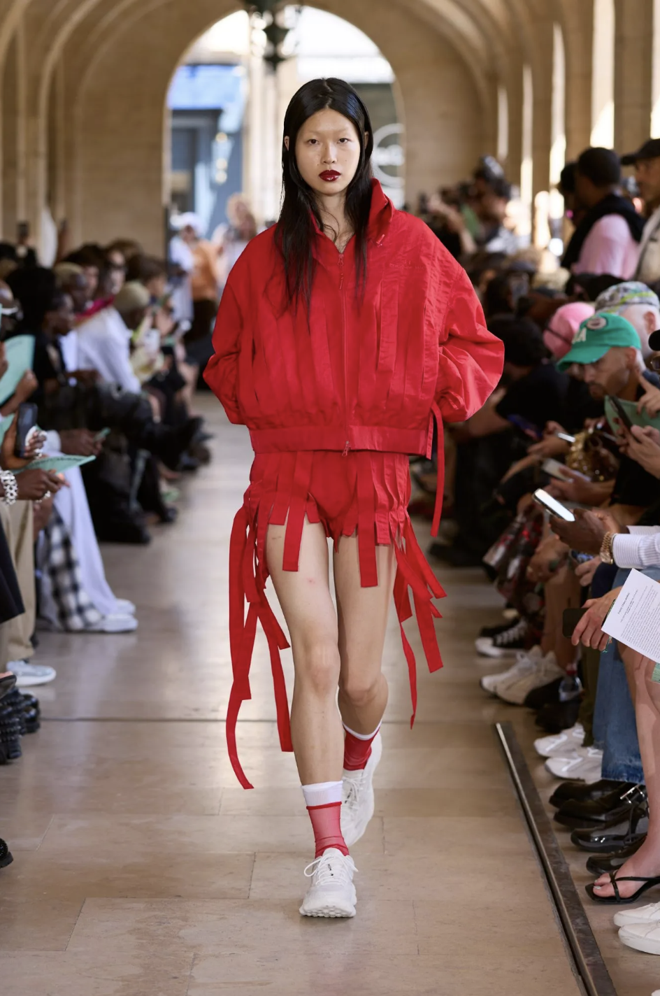
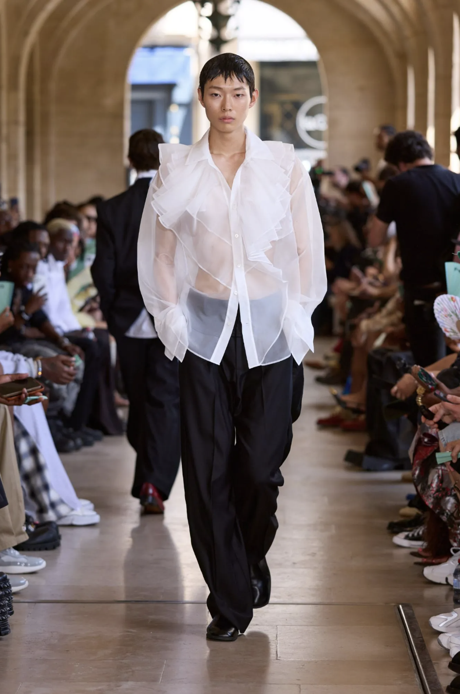
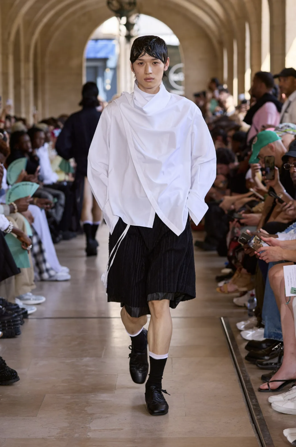
Feng Chen Wang’s Spring/Summer 2027 collection, titled Dreaming of Spring, builds itself on a declared collision of references from East and West that never fully settle into one another. The Seven Sages of the Bamboo Grove and Botticelli’s Primavera are placed side by side as a dreamscape of cultural and artistic conjuncture. The collection moves between these poles through silhouettes that borrow from both ancient Chinese scholarly robes and Renaissance drapery, translating them into oversized volumes, softened tailoring, and elongated folds.
There is a consistent interest in looseness and exposure with edges left unfinished and fabrics hanging without resolution. The dream framing occasionally flattens tension instead of intensifying it, turning potential friction into a unified aesthetic language. Floral motifs and ink-like gestures attempt to carry the East-West dialogue in a clear decorative way.
The collaboration with Under Armour introduces a more pragmatic layer through performance materials and an almost retro-futurist tone, though it sits somewhat apart from the collection’s more poetic ambitions. Overall, the show is most convincing in its quieter, softer moments of fabric movement and proportion, with some stunning tulle looks truly carrying forward this image of dreaminess.
AMIRI
review by FRANCESCO PIZZUTI
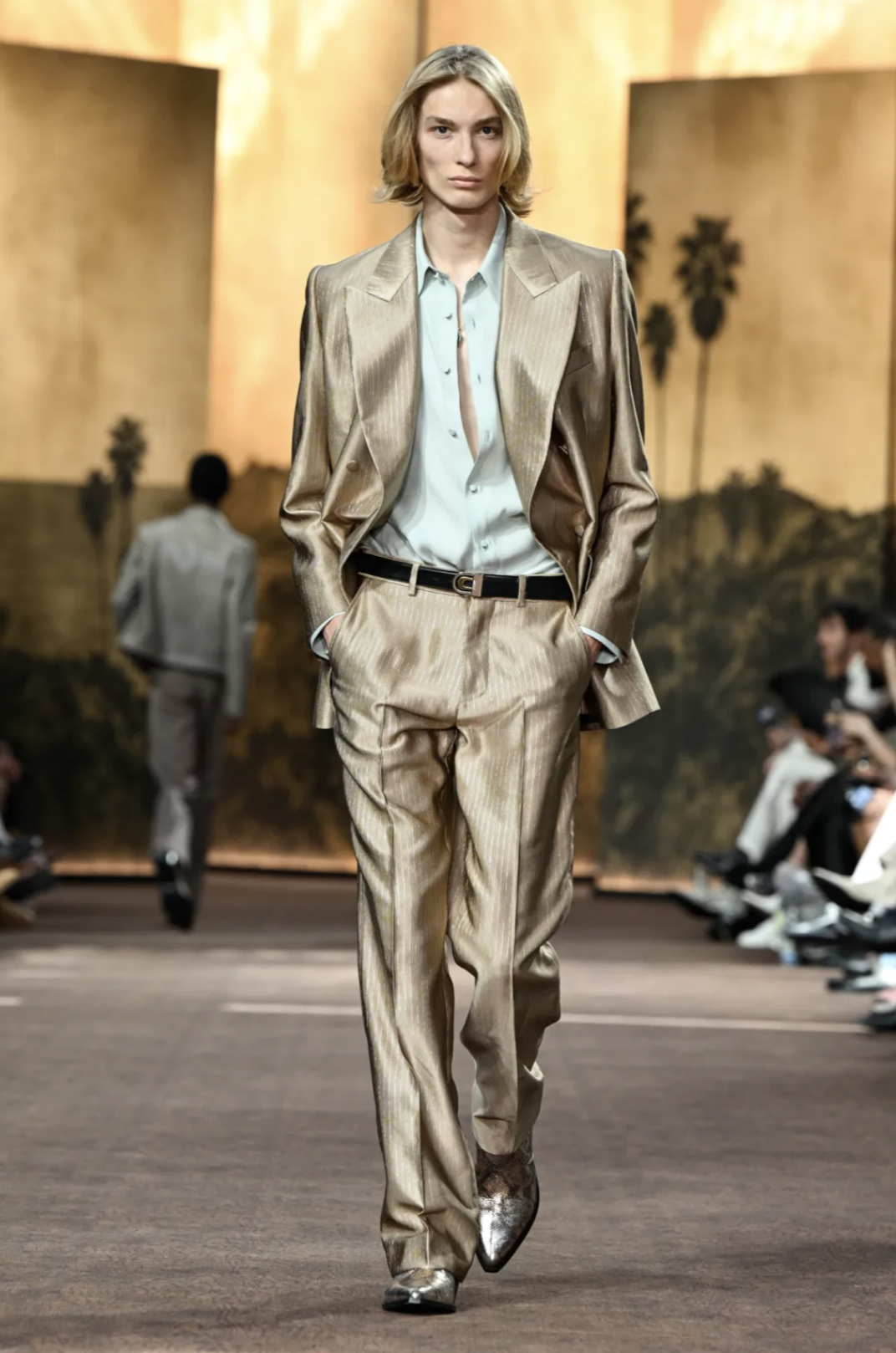
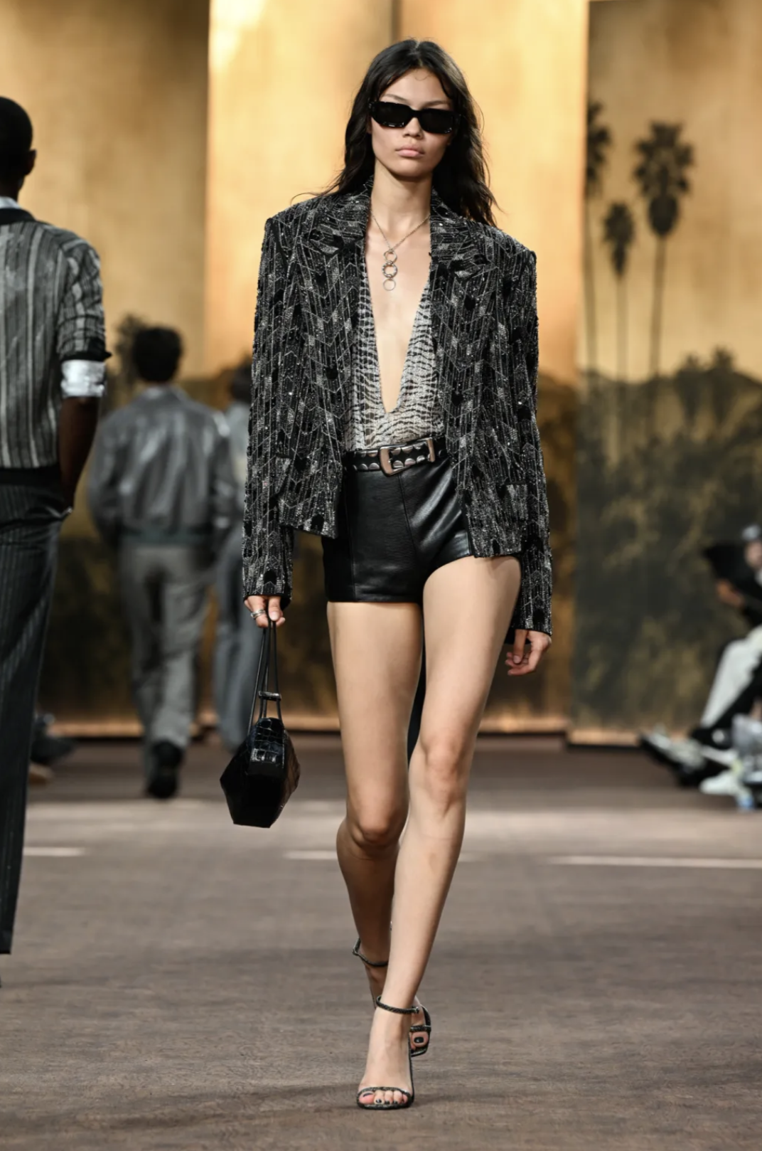
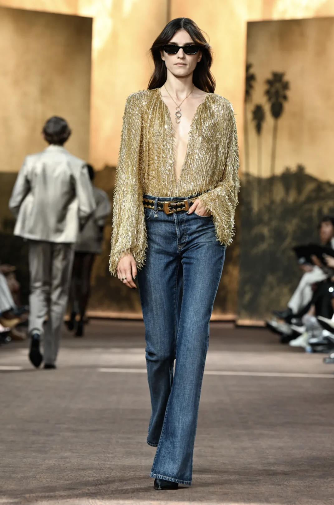
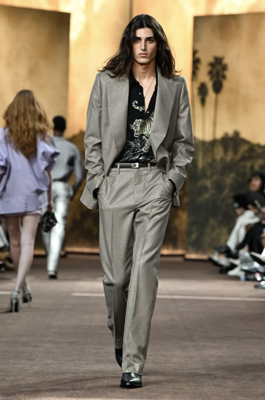
It-girls and nepo babies hit the runway with 70s glamour, fun, and excess during AMIRI’s Spring/Summer 2027 show. Titled American Pleasures, the collection unapologetically commits to its own fantasy of Los Angeles at night. Malibu sunsets, Beverly Hills midnight, neon reflections, everything is filtered through a cinematic haze that doesn’t really try to be subtle, and that’s kind of the point. After all, as critical as we can be about America, we have to admit spectacle is definitely their thing, and we eat it right up every time.
The clothes carry a real pleasure: soft tailoring, relaxed shoulders, denim and suiting moving into each other without hesitation. Everything glides easily with that confidence one only gets on a night out, perhaps after a couple of drinks.
The collection isn’t interested in irony; there’s not much to decode: silhouettes stay close to the body as they’re simply designed for being seen. What stands out is the attitude as it fully leans into a kind of glossy, slightly overdetermined desirability that makes it feel relatively direct compared to a lot of this season’s more conceptual, and at times dull, moments.
Materials do the atmospheric work: metallic sheens, lurex threads, tweed and tailoring reworked into something reflective and nocturnal — LA after dark.
Overall, the collection feels fun, coherent and somewhat dignified in its insistence on pleasure, image, and ease.
YOHJI YAMAMOTO
review by FRANCESCO PIZZUTI
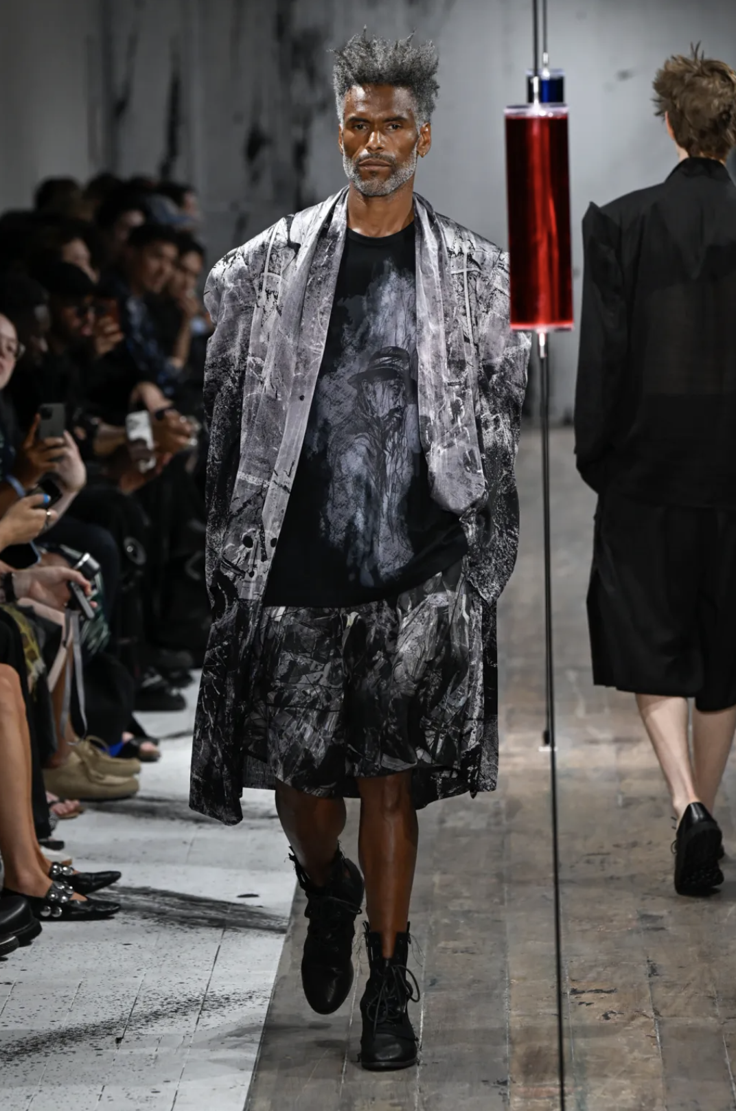
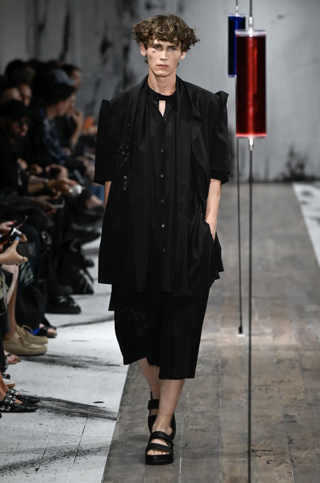
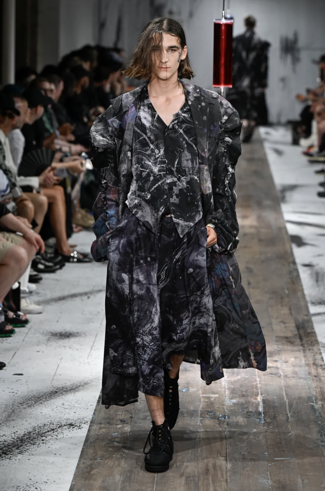
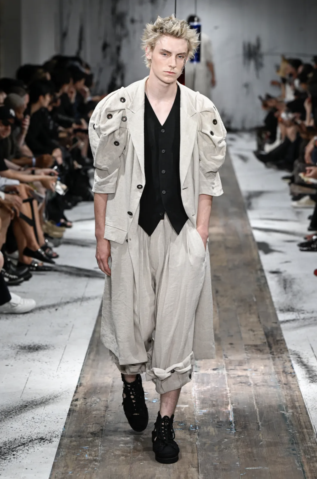
Yohji Yamamoto Spring/Summer 2027 sits in that familiar register where everything feels slightly delayed, like the clothes are arriving a second after the body has already moved on. The walking is more of an amble; unhurried, with a bit of fatigue and a bit of romance.
The collection itself continues his long obsession with construction as process — material and immaterial — rather than resolution. Shoulders are padded, softened, peaked, armour-like or slightly collapsed, refusing to decide on a final form. Sleeves become further sites of experimentation, sometimes excessive, sometimes missing; cut, rolled, almost in a state of negotiation with gravity.
The palette stays mostly within his familiar greys, black, and deep reds and the material is light with ventilation eyelets and stretches of mesh. Fabrics feel designed to endure.
There is a clear historical undercurrent that, however, never becomes flat: this armour logic, 19th-century silhouettes, and something vaguely pastoral drift through the garments, feeling romantic and poetic, and profoundly human in their duality. Everything remains in that space of suggestion, where the rugged feels deeply emotional and sensible.
DRIES VAN NOTEN
review by MAREK BARTEK
all images courtesy of DRIES VAN NOTEN
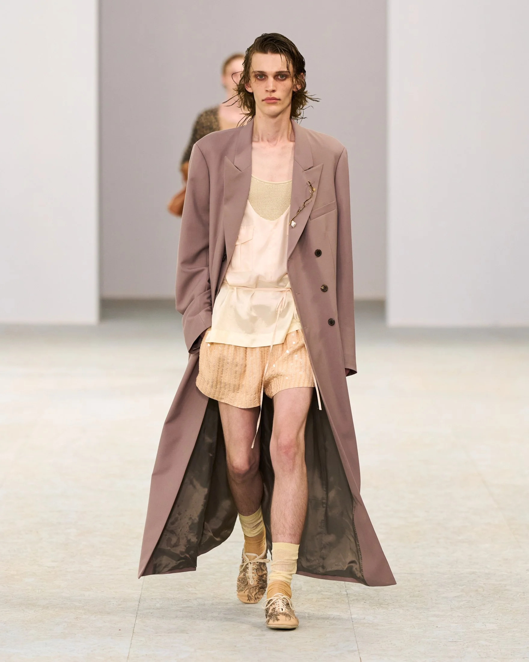
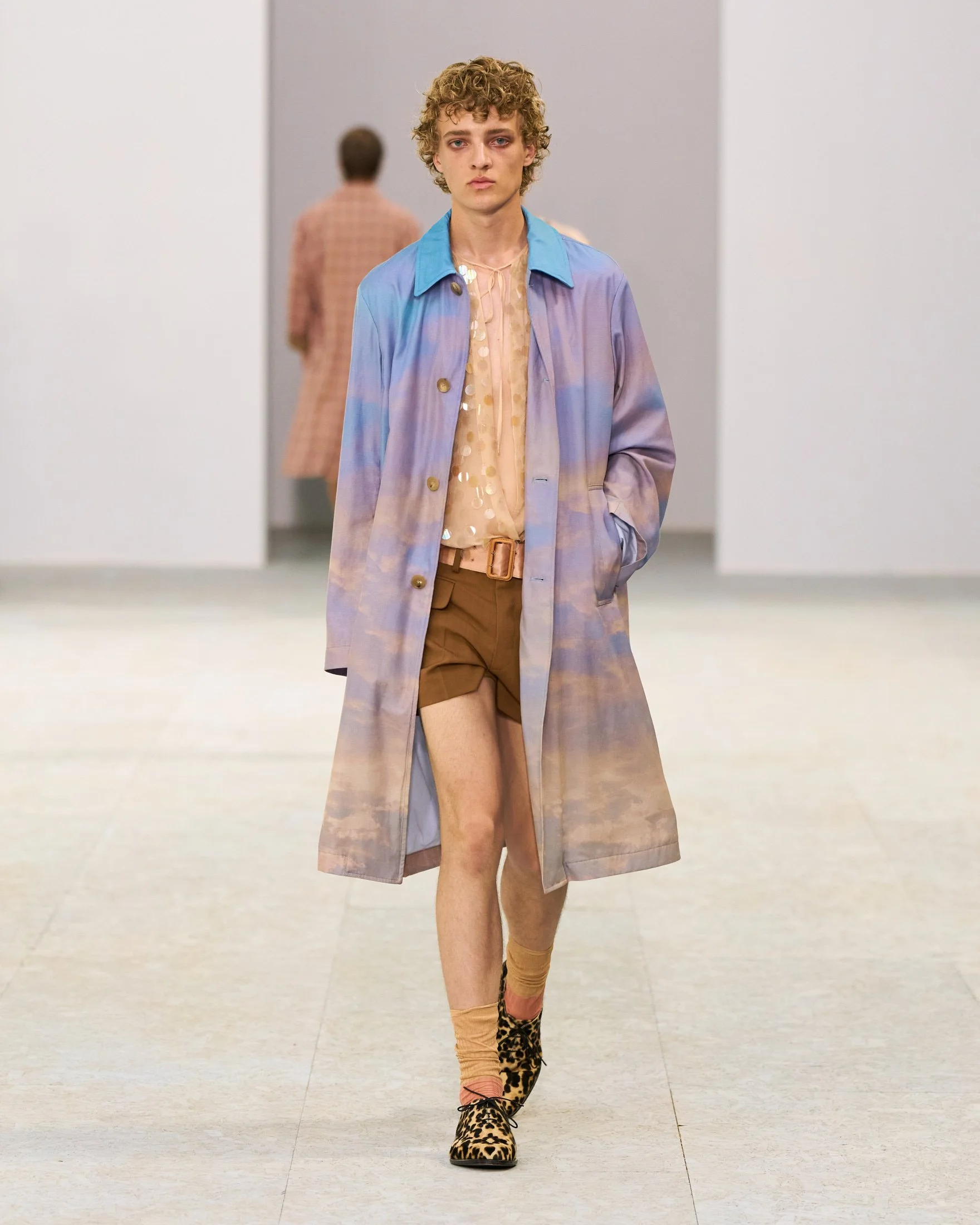
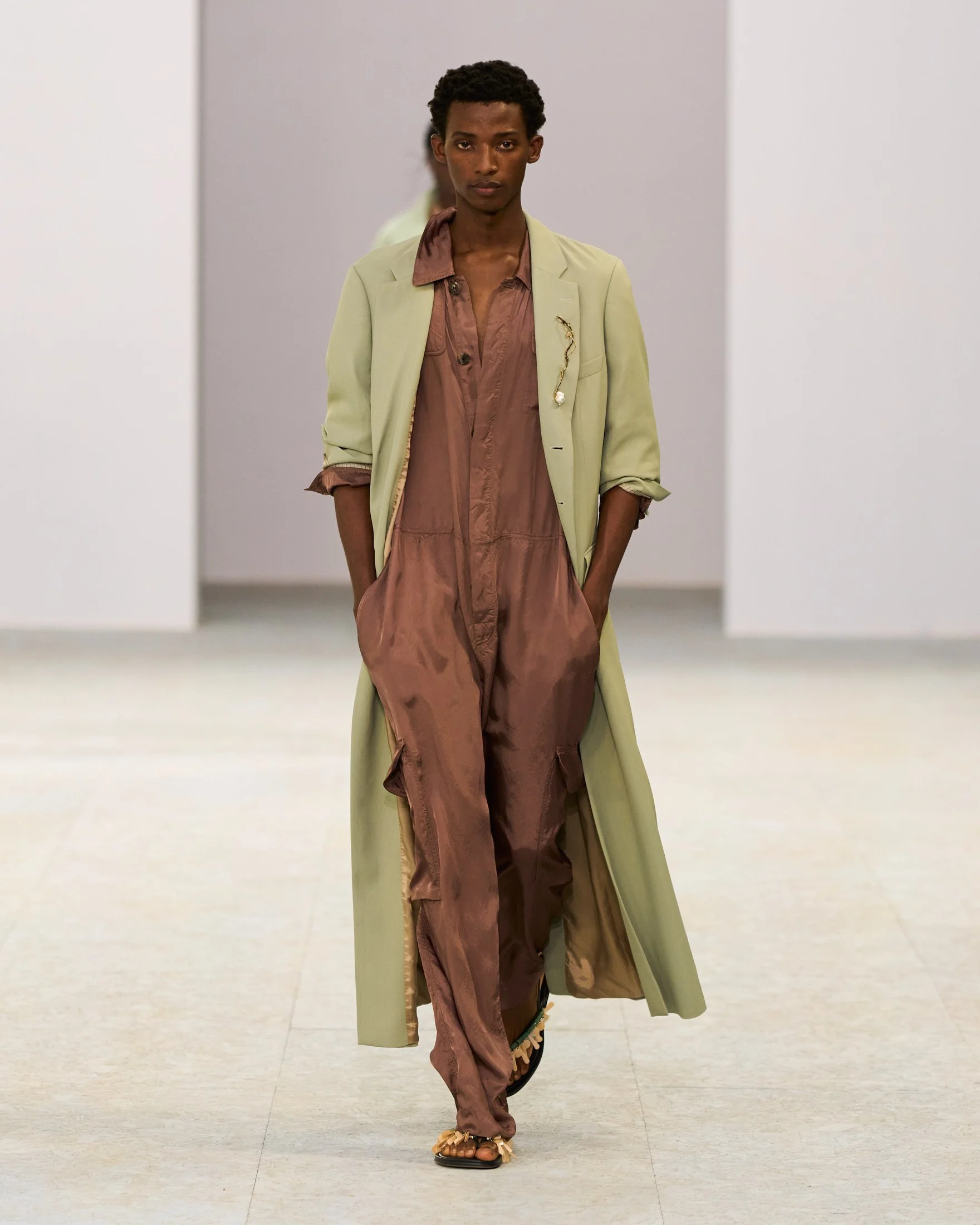
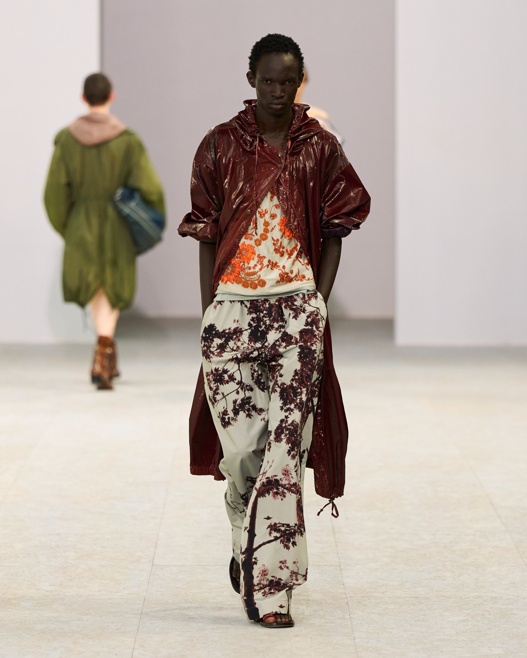
Julian Klausner has really found his footing at Dries Van Noten. With each season he seems increasingly confident in pushing the house’s poetic sensibility forward, and Spring/Summer 2027 felt like his strongest menswear collection yet. Inspired by Stéphane Mallarmé’s L’Après-midi d’un faune, the collection explored the hazy space between dream and reality, translating the poem’s sensual atmosphere into clothes that appeared almost weightless.
Everything was built around movement and lightness. Unlined dusters, transparent trenches, washed silk parkas and fluid tailoring floated around the body, while sheer layers, scooped necklines and delicate camisole-inspired tops introduced a softness that felt incredibly Dries van Noten coded. Klausner integrated lingerie references naturally, making them a desirable part of a masculine wardrobe. It felt intimate and contemporary.
The colour palette drifted from blush, sand and faded peach to watery blues, forest greens and deep midnight tones. Prints depicting blooming branches, clouded skies and shimmering reflections unfolded across coats, shirts and silk trousers, while sequins caught the light like sunlight on water. Bare legs, lace-up ballet flats, oversized soft bags and charms made from found objects reinforced the collection’s dreamlike quality.
There was an undeniable romance to the collection. Klausner proposed a wardrobe that embraced vulnerability without sacrificing wearability. As discussions around softer masculinity intensify across the industry, Dries Van Noten offered one of the most convincing interpretations — beautifully crafted, emotionally resonant and perfectly attuned to the realities of dressing for increasingly hotter summers.
MAM X CUPRA
review by FRANCESCO PIZZUTI
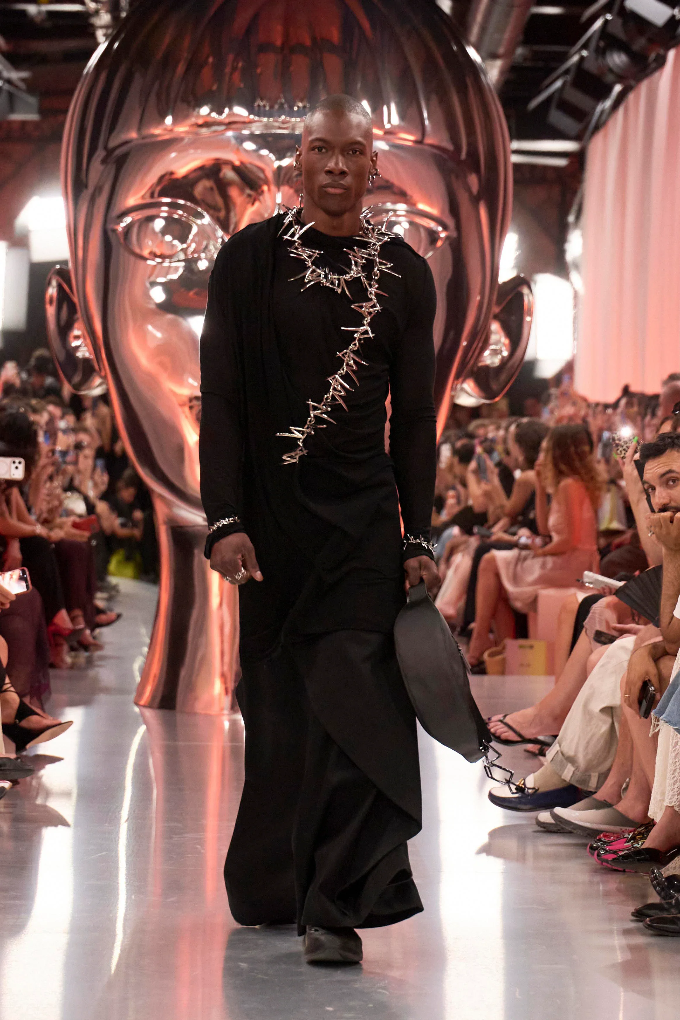
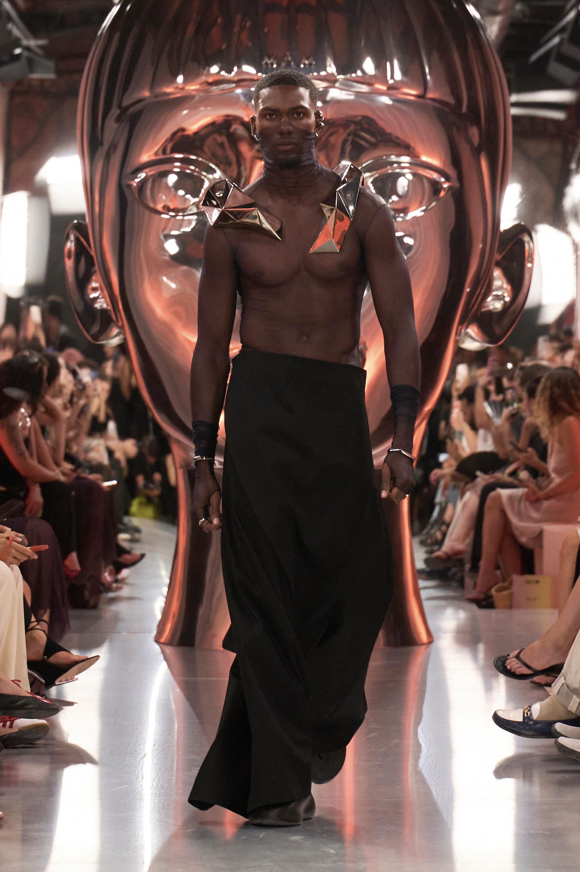
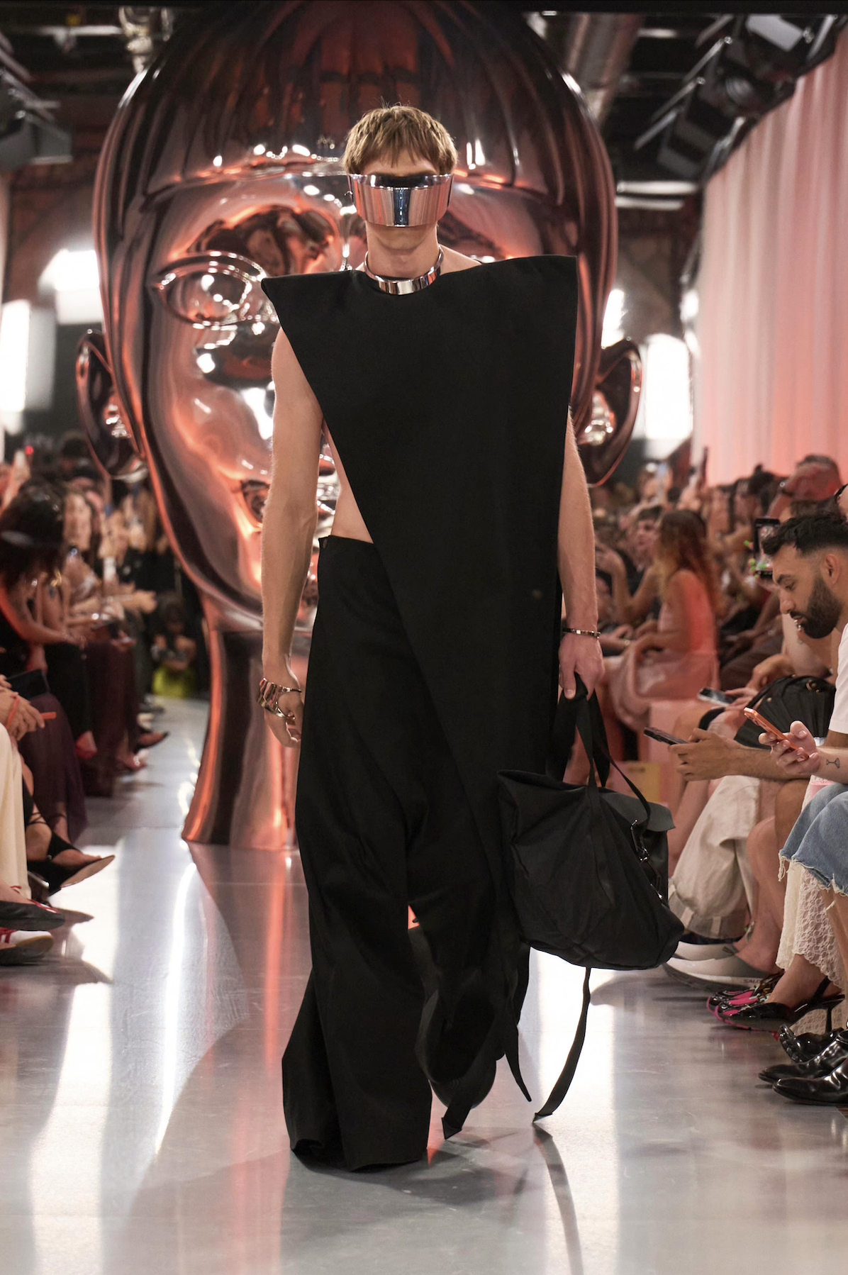
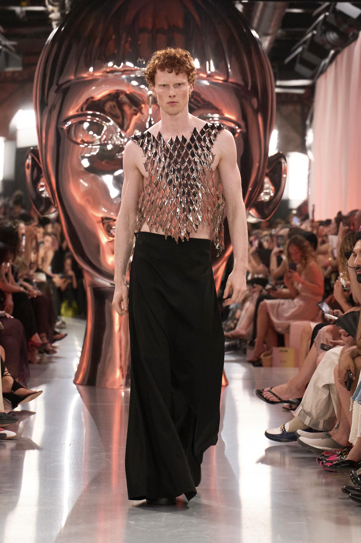
Aliens took over the Parisian catwalk during the MAM show as models’ carefully adorned bodies moved as if they came from another planet. The presentation imagined six interconnected civilisations, each embodying a distinct state of consciousness while sharing the same origin. This otherworldly energy was precisely the inspiration for the MAM x CUPRA “R Collection”, inspired by the CUPRA Raval and presented in the show.
MAM approached the show as a complete world-building exercise, introducing figures like the Andromedas, Felines and Carians — this last one specifically made possible by CUPRA. Marking the first time that the brand is designing its own clothes for the show, the garments featured simple lines, monochrome palettes, slightly exaggerated angular shapes, and geometric silhouettes. These garments acted as the perfect backdrop for the jewellery, allowing glossy, chunky and spiked forms to become the true protagonists.
The MAM x CUPRA collection also marks the collaboration’s first men’s jewellery line. Developed using MAM’s ULTRALIGHT CORE™ technology, the pieces feature an innovative hollow construction that creates sculptural, voluminous forms while remaining remarkably lightweight. Drawing from CUPRA’s design language and parametric architecture, the collection is engineered as wearable art.
This collaboration felt confident and individual, inspired by some of the brand's most distinctive design codes and reflecting the precision and forward momentum at the heart of the CUPRA spirit.
