
PARIS FASHION WEEK SPRING/SUMMER 2027: DAY 3
BALMAIN
review by TIANA DE HASETH
all images courtesy of BALMAIN
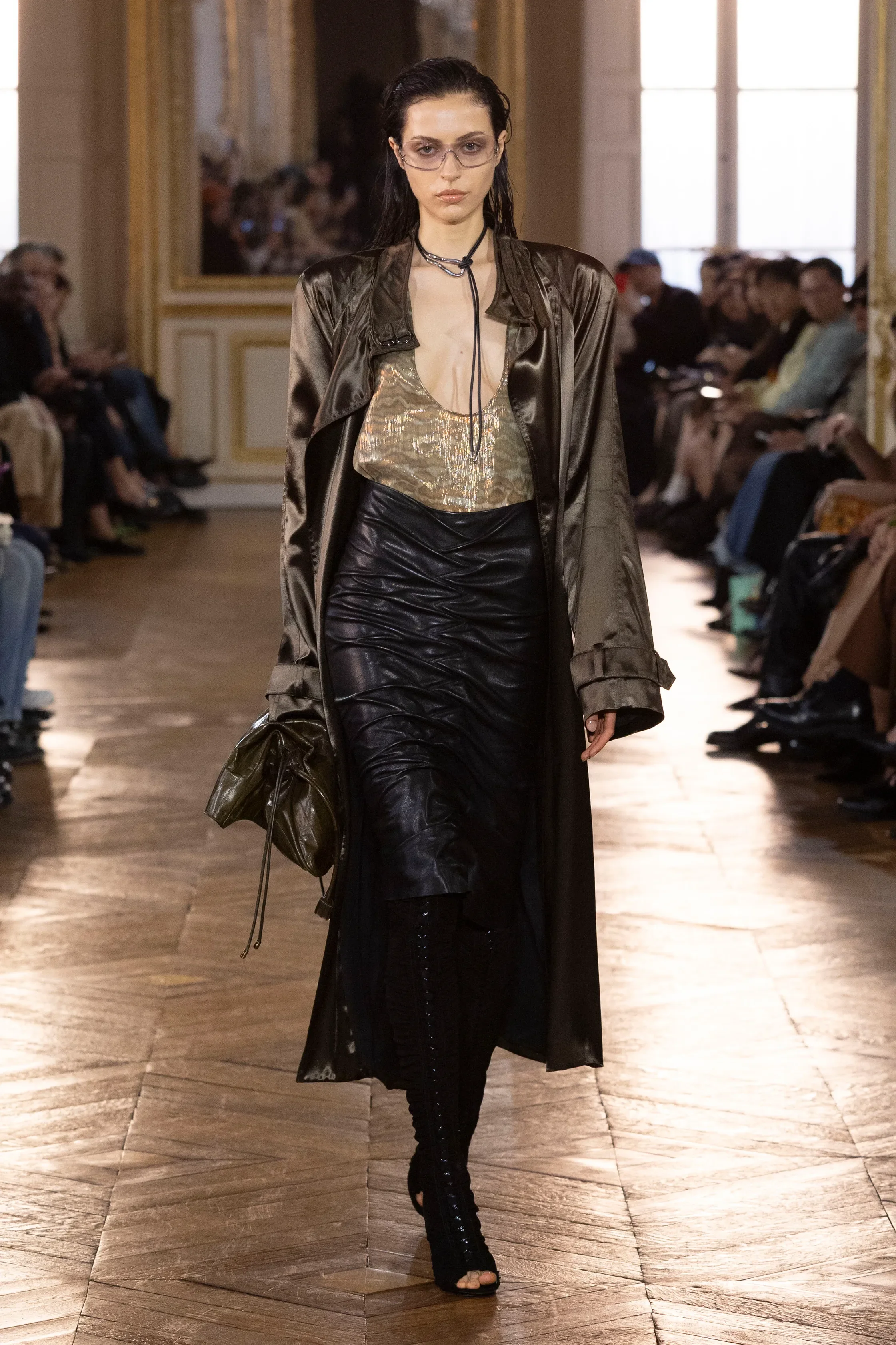
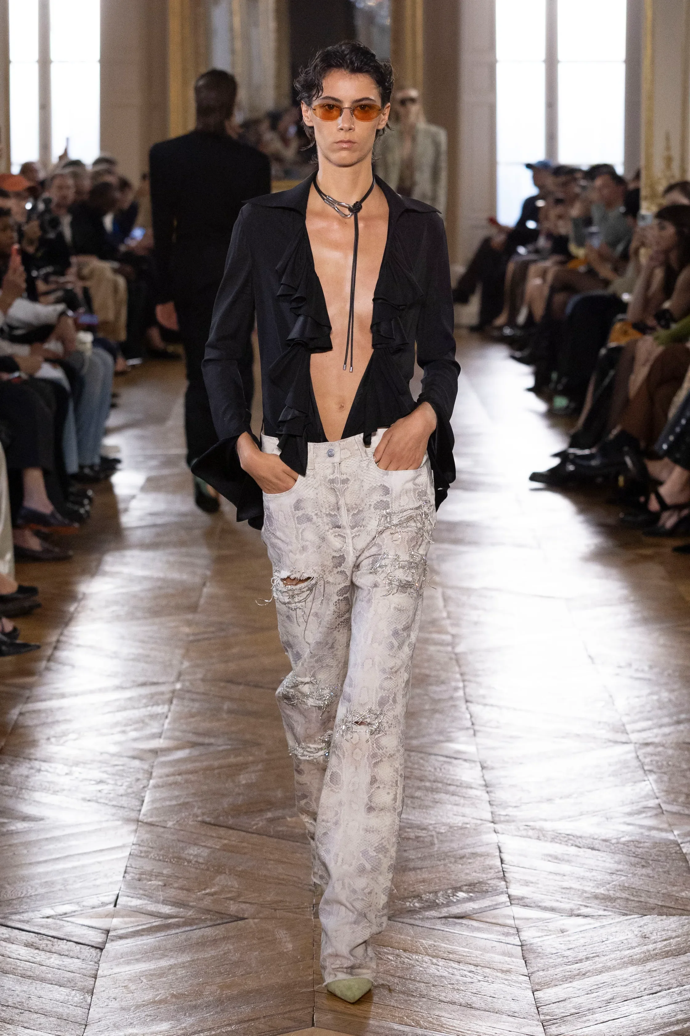
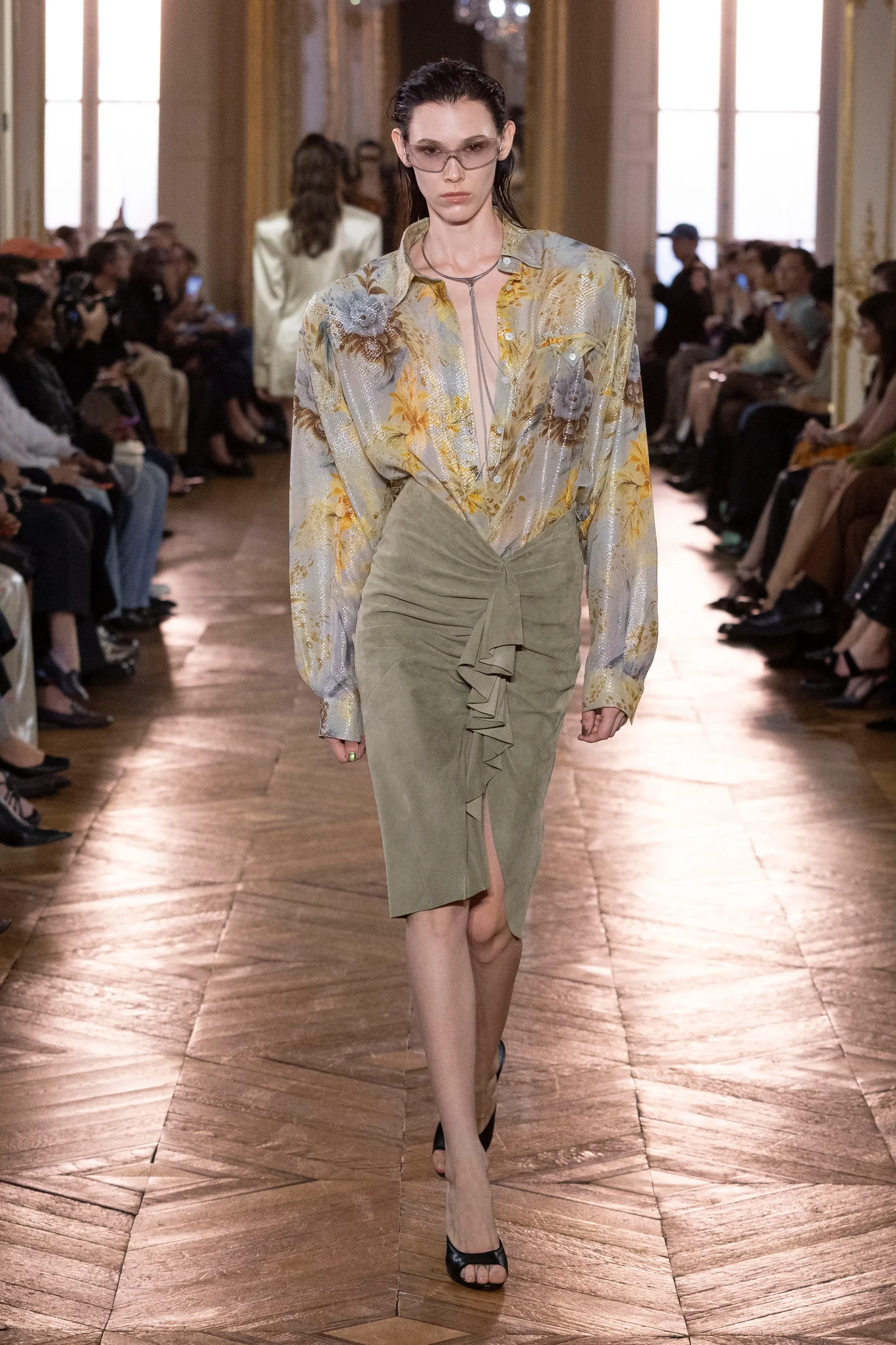
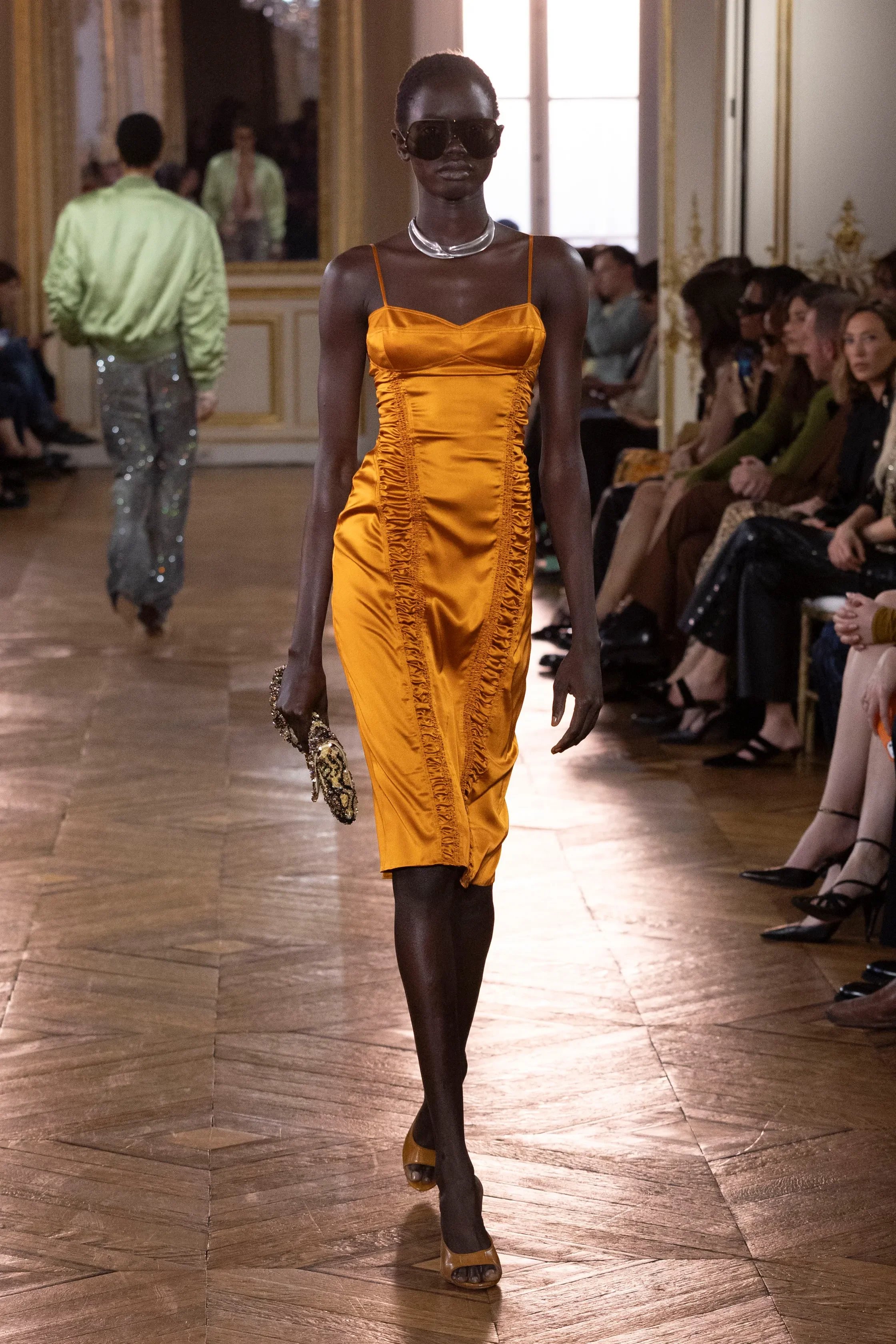
Antonin Tron embodied Pierre Balmain’s archive for his Spring Summer 2027 collection with a glamorous runway show held at the Hôtel de Maisons. With this being Tron’s second collection for Balmain, he maintained the house’s signature designs by seeking inspiration from founder Pierre Balmain — particularly his love for animal prints and extreme draping. These were techniques that evoked the elegance of mid-century Hollywood and the fascination with glamour.
These signature details were a big part of the collection. Broad shoulders, deep necklines, shimmering animal prints, intricate embroidery, and satin tailoring shaped the house’s core identity.
However, Tron’s own fascination with California’s mystical and spiritual counterculture era of the 60s and 70s gave the glamorous collection its psychedelic edge. Figures like Joan Didion, Walter De Maria, and Micheal Foucault, inspired the leather jackets, lace tops, corset seaming, bra tops, and draped leopard-print dresses that were styled with a wet-hair look and large framed sunglasses that embodied the spirit of Palm Springs and Death Valley.
The colour palette moved between brown, green, black, and beige, resembling the colours of the Californian desert. While, the silhouettes were defined by deep necklines, draped fabrics, and broad shoulders. The shimmering animal prints and floral print silks served as the psychedelic fever dream of Los Angeles translated in Tron’s own vision for Balmain.
RUOHAN
review by NIA TOPALOVA
all images courtesy of RUOHAN
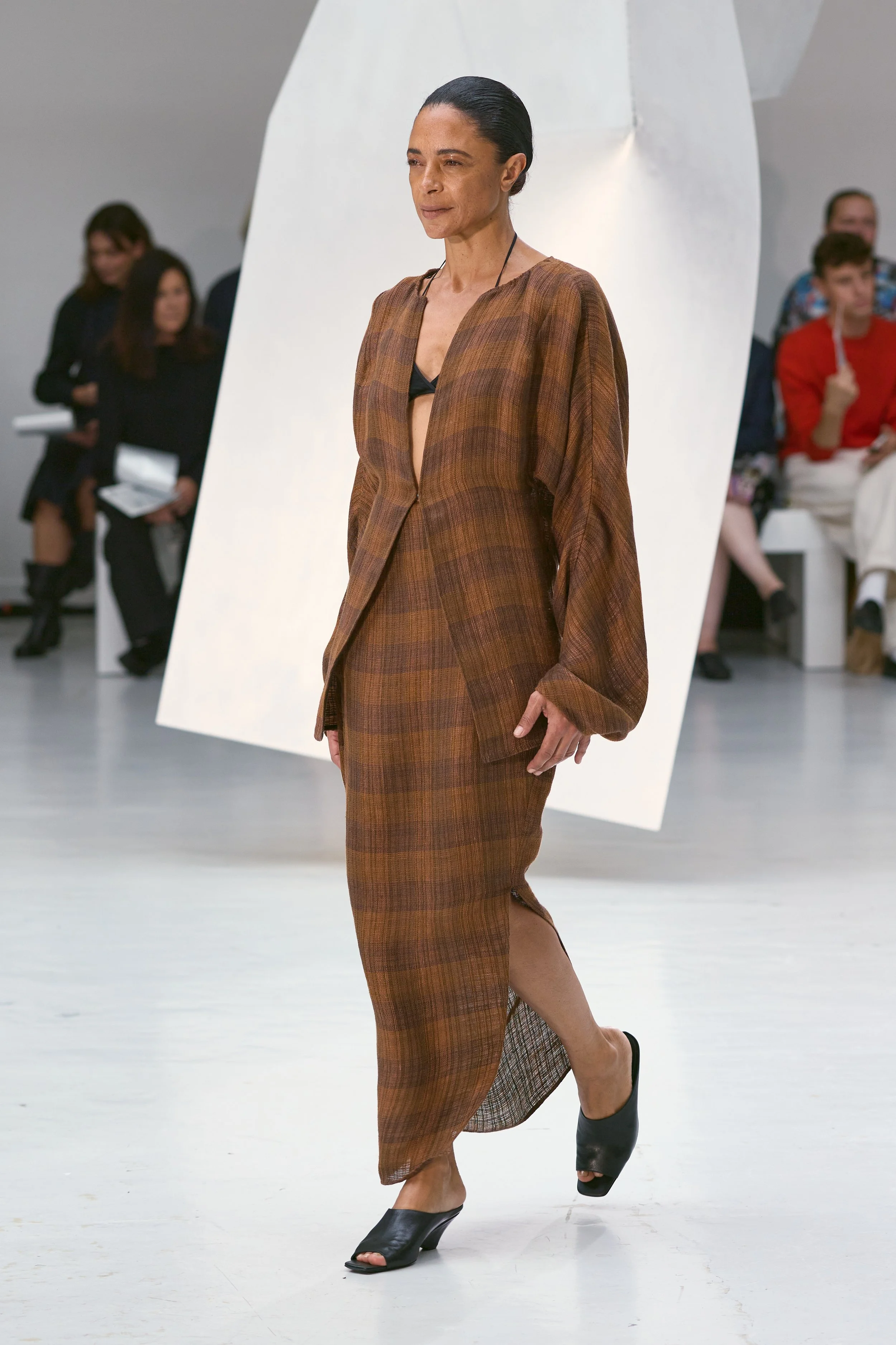
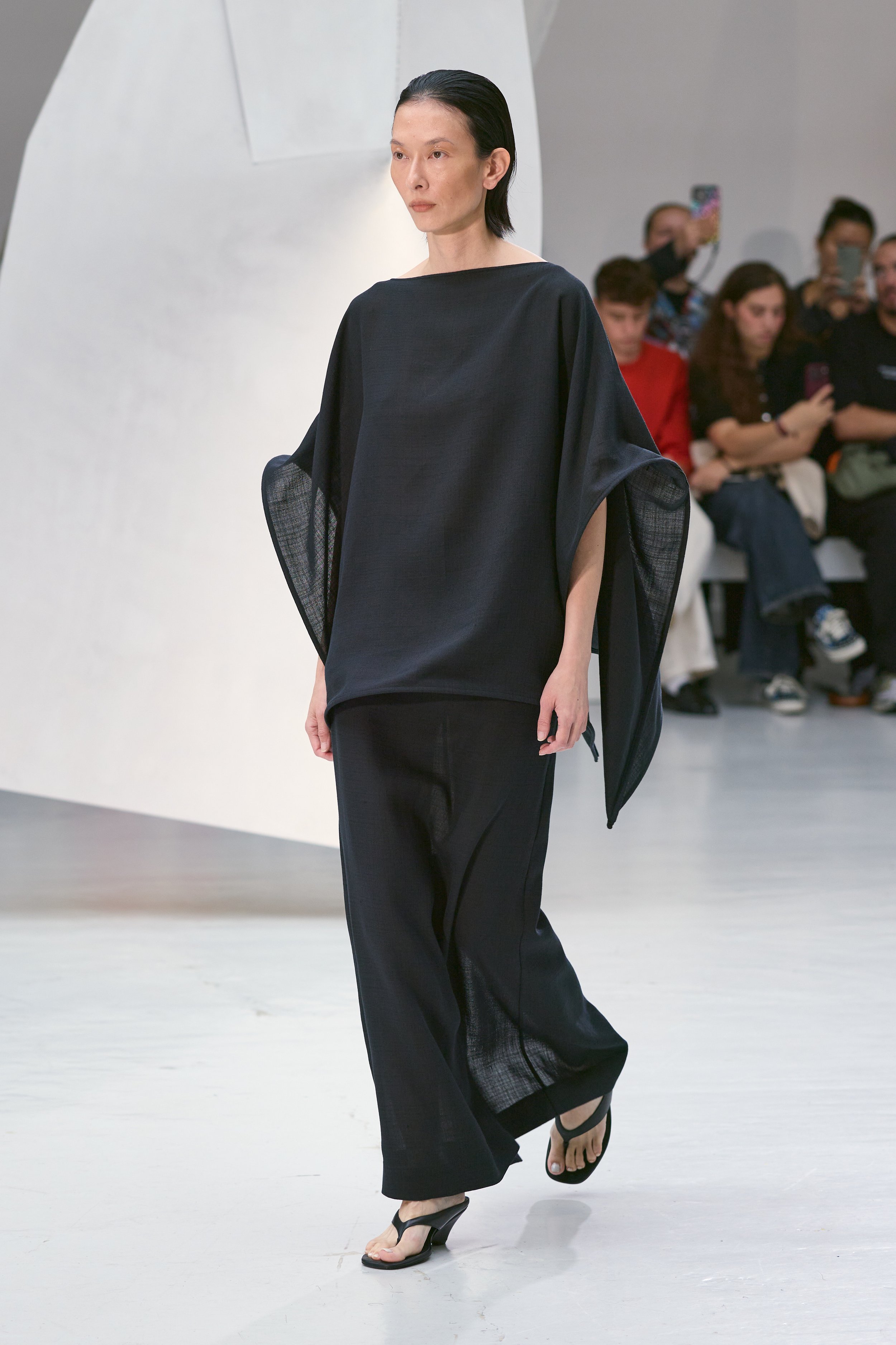
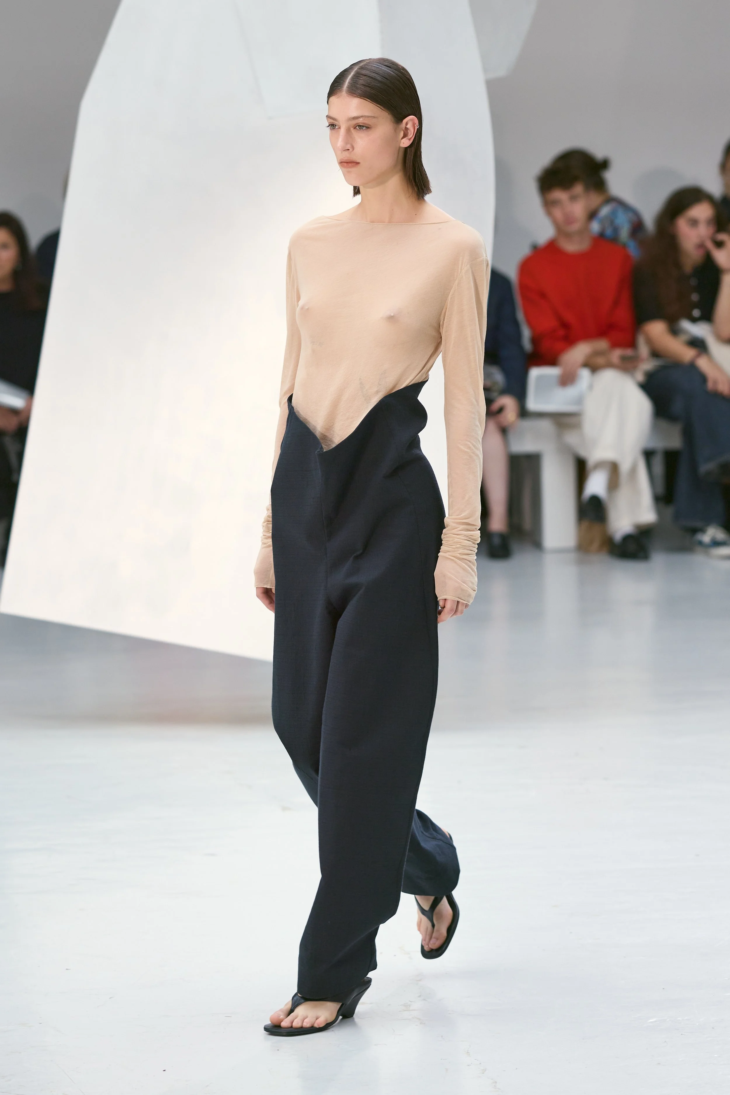
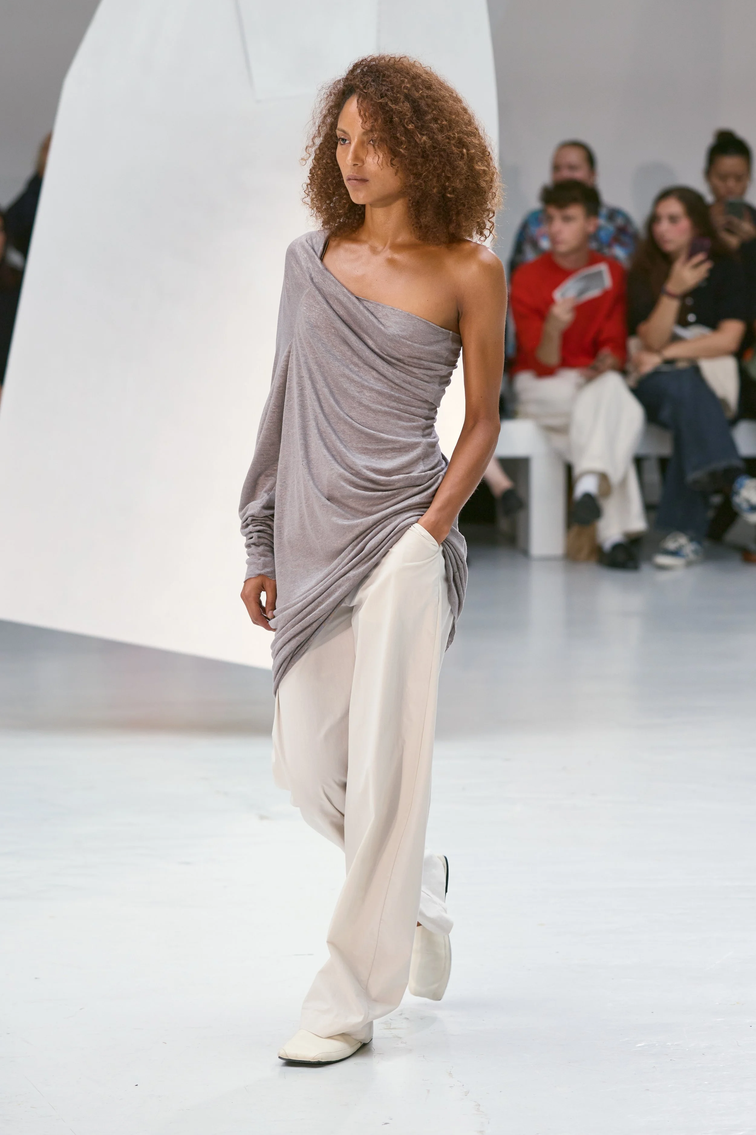
In Becoming starts with the idea of “what happens when something familiar is moved just slightly out of place?” The collection takes its cue from the basic strokes of Chinese characters: horizontal, vertical, falling left, falling right, and the way all of these small gestures gather together, becoming something with entirely different meaning.
The process begins with a grid, gradually broken apart into cuts, openings and interruptions. From there, the basic pieces of a wardrobe: a front, a back, a sleeve, a skirt, are treated kind of like building blocks. Darts become dividing lines; panels shift, stretch and reconnect. The results can still be traced back to the original garment, but its proportions and relationships have been thrown off.
The same linear forms are enlarged into aluminium structures suspended through the space. The fabric follows that same logic: a specially developed linen has the grid built directly into its weave, while ramie voile moves between transparency and rigidity. Everything seems caught between its original state and whatever it might become next. The collection’s premise is that becoming is about learning to see the familiar from somewhere else.
DRIES VAN NOTEN
review by MAREK BARTEK
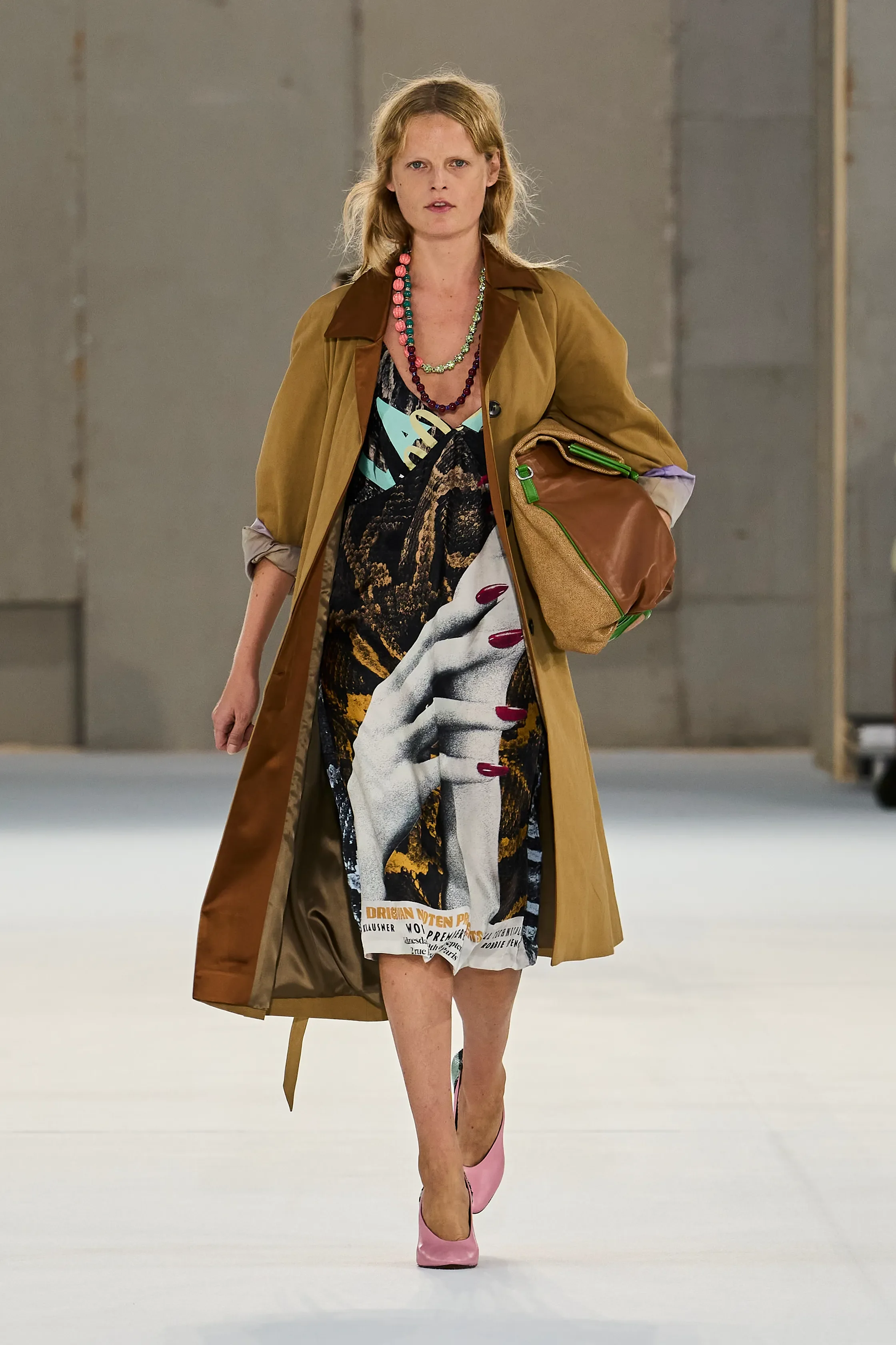
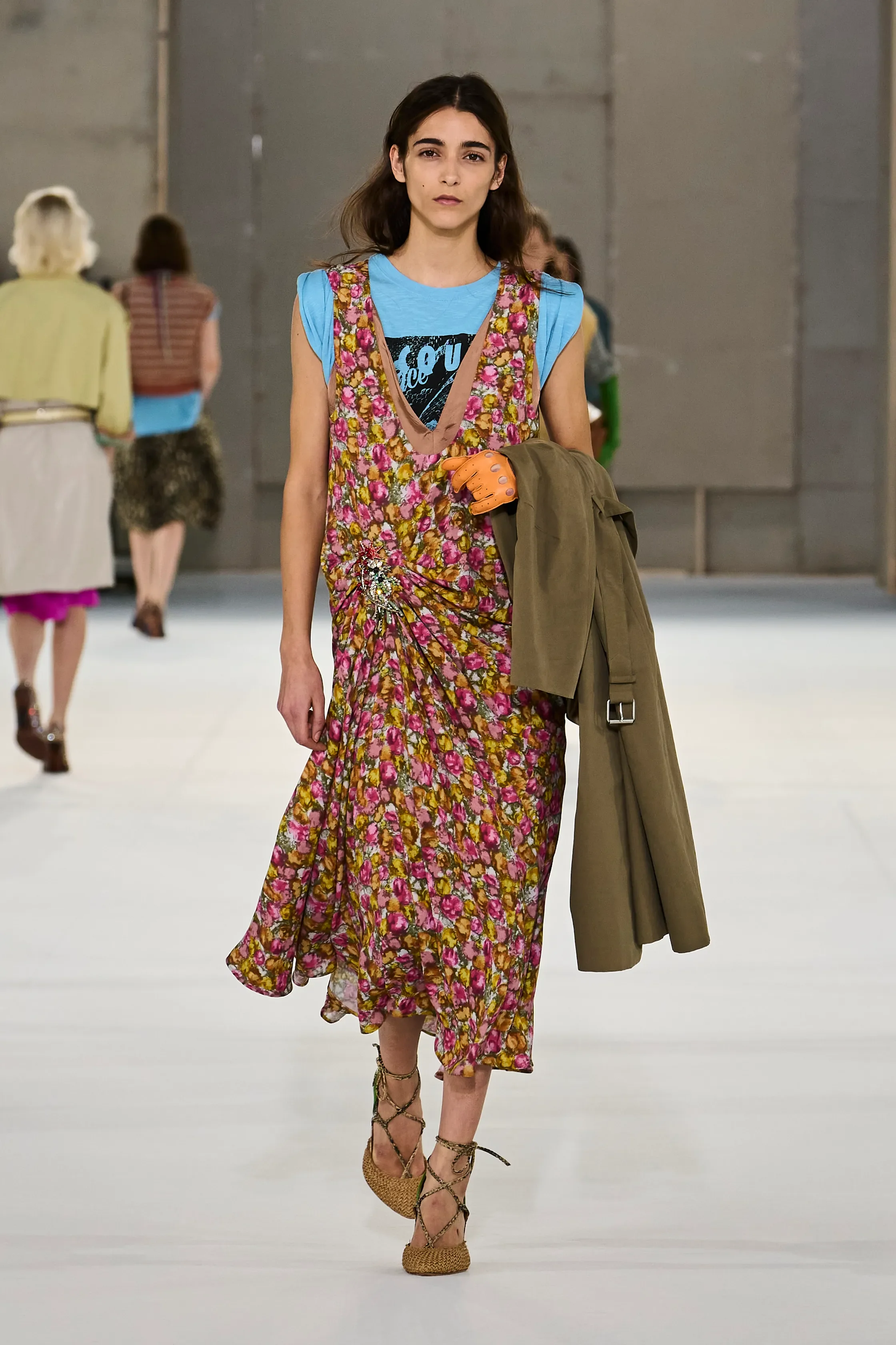
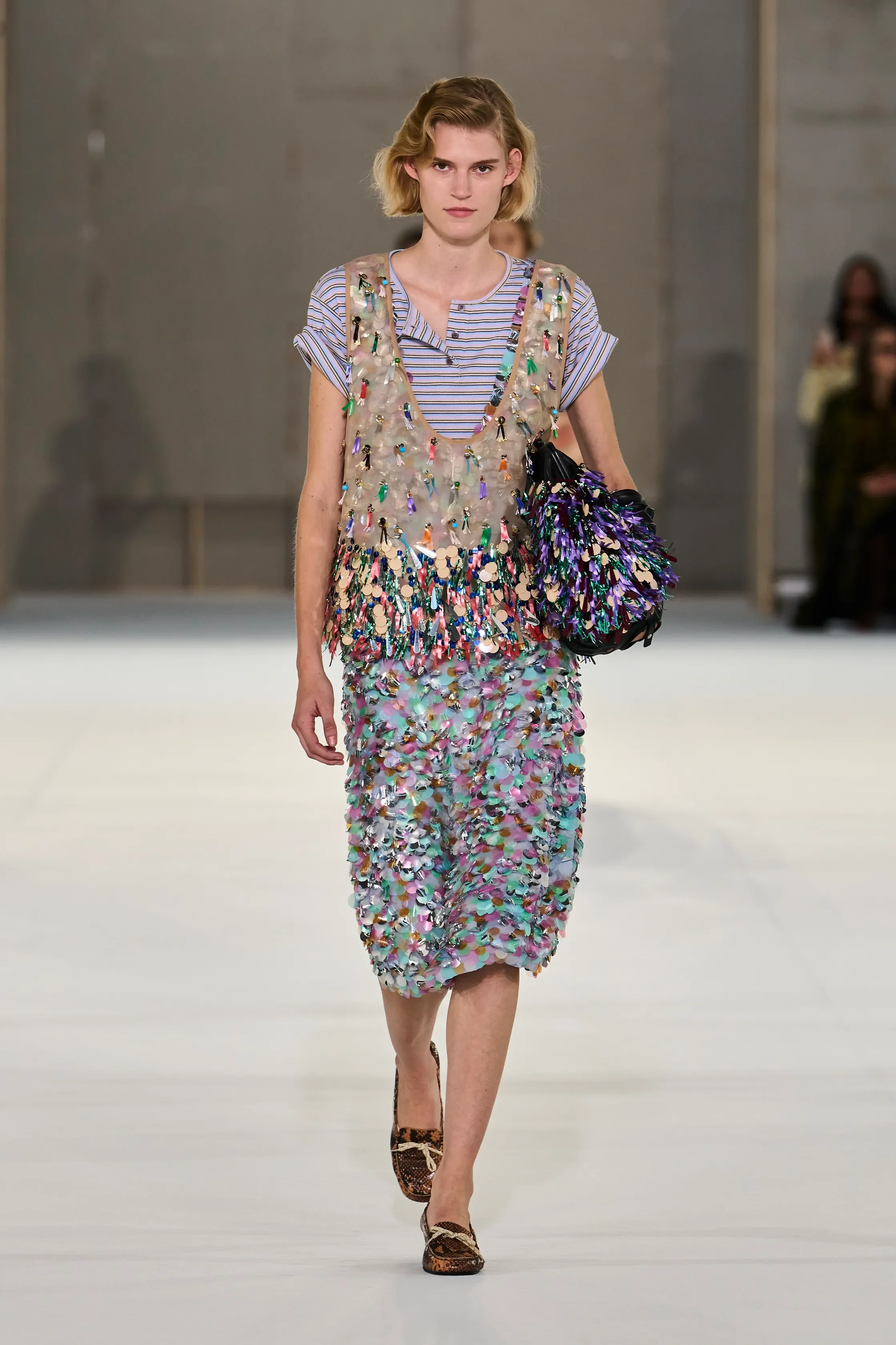
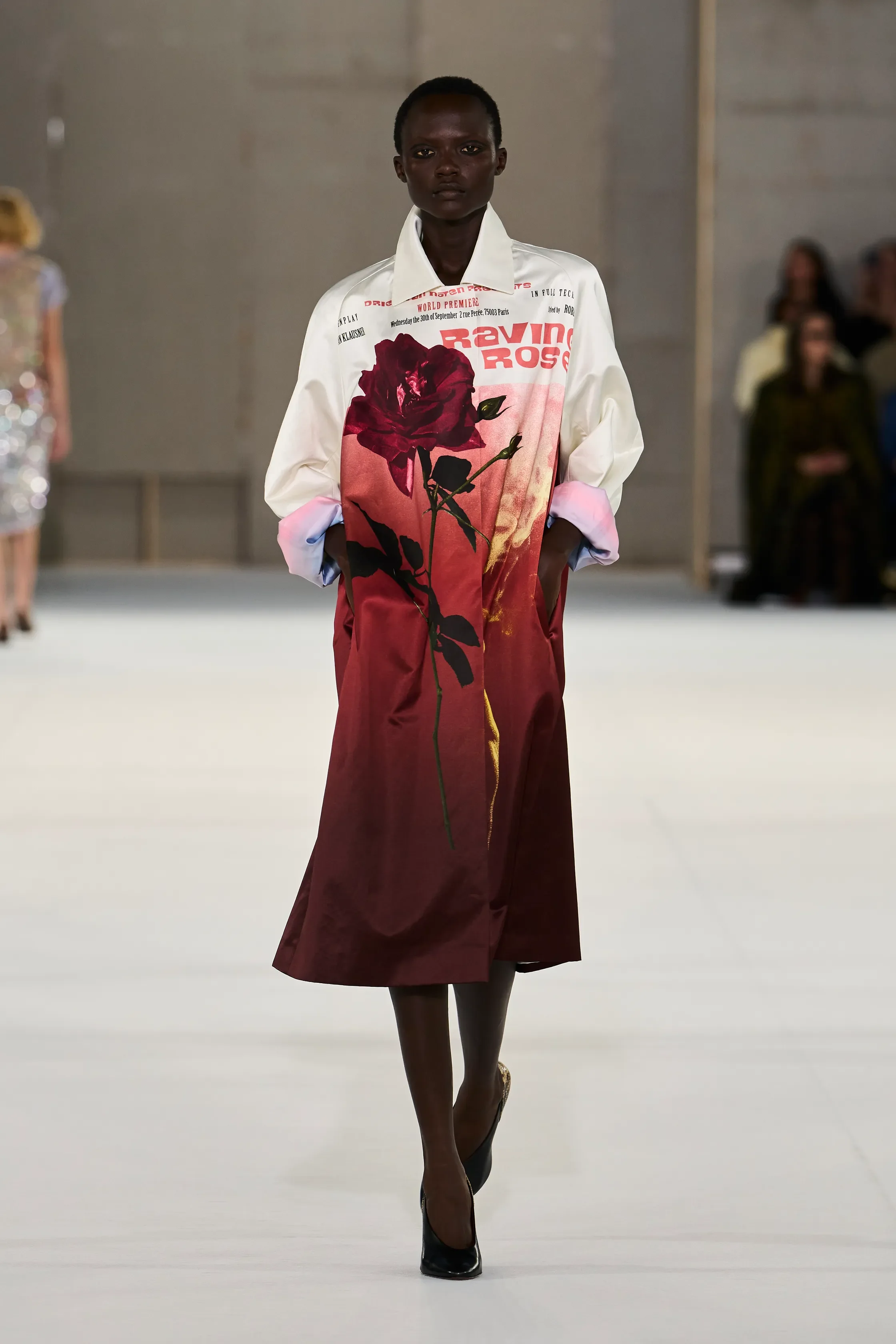
all images courtesy of DRIES VAN NOTEN
Julian Klausner has officially found his groove at Dries Van Noten. For Spring/Summer 2027, he imagined an actress leaving a film set and returning to reality, with the character she had been playing still lingering somewhere in her mind. Playing with the idea of dressing up for yourself, Klausner delivered a collection that felt beautifully flamboyant — vibrant, sensual and full of character.
Vintage movie posters became one-off prints across dresses, skirts, tops and trenches, complete with fictional titles like Lacquer and Lace, Vipère and Ruffle Her Feathers. Look closely at the credits and Klausner even slipped his own name in — a literal signature on what already feels like a signature collection. Unlike a stripe, floral or polka dot, these prints belong so specifically to this moment that it is difficult to imagine them simply returning next season. Their almost one-off quality, turn this collection into one full of collectables.
Klausner layered with joy and abandon this time around. T-shirts underneath dresses, knits over florals, skirts seemingly piled over one another, jackets thrown over slips, and prints clashing against yet more prints. Belts cinched otherwise loose silhouettes, brooches and embellishments moved and jingled as the models walked, while strings of beads added another layer of colour. It was busy busy and yet, it was a feast for the eye.
And what colour there was. Bubblegum pink met turquoise, mustard, lilac and brown; acid yellow appeared against dusty blue, while muted florals sat alongside saturated graphics. Individually, many of the shades were surprisingly subdued, but together they made the collection feel incredibly vibrant.
There was sensuality too, although never in an obvious way. A camisole slipping from beneath a trench, a floral dress layered over a T-shirt, or a skirt moving loosely around the body gave the clothes an ease that balanced all that decoration. Even the accessories amplified the theme, from ladylike pumps in sugary colours to heeled loafers and softly collapsed bags tucked under the arm.
Most importantly, Klausner no longer seems afraid of having fun with the language he inherited. The colour, print, unexpected combinations and slightly eccentric glamour feel unmistakably Dries Van Noten, but the confidence increasingly feels like his own.
STELLA MCCARTNEY
review by DEBORAH DRENOFCI
all images courtesy of STELLA MCCARTNEY
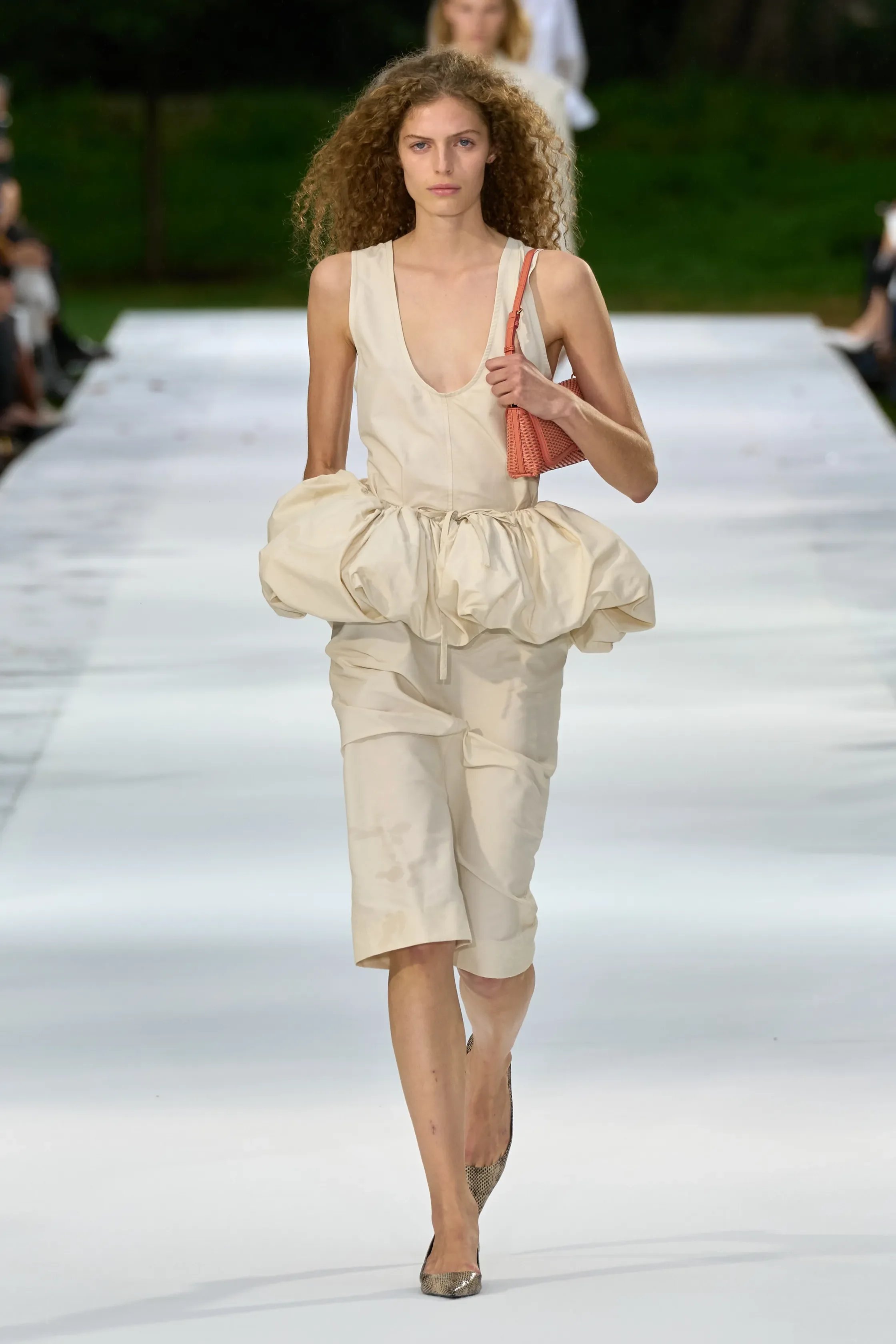
The Stella McCartney SS27 collection seemed like familiar territory, yet it brought a fresh breeze with it. After all, Stella McCartney is a cool girl, and she knows exactly how to dress one.
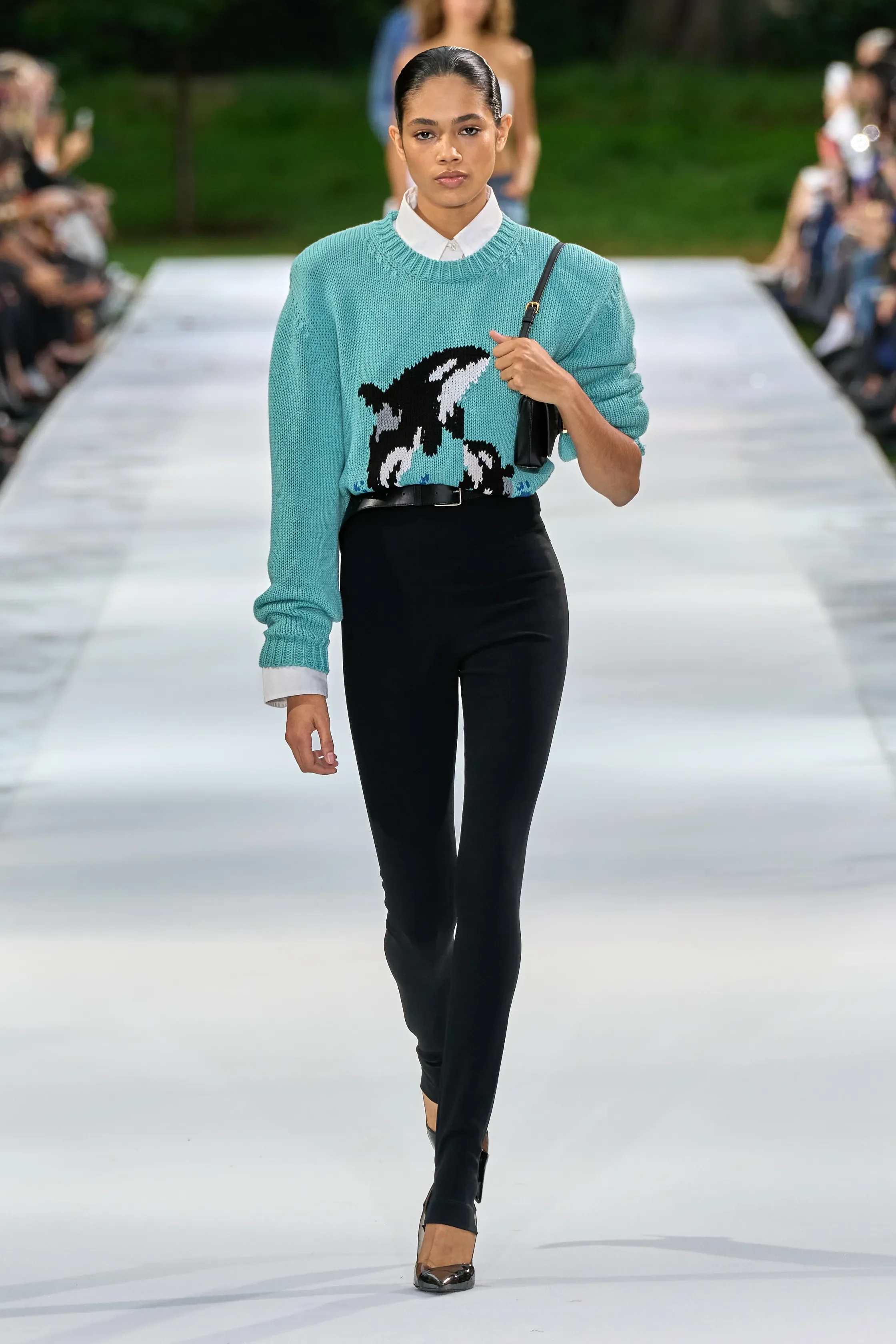
Particularly striking were the aquatic motifs that ran through the collection. Shades of blue appeared throughout, each embodying a different silhouette. Look 25 caught my eye: an oversized grey T-shirt dress with orange-toned sleeves and sea-life graphics across the front. Then came a turquoise knit with an orca across the chest. Cool girls love the ocean. The colour palette, however, was varied, opening with white, beige, black and rose before moving on to pops of blue and red, olive tones and browns.
McCartney played with shape, movement and proportion without losing the effortlessness that makes this collection feel so easy-going. On one hand, there was oversized tailoring, patchworked two-tone denim and crisp boxy shirts. A cream blazer was thrown over a denim shirt and pinstriped shorts, and low-slung jeans came with crystal appliqués at the hips. On the other hand, there were fantastic ruffle combinations. A red and turquoise striped knit set was edged in ruffles that looked like ocean waves, and floral pouffs bloomed like coral. A bright orange bandeau looked as if it had been lifted straight from a reef, while a strapless cream mini dress was covered in curling rosettes that resembled seafoam.
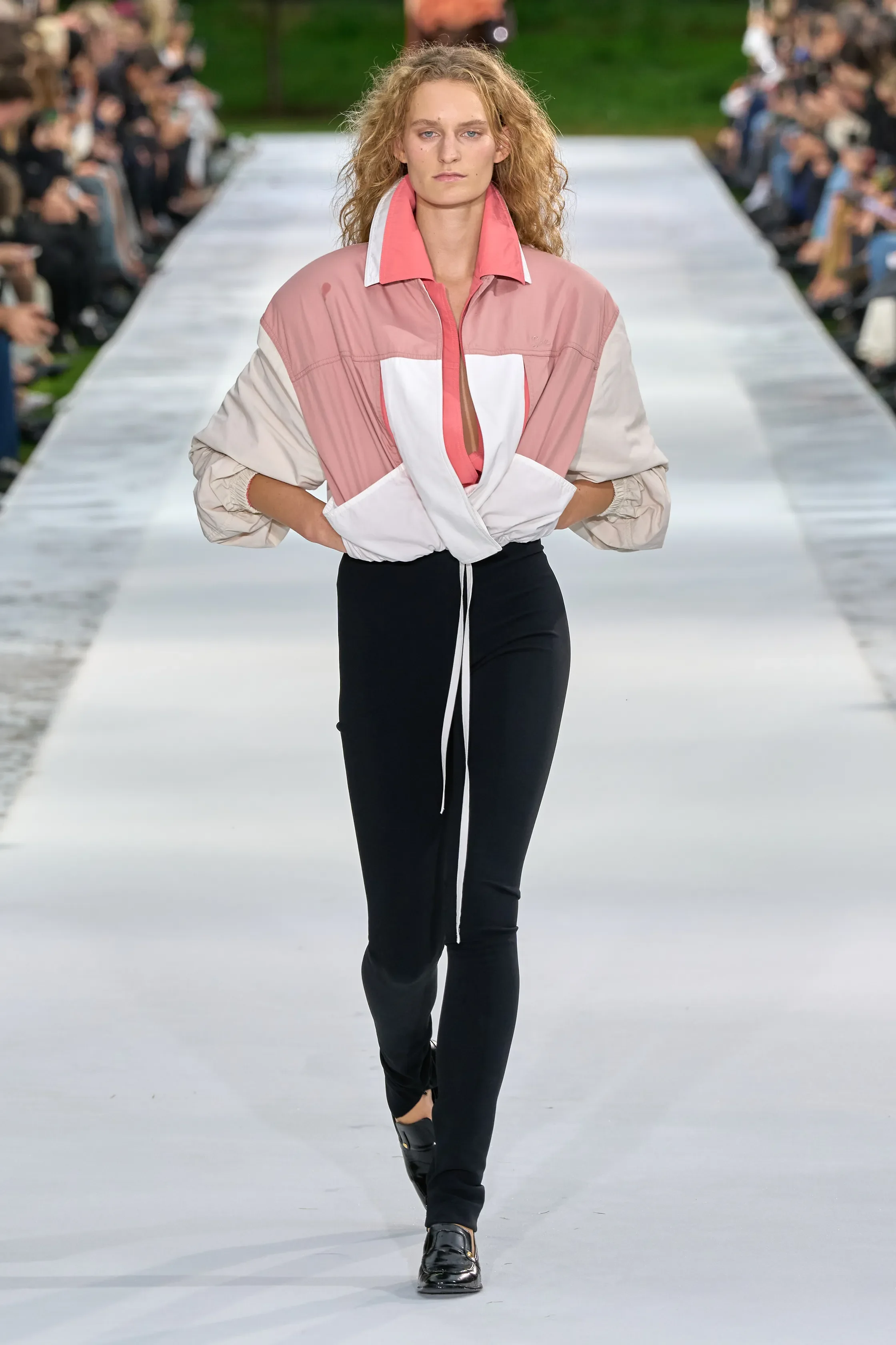
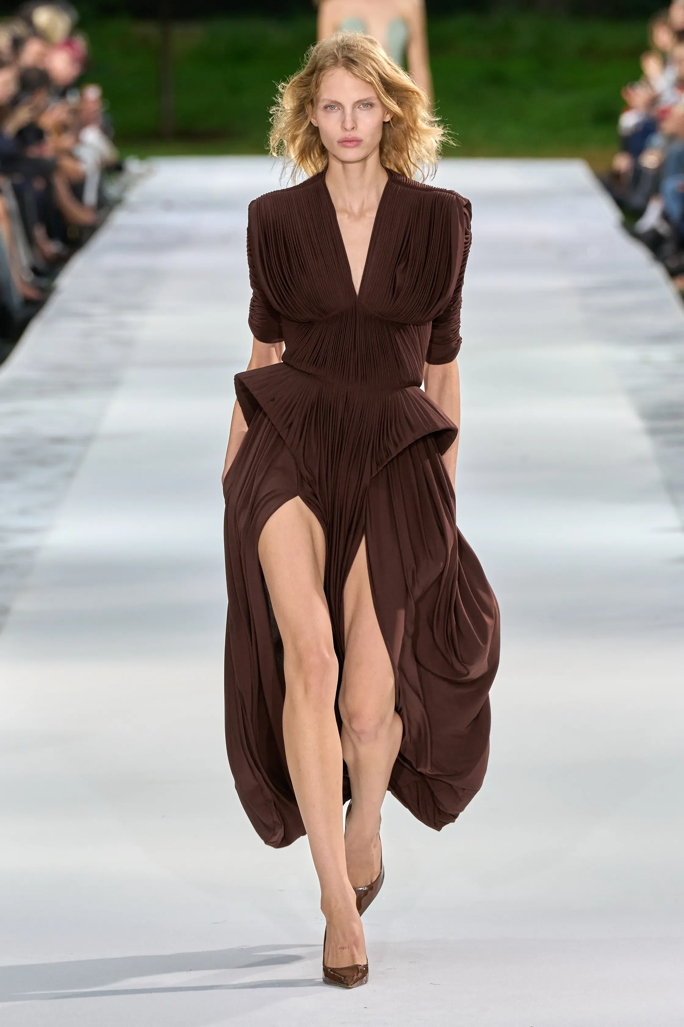
In between, McCartney kept things light and wearable. A coral trench dress moved with every step, a white poplin mini puffed out at the hem, and a pink colour-block windbreaker over black leggings and loafers brought a sporty edge. Towards the end, the dresses softened into draped jersey in sage and chocolate brown, knotted and cut out at the waist, with Miranda Kerr walking in the sage.
Nothing tried too hard, and that was exactly the point. Familiar territory, yes, but McCartney proved that familiar can still be refreshing.
AWGE
review by TIANA DE HASETH
all images courtesy of AWGE
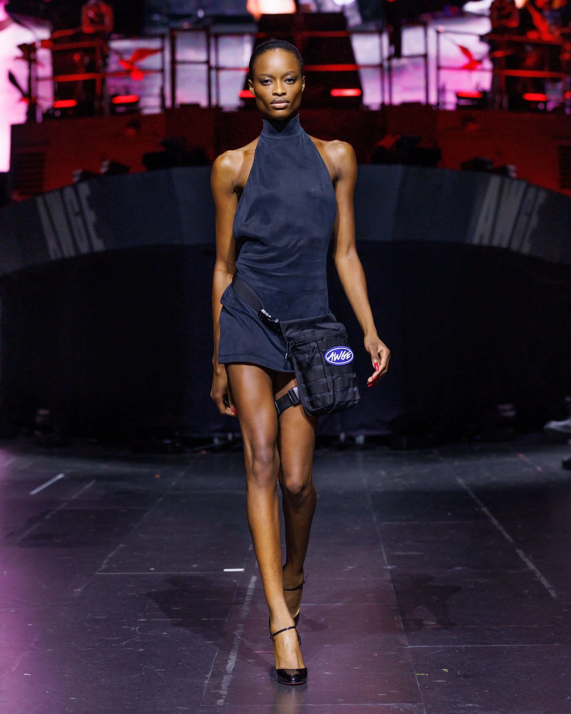
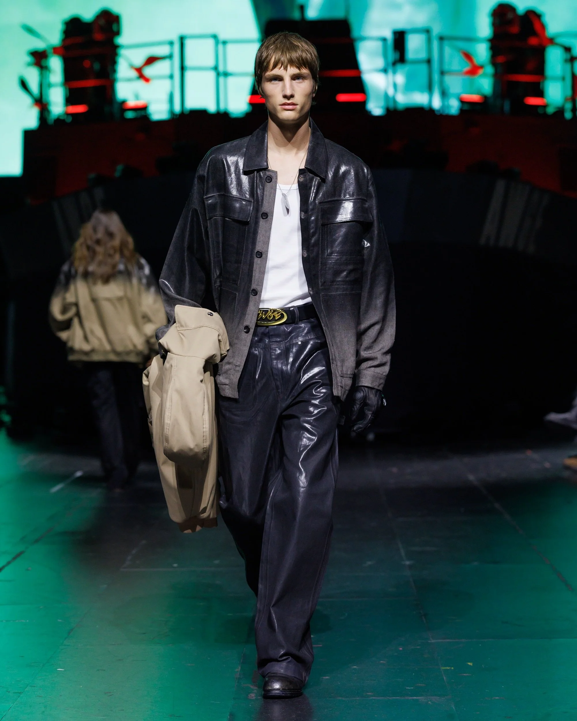
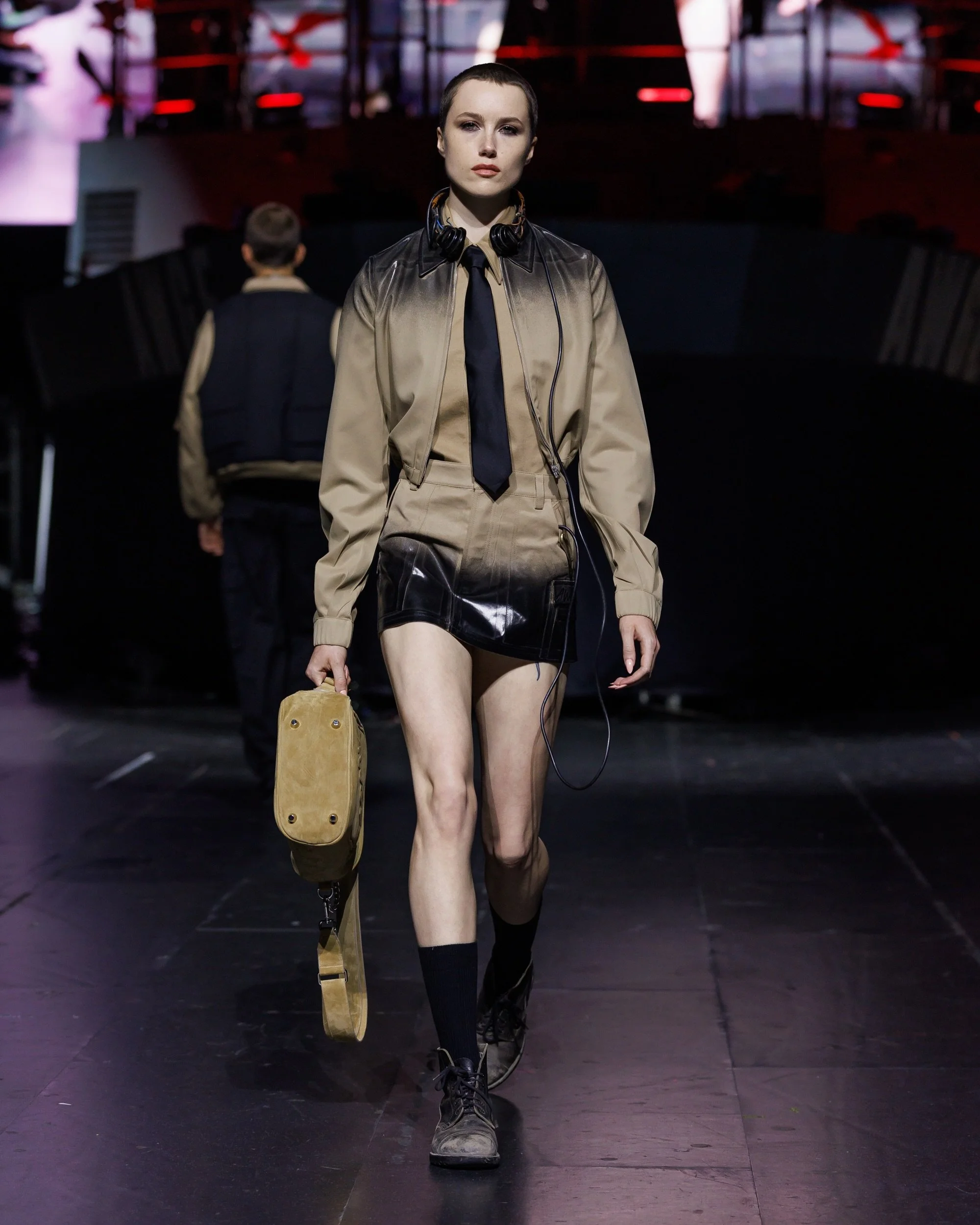
A$AP Rocky fans who had reserved-seat concert tickets to see him in Paris, were lucky to enjoy a surprise runway show from the AWGE Spring Summer 2027 collection before his tour performance at the Accor Arena. The runway show was part of the concert experience, with no tickets being sold outside of the show, making it an exclusive experience for concert attendees.
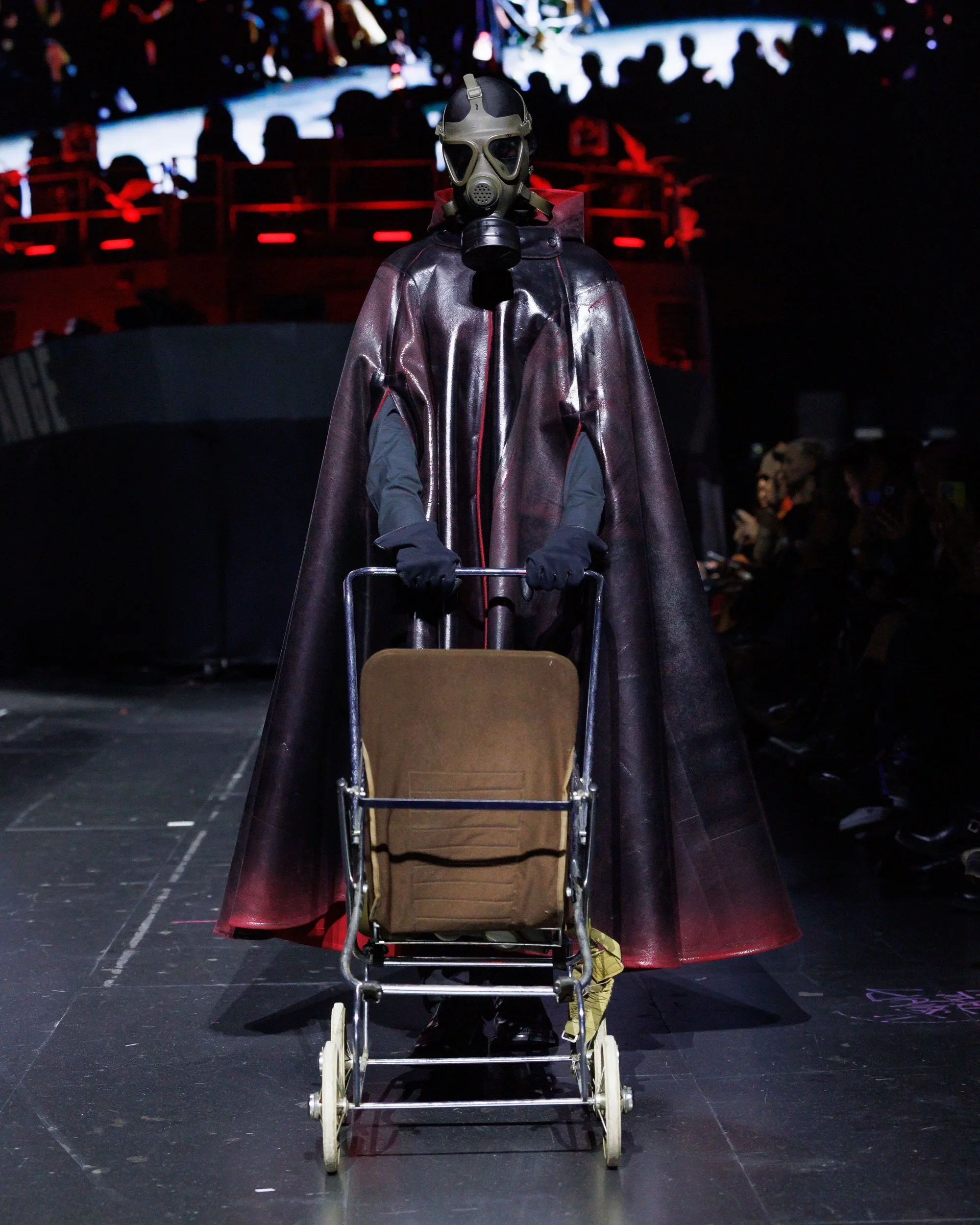
Titled “Anti War Global Economics”, the runway was a combination of streetwear, military uniforms, and tailoring, exploring the realities of war and global conflicts. AWGE seemed inspired by the elements of the military and turned them into fashion statements by reworking uniforms into streetwear garments.
The military references included gas masks, Napoleon-style jackets, bomber jackets, and camp prints that were more than just clothing, but symbolised the themes of survival, global conflict, and militarized imagery that we see in contemporary culture.
The oversized silhouettes and layered styling are what resembles the military uniforms. Making the collection a broader conversation about territory, authority, and resistance that’s rooted in the language of streetwear.
VAQUERA
review by DEBORAH DRENOFCI
all images courtesy of VAQUEARA
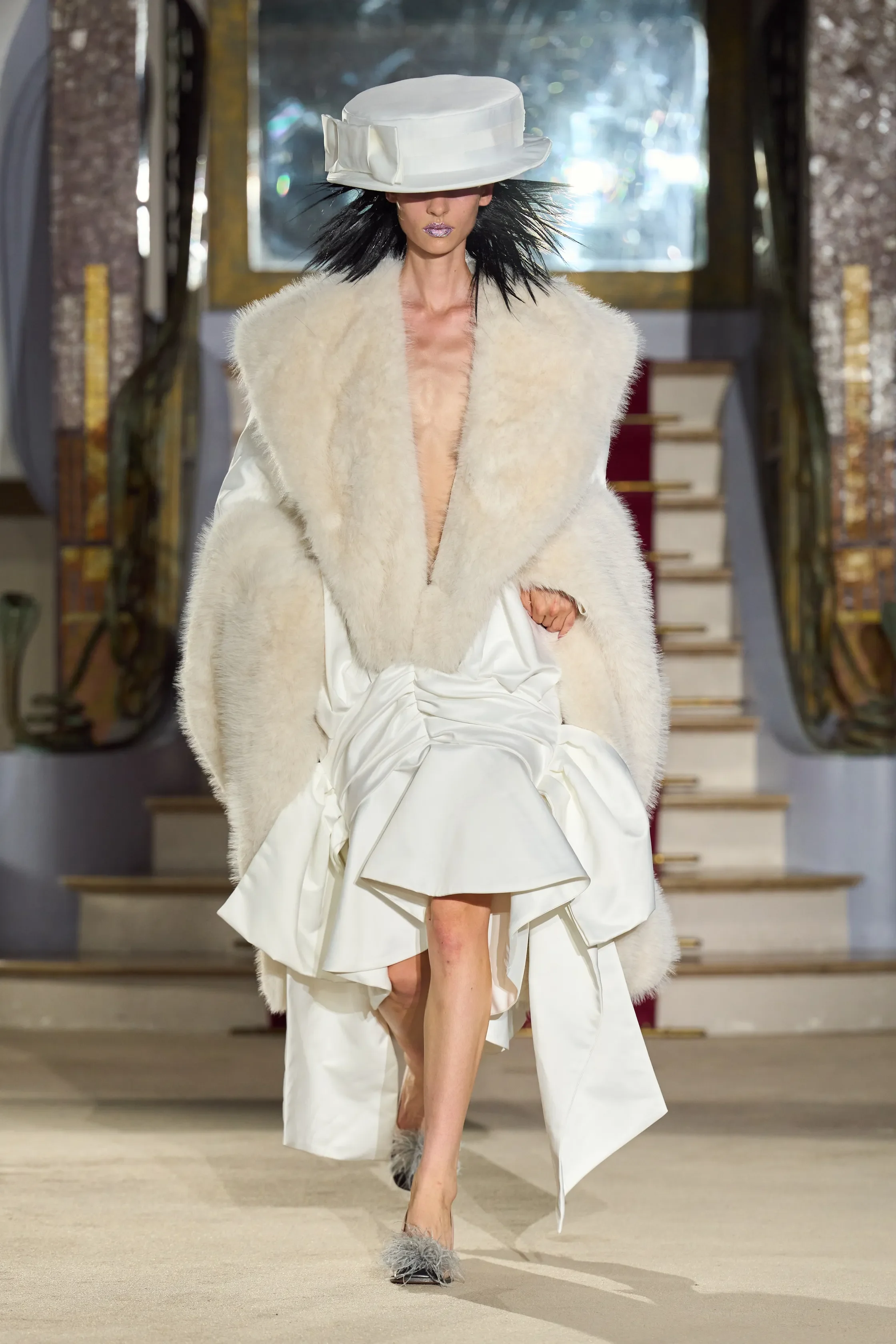
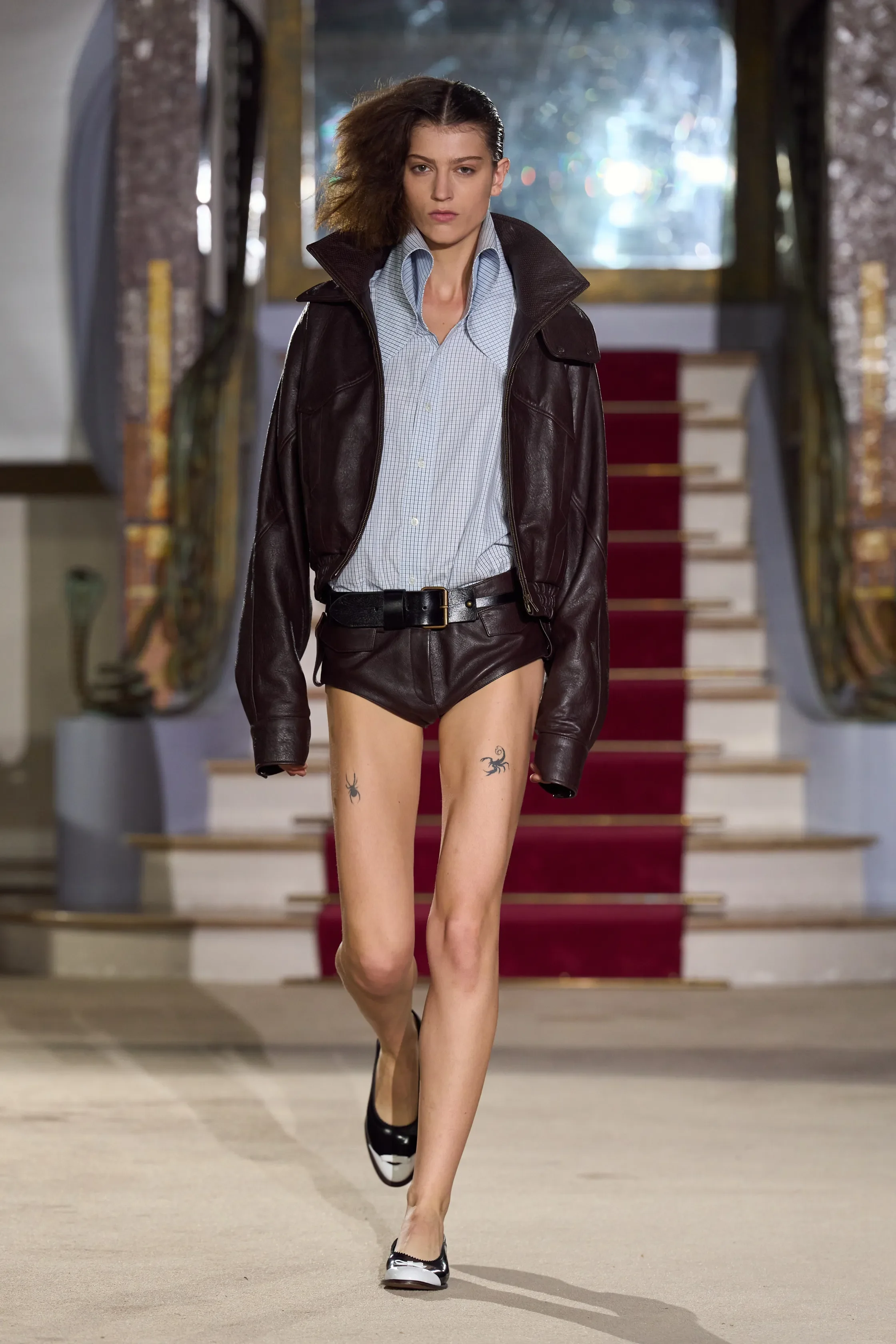
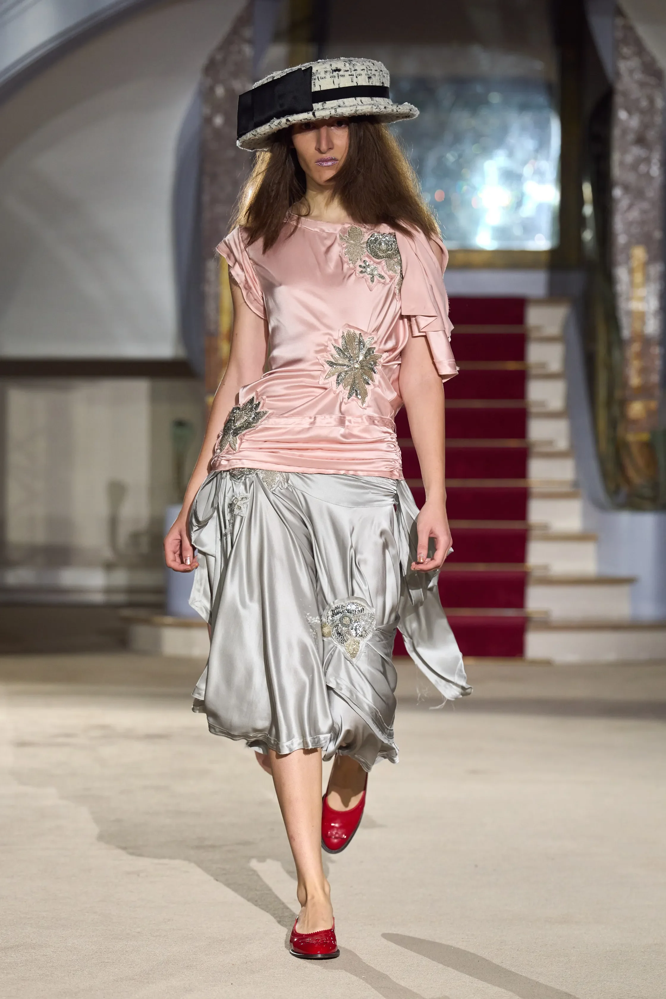
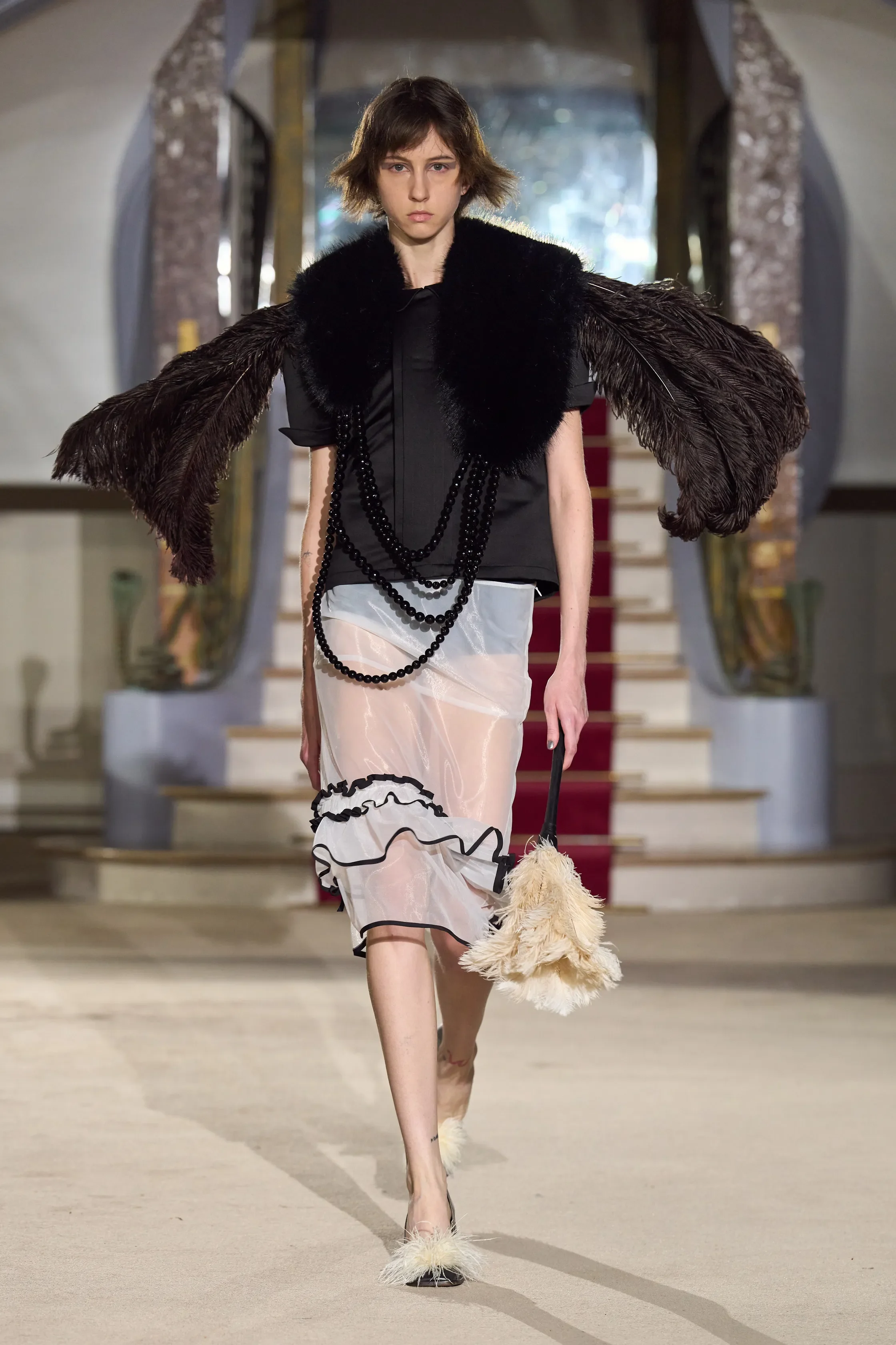
Bryn Taubensee and Patric DiCaprio proved to be great storytellers, and that is exactly how the Vaquera show felt. It was a bold introduction to archetypes, where each garment had a personality and each personality had a story to tell. The designers drew on the working uniforms of the 1920s and 30s, and decided that a uniform can always take an interesting turn.
The show opened with five white looks, loud, present and enchanting, as five spiky-haired models walked down the staircase to Sonny & Cher's "I Got You Babe". Among them were a fur wrap with a boater hat, a ruched gown and a cocoon cape. The mood was set, yet the story had only just begun. It unfolded through cargo-green trenches and leather, a first flash of neon with cigarette holders held like magic wands, and softer butter yellows and pinks. Towards the end, the cast came into focus, with a cook, a French maid and a nonchalant waiter.
Then came the final five, the same garments on the same models as the opening, now in an explosive pop of neon. The cocoon cape returned in sky blue, the ruched gown in electric green, and the fur look in tangerine orange. The collection folded back to the beginning, but not to the same place.
Maybe this is the lesson of the Vaquera show. The beginning and the end of a story are almost always connected. What makes the difference is the colour gained along the way.
ACNE STUDIOS
review by NIA TOPALOVA
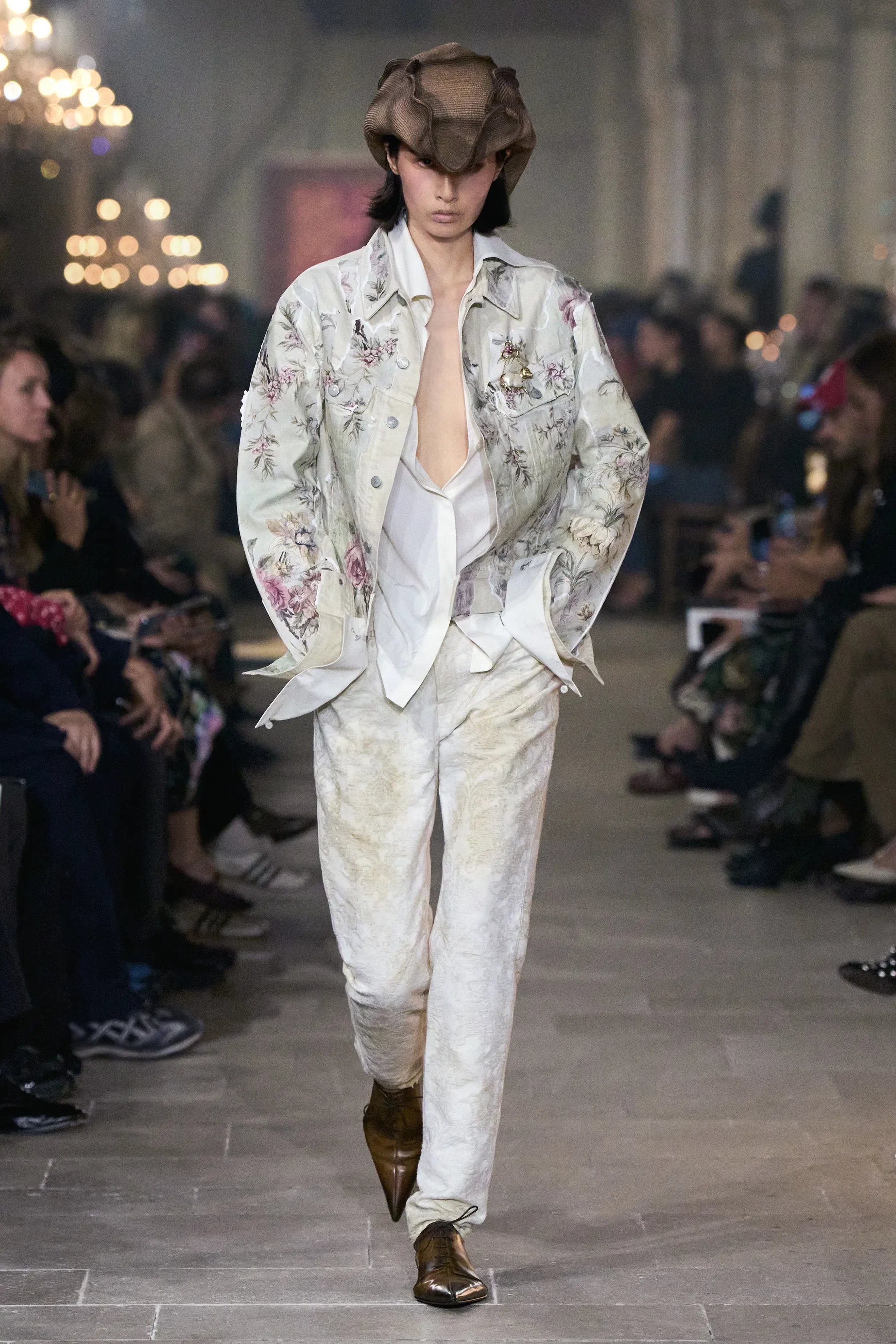
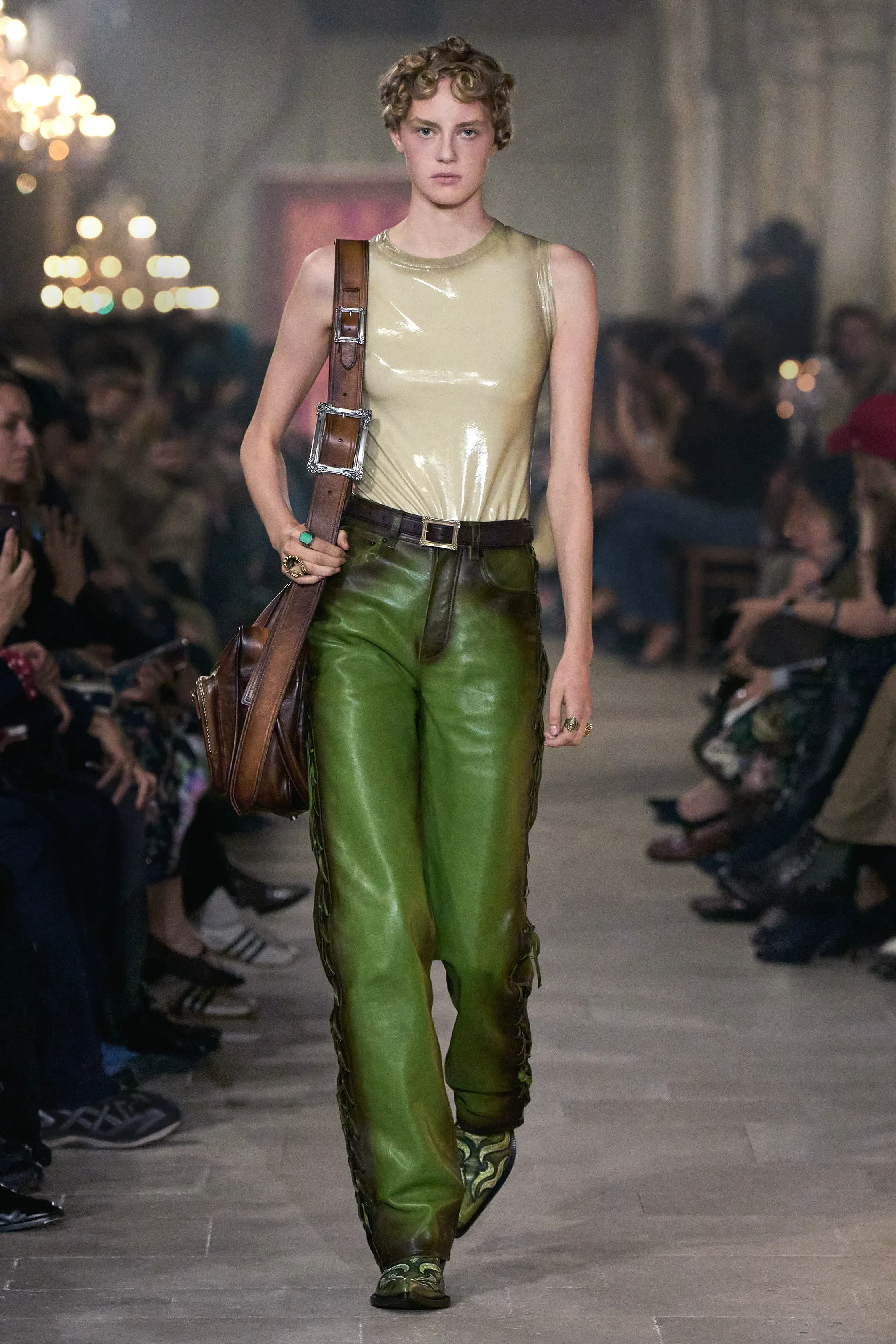
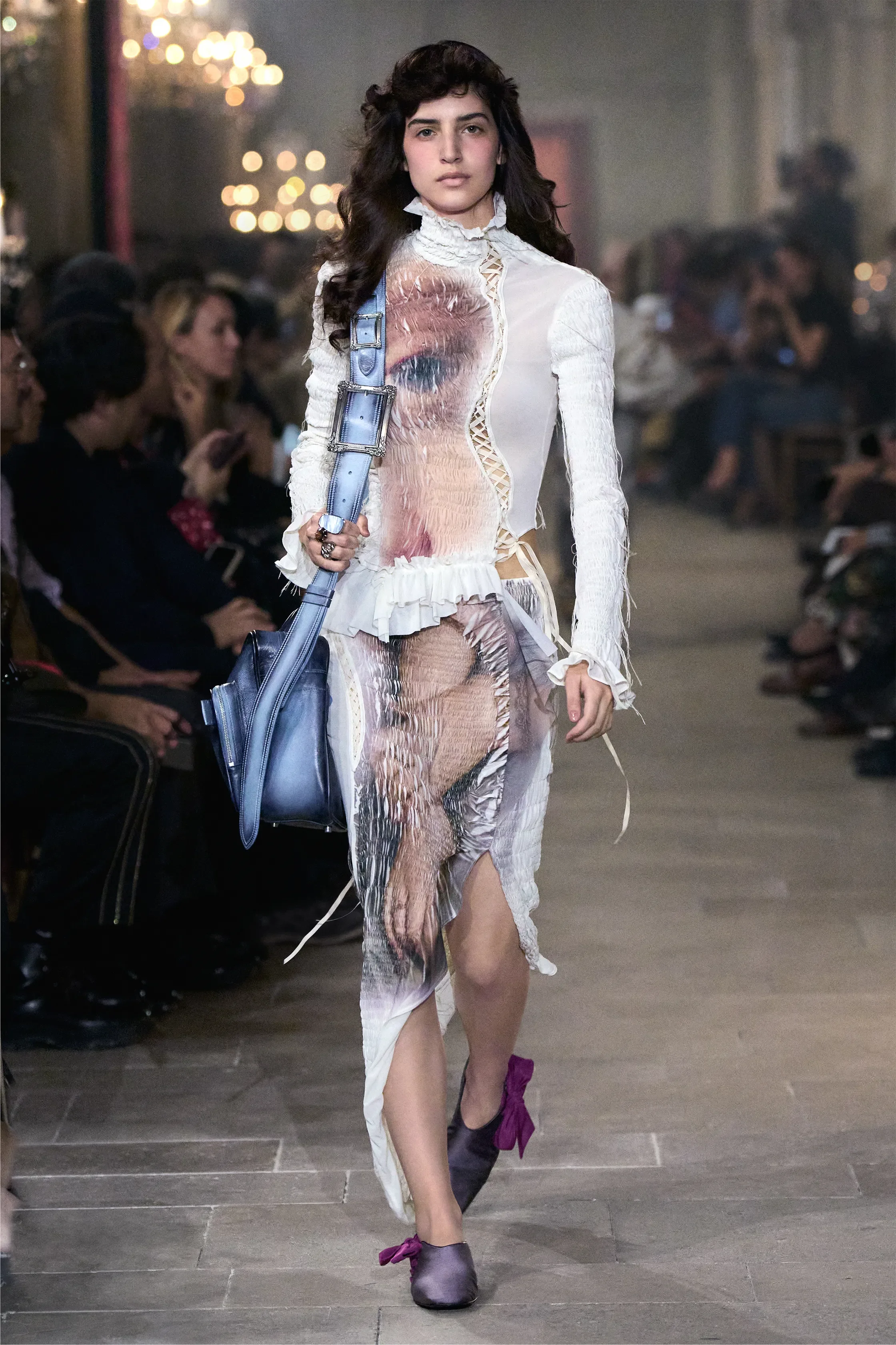
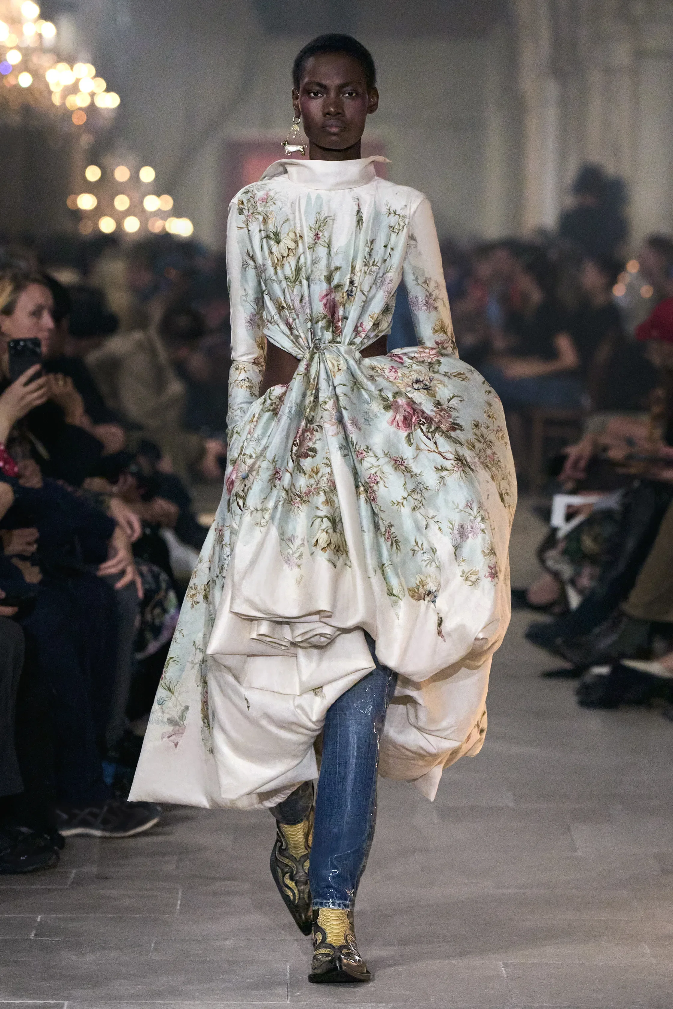
all images courtesy of ACNE STUDIOS
“The collection is fresh, salty and youthful, it is a study in modern theatricality while affirming something I believe to my core: that Acne Studios always likes to play, but we never want to pretend. For me, it has to be real.” – Jonny Johansson
For Denim Hystoria, courtly codes were made weathered and raw, and volumes counterbalanced in twisted miniskirts or taffeta tops; Polo knits, faded brocades, and full aged leather looks were balanced with fragments of torn Renaissance paintings or floral motifs such as porcelain-like faded blooms. Brooches held historical portraits, court shoes in satin were reimagined with teardrop heels, and satin slippers adorned with lace on the sides. In the background, melting traditional carpets by artist Faig Ahmed and a soundtrack of Prince Charming from Adam and the Ants.
Johansson has spoken about being drawn to things that “don’t belong”. Denim has been tied to the brand since its beginnings; here, Renaissance paintings and New Romantic references find their way onto the fabric. His Denim Hystoria folded Acne’s own three-decade backstory into a larger rummage through its past.
TOM FORD
review by MAREK BARTEK
all images courtesy of TOM FORD
Haider Ackermann wants us horny this spring and summer. There is really no other way of putting it. Tom Ford SS27 was sex from beginning to end — not the obvious, desperate and try-hard kind, but one that teases you until you can’t resist anymore.
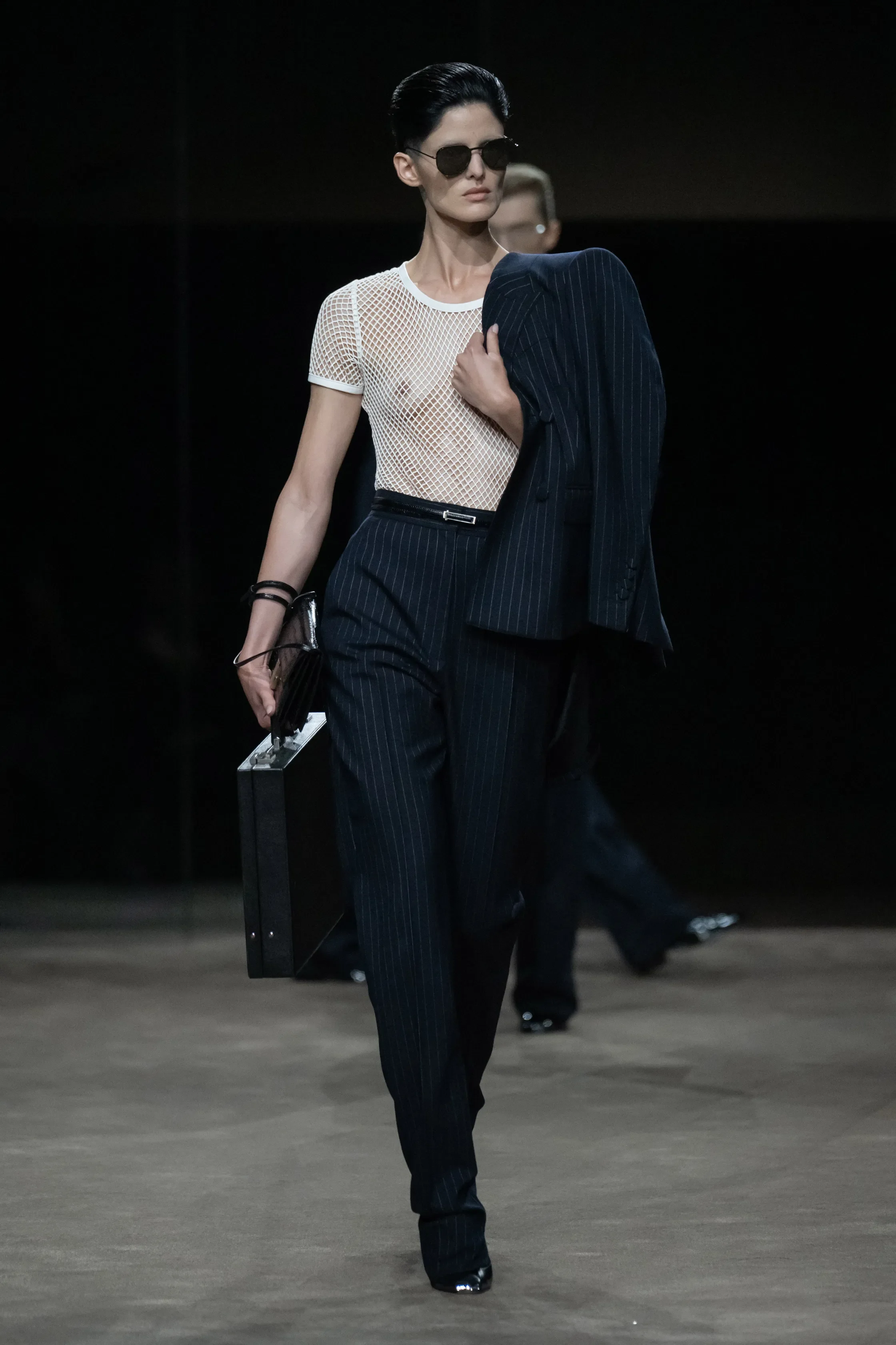
Inside a darkened room, models moved between slightly reflective glass walls, catching glimpses of themselves and one another as the sound of a woman moaning filled the space. Out came a pinstriped suit, worn with a shirt completely undone and a white scarf casually thrown around the neck. Then another: pinstripes again, this time with a sheer mesh top, a briefcase and retro slicked-back hair. Business attire had rarely looked this indecent, and that was essentially Ackermann’s game throughout.
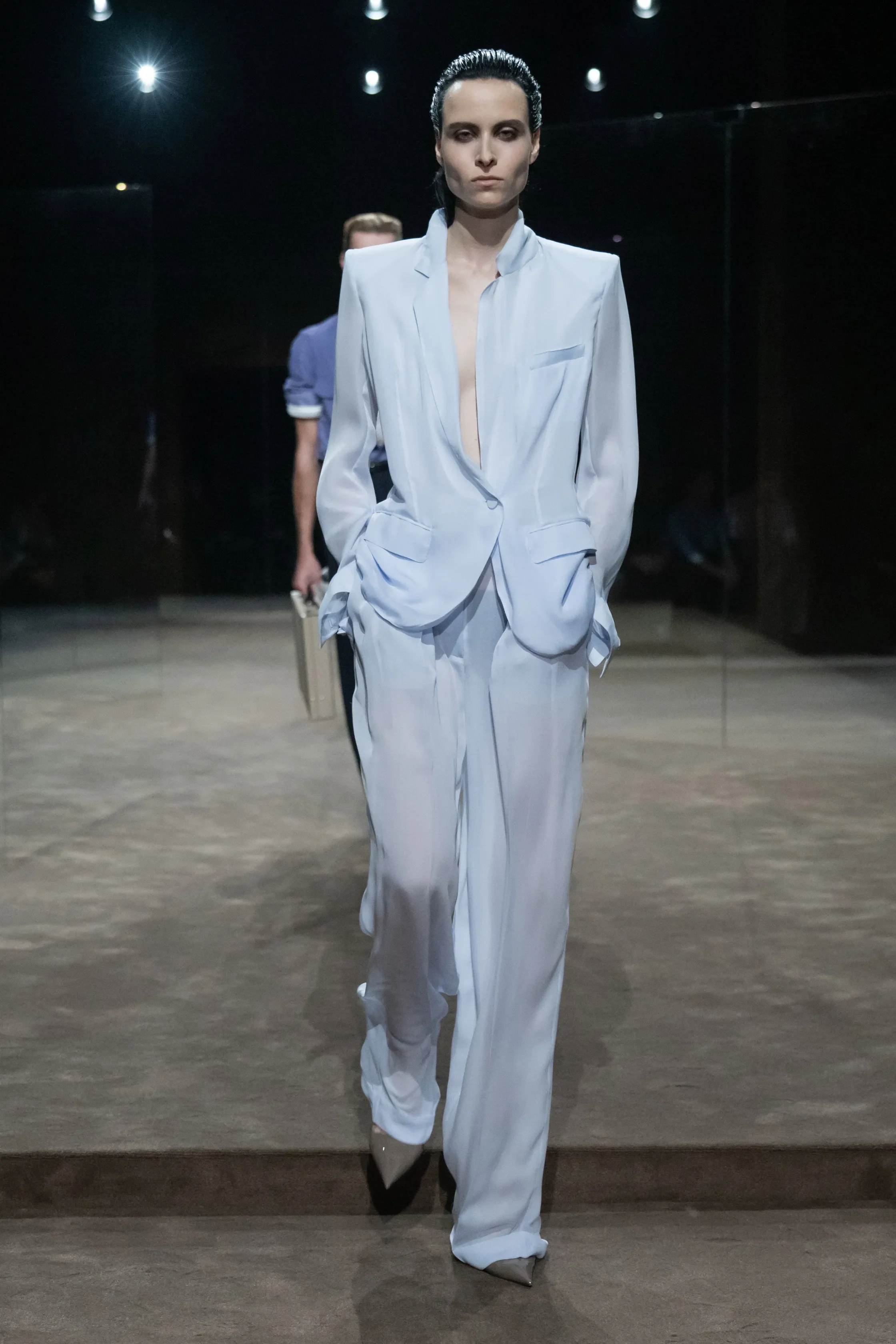
Everyone looked dressed up yet slightly undressed. Leather jackets were worn against bare skin, trousers sat dangerously low, sheer fabrics revealed underwear beneath, while bras became part of the construction rather than something simply exposed. One leather version was twisted into a sculptural bow across the chest — and just like that, wearing a regular bra as a top suddenly seems fucking lazy.
But for all the skin, nothing felt vulgar. That was the collection’s greatest trick. Ackermann knows way too damn well that showing everything isn’t necessarily sexier than showing almost everything. Fabrics occasionally became just transparent enough to reveal the body underneath. Jackets slipped from shoulders. Dresses appeared to be falling off. Trousers hugged the hips and a black skirt in look 49 sat dangerously low. Even Kristen McMenamy’s belted leather coat carried the suggestion that there might be absolutely nothing underneath.
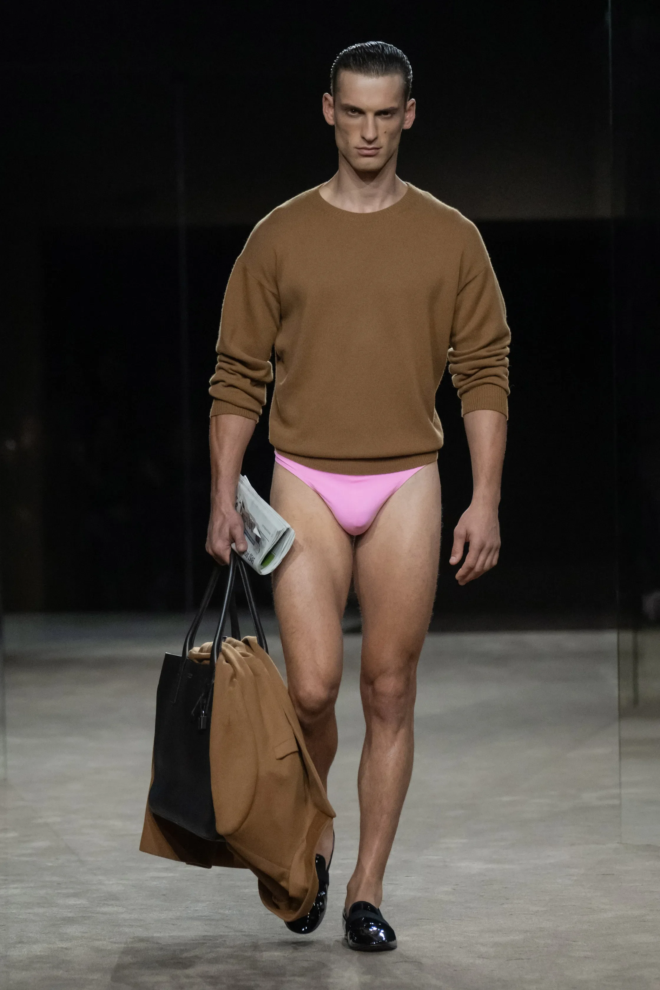
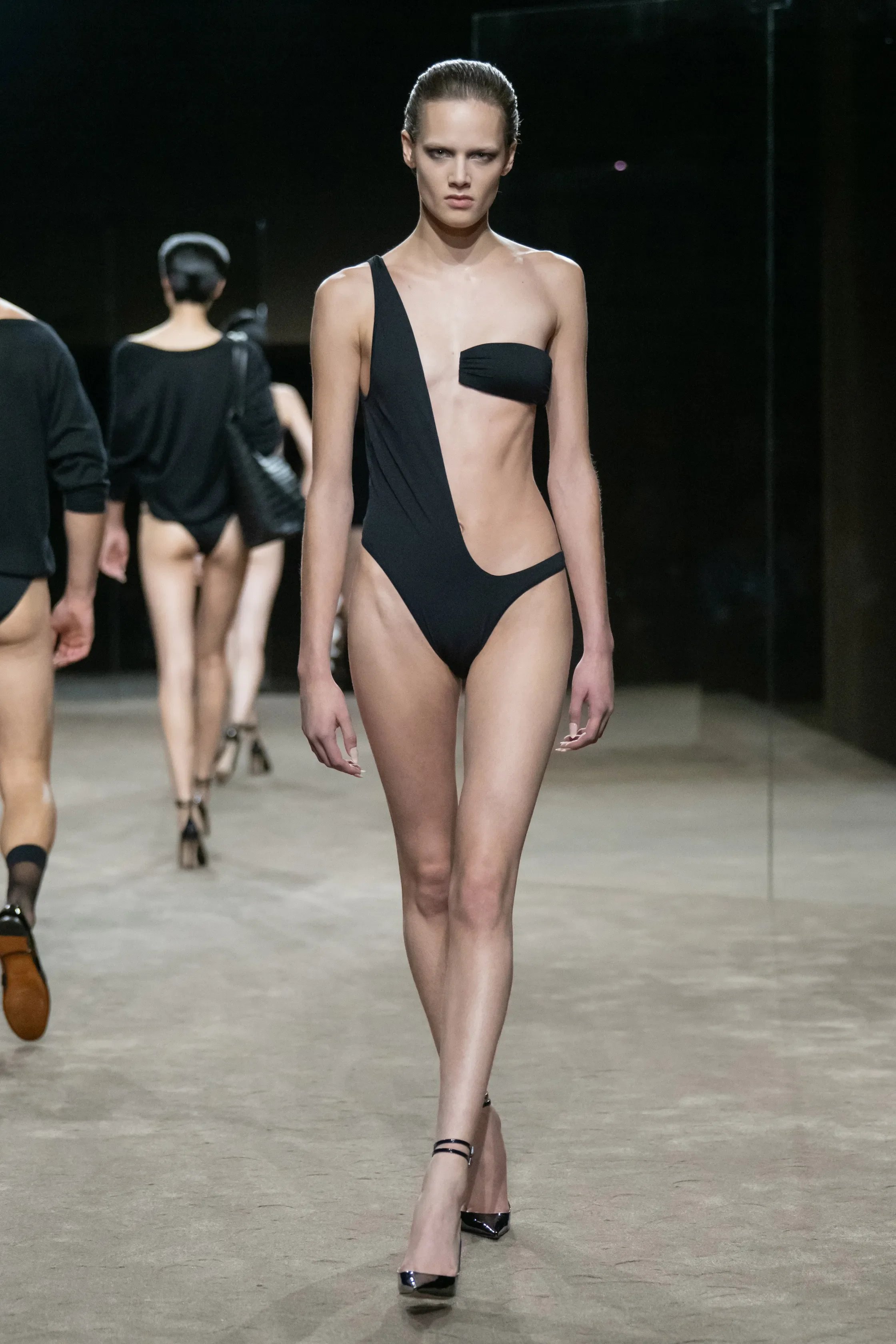
And just when we thought we were sexed-out, came the underwear. Bubblegum-pink briefs with a brown knit and an enormous bag; micro denim shorts under tailoring; bodysuits and bloomers cut so high they bordered on swimwear. For the evening wear, the palette erupted into red — satin robes, gowns sliced open across the body, and bras peeking from beneath tailoring — before silver sparkle and severe black took over.
This is quintessential Tom Ford, yet it doesn’t feel like Tom Ford cosplay. Ackermann is well aware of seduction the house was built on, but instead of imitating its founder, he has translates that sexuality into his own language. His elongated tailoring, sensual handling of fabric and fascination with the body were a match made in heaven for this house from the beginning. Now it really feels like it Tom Ford by Tom Ford this is not. This is Tom Ford by Haider Ackermann — and thank God for that.